Arby’s fast-food franchise may not be as well-known as McDonald’s, Wendy’s, or Burger King, but that doesn’t mean they haven’t developed a legendary brand. Arby’s established its impact by beginning to market its famed roast beast sandwiches, giving the globe an alternative to burgers and chicken sandwiches. We first saw Arby’s staple food, originally their roast beast sandwiches, mirrored in their first logo when they launched. Although we’ve been accustomed to the fast-food chain’s light red logo for nearly a decade, it was sometimes different.
The logo has only had four revisions since it was initially developed, and while it is close to the first logo, there are notable differences between it and the one used now. Since its inception in 1964, the fast-food company has developed incredibly, as has the franchise’s logo.
Let’s examine how the logo has evolved over time and how the company has.
What Exactly is Arby’s?
Arby’s is a sandwich-focused fast-food restaurant chain located in the United States. Sandwiches with duck breast and cherry sauce, chicken and parmesan, meatballs, turkey, beef stew, crispy onions, tomatoes, and other ingredients are available on the restaurant menus.
The Complete Arby’s Logo History
1964 to 1969
The franchise’s first logo resembled a cowboy hat and underlined what the restaurant was renowned for selling. This logo isn’t well recognized, and few people realize that the iconic red Arby’s emblem used to be a brown western hat. The logo had a dark brown hat with the words “Arby’s Roast Beef Sandwich” written on it. The text “Is Delicious” was put at the bottom of the hat.
1969 to 2012
The firm used the first logo for five years before they decided it was time for a redesign. This time, it was altered to the well-known red hat, which has since become the franchise’s iconic and characteristic symbol. This logo was a simpler version of the previous one, cleaner, and with less text. The revised logo removed all text from the logo and saved their name. The hand-drawn lettering gives the logo the essential aesthetic and a personal touch. This logo was welcoming and recognized the restaurant as a welcoming business that cared about its guests.
2012-2013
The previous logo had been with the company for decades until they thought it was time to give it another try. The brand preserved the core design for the new logo but chose to make it shiny and 3D this time. Although the logo’s outline was retained, the finer features were altered to make it more modern and distinctive. The top’s outline was significantly longer, the logo utilized a lowercase ‘a’ for the name, and the brand employed a new typeface. This year also saw the launch of the brand’s new motto, “Slicing Up Freshness.” While the lettering remained flat, the hat was made in three dimensions to contrast the two.
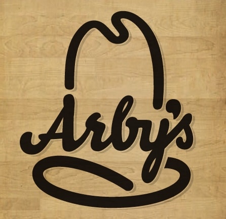
From 2013 to the Present
The previous logo was only with the company for a year until it was time for a new one. This time, the design returned to being 2D and looking more like the 1969 emblem that had become a franchise classic. The significant difference was that the logo was modified to meet current design trends instead of the earlier features from the late 1960s. The shape was a little wider and shorter than before, and it was now designed to fit social networking sites. The speech bubble apostrophe we saw in the previous logo made another appearance.
The Logo’s Colors and Font
Like any visual identity, the typeface and color combinations employed in the logo are critical to its success. These two design elements determine what catches people’s attention and make them remember the logo. The font will ensure that people can read the content and that it is easily distinguishable. Arby’s logo is primarily effective due to the brand’s usage of colors and text.
Color Scheme
The Arby’s logo is only two colors: red and white. The colors are clear and sharp, simplifying the logo and establishing a solid foundation by linking the two. There’s a reason why we see red used so frequently in food business logos.
The color inspires people’s need for food, and Arby’s, like many other food firms, incorporated it into its logo to capture people’s attention. The color jumps out and encourages others to use their brand. White is the second hue chosen, resulting in a clean, straightforward design with curving white letters. It works well with the red in the logo and makes it look professional and sophisticated.
The Typeface
The font employed in the logo is the second component that contributes to its visual identity. Arby’s has changed its font several times over the years, but the one they’re now using is their most remarkable. The font used in the logo is rounded and thick, giving it individuality and a lively look. The logo provides character and is one of the most important aspects of the visual identity.
Elements of the Arby’s Logo Design
Depending on the brand’s desire, graphic directors can meet their clients’ logo design needs using shape, form, texture, color, etc. For example, the creative artist behind Arby’s insignia used three graphic components to capture the attention of their customers: text, color, and symbol. Let’s look at the factors that give Arby’s a distinct image in the industry.
A Hat:
Chef hats are the most identifiable symbol in the food industry. Nonetheless, Arby’s logo hat was inspired by a cowboy hat. A cowboy hat is an item of popular culture in the American West. It denotes bravery. The hat represents safety, cleanliness, and respect. However, it also exudes power, authority, and nobility.
What Makes The Arby’s Logo Unique?
It’s reasonable to question what distinguishes Arby’s emblem from the millions of others worldwide. After all, with all of the logos we see regularly, speedy food logos, it’s natural to wonder why this one is different. The elements of the logo are quick responses. Some components make the logo stand out, resulting in the one-of-a-kind logo that has made its imprint. Here are a few features that make the logo memorable and distinct.
It’s Modest
One of the most essential characteristics of a truly great logo is its modesty. What makes the logo humble? It has fewer design components, which makes it simple and recognizable. The tiniest parts ensure that the logo may be used on a range of surfaces and that it is easily identifiable.
It’s Timeless
The logo is a true classic that has earned its status. The design does a fantastic job of merging the brand’s personality with the restaurant’s elements to produce a timeless mark. The logo has become a classic because the brand has maintained its features relatively consistent over the years. It’s easy to recognize because the brand has used the same colors and basic design since its inception. It’s become a classic by keeping the branding and logo elements consistent over time.
It’s Simple
Customers want the logo to be recognized and straightforward. Therefore unique logos don’t give them too much to look at. It is critical that there isn’t too much content and that the design is straightforward and to the point. The Arby’s logo is precisely that, with only their name and a simple symbol. Because they’ve maintained the same graphic elements for over five decades. The simple emblem and the fact that it has remained consistent throughout time have won the franchise’s loyalty.
4 Arby’s Facts You Didn’t Know
#1. It Wasn’t Named After A Person
Many people believe that Arby’s restaurant was named after a man named Arby. Even though this is a reasonable assumption, the restaurant was named after its two founders. Arby’s was created in the 1960s by two brothers, Leroy and Forrest Raffel. Because the initial name they wanted to use for the restaurant, “Big Tex,” had already been taken, they chose a different one. They chose “RB” to represent the Raffel brothers.
#2. They Ran A 13 Hour Commercial
The restaurant wanted to demonstrate that their Smokehouse Brisket sandwich was smoked for 13 hours, so they aired a commercial depicting it. They filmed the process and then broadcast it so viewers could witness the brisket being cooked for 13 hours.
#3. Arby’s Only Had Potato Cakes
You might find yourself purchasing a large order of curly flames the next time you visit Arby’s, but there was a time when you could only get their potato cakes. Until 1970, the restaurant’s main side dish was potato cakes rather than French fries. Later that year, in 1988, they debuted the curly fries that we now know and love as the go-to side item for Arby meals.
#4. Arby’s Is In Five Countries
Arby’s is present in practically every state in the United States and four other countries. Arby’s is only available in two states: Rhode Island and Vermont. If you’re traveling abroad, you can get some Arby’s in Canada, Qatar, the United Arab Emirates, and Turkey.
Who Established the Arby’s Food Chain?
Arby’s was founded by Forrest and Leroy Raffel. Leroy was born on March 13, 1927, and Forrest on May 14, 1922. Jacob and Anne Raffel were their parents. Forrest completed Cornell University, while Leroy graduated from the University of Pennsylvania.
They took divergent paths, with Forrest concentrating on hotel management and Leroy on finance. The Raffel brothers represented the United States during World War II. Leroy, Forrest’s younger brother, worked for the National Reserve when Forrest was in the Air Force.
In 1964, Forrest and Leroy used their different academic knowledge and skills to establish Arby’s Restaurant. Forrest died in 2008, leaving behind his wife, Gloria, and approximately nine children. In addition, in 1949, Leroy married Shirley Balbot.
Leroy and Gloria are the parents of four children: Kenneth, Janet, James, and Nancy. Both brothers have had successful careers. Leroy has held the positions of president and chairman of various organizations. Raffel Brothers, Inc., York Mahoning Company, and Arby’s, Inc. are a few examples.
Forrest, his senior brother, likewise held numerous jobs before passing away. He was the president of New Castle’s Temple, Israel. He also served on the board of the Greater Miami Jewish Federation. Despite the fact that they have retired from active labor, their legacy has had a good impact on the world.
How Did Arby’s Restaurant Begin?
Arby’s is an American fast-food restaurant owned by Inspire Brands, headquartered in Sandy Springs, Georgia. It was founded on July 23, 1964, in Boardman, Ohio, by the Raffel brothers. The brand’s signature product is roast beef sandwiches.
In the 1950s, the Raffel brothers purchased their uncle’s consulting firm. Raffel Brothers, Inc. was the company’s name. The company specialized in selling restaurant equipment. It was at a time when McDonald’s, KFC, and other food-related businesses were making inroads.
The brothers kept an eagle eye on the market’s massive growth while running their business. They discovered an opportunity due to their spying: an underserved market. Instead of imitating what the major players were doing with hamburgers, they went with roast beef sandwiches.
In 1964, the brothers launched their first restaurant in Boardman, Ohio, with the belief of a revolutionary product. They chose Arby’s name since their preferred name, Big Tex, had already been taken in Akron. Arby’s is a play on the initials of the Raffel Brothers.
Arby’s sold roast beef sandwiches for 69 cents, which was 54 cents more than hamburgers, to attract premium customers. Regardless of the price, customers flocked to the new fast-food restaurant. They began with roast beef sandwiches, soft drinks, and potato chips. It was a big hit!
Read Also: RESTAURANT MANAGEMENT: What It Is, Jobs, Salary, Software and More
Arby’s capitalized on this validation by issuing its first license in 1965. This permit marked the start of the second chain in Akron, Ohio. These success stories inspire the brothers to increase. Arby’s had over 300 locations in 40 states by the end of the 1960s.
While expansion leads to success, the latter is dependent on cash. Initially, the brothers funded their chains with equity and bank loans. However, they planned to attract significant finance by going public in 1970. Unfortunately, this ambitious endeavor did not proceed due to SEC’s own challenges.
They laid off some employees, ceased royalty payments, and filed for Chapter 11 bankruptcy in November 1970 with no cash. Following this terrible occurrence, the Raffles attempted every measure possible to restore Arby’s enviable standing. With approximately 500 outlets, it became lucrative once more.
Following their IPO lessons, the family sold its eateries to Royal Crown Cola in 1976 for $18 million. However, they did not immediately step down. Instead, they steered the food chain to unprecedented income and profit levels. The brothers finally retired in 1979, having worked at 800 Arby’s restaurants.
Arby’s now sells a wider variety of dishes in addition to its roast beef sandwiches. It has also spread into a number of countries throughout the world. Under the direction of Paul Brown, Arby’s has grown to become the second-largest food chain in the United States, after only Subway.
What Is the Size of Arby’s Food Chain?
Arby’s is one of America’s most successful and inventive quick-delivery services, with a global reach. The food business has expanded from a single store in Boardman, Ohio, to over 3,400 sites globally.
Though the founders developed a niche with their trademark product—roast beef sandwiches—the company is more likely to sell a variety of good foods. For the fiscal year 2020, these delectable products generated around $3.8 billion in sales revenue.
Arby’s continual high revenue is not accidental. Instead, the company has used its exceptional people’s abilities, knowledge, and experiences to achieve record sales volumes throughout the years. Arby’s current workforce ranges between 74,000 and 80,000 employees.
Yes, you read that correctly. This is the amazing quantity of brains that make the brand the world’s food paradise. Remember the workers’ dedication whenever you see a red hat.
What does Arby’s logo represent?
The cowboy hat emblem represents Arby’s restaurants’ particular Wild West vibe.
Is it a cap or an oven mitt in Arby’s logo?
Even though Arby’s employed an animated character in the form of a potholder in the old ad, its emblem portrays a cowboy hat rather than an oven mitt.
What should Arby’s logo look like?
The fast-food company’s logo is divided into a wordmark and an abstract emblem. The name ‘Arby’s’ is in bold serif type in the center. It is bordered by lines that form a cowboy hat silhouette.
What is the current slogan for Arby’s?
The current phrase was introduced as part of a new advertising campaign 2018. ‘Arby’s,’ it sounds like. We Have Meat… for Sandwiches.’
What is the significance of the cowboy hat in Arby’s logo?
The Arby’s logo is shaped like a cowboy hat to represent the Old West, where this fast food restaurant brand first appeared. Its designers aimed to create a new sort of interior that looked more luxurious than the usual catering outlets in 1964. They started with cowboy decor and foods common in the Wild West. A tall hat is a fashion statement and a nod to American food.
When did Arby’s change its slogan?
Arby’s last modified its motto in 2014. The company’s administration decided to stay current, so they created a millennial-focused strategy. To avoid becoming bored with a consistent client base, management approved a new slogan – ‘We Have the Meats.’ It replaced the tagline’ Slicing up Freshness.’ This was not reflected in Arby’s symbol.
What was Arby’s old catchphrase?
Arby’s fast food chain has numerous historical slogans that have altered. Slicing up Freshness (till 2014) is the most recent. ‘It’s Good Mood Food’ (until 2012), ‘Worth Every Penny’ (until 2011), ‘I’m Thinking Arby’s,’ ‘Every Day Tastes So Good,’ and ‘What Are You Eating Today?’ preceded him.’ Satisfy your grown-up tastes’ (until 2009), ‘Satisfy your grown-up tastes’ (until 2003). This company’s early tagline was ‘Roast Beef Sandwich Is Delicious,’ incorporated in Arby’s logo.
What exactly does Arby’s logo represent?
The Arby’s logo represents the perfection of Wild West cuisine, which is the fast food chain’s staple menu. Potatoes and beef are the main elements that form the base of local meals. Arby’s was represented by a cowboy hat by the restaurant’s creators on this occasion. And the inscription on it refers to the brand’s founders, Raffel Brothers (rb and’s).
Is Arby’s logo a kitchen mitt?
The Arby’s emblem is not an oven mitt since it is a cowboy-style men’s hat, not an oven glove. Its traditional meals and interior decor create a Wild West ambiance. After all, this cuisine is prevalent on the menus of these fast-food establishments. Furthermore, the hat symbolizes power, protection, respect, and dignity.
Conclusion
Arby’s logo is one of the most famous of all time, genuinely accentuating and affecting the fast food business. Although Arby’s is not as well-known as its competitors, the iconic fast-food company has built a name for itself with its legendary roast beef sandwiches. Since its inception in 1964, the restaurant has grown significantly in popularity, and we’ve witnessed the company’s growth and the evolution of its logo.
The brand’s visual identity is crucial to the restaurant’s success and has matured into an iconic masterpiece. Fans of the franchise may be startled to hear that the brand’s debut logo looked nothing like the one they know today. The first design had a different color palette, but the core concept was carried over to the current logo. Despite a few significant alterations, the logo has evolved into the iconic artwork we now identify with the restaurant.
Next time you swing by for curly fries and a roast beef sandwich, remember the journey their logo has taken to provide you with a one-of-a-kind experience.
Related Articles
- Best business to start with little money right now (+ all you need to start)
- WHITE HAT HACKERS: Who Are They, Salary, How to Become One.
- 25 Top Best HOT DOG BRANDS You Can’t Ignore, Ranked!!!
- The BEST COWBOY BOOT BRANDS in 2023 (Updated)