The first Marvel logo was created in 1939. When the first Marvel logo was made, it was based on the Timely Comics brand. It was encased in a shield-like structure. However, the change of the business name to Atlas Comics was mirrored in the logotype in 1951.
Basically, the magnitude of the Marvel logo is impressive. It represents extraordinary strength, endurance, and super speed. But there’s more. So, in this article, we will discuss the history of the Marvel logo, its symbols, the font, its color, and the company’s history.
The History of the Marvel Logo
Marvel was founded in 1939, and since then, it has grown to become the biggest brand in the comic book and entertainment industries worldwide. Timely Comics was the company’s original name until 1950; it changed to Atlas Comics in 1957 and then to Marvel Comics. The Marvel logo has seen several transformations since then, but the brand has never changed. The large, bright red and white typefaces in the Marvel Comics and Marvel Studios logos make them memorable.
If their work is all about creativity and new ideas, their logo shows their brand. The company’s successful efforts to change its image led to the creation of a logo that honors the company, its stories, and, most importantly, its heroes. The logo may look simple, but it went through a major change that has inspired hundreds of other companies to create easily recognizable and relatable brand images.
Who Designed the Marvel Logo?
Before the first Marvel Comics appeared in 1957, the business began publishing comic books in 1939 under Timely Comics. Publisher Martin Goodman created the original Timely Comics logo, a red, white, and blue medieval European heating shield. It was one of the best-selling items for the brand and resembled Captain America’s first shield from his early comic books.
Timely Comics’ name change to Atlas Comics also led to a change in the company’s logo. When Atlas Comics first used this emblem, a black circle on a red background with the phrase “Marvel Comics” on it, Stan Lee began penning several comics for the publisher.
The business unveiled a new iteration of its logo in the early 1960s; this time, only the letters “M” and “C” were positioned above one another. Sadly, it wasn’t as iconic as its forerunners or even as influential as the logos of its rivals, like DC Comics. The Age of Golden Comics officially began in 1963 with the publication of notable classics like “The Amazing Spider-Man,” “The Fantastic Four,” and “The Incredible Hulk” by Stan Lee, Jack Kirby, Steve Ditko, and other comic book creators. The business chose to update its logo to represent this new era. One of the few parts of the updated Marvel logo that mainly stayed the same for a long time was “Marvel Comics Group.”
Read Also: EXPEDIA LOGO: Everything You Should Know!!!
During the 1970s and 1980s, there were minor changes to the fonts and sizes, but the overall look didn’t change much. When the “Ultimate Marvel” imprint came out in the early 2000s, the company changed its logo, which had the word “Marvel” in bold white letters on a bright red background. The Marvel Studios logo, as well as the previous films in the Marvel Cinematic Universe, all adopted this new look because it was so well-liked by consumers. The original image eventually turned into the flipbook-style logo used at the start of modern MCU movies.
What Alterations has the Marvel Logo seen Over Time?
The company logo has undergone several changes since it first appeared in 1939, significantly when the firm’s name changed. According to Screen Rant, the red, white, and blue shield in the old Timely Comics logo was strikingly similar to Captain America’s shield. Timely Comics changed its name to Atlas Comics and its logo to a globe in the 1950s. By 1957, a red circle with the words Marvel Comics inscribed in white served as the new logo. A Marvel Comics Group logo quickly took its place when the initial form of the design, just the word M printed above the letter C, was discontinued.
The logo didn’t change much until the early 1990s, when a more stylish version was made with the words Marvel in bold, red block letters and Comics in a curving, yellow style. The Marvel logo, which is still the primary one used today, was altered in the early 2000s to Marvel, printed in white block letters on a red background. The MCU logo has changed a lot since 2008 when it was just a simple Marvel Studios logo. Since then, it has become the eye-catching design we see now.
Marvel Changed their Logo When?
The Marvel brand’s red and white visual design was established in the late 2000s. The logo for the company known as Marvel Studios was changed by adding a second nameplate.
The “MARVEL” rectangle logo, however, never underwent many changes.
From 1993 until 1996, the Marvel Films logo had a metal-like appearance. The word “Films” was scrawled in red and yellow calligraphy across the second section.
Between 1996 and 2002, the logo didn’t change much, except that a yellowish glow was added to the left side of the logo. Additionally, “Studios” was substituted for “Films.”
The 2002 creation of the red and white Marvel logo led to its long-term use. The bottom portion got a facelift in 2008, adding two parallel lines and the word “Studios” in the space between them.
This remained unchanged for a very long period. However, the typeface, spacing, and alignment had been slightly changed.
So, it is easy to imagine the huge changes branding has undergone to get to where it is now.
The Marvel Studios logo that is now in use was unveiled in 2016. This horizontal logo is divided into two sections: the word “Marvel” is inscribed in red on the left, and “Studios” is inscribed in white on the right. This is quite sleek and professional, so it makes sense.
Evolution of the Company
The same-titled comic book from 1939 served as the main building block of the magical universe. He made the illustrations for the superheroes and put them in the print version of Marvel Comics. And a film studio with the same name, Marvel Studios, debuted in the 2000s. Recently, movies have brought comic books and their characters to life. Furthermore, the logos of the studio and the combined corporation underwent similar changes.
The company’s visual identity was set when the red and white Marvel logo came out at the beginning of the 21st century. By adding the second part of the nameplate, the Marvel Studios logo was changed slightly. The slogan has moved around and changed size over the years, but between 1993 and 1996, the red rectangle and white text stayed the same.
An iconic logo marked the beginning of the Marvel Film Corporation. Also, the word “monumental” can be taken literally because the “M” in the visual identification sign looked like a wide, huge, huge “M.” It was said to be an essential part of the foundations, and the symbol showed that this was true.
A regular film with holes on the sides was used to create the letter. The middle part at the bottom was made by a short, pointed piece that replaced a piece of the written symbol. The first letter of the name, “Marvel,” appeared to “grow” out of it in the example above. It had the same metallic sheen and matched the color of the movie. The signs had a faceted edge and were straight and polished. A red-cursive “Films” was written in the background (or rather, on top of everything). It was written by hand in fluid handwriting.
1996 – 2002
After rebranding, the film studio changed its visual identity by taking ideas from the old design. She changed her name and wanted her previous emblem to reflect this. But some adjustments have been made. The developers, for instance, improved the hue of the capital “M” and the word “Marvel.” The gradual change from black and steel to olive-gray gave the shade a sense of lightness and beauty. “Studios” was added in place of “Films.” It was written in the same handwriting as the initial text: cursive, red, with small yellow lettering.
2002 – 2008
Marvel’s identity history underwent a sea change in 2002 when the movie studio shifted entirely to a red rectangle with white text inside. The designers did this by removing the enormous film “M,” lightening the letters, and enlarging the letters. As a result, the logo became incredibly memorable and well-known. All of the signs had upward extensions, except the “L,” which was distinct from the others. It had a small space separating it from the first part of the title.
2008–2011
This is the time frame during which the Marvel Cinematic Universe project first began. Then the logo showed the term “Studios.” This version was seen for the last time in the fifth Captain America movie and was seen for the first time in the first movie from the Iron Man studio. Two thin parallel lines are used to frame the white writing.
2013 – 2016
In the 2013 makeover, the word “Studios” was added beneath the primary badge, written in black, and placed against a plain white background. The tagline’s typography was also modified, and the statement was now written in a slim square font with crisp straight lines.
2016 – Today
The current Marvel Studios logo was unveiled in 2016. It consists of a horizontally stretched rectangular badge vertically divided into two equal parts: a white background with the word “Studios” written in a narrow black sans-serif on the right and a red background with the word “Marvel” on the left. The part of the lettering on the right is between two black horizontal lines, giving it a polished, stylish look.
The Symbol
The Marvel wordmark was being altered repetitively, growing ever closer to its current appearance. Since 1990, the logo has used a white and red color scheme.
From 1990 to 2002, the logotype had a distinctive “M” that looked like the MTV logo. The company ultimately went with a more straightforward “sans serif” wordmark. The most recent change was made in 2012. It was a very small change that could only be seen when the two versions were put next to each other.
Where Did the Name Marvel Come From?
Martin Goodman originally released Marvel Comics in the year 1939. For the second issue, which featured characters like the Sub-Mariner and the Human Torch, the name was altered to Marvel Mystery Comics.
Unfortunately, superheroes started to lose popularity by the end of the 1940s.
Timely Comics was a part of Goodman that made comic books. It published stories about many different things, like western culture, funny animal stories, romance, horror, and more.
After World War II, Stan Lee wrote stories with characters like the Blonde Phantom, who would later become part of the Marvel Universe.
The Sub-Mariner and other heroes became well-known in 1961, and Marvel Tales and Marvel Comics were also prominent.
The corporation became known as Marvel Comics during this time. Famous people like Martin Goodman’s employees, Jack Kirkby and Stan Lee, created fantastic superheroes and published “The Fantastic Four.”
This was a turning point for Marvel as they began producing more characters, including Thor, Ant-Man, the Hulk, Iron Man, and many others.
Read Also: Google Logo: History, Meaning, Brand Secrets (Detailed Guide)
But when Martin Goodman sold the business in 1968, they could make more comics, which had been illegal before.
Stan Lee, renowned for developing many classic heroes that we see on the big screen today, took up Goodman’s role as publisher in 1972.
So, Timely Comics was around until 1950, Atlas Comics from 1950 to 1957, and then Marvel Comics.
The Marvel logo has been altered numerous times due to multiple transformations. The company’s personality has endured, nevertheless. So what distinguishes the brand as notable? The fonts are a strong red and white!
As was already said, the company started making comics in 1939 under Timely Comics. During this time, Martin Goodman created a red, white, and blue European heater shield to serve as the company’s emblem.
Time changed, and Timely Comics became Atlas Comics. As a result, the logo was altered to a black circle with a red background. On it, the name “Marvel Comics” was inscribed.
Another iteration of the logo was unveiled in the early 1960s. This time, the logo was limited to the letters “M” and “C.”
Read Also: BUICK LOGO: Meaning, Old Logo, & History
However, this logo didn’t have much of an influence. As a result, it was updated again, and “Marvel Comics Group” became the new logo.
Except for a few minor adjustments to the size and fonts in the 1970s and 1980s, this logo remained the same for a long time without going through any significant revisions.
In the early 2000s, the final design was copied, which had the word “Marvel” written in white letters on a red background. This trendy logo was used for the Marvel Studios logo and the movies in the Marvel Cinematic Universe.
Why Does The Marvel Logo Have a Meaning?
The Marvel logo looks incredibly unique and intriguing and quickly piques your curiosity.
The Marvel logo’s current design makes it simple for you to connect it with Captain America, Spider-Man, and Iron Man, thanks to its white letters on a red background.
Why Does the Marvel Studios Logo Have a 10?
A business can indeed be as imaginative as it likes with its logos. As a result, logos are essential because they are linked to a brand’s identity.
In 2018, Marvel Studios creatively used its logo to mark the end of a decade.
The studio’s logo was unveiled as “MARVEL STUD10S.”
The crimson color of the number 10 in this design helped it stand out. It looks incredibly original and matches the scene well.
Elements of the New Marvel Logo Design
#1. Shape
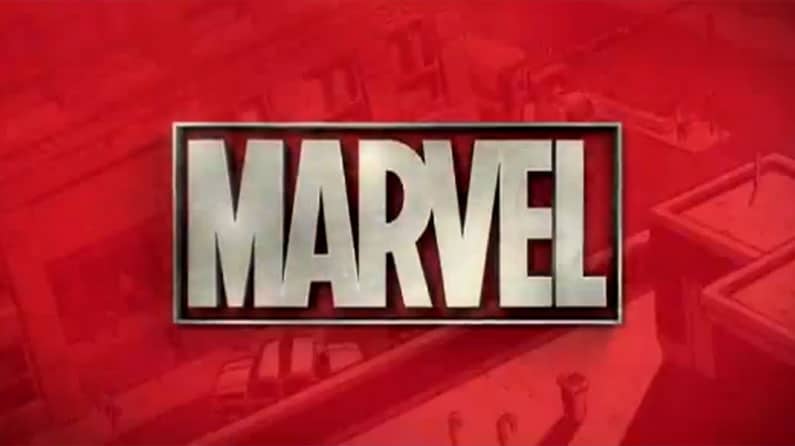
Since we’ve already covered the many phases of Marvel’s logo evolution, we’ll concentrate on the most recent one in which the word “Studios” is the same size as “Marvel.” The square frame around “Marvel” and the parallel lines below and above “Studios” give the logo an unmistakable look.
Another exciting element is the “Marvel” frame made of silver and chrome, where the letters appear to have been sliced out of the backdrop color of red. The word “Studios” seems to have been taken out of the silver frame similarly. This is probably done to demonstrate how, despite having its roots in Marvel Comics, the Marvel Cinematic Universe has grown to become a distinct and equally significant entity all on its own.
#2. Color
The most recent Marvel Studios logo extensively uses the colors red and silver. In addition to being classic superhero hues, each color has a distinct meaning and function, even when used separately.
First, red is typically utilized in superhero comics to represent the strength and fervor of the ultimate hero. Superman and Spiderman, for instance, have traditionally donned red as symbols of their commitment to helping others.
It may quickly capture the audience’s attention because it is also the color of romance, action, and adventure. On the other hand, the silver chrome color of the Marvel logo is frequently used to represent innovation, glamour, elegance, plenty, marvels, magic, and perfection. This indicates that even while the MCU may be novel compared to the comics, it is still a strong and valuable business component.
#3. Font
Tobias Frere-Jones revised the Marvel Studios logo in 2012, and Cyrus Highsmith later revamped it. This typeface is included in Google Fonts and Microsoft Word under the regular fonts category. You may utilize this clean and practical typeface in various branding collaterals, such as App design, product wraps, event and conference materials. posters, TV commercials, email marketing templates, etc. Even though it’s frequently used in graphic design, if you want to use it for a business, you’ll need to either pay for it or get the author’s permission.
What We Can Learn from the Marvel Logo of Today
The current Marvel logo made its debut in 2002. Since then, it has been somewhat altered to improve the harmony and smoothness of the characters. The text was written in plain white on a crimson background.
The Marvel logo had its most recent change in 2016 when the business officially changed its name to Marvel Studios. At Comic-Con, the logo’s unveiling was announced and there was new fanfare. Michael Giacchino, who also worked on The Incredibles, Star Trek, and the television series Lost, wrote the music. These marketing campaigns teach us some branding concepts that we can all apply:
If you haven’t launched your business yet and don’t have a logo, you can think about keeping it as straightforward as possible. Simple also entails adaptability, memorability, and Its aesthetic appeal. You can design a professional-looking logo for yourself. Just be mindful not to include too many components.
It’s time to reevaluate and modify some of your corporate messaging, taglines, tone of voice, and ad images once the general public starts to admire you. But make an effort to be consistent throughout your entire rebranding process.
Read Also: APPLE LOGO: Why Did Steve Jobs Use An Apple? What You Should Know!
If you have a sound marketing plan, brand extensions won’t conflict with your primary brand. For example, the FedEx Corporation created sub-brands like Express, Ground, Freight, Customer Critical, and Trade Networks. Each sub-brand has a different font and color below the parent brand mark.
Situations do matter. By the time the Marvel Studios logo was made public, Disney had already bought the Marvel Studios brand. In 2009, the change was announced. One of Marvel’s most recent movies is Black Panther. It brought in more than $80 million globally.
The road from Timely Comics to the “flip book” logo of modern MCU movies has been long and hard, but it has been worth it. After going through some hard times, it became one of the most well-known entertainment logos in the world. This shows how important it is to show your brand identity in the most creative way possible.
Conclusion
The Marvel logo has undergone several iterations. However, for the most part, the logo has kept the same essential elements as the company’s first logo.
Without a doubt, Marvel enjoys unrivaled appeal. Since you are a huge Marvel fan, you want to know everything there is to know about the franchise.
Marvel holds a market share of around 40% in American comic book stores, which will astound you if you visit one.
The Fantastic Four, Amazing Spider-Man, and Wolverine comics, among other titles, are among the market’s best-sellers.
Marvel superheroes have also become controversial cult figures among comic book readers.
You can never have enough of them, whether it’s Iron Man, Thor, Spider-Man, Captain America, or the Hulk. With each new release, Marvel continues to break its previous records, astounding the audience.
Related Articles
- AVENGERS LOGO: Meaning and Evolution (Detailed Branding Guide)
- PUNISHER LOGO: The True Meaning of the Controversial Logo, Revealed!!!
- Iron Man Logo: The Evolution & What It Really Symbolizes
- 20th Century Fox Logo: Facts and History
- PUNISHER LOGO: The True Meaning of the Controversial Logo, Revealed!!!
