Apple ranks as one of the world’s most successful companies, with more revenue than several businesses combined. The Apple brand is so powerful that customers open their wallets just at the sight of its logo or hearing its name.
But it wasn’t always like this.
For years, Apple struggled to survive the cutthroat industry of computing. They were thought to be doomed at one point until Steve Jobs miraculously returned and revamped the company.
Their incredible branding, beginning with their logo, is a huge part of their success.
In this post, we’ll look at how Apple’s logo evolved over time to become one of the world’s most iconic symbols, as well as the story behind Apple’s famous logo.
Overview
Apple’s logo is one of the world’s most recognizable symbols. As with any famous logo, its origin has been the subject of numerous anecdotes, ranging from the romantic story of Allan Turing, an artificial intelligence pioneer who committed suicide by biting a poisoned apple, to biblical stories of Adam and Eve.
So, what is the origin of the Apple logo?
Where and When Did Apple Get Its Name?
Apple Inc. was founded in 1976 by Steve Jobs, Steve Wozniak, and Ronald Wayne. The now-colossal technology company was founded when technology was still in its infancy and computers were quite cumbersome.
As a result, the three, led by Jobs, set out to change people’s perceptions of computers by making them smaller and more user-friendly. Wayne called it quits after only two weeks and sold his share for $800, unknowingly walking away from what would become a multi-billion dollar venture.
The Inspiration Apple got its iconic name around the same time it was officially established in 1976. However, just like its logo, there are numerous theories about the company’s name.
According to some theories, the three founders wanted a less official name than the tech giant’s competitors at the time, while others claim Jobs and Wozniak wanted to be listed before Atari in phone books.
While these theories are plausible, there is a much simpler explanation for the name Apple.
According to Walter Isaacson’s biography of Jobs, the Apple founder was on a fruitarian diet and had just returned from an apple orchard when he thought the name Apple sounded fun and spirited and suggested it to Wozniak.
Why Did Steve Jobs Use an Apple as a Logo?
Before delving into the history of the logo and its evolution, we must first examine the history of the brand’s name to better understand how the logo came to be.
Steve Jobs, Steve Wozniak, and Ronald Wayne founded Apple Inc. on April 1, 1976. Apple Inc. celebrated its 45th anniversary this year. Despite the fact that the company has been around for decades, there are many theories about the origin of its name and the meaning behind its logo.
The following are the most plausible explanations for why Apple was named “Apple.”
Reason #1: Isaac Newton Connection
Apple’s name is thought to be inspired by the folk-tale “event” that led Isaac Newton to discover the law of universal gravitation. While there is no evidence that an apple landed on Newton’s head, there is plenty of evidence to support the theory that the first Apple logo was inspired by Isaac Newton’s love of apples. But we’ll talk about that later.
Reason #2: Steve Jobs adored Apple products
Jobs revealed his love of apples during a press conference in 1982. This “confession” was confirmed in Walter Isaacson’s biography of Steve Jobs. Jobs revealed that he went to an apple farm during one of his fruitarian diets, which caused him to take a “second look” at the name “Apple.” His first impression was that the name sounded “fun, spirited, and not intimidating.”
This could be one of the most compelling reasons why Apple is called Apple—Jobs hoped that customers would see the company as a fun place to work that doesn’t intimidate people but instead inspires them to think differently.
Also, can we just point out that Jobs confessed his love for apples to Walter Isaacson, whose last name is almost identical to Newton’s first name?
Reason #3: Steve Jobs was a Beatles fan
If the name Apple Corps sounds familiar, it’s because it is a multimedia corporation founded in 1968 by members of The Beatles. It is also speculated that as a fan of The Beatles, Jobs chose this name for the company as an homage to the band.
Reason #4: So that the word “Apple” appears near the top of the phone book
When phone books were still in use in the 1990s, it was critical to have a name that appeared as close to the front page as possible. Customers would be able to find them more easily. Any company beginning with the letter A would thus appear in front of all the other companies.
Atari, a computer company where Jobs had previously worked, was Apple’s main competitor at the time. During a presentation in 1980, Jobs admitted that, aside from liking apples, another reason they chose this name was to appear before the name Atari in the phone book.
Reason #5: “Apple” was the best name they could come up with
According to Steve Wozniak’s biography, Apple’s founders decided to stick with this name because all of the other suggestions were not better, despite their best efforts to come up with a more “techy” name.
Apple’s History
Apple is one of those names and brands that does not require an introduction. The company that created the iPhone and iPad revolutionized not only the technological world but also the fashion world.
Apple is well-known for the exquisite design of its products as well as its minimalist approach to visual identity. However, this minimalism is very edgy, and given that the famous Apple logo first appeared in the late 1970s, we can see how progressive and innovative the company was from the start.
Steve Jobs, the brand’s and philosophy’s founder, is unquestionably a trendsetter. And there are undeniable facts, such as the fact that Apple is the most famous smartphone manufacturer, and the Apple logo is the most recognizable consumer electronics brand worldwide.
The iconic Apple logo was introduced just one year after the company’s founding and hasn’t changed since. It is one of the most brilliant examples of branding in modern marketing history, demonstrating that not everything has to follow trends, but there are logos that set them.
Who Created the Apple logo?
Rob Janoff, a graphic designer best known for corporate logos and identities, created the current Apple logo. Steve Jobs came up with the idea. By the way, Steve Jobs and Ronald Wayne designed the original Apple logo.
Was the Apple Logo Inspired by Alan Turning?
Do you want to know what influenced the design of the Apple logo? Here are three possible explanations.
Steve Jobs’ Passion for Fruit
As previously stated, the tech pioneer got the idea for the brand’s name while visiting apple orchard communes in Oregon. As a result, it’s not surprising that the company’s logo is an apple.
Apple’s Products
The original rainbow-striped logo used bright colors to humanize the company and to pay homage to the world’s first color monitor. Apple has also had to change its logo design several times to accommodate changes in device design over the years.
For example, the company had to convert its rainbow-striped logo to monochrome black in order for it to look right on the iMac G3.
Brand Identification
Despite the significance of the Newton plaque, Jobs desired a simple, modern logo to reflect the company’s business in modern computers and devices.
He also desired something more enticing in order to increase brand identity and awareness. Since then, the rainbow-striped logo and every other Apple logo have served this purpose.
Why is Apple’s Symbol a Bitten Apple?
Despite the numerous theories surrounding the bitten portion of the Apple logo, it has a rather mundane meaning. The bitten part was simply for scale, according to Rob Janoff, Apple’s original logo designer.
He used it to differentiate the apple from other similar fruits, such as the cherry. Janoff even admits to buying a couple of apples and cutting them in half to create the perfect Apple logo.
The logo also represents the brand’s uniqueness, and its evolution over time attests to Apple’s tenacity.
The Apple Logo’s Evolution and Diversity
The Apple logo hasn’t always looked the same. It went through four major design changes before becoming the iconic, bitten apple logo we know today.
Apple Computer Co. Newton Plaque (1976)
The first Apple logo was the Newton Plaque from 1976. Wayne designed it, and it depicted Isaac Newton sitting under a tree with a book when an apple fell on his head.
The image depicts Newton discovering gravity and includes a quote from William Wordsworth’s poem.
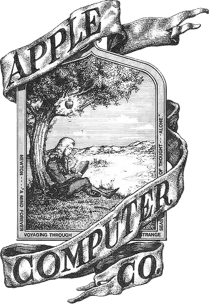
It also has an Apple Computer Co. ribbon around the top and bottom edges. Even though it was distinct, it bore no resemblance to the current Apple logo and was more akin to a miniature work of art, suitable for craft beer branding rather than a tech-related brand emblem.
It appears to be an old vintage logo, but it is not the Apple we know and love today. It was also far too complex and unmemorable.
Apple Rainbow Striped (1977-1998)
The Newton Plaque logo, like its creator, did not last long. After a year, Jobs declared that it was too traditional and hired Janoff, a professional graphic designer and the driving force behind Apple’s iconic bitten logo.
Janoff’s original version used rainbow strip colors, a nod to the Apple II, one of the company’s finest creations and the world’s first computer with a colored display.
The two-dimensional rainbow apple logo included a bite mark to differentiate it from cherries. As a nod to the first-ever beautiful typography used on a computer, it also included a geeky play on words written in San Serif Italic font.
Jobs embraced the logo right away, and by the end of the year, it had been fully integrated into the brand’s products.
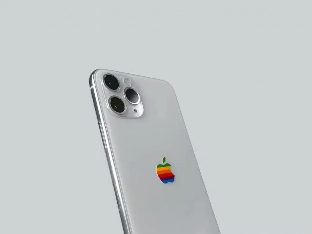
The rainbow colors of the logo drew public attention, as did its association with the LGBT community. These colors, however, had nothing to do with any community or minority and were not a hidden message, as they were a nod to Apple’s colored display.
Black Apple (1998)
When Jobs returned to the company in 1998, he changed the rainbow-striped Apple logo. Apple was losing money quickly and was on the verge of bankruptcy at the time.
As part of his efforts to turn things around, Jobs decided to capitalize on the company’s universally recognized, bitten apple logo.
To show that Apple was a high-end brand, the tech pioneer changed the rainbow logo to one that was blue and see-through, and then, in 1998, to one that was just black. This time, the logo was also thinner and more resembled the company’s current logo.
Aside from Jobs’ branding efforts, the new logo was also created specifically for Bondi Blue, Apple’s first-ever iMac.
It was sky-blue and translucent, so a rainbow logo would be out of place. Aside from the Bondi Blue, all other iMac G3 models sported the black Apple logo.
The Skeuomorphic Plastic Translucent Apple (1998)
The black Apple logo, blue color, and distinct translucent plastic case of the iMac G3 from 1998 immediately distinguished it. It was later released in additional colors ranging from lime to tangerine, covering the entire spectrum of a bright color palette.
With the assistance of Scott Forstall, a software engineer and longtime friend, Jobs also introduced Aqua, a new language designed for macOS.
It used the skeuomorphism idea, which made the interface elements look more like real things. This gave the user a better sense of depth and dimension and a better overall experience.
This was a useful concept at the time because it made computer interfaces less intimidating. It was also a win for Apple because it encouraged faster adoption.
Monochrome Plastic Skeuomorphic Apple (2001-2007)
Cheetah, a MacOS X with a slightly embossed aqua Apple logo, was released by Apple in 2001.
The aqua design was used until 2007, when Apple switched from a glass-themed to a chrome-textured interface, indicating the company’s shift toward aluminum-based device models.
Apple Metallic (2007-2015)
Aside from the Apple logo, Apple’s approach to computer design has evolved as well. Apple released the Aluminum PowerBook G4 in 2003, replacing plastic enclosures with low-carbon aluminum enclosures.
Following that, the company released the MacBook Air and MacBook Pro series, all of which featured a custom aluminum enclosure. The decision was motivated by a desire to create a greener Apple, and its success has prompted many other tech companies to follow suit.
However, this was to be expected because renewable aluminum emits fewer greenhouse gases and consumes less energy, making it an environmentally and economically friendly raw material choice.
Apple also shifted to renewable, energy-efficient architecture as part of its commitment to sustainability. Today, the company’s global facilities run entirely on clean energy, and it has numerous renewable energy projects around the world.
Flat Design Apple Logo
Because of its flat design, the Apple logo now appears more minimalistic. This flat aesthetic eliminates gradients, textures, and drop shadows, improving readability and providing a modern, up-to-date appearance.
It’s no surprise that many companies, including well-known names like Pepsi, Google Chrome, YouTube, eBay, and American Airlines, are embracing flat design.
However, as flat designs became more popular, skeuomorphism became one of the most despised trends in web design.
Although it aided in easing the learning curve, the 2000s trend gradually replaced glass morphism as people became more familiar with computers and could interact with software comfortably.
The Influence of the Apple Logo on Competitors
The Apple logo is one of the top five most recognizable symbols in the world.
It distinguishes itself from the start because it is more than just a logo; it is also the company’s name, which means that the more a consumer hears about Apple, the more they associate it with the brand.
Furthermore, it is a bitten apple, not just an apple. This distinguishes it and makes it easier to remember.
The evolution of the Apple logo also represents the brand’s growth over time and its emphasis on user-centered design, and the fact that it still retains its original shape evokes a strong emotional connection toward Apple among consumers.
Many years after its inception, the Apple logo continues to set the standard for future logo designs by encouraging brands to create imaginative and innovative emblems that exude history and heritage while also retaining a modern edge.
FedEx, Target, and Volkswagen are among the companies that appear to have taken notice.
Why the Current Apple Logo Is Effective
What is it about the Apple logo that makes it so memorable?
To begin with, the logo represents the company’s name, which aids in brand recognition. Every time a consumer hears the word “Apple,” the logo design reinforces it in their mind, and the same goes for the other way around.
Over time, the combination of the logo and brand name makes it easier for the public to recognize the Apple logo and immediately associate it with the company’s representation.
The design is then intelligently evolved. As seen above, the Apple logo began as a detailed drawing, but over time, it evolved into a flat, simple, and elegant design that perfectly represents the brand.
Finally, Apple’s overall branding efforts reinforce a specific set of emotions and strong associations that are evoked when the logo is seen. It’s sleek, stylish, and modern, and you, as a customer, will feel the same way when you use their products. How does that work?
Whether it’s one of their amusing commercials or sophisticated retail stores that offer a one-of-a-kind shopping experience, all of Apple’s branding contributes to the same story—consistently pushing these associations.
How Did They Manage It?
Their branding focuses on how your Apple experience makes you feel by unleashing your imagination, embracing innovation, and allowing you to chase your hopes and dreams and aspire to great things.
Apple’s ability to make customers feel emotionally connected to the brand has helped it become so well-known, and its logo is an important part of that.
7 Apple Facts That You Probably Didn’t Know
There’s more to Apple’s beloved brand than meets the eye. Here are some interesting Apple facts that you probably didn’t know:
- Apple possesses more cash than the government. The world’s most powerful brand sometimes has twice as much money as the US government.
- In 1986, Apple launched a clothing line. Apple debuted a clothing line called “The Apple Collection” in 1986. The designs were a far cry from the minimalistic Apple of today. Their clothing line featured rainbow-themed shirts, accessories, and other items.
- Almost all Apple devices in advertisements are set to 9:41. When Steve Jobs introduced the first iPhone in 2007, the time was set to 9:42. However, it was later changed to 9:41 during the first iPad launch in 2010.
- In 2020, Apple had over 140,000 employees worldwide.
- In 2021, Apple sold 657,000 iPhones per day.
- The Apple iPad does not include a calculator. According to legend, Steve Jobs did not like the original calculator design for the tablet in 2010. Even today, the Apple iPad does not include a calculator.
- Apple remains one of the most successful and influential brands in the world. Apple’s branding evolved as the company changed and evolved.
Is a New Apple Logo on the Way?
With the rise of minimalist design, Apple is unlikely to change its logo anytime soon, especially since it already uses three distinct colors.
Furthermore, because the “flat” logo craze is still alive and well, Apple’s chances of changing its logo anytime soon are slim. There is, however, the option of adding additional flat logos in either a monochrome or, as previously mentioned, a colorful flat logo design.
Skeuomorphism’s Demise
Your brand’s logo can make or break it. This is why companies, such as Apple, pay close attention to their logos and revitalize them whenever they believe the logo is an outdated representation of their most recent and current advancements.
The majority of the famous logos we know and admire today have come a long way to get to where they are. Some were drastically altered, while others underwent minor changes over time.
Cartier is an exception to this rule because its logo has not changed since it was first designed in 1900. Most brands are rarely like this because goals change, tastes change, and trends come and go.
Companies are finding it more difficult to stick with a unique, simple, and eye-catching logo that is future-proof. The logo must also be scalable, have an impact, and be a good representation of the brand as a whole.
As new “requirements” come out every few years, it’s getting harder and harder to check all of these boxes.
If we look back at the requirements at the beginning of the digital age, we can see how important 3D was and how important it was to make everything, including logos, as realistic as possible.
Skeuomorphism (referring to graphics that look like real-life objects or any 3D versions of any logo) is a dead concept in logo design nowadays. Creating logos that mimic real-life experiences is outdated, and companies are already switching to flat logo designs.
However, keep in mind that skeuomorphism is still alive and well in other design trends, such as user interface design. This type of design is not expected to die anytime soon in this direction or any other case where skeuomorphism makes it easier for users to interact with any tools they need to use.
The Ascension of Flat Logo Design
The popularity of flat logo design, for example, demonstrates that brands must now consider future trends. It requires a great deal of research and predicting skills. Nevertheless, we have repeatedly seen that the simpler and more minimalistic the logo, the better it will stand the test of time.
Other Companies Choosing a Flat Logo Design
Many other businesses decided to switch to a flat aesthetic, a two-dimensional minimalistic approach. Flat design has its origins in the Swiss Style and the Bauhaus movement. Returning to basics and combining aesthetics with function is what a flat design promotes.
Companies such as Airbnb, Facebook, BMW, Warner Bros, and Revolut have switched to a flat design once they understood the importance of following a minimalist approach. Other brands that use a flat design in their logos are Nike, Netflix, Microsoft, and HP.
Apple Logo FAQs
Is the apple logo biblical?
Rob Janoff, the designer of the Apple logo, claims that when he created the logo in 1977, he did not intend to include a Biblical reference. He wasn’t required to. Mr. Janoff explained that he included the bite “for scale, so people understand that it was an apple and not a cherry.”
Why is apple called a false fruit?
The apple is known as a false fruit because it develops from the flower’s thalamus, which forms the flower’s thick basal structure.
Related Articles
- THE APPLE BRAND EXPERIENCE: 7 Things Apple Brand Experience Mean To Customers
- WEBSITES THAT ACCEPT APPLE PAY: All You Should Know and How It Works.
- DOES BEST BUY ACCEPT APPLE PAY in 2022? (Detailed Guide)
- APPLE BRAND AND LOYALTY: Creating a Brand the Apples Way


