Every day, approximately 3.5 billion Google searches are conducted. With statistics like these, it’s safe to say that the average person sees the Google logo anywhere between one and thirty times per day.
The Google logo has become iconic and easily recognized over the last two decades. And it has remained deceptively simple throughout all of its evolutions.
Most users don’t know, though, that the most famous Google logo design on the internet has a very interesting history that began in 1996.
The Google logo is now a design masterpiece. Its use of colors and a clear, simple, but distinctive typeface make it easy to remember, instantly recognizable, pleasing (or at least not annoying) to see on a screen every day, and easily changed, as seen in Google’s larger family of logos and regular doodles. But it wasn’t always like this. Oh no, the early Google logos are extremely difficult to look at today.
But, in the course of this article, we’ll examine them because they demonstrate a series of sound design decisions that led to the Google logo being where it is today.
Who Is the Man Behind Google?
There was no single creator; Google was the result of the efforts of Larry Page and Sergei Brin. Google began as a research project called Backrub, which aimed to connect information for Stanford University. This project has grown tremendously to become the massive corporation that we all know today.
The Google Logo Evolution (History)
1996: The First Google Logo
The search engine’s very first logo predates the name “Google.” Larry Page and Sergey Brin originally called their web crawler “BackRub,” because the engine’s main function was to search through the internet’s backlinks.
Fortunately, by 1997, the company’s name had been changed to the much less creepy “Google” – a misspelling of “googol,” a Latin term that literally means 10 to the 100th power (written out, that’s one followed by 100 zeros). The idea behind the name was that Google’s search engine could quickly provide users with large quantities, or googols, of results.
1998: The First (True) Google Logo
Some sources attribute the first Google logo to Page, while others claim Brin designed it using a free image editor called GIMP; whoever it was, their design wasn’t exactly the most polished.
Google’s first logo, from 1998, featured colored letters and an exclamation point.
Another interesting fact is that Google’s new logo reportedly has an exclamation point because Yahoo’s logo also has one. It seems that tech companies all copied each other back then.
1999-2010: Ruth Kedar’s Logo designs
Brin and Page met Stanford assistant professor Ruth Kedar through a mutual friend, and because they weren’t happy with their logo, they asked Kedar to design a few prototypes.
She started with a logo that was mostly black and used the Adobe Garamond font. The original logo had an exclamation mark, which she took out.
According to Kedar, Page, and Brin like this logo because the mark in the middle looks like a Chinese finger trap.
The Google logo prototype is in an early black serif font, with the Os connected by a colored square pattern.
The graphic designer’s next try used a familiar typeface called Catull. The logo was meant to make people think of accuracy, like a target.
Read Also: NIKE LOGO: The Story Behind Great Branding!!!
The Google logo is in black font, with the letter O representing a compass and a bullseye.
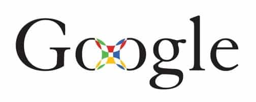
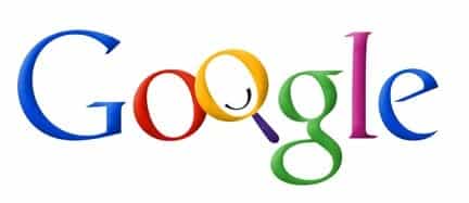
Then Kedar started to have more fun. He started to play around with color and overlapping Os, which led to the Os at the bottom of every search engine results page.
The early Google logo had black letters except for the Os, which were made to look like a compass.
Brin and Page thought this design was a little too busy with the crosshairs and magnifying glass.
An early version of the Google logo had solid colors and the first O was a compass and the second O was a magnifying glass.
The following iterations look more like the Google logo we know and love today, with designs that feel younger and less serious than their predecessors.
Kedar wanted to show Google’s potential to become more than just a search engine (hence the removal of the magnifying glass), and she also changed the traditional order of the primary colors to emphasize how unconventional Google was.
Read Also: STARBUCKS LOGO: Evolution, Significance, Branding Models & Tips
Ruth Kedar’s early iteration of the Google logo, which includes a risen O
The colors and slanted angles of this version make it feel youthful and energetic.
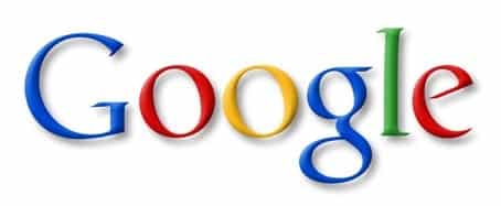
The final design, which served as Google’s official logo from 1999 to 2010, is one of the most minimalist.
Google updated its logo on May 6, 2010, changing the “o” from yellow to orange and removing the drop shadowing.
2015: A New Logo for Google
Designers from across Google gathered in New York City in 2015 for a week-long design sprint to create a new logo and branding.
After the sprint, Google’s logo went through a big change. The blue-red-orange-blue-green-red pattern stayed the same, but the typeface was changed from Catull to the schoolbook-inspired Product Sans.
At the same time, Google released several logo variations, including the rainbow “G” that represents the smartphone app and the favicon for Google websites, as well as a microphone for voice search.
The new logo may appear simple, but the transformation was significant. Catull, the former typeface, has serifs, which are small lines that embellish the main vertical and horizontal strokes of some letters. Serif typefaces are less versatile than sans-serif typefaces because letter weight varies.
Google’s full name desktop version of the logo is a sans-serif typeface, which means it’s simple for Google’s designers to manipulate and adapt the logo for different sizes, such as the face of an Android watch or the screen of your desktop computer. As Google’s product line expands, an adaptable design becomes increasingly important.
The logo is also meant to appear young, fun, and unthreatening (read: “I’m not like other massive tech corporations, I’m a cool massive tech corporation.”) This was a foresighted move, as concerns about data privacy have reached a fever pitch since Google unveiled this design in 2015.
A Dynamic Logo
When you launch a voice search on your phone or tablet, you’ll notice the Google dots bouncing in anticipation of your query.
As you speak, the dots transform into an equalizer that responds to your voice, and when you’re done, the equalizer transforms back into dots that ripple as Google finds your results.
A blog post from the Google design team said, “A full range of expressions were made, including listening, thinking, replying, not understanding, and confirming.”
While their movements appear spontaneous, they are rooted in consistent paths and timing, with the dots moving along geometric arcs and following a standard set of snappy easing curves.
Implementation and Growth of the Google Doodle
Google began experimenting with the Google Doodle in 1998, which was a temporary modification of the traditional Google logo.
The first Google Doodle appeared in 1998, before the company was even a company when Page and Sergey were attending the Burning Man festival and put a stick figure drawing behind the logo’s second O as a kind of “out of office” message.
The detail of the featured doodles improved over time.
Brin and Sergey commissioned then-intern Dennis Hwang to create a doodle for Bastille Day in 2000, and users loved it so much that Dennis was named “chief doodler.”
Doodles are now frequently used to commemorate holidays, special occasions, and birthdays of scientists, thinkers, artists, and other notable individuals.
The first doodles were usually about well-known holidays like Valentine’s Day, Halloween, and Indian Holi (in India), but as time has gone on, they’ve become more global and creative.
Read Also: MERCEDES BENZ: The Untold Story of the World’s No. 1 Car Brand
To decide which events, figures, or topics get doodles, a team meets on a regular basis to brainstorm, and doodle ideas can also come from Google users. Once an idea or doodle pitch is approved, illustrators and engineers design the actual doodles.
While Google hasn’t shared more recent statistics on its doodles, PRI noted that they’d climbed over 4,000 by 2016.
Google has maintained its support for doodles, with a verified Twitter account dedicated to informing its audience about newly published doodles, which has over 127,000 followers.
At its core, Google’s logo is more than meets the eye; as people and technology evolve, so will the design. At the rate things are changing, we’ll probably see a new version in a few years.
Google’s Evolution
1998: Google is founded
Google was founded in 1998 after Sun Microsystems co-founder Andy Bechtolsheim put up $100,000 in funding for this billion-dollar idea, which was the concept of Google that Larry Page and Sergey Brin came up with. They knew it was a good idea because every day, more and more website URLs appeared on the web, and they knew Google would agree.
After Google was founded, daily operations were relocated to Susan Wojcicki’s garage; Susan remained a part of the Google brand as the company grew, eventually becoming the CEO of YouTube.
2002: Yahoo! Attempts (But Fails) To Acquire Google
Yahoo!, which was established as the premier search engine in the early 2000s, was Google’s main competitor. What set Google apart was that they had better search engine technology built into their platform, which Yahoo! was aware of. Google went on to supply its search engine technology to Yahoo! in 2000. Yahoo! tried to take over Google with a $3 billion offer, but Google did not bite. Larry and Sergey felt Yahoo! gave them a low offer and they believed Google would bite.
2004: Google Introduced Gmail
Paul Buchheit, a Google employee, decided to take Google’s internal communication upgrade into his own hands. He saw problems with their current internal communications and worked on creating a new email platform to address those problems. Buchheit used Ajax, a web scripting technology, to create a faster email server that could refresh communication content without requiring the page to be reloaded.
Buchheit began working on this project in 2001, and it formally became Gmail on April 1, 2004. When it was first released to the public, Gmail offered 1 GB of data storage, and in just a few years, Gmail had surpassed Yahoo! yet again.
2006: Google Acquires YouTube
Google’s first acquisition was YouTube, which they purchased for $1.65 billion; Yahoo! and Microsoft also bid on YouTube, as it was the most popular video platform on the internet at the time, but Google outbid them.
With this partnership, Google was able to move beyond email and into video, and YouTube was able to move beyond video and into all of Google’s tools and services.
2007: Google Continues to Acquire Companies, This Time Purchasing Doubleclick
Google’s list of services and specialties expanded with each acquisition. In April of 2007, Google took on the advertising industry with the purchase of DoubleClick. Prior to this acquisition, Google was beginning to plant seeds to name itself as one of the largest players in the advertising industry through its use of AdWords. With this acquisition, Google was able to be even more dominant in the search engine marketing industry.
2008: Google Launches the Android phone
Prior to the Android, the terms “iPhone” and “smartphone” were interchangeable. However, when Google launched the Android in September 2008, it entered this market, and loyal iPhone users began to adopt the Android.
Google paid $50 million for the Android platform, and today, over a billion smartphone users prefer an Android phone over an iPhone.
Roadblocks Along the Way:
When you are one of the leading technology companies in the world, you are not immune to bad publicity and roadblocks. Over the years, Google has certainly encountered its share of roadblocks, but they have been able to overcome each challenge that has been presented. One of these instances was their poor choice in acquiring Motorola Mobile in 2013.
Their strength comes from the fact that their brand is built on strong pillars and a strong foundation. As Google grows, so does its brand loyalty, which means that no matter what roadblocks Google faces, its consumers never abandon the brand.
Why Does Google Use 4 Colors?
From a communication standpoint, the colors of the Google logo are important for a company to consider. Psychologically, these colors have an impact on our brains, and each color is associated with human behavior. We will disregard the rumor that these colors are inspired by Lego bricks, and instead investigate why Google would have chosen these colors.
Blue
Blue is the most popular color in the world, and it represents calmness, change, and confidence.
Red
It is the most visible primary color; it is sometimes associated with danger, which is why it is the color of fire trucks; however, it also represents very strong emotions such as passion, love, energy, and dynamism.
Yellow
It adds brightness to a design. Yellow represents youth and cheerfulness. It is the color of the sun and represents happiness. However, yellow has a negative cultural connotation. For example, Judas was supposed to be dressed in yellow, the yellow star, and so on.
Green
Green is the only non-primary color in the logo, and it is associated with growth, hope, wealth, and nature, as well as confidence and safety.
The Logo’s Characteristics
Contrary to popular belief, a brand carefully considers the selection of a logo.
Here are the three most important factors that influence the design of Google’s logos.
Simplicity
The company’s logos are not overly ornate, but rather simple and clean, with bright colors that bring the logo to life.
Adaptability
Google is the market leader in search engines, so it must provide a logo that can be adapted to any type of support. A responsive design has been implemented since 2013, allowing for perfect visualization in every dimension.
Google’s Applications
When looking at the Google Company in 2023, one can see that it is no longer just a search engine, but also offers a variety of other services.
Google Chrome, Google Maps, Google Drive, Google Cloud, Google Play Store, and so on.
All of these logos are based on the current Google logo and are updated on a regular basis.
Updating the logos of the various services prevents users from becoming bored.
The Graphic Design’s Conformity
Looking at Google’s graphic design, one can see that the company adheres to one design; the shades and colors found on all of their logos are the same, allowing them to strengthen their brand image and create a universal feeling when using Google.
When Did Google’s Logo Change?
For a long time, the Google business logo and official search engine logo were the same, but as the internet evolved and the Company changed, a Google logo change became necessary once more.
Because the digital world changes quickly, Google’s icon looked a little old by 2015, so the company did something about it.
In search of a new Google symbol, the company held a week-long design sprint in New York with designers from across Google’s ecosystem, which resulted in a slew of Google icons and designs aimed at helping to update Google’s visual identity.
By the end of the sprint, the Google logo had changed dramatically: the distinctive red, orange, blue, and green colors remained, but the typeface had changed to the Product Sans that many people are familiar with.
The decision to switch to a sans-serif font was significant for Google, as it helped to make the Google logo colors pop while also giving the company a more approachable image.
At the same time, the business logo for Google was updated in a number of ways, including the new multicolored G that we now know as the smartphone app or favicon for Google websites.
Though relatively simple, the new logo had a huge impact on the technology world, and many companies followed suit by switching to a sans-serif typeface in an effort to make their company more approachable as well.
Google’s logo today is intended to be fun and youthful, rather than the image of a stuffy organization.
The Meaning of the Google Doodle
For a long time, the Google logo was the simple sans-serif option we’re all familiar with – and this is still the image you’ll see when using Google on certain days of the year – but Google’s logo is now far more dynamic, thanks to the Google Doodle.
Interestingly, while the Google Doodle is widely regarded as a modern phenomenon, it first appeared in 1998, when Google began temporarily uploading new versions of the logo for special occasions.
The first Doodles frequently marked well-known holidays, special occasions, and important people’s birthdays; now, these Google logo variations are much more creative; Google has created doodles for virtually every major event, as well as some lesser-known ones.
Today, the team has created over 4000 doodles, and the current doodle for the 2021 Olympics is a fully playable game!
What Font Is Used in the Google Logo?
The Google logo as we know it today uses the font Product Sans, which was created by Google’s in-house design team. The new font was a refreshing change from the old-fashioned serif font, and it was designed to be bold, easy to read, and pixel friendly.
It works with all screen resolutions and is dynamic as well!
Google logo fonts are consistent throughout the Google ecosystem, with the Google logo typeface visible in bold in the form of the favicon Google uses for its websites and mobile apps, as well as the Google + logo and the Google Maps logo.
Google’s Logotype:
Google’s font is a sans-serif font called Product Sans that was created by Google’s in-house design team. While this team was developing this font, they ensured it was pixel-friendly by incorporating bold and streamlined accents. These features allowed the font to be easily viewed no matter what screen or platform it was on.
Color of Google’s logo:
Google’s iconic logo stands out due to its memorable color choices: red, yellow, blue, green, and red. As Google is spelled out, the colors appear in the sequence of blue, red, yellow, blue, green, and red. These colors are familiar, and whenever someone logs onto Google.com, they expect to see those familiar colors.
Ruth Kedar, a former Google logo designer, says that these colors were chosen on purpose because they are so well-known. Google differed in that they chose to add one secondary color, on the “L,” within the logo, to represent that Google is not a rule-following company. This choice fits into Google’s characteristics of being an innovative company that pushes the boundaries.
Google’s Logo Icons:
At first glance, you might not associate Google’s logo with any symbols, but when you look deeper, you can see that behind the logo are symbolic components. Take the “G” symbol, which was created as a variation of a previous logo in 2015. With its simplistic nature, it’s a quick identifier of the Google brand, without having the entire Google name written out.
Another symbolic component is their color choices and Google doodles; the doodles represent a specific holiday or birthday, and the colors represent Google’s mission while also being eye-catching and visually appealing.
When you use the voice command feature on a Google device, you’ll notice the three Google dots bouncing up and down. As you speak, these dots appear to show how your request is being processed. This shows that Google is listening to its users and the questions they are asking.
Google Today
Despite the fact that Google has only been around for less than 25 years, it is a company that is a trendsetter in its industry and constantly sets the standard for what artificial intelligence should be.
Google’s artificial intelligence research and innovation departments regularly produce breakthroughs, such as self-driving cars, smart 3D glasses, updated Google Maps technology, education initiatives, voice-powered search features, and more. With nearly 250 million users in the United States alone, and their parent company, Alphabet Inc., being the fourth largest global company, it doesn’t appear that Google has any plans to slow down.
Google Teachable Moments
The most important takeaway from the history and evolution of Google’s logo is that a little attention to detail can go a long way. Google never chose a complicated logo with tons of components; instead, they kept it simple, and the logo we know today is similar to the logo we remember from years ago.
With a logo as recognizable as Google’s, it’s important to treat its history and evolution as a case study. While Google had a few different iterations, its logo features were never drastically updated or altered; the latest version, which we know today, is simply a more modern and sleeker version.
When considering your own company’s logo, Google is a good example of a logo to strive to emulate. You want your company’s logo to be memorable, and familiar, and to evolve with your brand.
What does Google logo represent?
According to Wired, it’s a combination of wanting to represent how smart they are and how they’re not just a “system,” but far more intuitive and friendly than that today. Product Sans is a one-of-a-kind typeface.
What Colour is G in Google?
The color of the initial G has changed from green to blue. This color sequence is still used today, though the hues and font have changed.
Why is Google logo so popular?
A lot goes into the design of a good logo, not the least of which is the use of colors. When Google designed its logo, they were aware of this, and it paid close attention to selecting a color scheme that would be eye-catching and aesthetically pleasing. They would accurately portray the company’s vision.
Related Articles
- BEST BUY LOGO: Why is the Best Buy Logo Yellow? The Success Story!
- The Google Brand Strategy: How it Dominates Markets
- YAHOO LOGO: Meaning, Why Yahoo Changed Their Logo and History
- Yahoo Finance: News, Net worth, how they started and API Guide
- GOOGLE WEBSITE BUILDER: How to Use Google to Build Website For Your Business