Starbucks can generally be found near you no matter where you are in the world. For some, the Starbucks logo represents the convenience of being able to find great original products wherever they go. Others see this as another example of a multinational behemoth annihilating little local enterprises.
Whatever your position on the debate, you have almost certainly visited a Starbucks coffee shop at some point in your life, but have you ever wondered what that ubiquitous green and white logo represent?
Basically in this post, we answer the question, “What does the Starbucks logo mean?” We will also look at some of the prominent elements of the Starbucks logo that led to a successful branding down the road.
Starbucks Logo: Overview
Just a few people are likely to be unfamiliar with Starbucks’ famous emblem. Have you ever taken a close look at it?
It looks to portray a crowned lady clutching something in each hand, possibly a fish. The first time you truly look at the most recent version without prior information, it’s not quite clear what the image should symbolize.
Of course, most people are aware that the figure emblazoned on coffee shops around the world is said to represent a siren, a figure from Greek mythology. Traveling mariners were said to be lured by sirens’ lovely singing voices, causing their ships to stand on the rocks.
But looking more closely, you’d find that she isn’t even holding anything in her hands. The twin tails that we can see are supposed to be hers. The only issue is that sirens didn’t have tails back then. In Greek mythology, sirens were thought to be a hybrid of women and birds.
So maybe we’re mixing up sirens with something else: the lady may be another well-known mythological monster. It’s possible she’s a mermaid after all.
Why is there a mermaid in the Starbucks logo?
The mermaid notion, on the other hand, does not seem to suit. We all know that mermaids are half-woman, half-fish, right?
Isn’t it true, though, that they should have one tail? So, why is the lady in the Starbucks emblem having two? Well, we have an idea for a solution.
There’s another possibility if you look through your ancient mythology literature. Another creature from medieval European legend was the Melusine.
Melusines were half woman, half fish, and were sometimes represented with two tails, akin to mermaids. This is the creature that looks the most like Starbucks’ famous “siren.”
When choosing the symbol, it is uncertain how thoroughly the Starbucks founders investigated their ancient mythology. The simple fact is that two tails allow for a more asymmetrical shape that is better suited for usage in a logo — and this is most likely what influenced their decision.
Aside from the mythological conundrum, a siren is an especially fitting symbol for a coffee business. Starbucks’ modern-day siren does an admirable job of luring high-street passers-by in for a brew in the same manner that the fabled sirens of old drew unfortunate sailors over the cliffs.
But how did they come to chose this sea-lady in the first place, and what was the reason behind it? We’ll get to that later!
What is the significance of a Siren?
Aside from the debate about which mythical creature she represents, the more pressing question has always been; why was she the first choice in the first place?
The answer to this question dates back to the company’s inception in 1971. The initial founders planned to develop a company that offered foreign ground coffee and coffee beans, as well as tea and spices, from all over the world.
Furthermore, the business was based in Seattle’s Pike Place Market, which was historically a port city where coffee and other goods arrived by ship.
The founders wanted a name that symbolized the tremendous adventure and romance of sailing on the open seas for these reasons. They were looking for a name that would sound like a good fit for the business; especially when they came across Herman Melville’s Moby Dick.
Originally, they intended to call their company Pequod after Captain Ahab’s ship. After some deliberation, they decided on Starbucks, named after Starbuck, the Pequod’s Chief Mate.
After deciding on a seafaring name for their fledgling business, they needed a logo to match, so they started looking through ancient mythology books for inspiration.
The siren was “originally taken from a twin-tailed siren in an antique sixteenth-century Norse woodcut” that they discovered in an old book, according to the Starbucks official website – they had found the picture they were seeking for.
There are now others who question the authenticity of this tale about the image’s “Norse” origins. In any case, she is the icon we still connect with the world’s most famous coffee chain half a century later.
Starbucks Logo : A Brief History From Starbucks Coffee, Tea, and Spice to Starbucks
In February 1979, founders Zev Siegl, Jerry Baldwin, and Gordon Bowker met in Seattle, Washington.
Jerry Baldwin, Zev Siegl, and Gordon Bowker, three coffee connoisseurs, teamed together with their humble local coffee bean shop, Starbucks Coffee, Tea, and Spice, to create an iconic chapter in coffeehouse history. Their initial idea was to establish an uplifting space, a buffer zone, where people might have a cup of coffee in Seattle, Washington, near the famed Pike Place Market, in the spring of 1971.
Most coffee drinkers in 1971 preferred low-cost, low-quality coffee, often scooped from a can. Baldwin, Siegl, and Bowker all contributed to changing the perception of what a cup of coffee could be, hence transforming the coffee industry as we know it.
A competitor of Starbucks Coffee, Tea, and Spice kept a close eye on the modest firm. Until the two surviving owners decided to sell in 1987, at which point Howard Schultz organized a group of investors to purchase the company. They rebranded and altered the name to simply Starbucks Coffee, focusing on attracting new customers with a polished, corporate, and friendlier appearance.
Starbucks flourished rapidly in the United States and subsequently around the world after its initial purchase. In 1990, the company had 30 stores and in 1992, it had 53. Schultz rose to prominence as a progressive corporate leader who pushed for increased minimum salaries and health-care coverage, as well as fair trade regulations. With Starbucks as the world’s most well-known brand and the world’s largest coffeehouse chain, we can all learn a thing or two from the global coffee behemoth.
The Origins of the Starbucks Logo
The following is more like the evolution of the Starbucks logo from inception to its present form.
She Was Originally Bare-Breasted
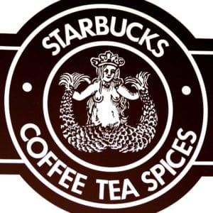
The initial woodcut differed significantly from what we now regard to be the perfect business logo.
Starbucks repurposed the lady from the woodcut and around her with the phrases “Starbucks – Coffee – Tea – Spices.” The lady and the letters were white, but the background was brown.
The actual fish-lady was depicted in great detail while remaining true to the original woodcut. She wore a crown on her head and had a tail curling up on either side of her; plus the human half of her body was completely exposed, including her breasts.
The Second Version Starbucks Logo Appeared In 1987
In 1987, the second iteration of the Starbucks Logo was released.
Starbucks’ logo basically evolved along with the company. Howard Schultz, a former director of retail operations and marketing at the corporation, bought the company in the first half of the 1980s. They began to shift away from the concept of a coffee, tea, and spice store toward that of a coffee café.
It was at this time that they realized the original logo was no longer appropriate for the company’s image.
The second version of the logo was introduced in 1987, after the business had already opened 17 locations, including locations in Chicago and Vancouver, Canada.
Although the 1987 logo was still based on the original 1971 form, it had become much more stylized. The white on black of the two-tailed figure had changed. Her wavy hair obscured her breasts, but her navel was exposed, making her more appealing to a larger audience.
The words “Starbucks Coffee” were written in white capital letters against a green background around the black and white core section; marking the first time this color came into the picture. The choice to remove the phrases “tea” and “spices” reflected the company’s desire to change course.
One star was added to each side of the human form in the new logo.
A Third Starbucks Logo Hit the Market In 1992
Starbucks had grown to be a substantial company by 1992, with 165 locations. However, none was outside of North America. The logo was overdue for revamping once more.
The third rendition “zoomed in” more on the siren’s head and upper body, leaving the lower half of her body out of view. Her navel was also no longer visible in this new version. The color scheme was the same as the previous iteration.
The words “Starbucks Coffee” were kept in this third rendition. The same was for the stars on either side of the siren. This was the third iteration of the famous logo, which was simpler and less cluttered.
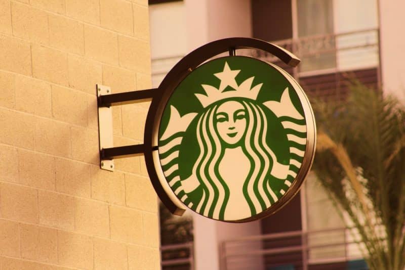
The Present-Day Starbucks Logo Was Created In 2011
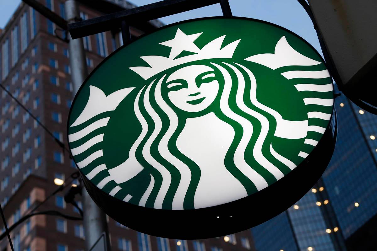
The fourth iteration of the logo, which is still used by the firm today, was unveiled in 2011 to commemorate the 40th anniversary of Starbucks’ foundation.
There are some noticeable design differences in the fourth version; plus one other minor update that we’ll discuss in just a bit.
The logo is now completely green and white, with no black in sight. There are also no words in this version. The creature in the center is the only thing left, with only her head and upper body, as well as her twin tails on either side.
The most noticeable modification is the elimination of the writing, which was a result of a couple of reasons. To begin with, the wording dominates the old logo, drawing your attention away from the siren and focusing it on the words.
Another reason for the elimination of the text was that it is now much more difficult for other companies to copy the design.
It was once fairly simple to build Starbucks-style coffee shops that imitate the original version. This would have been possible by utilizing a comparable typeface but with different text and images. Now? Not so much. It is considerably more difficult to deceive people now.
It’s a simple and distinct symbol that’s become one of the world’s most recognizable trademarks.
She isn’t flawless
So, what was that one minor design feature we mentioned earlier? You may not have paid close attention to the Starbucks siren or Melusine. But then even if you are a major Starbucks enthusiast who has spent time analyzing the logo, you may not have noticed. This may come as a surprise to you…
She isn’t without flaws.
When Starbucks’ in-house designers and Lippincott’s designers started working on the revamp, they came up with a flawlessly symmetrical creature. To them, this had to signify faultless beauty. Except that their ideal new Starbucks siren left them all chilly.
The design team finally discovered that the flawless “mask” they had built for the siren’s face was hollow and even terrifying after much debate and trial.
While we may believe that perfect symmetry is the apex of human beauty, we really anticipate perceiving some flaws in what we see. But then, we may reject a face that is too flawless because it appears to be flawed.
When the designers noticed this, they went back to the drawing board and made the slightest of changes. You may tell that the shadowing on her right eye is somewhat longer than on her left if you look closely.
This minor distinction gives her depths of character and individuality, as well as a hint of mystery and appeal, as a siren should.
And we’re ready to wager you’ve never seen anything like it before!
The Logo Has Been The Subject Of Several Conspiracy Theories
A couple of intriguing conspiracy theories concerning evil connotations hidden inside the Starbucks badge have been suggested, as with many other well-known business logos.
According to one idea, the soothing siren heard at coffee shops around the world is supposed to resemble the biblical Queen Esther, and Starbucks depicts a Zionist Jewish plot.
Others have claimed that the logo contains masonic images or that the design is a vehicle for the Illuminati to send subliminal messages to the general public. Some folks appear to believe they are brainwashing us by placing an insidious image on the side of our coffee cup.
Finally, some brilliant minds have proposed that the Starbucks siren emblem shows more than a passing resemblance to images utilized by various satanic groups and that Starbucks is somehow connected to the occult.
All we’ll say about it is that we’ll leave the final decision to you!
The Starbucks Design’s Success
Many successful features have emerged from various variations of the Starbucks logo. Because of how simple and calming the Starbucks logo design has been overall, the Siren has become such a memorable character with the brand.
Starbucks’ early incorporation of visual branding into its corporate identity led to its enormous reach and influence. Remember that having a solid brand isn’t enough; you also need to advertise your goods correctly.
“As we evolve to accommodate the different needs of our clients around the world, our brand has evolved as well. Here, we introduce a brand-new design approach that keeps our clients at the center of creative expression while maintaining the key characteristics of our brand.” –
Starbucks
Natural shapes, particularly circles, have an infinite quality to them, with no distinct beginning or finish. This offers a great sense of liberation. There was always an opportunity for improvement, and designers had a worldwide influence in mind from the start. Starbucks wanted to interact with people from all over the world.
“Starbucks cups have become part of the cultural landscape, serving as an unspoken reminder of the company’s existence. It’s a very effective piece of packaging.”
Can Akdeniz, Management consultant and business speaker
Great Features
Natural tones have long influenced their color palettes, which ties in with the company’s goals of connecting with others and general good health. Customer loyalty and trust are increased when corporate values and visual representations are consistent.
Plain typefaces, poor color choices, and unbalanced pieces can have a negative impact on how people perceive your organization.
We can learn a lot from the evolution of the Starbucks logo. They were able to establish a significant brand presence not only in America but also in countries all over the world. This was because of their unique and identifiable symbol.
Their logo was linked to their brand in the strongest conceivable way from the start. Without the logo, there was no Starbucks coffee.
There’s A Lot More To A Logo Than What Meets The Eye: Branding Model
For the most part, circles are a great form to use because they signify a never-ending tour around the earth. It’s also a simple shape to deal with in a variety of formats, whether you’re putting it on coffee cups (which have a curve and can make your logo difficult to read) or printed advertising like newspapers and billboards.
Not only that, but emblem logos have a classic, timeless vibe to them, which is why Starbucks has used them for so long.
Choosing a vibrant, healthy green as their major brand color communicates compassion, caring, and kindness, in addition to their now-famous siren.
Starbucks’ logo is a great illustration of how good logo design works in tandem with the company’s identity and branding activities.
Conclusion
As is often the case, the Starbucks logo hides a lot more than meets the eye. If you’ve ever wondered, “What is the meaning of the Starbucks logo?” we hope you’re now a little more…enlightened.
Are there any other intriguing facts about the Starbucks logo that you know of? What about Starbucks as a company? Do you enjoy it or despise it? Please let us know what you think; we’d love to hear from you!
Who Is the Woman in the Starbucks Logo?
So, why is the lady in the Starbucks emblem having two? Well, we have an idea for a solution. There’s another possibility if you look through your ancient mythology literature. Another creature from medieval European legend was the Melusine.
Why Is the Starbucks Logo a Mermaid?
For starters, the Starbucks logo is not a mermaid. The mermaid notion does not seem to suit. We all know that mermaids are half-woman, half-fish, right? Isn’t it true, though, that they should have one tail? So, why is the lady in the Starbucks emblem having two?
What Is the Hidden Message in the Starbucks Logo?
Aside from the mythological conundrum, a siren is an especially fitting symbol for a coffee business. Starbucks’ modern-day siren does an admirable job of luring high-street passers-by in for a brew in the same manner that the fabled sirens of old drew unfortunate sailors over the cliffs.
What Is the Starbucks Lady Holding?
But looking more closely, you’d find that the Starbucks lady isn’t even holding anything in her hands. The twin tails that we can see are supposed to be hers. The only issue is that sirens didn’t have tails back then. In Greek mythology, sirens were thought to be a hybrid of women and birds.
What Does the Siren Mean in Starbucks?
Aside from the debate about which mythical creature she represents, the more pressing question has always been; why was she picked in the first place?
The answer to this question dates back to the company’s inception in 1971. The initial founders planned to develop a company that offered foreign ground coffee and coffee beans, as well as tea and spices, from all over the world.