Have you ever wondered how to assess a business’s financial health? Do you always feel like your startup’s finances are a black box? You’re not alone. Especially in the early stages, keeping track of cash flow and predicting the runway can feel like navigating a financial fog. That’s where the mighty burn rate chart comes in. It’s a financial tool that cuts through the confusion, giving you a clear picture of your burn rate – the rate at which your startup is burning through cash.
Think of it as a financial compass. A good burn rate chart will not only show you how much cash you’re spending over time, but also help you identify trends, forecast future runway, and make strategic decisions. But crafting and analyzing a burn rate chart isn’t just about plugging in numbers. It’s about understanding the story your chart tells.
In this guide, I’ll walk you through the process of building a powerful burn rate chart, one that will illuminate your startup’s financial path and empower you to become a burn rate chart pro.
Key Points:
Burn rate charts provide a clear picture of a startup’s spending habits over time, acting as a financial compass for entrepreneurs navigating the turbulent waters of business.
Understanding the burn rate chart is crucial for assessing a business’s financial health, as it not only displays the speed of spending but also the viability of the existing financial plan.
Burn rate is calculated by subtracting a company’s net operating loss from its cash inflow, divided by a specific period, typically a month, helping entrepreneurs gauge how quickly their company is spending available funds.
Burn rate serves as a Key Performance Indicator (KPI) for startups, helping them assess cash reserves, focus on future investments, and make informed decisions about growth strategies and fundraising.
Reading a burn rate chart involves analyzing trends, comparing to industry benchmarks, and forecasting the runway of available cash, empowering entrepreneurs to make data-driven decisions about their startup’s financial future.
What is A Burn Rate Chart?
A burn rate chart is a crucial tool for assessing a business’s financial health and responsible development. It provides a clear picture of a company’s spending habits over a given period, allowing entrepreneurs to navigate the turbulent waters of the company. Understanding the burn rate chart is like having a compass in new territory, as it displays not only the speed of spending but also the viability of the existing financial plan.
Whether you’re a startup newbie or a seasoned entrepreneur, understanding your burn rate is crucial. It’s like the fuel gauge for your business that tells you exactly how fast you’re burning through cash. Now, two main key metrics play into most startups’ burn rates; Cost of growth, and Unit economics.
In this situation, the “Cost of growth” pertains to the cost associated with operational expenses. These usually encompass expenses arising from leasing office premises, paying employee salaries, and providing benefits packages. “Unit economics” describes the revenue generated by each sale of your product or service. This value can be computed by deducting the customer acquisition cost (CAC) from their customer lifetime value (CLV).
To calculate your burn rate, it’s cash flow versus cash burn. List all your monthly expenses – rent, salaries, marketing – everything that keeps the dragon breathing. Then, subtract any income your startup generates, like sales or investments. That’s your burn rate.
For the pros, To ignite a startup’s burn rate, gather your financial information and construct a burn rate chart. This chart will display the differences between spending and income, exhibiting patterns and trends. A high burn rate can drive exponential growth, yet an uncontrolled burn can bring the startup down. The image below is an illustration of what we just discussed. As a pro, Analyzing a burn rate chart may assist in identifying areas where revenue can be tightened or increased, enabling choices about expansion, hiring, and fundraising. Understanding your financial narrative is what makes you a burn rate pro.
Let’s break down the Calculation of burn rate. Imagine your startup is a rocket ship blasting off – exciting, right? But like any rocket, you need fuel, and in our case, that fuel is cash. The burn rate tells you exactly how fast you’re burning that cash.
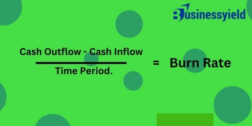
To calculate it, I divide my company’s net operating loss by a specific period, usually a month. The formula is straightforward: Burn Rate = Cash Outflow – Cash Inflow/ Time Period. For example, if my company incurs a net operating loss of $60,000 in a month, my burn rate for that month would be $60,000.
This simple yet powerful formula gives me insight into how quickly my company is spending its available funds, helping me make informed decisions to ensure financial sustainability.
Is Burn Rate A Percentage?
Yes, the burn rate is a percentage. The more your capital investment or current cash, the lower your burn rate—even if operational expenditures remain constant. It can be a bit of a financial chameleon, sometimes throwing you a curveball.
Sometimes, people use it as a quick way to gauge the efficiency of their burn. Imagine you have two startups, A and B. Startup A burns through $10,000 a month, but they’re bringing in zero revenue. Yikes! Startup B also burns $10,000, but they’re generating $5,000 in sales monthly. Here, expressing the burn rate as a percentage of revenue can be helpful. Startup A has a 100% burn rate (they’re burning all their cash), while Startup B is at 50% (better, but there’s still room for improvement).
The burn rate itself is a raw number, but percentages can offer a snapshot of your financial health relative to your income stream. It’s like comparing apples and oranges – both fruits, but with very different sugar content! We’ll dive deeper into crafting a powerful burn rate chart that tells the whole story in the next section.
You might be wondering, “Is burn rate a KPI?” Absolutely! Burn rate is a very helpful KPI for assessing cash reserves, growing them, and focusing on future investments. but first of all, KPI stands for Key Performance Indicator. It’s a fancy way of saying it’s a metric that tells you something crucial about your business. KPIs come in all shapes and sizes, tracking everything from customer growth to website traffic. But for startups, especially those in the early, pre-profit stage, the burn rate reigns supreme.
Why? Because, unlike established companies with a steady income stream, our primary concern is making sure we don’t run out of fuel – cash, in this case. The burn rate tells us exactly how fast that’s happening. It’s like a financial speedometer, letting us know if we’re cruising comfortably or hurtling towards a cash crunch. This intel is gold. It helps us make informed decisions, like when to seek new funding or where to tighten our belts on spending. So, while burn rate might sound scary, it’s a powerful tool for navigating the wild ride of a startup.
For beginners, imagine it as a story about your startup’s cash. The X-axis is time, tracking how long you’ve been on this wild ride. The Y-axis shows how much cash you’re burning – the higher the line, the faster you’re spending. See that downward slope? That’s a good sign, indicating you’re becoming more efficient. But a constantly rising line? Time to course-correct!
For financial wizards, the chart reveals treasure troves of data. We can spot trends – is our burn rate accelerating or slowing? We can compare it to industry benchmarks – are we burning through cash faster (or slower) than similar startups? This allows us to forecast our runway – how long will our current cash last? It’s like a financial fuel gauge, but way cooler (because of startups!).
The burn rate chart is also a strategic partner. We can use it to evaluate the impact of new hires or marketing campaigns before we blast off. See a spike coming? Maybe it’s time to secure more funding. The chart empowers us to make data-driven decisions, ensuring our startup’s financial future is as bright as our million-dollar idea.
Conclusion
So, from this information the burn rate chart! You can now build one that shines a light on your startup’s financial health. But remember, a burn rate chart is a living document. Update it regularly to track trends and make adjustments as needed. Don’t be afraid to experiment with different formats – maybe a cash burn forecast is next?
The more you analyze your burn rate chart, the more you’ll understand your company’s financial story. You’ll see where you can tighten your belt or identify areas to boost revenue. This empowers you to make informed decisions about growth strategies, staffing, and fundraising. After all, a well-managed burn rate isn’t just about keeping the lights on, it’s about fueling your startup’s journey to success. So, grab your financial data and get crafting that burn rate chart – it’s your roadmap to a bright financial future!
Table of Contents Hide Key PointsUnderstanding the concept of persuasive advertisingPersuasive advertising strategiesEthosPathosLogosTips for creating persuasive advertising campaigns1. Appeal…