The first step in establishing a relationship between your company and a prospective customer is to convert visitors into leads. The big question remains: how can you convince them that your website is worthwhile? In light of this, allow me talk about one of my favorite topics: landing pages. My career in digital marketing has been built on landing pages, and I’ve learned a lot in the process. In this article, I’ll explain all you need to know about creating appealing landing pages that turn clicks into sales. Now grab a seat and let us begin!
Understanding the Purpose of Landing Pages
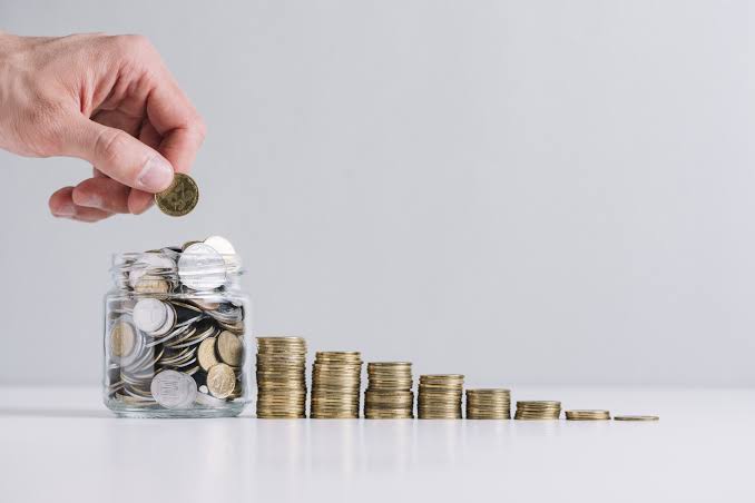
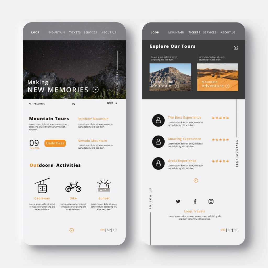
Image Source Venngage
The first landing page I created from scratch is still fresh in my mind. A client asked it to promote their newly released ebook. My entire being was invested in that page; I worked nonstop to polish the call-to-action (CTA), write compelling copy, and tweak the design. I prayed for the best and held my breath as the campaign began.
Guess what? It was ultimately a huge success! It was incredible how well the landing page converted. That’s when I realized how valuable a well-designed landing page is.
A landing page is a standalone webpage designed specifically for a marketing or advertising effort. This happens when a person clicks on an email link or an advertisement from Google, Bing, YouTube, Facebook, Instagram, Twitter, or another similar website, and they “land” on this page.
As much as the homepage of a website often provides a wide overview of the firm, it also can be a useful internet marketing strategy for achieving a specific, short-term goal later in the buyer’s journey. In other words, landing pages offer an amazing opportunity to convert visitors into paying customers because they are designed with a specific target group in mind.
Also, landing pages are fantastic for online advertising campaigns, but they can also be beneficial for linking a QR code on printed marketing materials to a specific website.
Key Takeaways
- Landing pages play an essential role in digital marketing because they act as a gateway to your offers and help convert visitors into leads or customers.
- Creating successful landing pages necessitates careful attention to detail. Clear headlines and appealing images, as well as persuasive copywriting and strategic CTAs, all contribute to conversions.
- Optimization is vital across all platforms. Whether it’s mobile optimization, social media integration, or compatibility with several web browsers, providing a smooth user experience is critical for increasing conversions.
- Testing and assessing performance is critical: A/B testing and tracking important metrics enable marketers to fine-tune their landing pages and enhance outcomes over time.
- Building irresistible landing pages is an ongoing process that requires experimentation, analysis, and a commitment to delivering value to your audience.
What are Landing Pages?
Landing pages are invisible heroes in the world of digital marketing. They operate as gatekeepers of your sales funnel, directing visitors to a specific activity, such as signing up for a webinar, downloading an ebook, or completing a transaction. In essence, without an effectively designed landing page, your marketing strategies will be ineffective.
In layman’s terms, a landing page is an independent website that a person “lands” on after clicking on an advertising, email, or other digital link. Furthermore, landing pages are an important part of any content strategy that intends to increase traffic and conversions.
When someone lands on your page, you want them to do something like subscribe to your email list or purchase your goods, if they complete the precise required action. After that, you can tell if a person has converted successfully from your landing page.
Landing pages usually encourage readers to do just one of these actions, such as completing the page’s customized signup form. Why? It is due to the “paradox of choice,” as scholars refer to it. That means that people find it more difficult to decide what to do and how to do it when they are presented with more options.
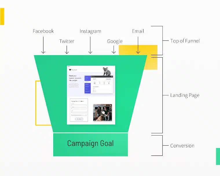
Because of this, a landing page needs to be optimized for conversions and have a distinct visual hierarchy and value proposition. Here’s where landing pages might fit into your marketing funnel:
Examples of Builders with Effective Landing Pages
Landing page builders are an excellent tool for creating a single-page marketing site with a clear call to action. If you know you’ll eventually want to grow it to a full website or perhaps an online store, you should start by constructing a single-page site. Let’s take a look at these few examples of providers with effective landing pages,
#1. Shopify
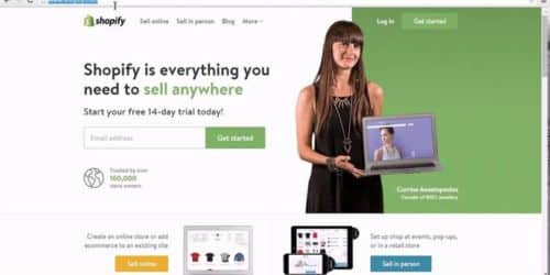
Shopify’s trial landing page for sellers, like many of the other landing pages included in this piece, is straightforward. It’s not overly text-heavy, yet it nevertheless manages to convince users by emphasizing a few important features of its superior offering, which in turn, makes visitors leave with the impression that Shopify is an all-in-one platform that is simple to use and widely trusted. But how effective is this Landing Page?
A. The interface is clean.
The user-friendly headline is only a few words long, and the page communicates the test’s facts and benefits with simple graphics and short text.
B. Clear call to action:
There are simply a few fields to complete before you can begin. All of this makes it easy for you to swiftly begin selling online with
What Can Be Improved?
- highlighting security:
The final column claims that the platform is safe but does not explain why. Instead, it says that over a million firms use it. A few lines of on-site security might improve this area, as the number of vendors is already listed at the top of the page. Also, it would minimize friction for guests who are concerned about security.
#2. DoorDash
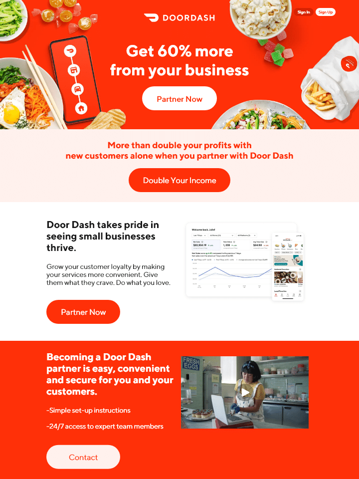
Takeout fans are undoubtedly conversant with DoorDash, the app that allows you to order meals from a variety of restaurants using your mobile device. Instead of customers, this landing page is designed to attract partners and Dashers who perform deliveries. This Landing Page’s effectiveness lies in the fact that:
A. It emphasizes dasher independence: This landing page demonstrates Dashers’ independence and freedom to work when they choose.
B. User-friendly: Simply type your address into the search field and voilà! Discover the top local eateries near you in an instant.
What they can improve on
The pros over rivals: DoorDash isn’t the only delivery service in town. So, they could emphasize what differentiates them from competitors like Uber Eats.
#3. Webflow
This is a web developer design instrument that compresses a lot of data into a single GIF. Webflow, like Muzzle, goes straight to the point and displays what its tool can do rather than just talking about it. There, the animated GIF appears in the same frame on the page, allowing users to observe how the product works and sign up without scrolling.
How Does This Landing Page Work?
A. Display rather than preach: Being able to see Webflow’s technology in action gives potential customers a clear picture of not just what it does but also how their user experience will go.
B. Removes risk: Several times on the landing page, users are informed that the service is free. In addition to that, there are no trials to join up for. They can create their site for free and then choose whether or not to pay for a plan when they are ready to launch.
What Can Be Improved
Absolutely nothing: This is because the landing page strikes the ideal combination of information, usability, and images.
#4. Bills.com
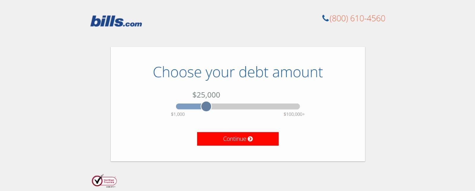
Most times, landing pages are frequently misunderstood as static web pages. However, with the correct tools, you can make them dynamic and personalized.
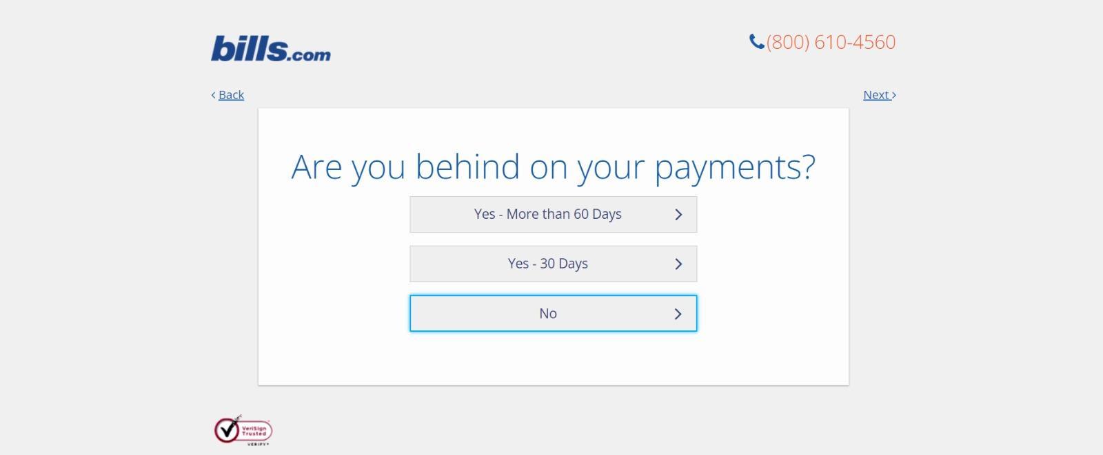
Take a look at the example provided by Bills.com. Before being provided a form, you answer three questions to determine whether or not you might benefit from the consultation.
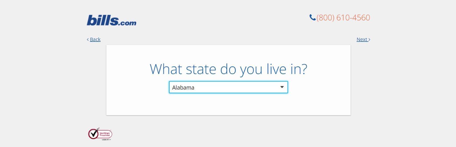
Then you respond to two more questions, like the one below:
And here’s the final landing page form where you fill out your information:
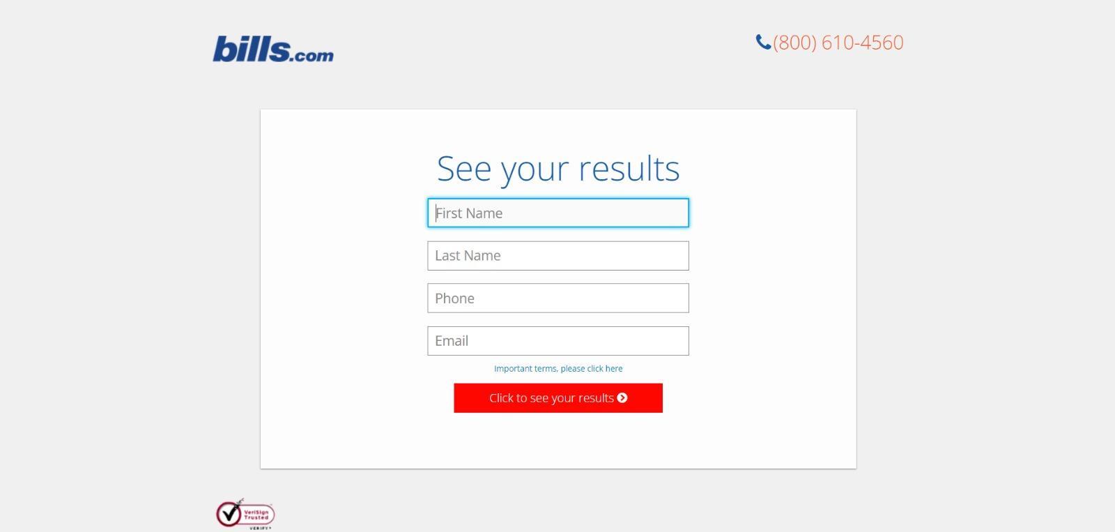
I’m not sure how the algorithm works (or if there is any), but while filling it out, I was worried about not qualifying. When I discovered I did, I was eager to fill out the form, as I am sure most individuals who are using this tool were. Bills.com likely enhanced conversions by making this deal appear more exclusive before the form shown on the landing page.
What to learn from this page:
A. Exclusivity.
Everyone likes to feel special, which is why exclusivity is so effective. The page conveys the sense that the offer is not extended to just anyone. Instead, it says you must first meet the qualification requirements.
B. Interaction:
You can encourage users to interact with the page at any time, even if it’s as easy as filling out a form with a sliding bar inquiry.
#5. Netflix
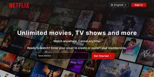
Netflix’s landing page can’t be both simpler and better. It cleverly sets the email sign-up form at the center. But, when you input your email address, it sends you to the account setup or login page (if you already have an account).
In essence, the Crystal-clear CTAs and smooth, simplified stages ensure that users of all ages can navigate with ease. Why is This Landing Page Effective?
- Easy talk: Netflix uses simple terms. There is no need for a vocabulary; just purely simple information.
- No challenges: The entire offer is clearly stated.
- Amazing design: Cool movie and series images in the background and the tempting red and black color scheme make the page appear great.
What Can Be Improved
- Pricing strategy: Instead of FAQs, place the costs where consumers can easily see them.
#6. Constant Contact
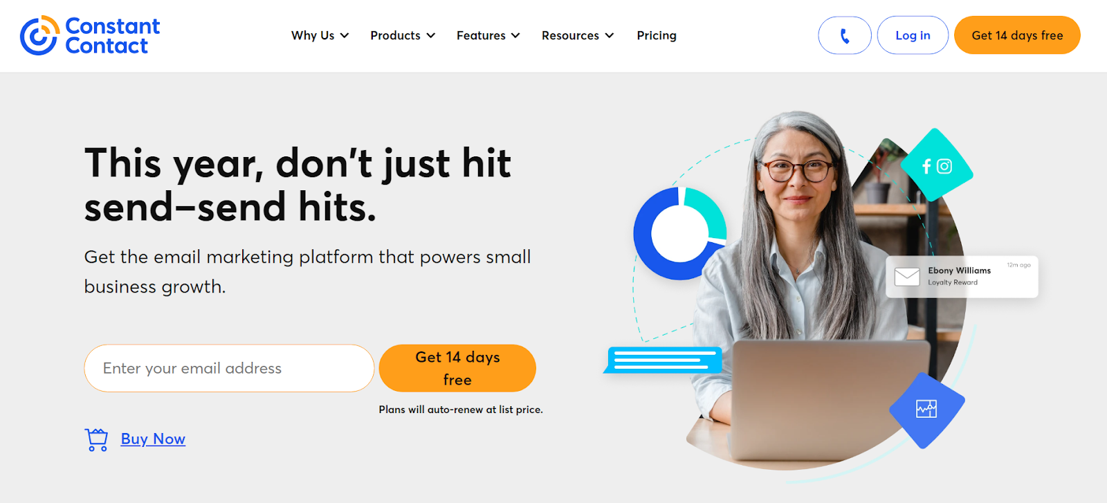
When I first opened Constant Contact, I was immediately drawn by its simple and well-organized design. The phrase, “This year, don’t just hit send-send hits,” also attracted my attention right away.
‘Simple and effective. Amazing.’
Enter your email address and take advantage of a 14-day free trial to figure out what you need. Also, you can’t miss the badge proclaiming Constant Contact as the best email marketing agency in the summer of 2023, so you know they’re serious.
Although the site contains various colors, Constant Contact still maintains the perfect balance for an excellent user experience. How Does This Landing Page Work?
A. Cool words: The text is engaging and encourages you to learn more about the service.
B. Simple to get on. Locating items is simple due to excellent structure and categorization.
What Can Be Improved
- Communication options: You can call or email for assistance, but having a chat option would improve communication.
How to Make Landing Pages: Best Practices
By following this checklist, marketers can ensure their landing pages are optimized for maximum effectiveness and conversion potential.
You can use a landing page builder, such as Mailchimp’s page builder, to easily drag and drop design components like videos, images, icons, and text without needing a website developer or coding skills.
This is because landing page builders allow you to test every component of your landing page to verify that your design and copy are optimized for maximum effectiveness. For example, you can test different headlines and body copy, as well as change your offer, to see what improves your conversion rates.
#1. Landing Page Structure

The good thing is that you don’t need to be very inventive here. Most landing pages have a pretty similar pattern, which has been confirmed to succeed.
This means you can inject your creativity with branded components and photos, but keep to a landing page framework that visitors are used to seeing. A good landing page has five elements:
- A headline that grabs the visitors’ attention
- Relevant image that is relevant to your audience
- Lead form that sits above the fold to capture visitors’ information
- CTA that is action-oriented and compelling
- Copy and description that informs and entices your visitor to complete your form
Consider adding social sharing buttons to encourage visitors to share the word about your offer. This is because it’s the basic requirement.
Also, to establish how much material to provide, you must first identify your target audience, where they are coming from, and where they are in their buying process. The usual rule of thumb is to have as much information as is needed to convince them to convert.
#2. Landing Page Layout
Believe me when I say that most people do not read every word of your cleverly written copy. Instead, they glance through and extract the most crucial details. Hence, your task is to make those pieces shine so that your visitor does not overlook anything crucial. This means a few things like,
- Keep the most important information above the fold so your visitor doesn’t need to scroll to get to it.
- Perform a blink test on your page, meaning a visitor should be able to gather the main message in less time than it takes them to blink, i.e., less than five seconds.
- Use white (or unfavorable) space to keep your visitors engaged and focused and to help them comprehend your message.
- Write with bullets and short paragraphs to make your copy easy to digest.
Try arranging the critical information in an F-pattern, which is how most consumers scan pages online. Also, use the flow of visual patterns to guide people to the key spots that will lead to conversions.
#3. Landing Page Colors

The design of your landing page, particularly the colors you use, should match those of your website. You want to establish a long-term relationship with those who visit your landing page, so they become acquainted with your branding colors and distinctive style. This is because the more they recognize your brand, the more they trust you (making it easier to urge them to do what you want).
Also, look at using contrasting colors for page elements that need to stand out, such as your CTA button. Contrast is the key here. If your brand’s colors are largely green, you should use another color that will catch users’ attention, such as purple.
#4. Landing Page Images
Humans are visual creatures, thus graphics are essential for attracting people’s attention and keeping them engaged. Use excellent images, videos, and graphics to make your landing page stand out and reinforce your message. Remember, every picture should serve a function; don’t include fluff just for the pleasure of it.
The image on your landing page is one of the first things visitors see and because people process images much faster than text, it sets the tone for their whole experience. But the question now is, how can you choose between millions of stock photographs and the company photo shoot that’s using up all of your computer’s space? Let’s narrow down the selection with a few essential questions:
- Who is my target audience?
How does your persona appear? What are their ages? How are they dressed? What are their interests? The answers to these questions will help you choose which image to use as the landing page’s focus. So, if you want to appeal to your target audience, you have to reflect them in some way.
- Where on my landing page do I want them to look?
This may appear unusual, but it is founded on the idea that people follow directional indications, such as where someone is looking or pointing. So, if you want people to fill out a form, use an image that draws their attention to the form.
- Will this image reinforce my message?
Every piece on your landing page has a specific purpose. But because your image is one of the first things people see, it should help visitors understand what to expect from your page. In other words, make sure your image provides value.
#5. Call-to-Action (CTA)
Your call-to-action (CTA) is the core of your landing page; it drives action and turns visitors into leads or customers. Make it difficult to ignore using strong colors, enticing copy, and a clear message. Also, don’t be hesitant to experiment with different CTAs to find what works best for your audience.
I’ve talked about your CTA a few times, but since it’s the most important aspect of your landing page, it’s worth repeating. When it comes to designing your CTA, there are a few methods to make it so appealing that visitors feel driven to click. To be clear, your CTA comprises both the button and the content you employ to draw attention to it; these ideas address both.
- Give your CTA a vibrant and contrasting color
- Focus your copy on the benefit to your visitor
- Get to the point — try using no more than five words
- Tell your visitor what you want them to do using action verbs, e.g., Get, Download, Click
- Make your button large enough to stand out on the page
- Give it some negative space — don’t crowd the area around your CTA
Follow the page’s flow and position your CTA where your readers’ eyes will naturally go such as to the right of or below the text. Test and copy your button shape. Instead, just try everything!
#6. Mobile Landing Page
No one likes feeling lost or confused, especially when attempting to finish a task. So, make your landing page design simple, clean, and intuitive, with a clear path from start to finish.
Optimizing Landing Pages for Different Platforms
Optimize is an unusual term, isn’t it? But are we talking about pictures, copy, keywords, or UI? The answer is yes; we’re discussing everything. Optimizing means to make your landing page the best it can be, which may entail a variety of changes.
certainly, you want your landing pages to be effective conversion engines. Still, you must also optimize them for search engines (SEO). This will boost your site’s visibility in organic search results, increasing visitors and conversions. Here are some landing page best practices to assist you enhance your landing pages’ SEO and conversion rates:
#1. Present an Outstanding Offer
You might say that everything free is “good,” but this is not entirely true. Not only should your offer be free (I’m not talking about sales pages here), but it should also be appealing enough to encourage a stranger to provide you with their personal information.
Think of it: many organizations are competing for your audience’s attention by soliciting information and sending them emails. So, what will distinguish you from the crowd? What a great deal. Here are some questions to determine whether you have an appealing offer:
- Does my offer solve a pain point for my target audience?
- Is there a clear benefit that a lead can gain from this offer?
- Can my offer rival the competition?
#2. Decrease Page Load Time
A single-second delay in website load time results in 7% fewer conversions and 11% fewer page views. This is because slow page load times can lead to client dissatisfaction and frustration. Therefore, your landing page load time should be taken seriously.
#3. Keep the Buyer’s Journey in Mind
While you’re driving traffic to your landing page, you must recognize where your visitors are in their purchasing journey. That is, you will observe whether they are attempting to diagnose an issue (awareness), looking for a solution to their problem (consideration), or are ready to close (decision). In other words, if you intend to convert, your copy and offer should reflect that. It’s much like any other marketing material: meet your visitors where they are.
#4. Create a Seamless Experience
Nobody should be surprised when they arrive on your landing page. It should be exactly as described, which implies it must be consistent with your copy.
For effective results, use the exact terms that directed them to your landing page, whether it was a paid ad, social media post, blog CTA, or email. If you want them to stick around, you should avoid using the bait and switch at all costs.
#5. Create a Clear Path to Conversion
Your landing page should be easy to navigate. When someone visits your page, you should make it plain what you want them to do: like complete your lead form. Your goal is to drive users to your form by employing distinct directed signals. Here are a few techniques to get your visitors to convert:
- Choose an image of a person that is either gazing in the direction of or meaning to your form
- Make your CTA a contrasting color to draw attention to it
- Use arrows that point to your lead form
- Insert anchor text that brings people back to the form when clicked
- Give your CTA some negative space on the page
- Frame your lead form with a bold color or outline
#6. Add Scarcity to Your Offer
Few behavioral marketing strategies are as effective as anxiety and the fear of missing out (more technically known as FOMO). Consumers dislike losing their ability to select, and if you make it evident that your offer is in high demand and/or in short supply, they will scramble for it.
Another reason this strategy works is that individuals prefer difficult-to-obtain items because they represent value and exclusivity.
So, to convey scarcity, emphasize how little of your offer remains, display a countdown meter, and use phrases like “ends soon” or “last chance.” only use real-world strategies for your business. As much as you have to be authentic.
#7. Use videos
Video marketing is gaining popularity for a good reason. Customers love to view videos from organizations, and 88% of video marketers believe that video provides a favorable ROI. The idea is to make an engaging video that does not divert attention away from your ultimate goal: the call to action.
If you’re still on the fence about employing video, here are some factors that might push you over the edge:
- Increases conversion rates
- It is a more personable way to share a message and connect with prospects
- It can be more engaging than an image and will get visitors in the habit of clicking (and converting)
- Can reduce the number of support calls or tickets you receive
- It is processed 60,000 times faster than text
#8. Carry Out A/B Testing
Landing pages are crucial to get right, and because consumer psychology can be unexpected, it’s always smart to test multiple versions of your pages to see which has the highest conversion rate (CVR). Test the offer’s position, CTA types, and even its color scheme.
A/B testing is critical for improving landing pages. Experiment with various headlines, pictures, CTAs, and layouts to see what performs best for your target audience. Don’t be afraid to do dangerous experiments, and sometimes a small alteration can have a huge effect.
Key Metrics to Track
When it comes to measuring landing page performance, there are a few key metrics you’ll want to keep an eye on:
- Conversion Rate: The percentage of visitors who take the desired action (e.g., fill out a form, or make a purchase).
- Bounce Rate: The percentage of visitors who leave your site without interacting further.
- Time on Page: How long visitors spend on your landing page before navigating away.
- Click-Through Rate (CTR): The percentage of visitors who click on your CTA or other links.
How do I do Lead Conversion using the Nurturing Method?
So now you have an optimized landing page that performs like a magnet. What happens now? You do not want to leave those leads hanging. Instead, you need to nurture them until they become clients, and then develop them even further. Here is how.
#1. Optimize Your Appreciation Page
I hope you aren’t bored of optimizing yet. Your thank you page is the first thing people see after converting, so this is a wonderful opportunity to thrill your new lead even more than you already have.
#2. Help Them Along Their Buying Process
Your fresh lead will reach the decision stage, with or without you. You want to be the one who helps them get there.
Provide content or tools to help them go to the next level of their trip; you might even be their only option for the decision stage. After all, we know that people buy from businesses they know, like, and trust.
#3. Form a Relationship.
When someone signs up to get information from you, they become a potential customer with whom you should strive to establish a relationship and connection.
The nice part is you already know what they’re interested in and their problem spots, so you can target them with more, useful information and tailored marketing.
Can I have both a landing page and a website?
You can even combine both a landing page and a website into a single website known as a microsite
Can you host a landing page for free?
Yes! You can build a landing page with ConvertKit or other builders and host it with them.
How much does a good landing page cost?
The work can cost $15 – $80 per hour. The minimum landing page creation cost is around $500, the average – is $1000, and the maximum can be up to $3000.Feb 14, 2023
What is the best landing page software?
The best Landing Page Builder Solutions by Use Case are,
- Unbounce – Best for conversion rate optimization.
- Leadpages – Best for selling Products on landing pages.
- Moosend – Best for small businesses with limited budgets.
- Instapage – Best for team collaboration.
- Wix – Best for beginners.
- ClickFunnels – Best for generating leads.
Conclusion
Landing pages will always account for the majority of your new leads, demanding your attention. With so many adjustments, additions, and variants available, there’s no reason you can’t create a high-converting landing page.
As long as you follow the best practices I highlighted above, you’ll be on your way to a high-performing landing page.
References
- zapier.com
- blog.hubspot.com
- mailchimp.com
- unbounce.com
- instapage.com