Knowing the universal perceptions and relationships of colors is crucial to being a great artist or designer. It’s recommended to conduct extra research on the color wheel to better consolidate your understanding of both the art and science of color.
Colors That Match
Colors are so distinct, our brains can nearly instantly identify any hue that fits when we see it. The likelihood that you will recognize the colors of three brand logos is high if you take a color awareness test for three well-known brands while closing your eyes in this situation. Red and white: Coca-Cola. Red and white for Google and blue for Facebook. Colors play an important role in our lives. It can be used to communicate people’s emotions or show ideal interest in a particular subject matter. And it plays an important role when developing a Brand Identity, and conspicuous brand assets like Logo if you choose wisely colors that match.
Hues That Fits
Understanding how different colors connect to one another is essential to choosing complementary hues (their relationship). Understanding and mastering the color wheel may be quite beneficial for choosing the right colors to create a stronger brand. Additionally, it facilitates knowledge exchange with your designers and constructors. The color scheme possibilities for your brand’s website can be exciting and a little challenging to choose, with more than 10 million hues available to choose colors that match. Do not be concerned, as this article will act as a thorough guide to scale you through. This article features some of the best color combos that will be ideal for your next design.
Let’s look at the color wheel and the fundamental colors before moving on to choose the appropriate colors for your designs.
The color wheel can be divided into three main parts: primary colors, secondary and tertiary colors.
Primary colors are colors that are the RGB (red, green, and blue) combination, and primary colors are known to be the bedrock of other colors because from these colors (primary color) many other colors are obtained.
Secondary colors are colors that are a mixed combination of orange, purple, and green (OPG). It is okay to consider these three basic secondary colors as children to the primary colors. They are gotten from a mixture of two primary colors
In the RYB color wheel, secondary colors are gotten from mixtures of two primary colors
Yellow + Red = ORANGE
Blue + Red = PURPLE
Blue + Yellow = GREEN
Tertiary colors are colors obtained from a mixture of a primary color and its nearest secondary color. The remaining six colors in the color wheel are regarded as tertiary colors. They are
- Yellow-green
- Yellow-orange
- Red-orange
- Red-purple
- Blue-Purple
- Blue-green
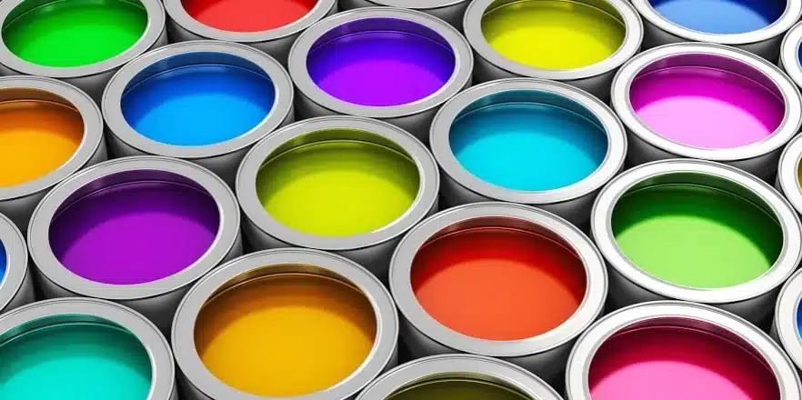
Paint Colors That Match: Best Fittings
To discover the perfect paint swatch for your design, you may spend literally hours looking through your collection. However, If you don’t know how to approach it, you can begin to lose enthusiasm. You will lack zeal for what you want to paint and acquire cold feet. But in order to achieve this, there are necessary parameters that can guarantee an outcome of perfect matching paint colors. You can start by Using the following
Best Paint Colors That Match
State Of Aura:
Although you can choose or pick colors depending on an aura or mood, it’s crucial to completely comprehend how the psychology of color functions.
There is a degree of influence that colors have on what we do every day. For instance, you’re traveling to a place where someone passed away, and as per custom, you must wear all-black attire to signify that it is morning or that a loved one has passed away. A condition of ambience is created by deep white and a hint of sky blue significantly indicating loss.
It is considered to think of choosing paint colors that match a desired mood. Do you want to have a relaxing soothing bedroom that gives you this ambience, it is equally important you choose a sky blue or maybe white color. Whatever mood or feeling you want to achieve, it is okay to think of a paint color that gives a perfect match because it brings out a desired mood
Find Ideas Around You:
You can find inspiration from natural elements around you or can also make use of artificial elements around you. You can find desired designs from ocean views, beaches and certain picturesque places that have radiating glows. In addition, you can also find inspiration or ideas around you from certain objects (domestic) like the designs of your duvet, pillow sheets, and even rugs.
Furthermore, you can find ideas for your design from already-made brands. Similarly, when conjoined together with your own ideas, it will give you that striking, desirable design you have always wanted.
Designs can also be gotten from artwork, gallery stores, and clothes as well as mother nature can also play a huge role in choosing designs.
Use Of Color Wheel.
The color wheel is another paramount factor to consider when it comes to choosing paint colors that match your designs. Like we stated above in this article, the color wheel comprises three colors : primary color,secondary color and tertiary colors. This can be a major tool in choosing multiple colors for your designs. Purple which is a mixture of two primary colors can be ideal for your designs. Equally important to note that mixtures of primary, secondary or tertiary colors can be a perfect combination for your desired designs.
Another method can be pairing colors in the color wheel to see which ones best fit together. This is termed Analogous color schemes and it creates a befitting look for your designs.
Monochromatic Color Features:
Monochromatic colors is a color scheme that is made up of more than one color variable. For instance,let’s assume that you have a knack for the color blue. You can add a black hue to the color and you will notice that you have darker shades of the blue color, in the same way, if you add a white color to that blue color you will have a lighter blue color. This is how you can achieve monochromatic color schemes and hues that fit your designs.
Components Of Monochromatic Color Features.
- A dark version of a particular color = Shade
- A lighter version = Tint
Use Bold Color Expressions:
Making use of bold colors that match can also be advantageous. Bold colors matched with lighter color expressions can give you a dazzling feature that is relaxing and soothing to your taste.
Three (3) Colors That Look Good Together.
Colors have a definite way of expressing feelings and communicating ideas. A tenet of the color proposition expresses that everybody naturally interprets colors how they see fit which in one way or another influences our decision-making. This article will guide you on how three different colors combined together will give you a perfect look for your designs.
Set Of Three Colors That Match Together.
- Deep purple, Gold, and Green.
- Yellow, Red, and Blue.
- Sky blue, White, and Black
- Teal, Magenta, and Gold. And the list goes on.
As was mentioned before in this post, colors have a stronger influence on our lifestyle and decision-making. When color is chosen carefully, as well as when it is not done or is done haphazardly, it does not seem good and may even upset the flow of events.
The Three Best Of Colors That Go Together.
A good color combination gives a level of fulfilled satisfaction and credibility to an extent. Ranging from branding,textiles and clothing, designing, etc you need to understand the basics of combining colors to create a masterpiece. Color can be the first that fancies an individual when they come across objects like the design of a particular table. Color can also change how we perceive things in our environment. Take a look at the three best colors that go together
- Turquoise, Mustard yellow and Black.
- Peach, Teal, and Salmon
- Magenta, Cyan and Yellow.
- Blue, Indigo, and Dark red.
- Sky blue, Navy blue, and Salmon.
- White, black and Gray.
- Navy blue, Black, and Indigo
- Olive green, Forest green, and Dark green.
- Tan, Cream white, and Black.
- Copper red, Turquoise, and Plum.
- Warm yellow, Scarlet red, and Plum.
The Two Best Colors That Go Together
Let’s consider two best colors that go together and give a perfect view. Besides that, you can also use them for your brand logos, web design, interior decorations, outdoor services, textiles, and clothing. They are as follows:
- Yellow and Dark blue
- Teal and Creamy yellow.
- Cyan and White.
- Violet and Turquoise
- White and Navy blue
- Red and Cream white.
- Black and Red.
- Purple and Gold.
- Peach and Cream
- Black and Gray Blue
- Cream yellow and Black
- Orange and Black
What Five Colors Go Well Together.
Five colors that go well together to give a desired taste that is unique are as follows. You should note that some color combinations are not good for a perfect view, but in this article, we will take a look at some of the best five color combinations.
- Red, Green, White, Navy blue, and Navy green.
- Orange, Black,Pink, Dark yellow and Teal.
- Cerulean, Orange, White, Navy blue and Yellow.
- Denim blue, Dark orange, Gray, Warm wood and Black.
What Are The Twelve Set Of Complementary Colors?
Complementary colors are pairs of colors that match when mixed together, creating disparity by each of them losing its hue and producing another color that is somewhat grayscale (white or black). Complementary colors can be called Opposite colors. They are found on opposite sides of the color wheel.
The twelve complementary colors are :
- Red-green
- Yellow-purple
- Blue-orange
- Yellow-green
- Red-orange
- Blue-green
- Blue-purple
- Yellow-orange
- Red-purple.
What Color Combination Attracts Attention?
When colors are combined in a unique style, it attracts attention. Assuming you put on a dress, people look at you to know whether what you are putting on rightly fits. In addition, whatever you put color into whether; a brand logo, web design, or even textiles and clothing attracts the attention of people whether in a good or bad way, so choosing good color combinations matter a lot. Let’s see color combinations to use both for clothing, business brands, website branding, and so on that commands attention.
Color Combinations That Attracts Attention.
Yellow and Blue: Yellow is a powerful color, use yellow to show your confidence in your abilities, and use blue to show your trustworthiness coupled with your serene nature.
Red and White: Red is a dominant color, it gets people’s attention quickly and fast and is very expedient for marketing. White is also is very synonymous to peace and calmness. Use these two color combos for your marketing.
Green and Gold: Green is a versatile color. It is warm and soothing. Green also connotes goodwill, resources and health. Moreover, gold is prestigious and relaxing, and it symbolizes pedigree and virtue. Combos of these two colors attract attention very fast.
Black and Purple: Black is another versatile color. It is soothing and relaxing besides that purple is symbolic of royalty which makes it ideal for finishing touches of elegance and prestige for your marketing brands.
White and Gold: White is ideal for your brands and designs, equally important to note that gold is of prestige. When combined together it gives and attracts the attention of the people.
What Are Four Good Color Combinations?
What are four good color combinations? How do I combine four different colors to create a good combination”? Effective combinations of colors can be good and when not done harmoniously, it can be detrimental to your brands and marketing.
Four good colors that match and are ideal for your brand building, logo and designs, textiles, and clothing are as follows:
- Teal, salmon, gold, and Turquoise.
- Sea green, dark green, cerulean, and navy blue
- Muschia, Teal, dark violet, and scarlet red.
- Black, white, dark-orange, and light gray.
- Cream white, brown, blue-gray, and dark pink.
- Cream blue, dark gray, purple and gold.
Conclusion
When applying colors to create a definite hue that fits a specific purpose like a brand logo, web design, and so on. It is equally important to make sure it communicates the brand’s core values, ideas, and the products and services you are offering. A few important clues when choosing your brand colors are as follows:
- Identify your trademark: This is paramount that if not identified properly, it won’t be able to convey the proper message required about the brand to the public. It should advocate your core values, ideas, and messages. Whatever color or set of colors you choose should reflect the brand’s values.
- Choose a color palette and test it out: Before you apply your desired set of hues on that brand or logo, first of all, try it out on a color palette to see the desired result.