
Your brand identity is the face of your business, and you want to put your best face forward for your audience. It’s sort of like going for an interview for a big new job; of course, you wouldn’t show up in sweatpants. You’d want to appear at your best looking, presenting an air of competence and professionalism. This same principle applies to creating a brand.
First impressions matter a lot here.
However, you should know that developing a brand identity goes further than simply creating a logo. While a logo can be the symbol of a business and do a good job of presenting your brand in the best of lights, it is not the entirety of a brand.
In fact, creating a logo is just one small step toward developing a strong brand identity.
Key Points
- Brand identity is the visible elements of a brand, such as color, design, and logo, that identify and distinguish the brand in consumers’ minds.
- The terms “brand” and logo” are often used interchangeably, but they are not the same.
- When people understand your story and share your values, they feel more connected to your brand.
- As the embodiment of almost everything your business is and does, a brand identity can inspire customers and increase a sense of loyalty for your brand.
What is brand identity?
Brand identity is the visible elements of a brand, such as color, design, and logo, that identify and distinguish the brand in consumers’ minds. It is distinct from brand image, in that it corresponds to the intent behind the branding and the way a company does the following — all to cultivate a certain image in consumers’ minds:
- Chooses its name
- Designs its logo
- Uses colors, shapes, and other visual elements in its products and promotions
- Crafts the language in its advertisements
- Trains employees to interact with customers
Brand image, in contrast, is the actual result of these efforts, successful or unsuccessful.
The terms “brand” and logo” are often used interchangeably, but they are not the same. A brand is a feature — or set of features — that distinguishes one organization from another. It is typically comprised of a name, tagline, logo or symbol, design, brand voice, and more.
Brand identity, then, is the aspect of branding that focuses on your brand’s personality, as well as the values you convey to customers.
SEE: 10 Positioning Statement Examples That Drive Customer Loyalty
To put it succinctly, a brand is the sum of how its audience and/or customers view a person, product, or business. Brand identity is how a business wants to be viewed. These two ideas often go hand in hand, but can sometimes be at odds, depending on how well a brand can cultivate and maintain its brand identity.
Why is brand identity important?
Brand identity is your ticket to standing out, being remembered, and creating meaningful connections with your customers. It’s the secret sauce that turns one-time buyers into lifelong fans.
We live in a world full of choices. Countless brands are selling similar products or services. With so many options, customers often prefer to buy experiences, stories, and associations. Rather than just the product or service itself. A strong brand identity helps you tell your story, connect with your audience on a deeper level, and build trust and loyalty.
When people understand your story and share your values, they feel more connected to your brand. They’re not just buying your product. They’re buying into your brand’s story and its identity.
READ:
- Writing a Brand Story the Right Way (Detailed Guide)
- REDDIT LOGO: The Brand Story Behind The Smily Mascot
- Google Logo: History, Meaning, Brand Secrets (Detailed Guide)
How to build a successful brand identity
The steps a company should take to build a strong, cohesive, and consistent brand identity will vary, but a few points apply broadly to most:
- Analyze the company and the market. A complete SWOT analysis that includes the entire firm—a look at the company’s strengths, weaknesses, opportunities, and threats—is a proven way to help managers understand their situation. It will also help determine their goals and the steps required to achieve them.
- Determine key business goals. The brand identity should help fulfill these goals. For example, if an automaker is pursuing a niche luxury market, its ads should be crafted to appeal to that market. They should appear on channels and sites where potential customers are likely to see them.
- Identify its customers. Conducting surveys, convening focus groups, and holding one-on-one interviews can help a company identify its consumer group.
- Determine the personality and message it wants to communicate. A company needs to create a consistent perception rather than trying to combine every conceivable positive trait: utility, affordability, quality, nostalgia, modernity, luxury, flash, taste, and class. All brand elements, including copy, imagery, cultural allusions, and color schemes, should align and deliver a coherent message.
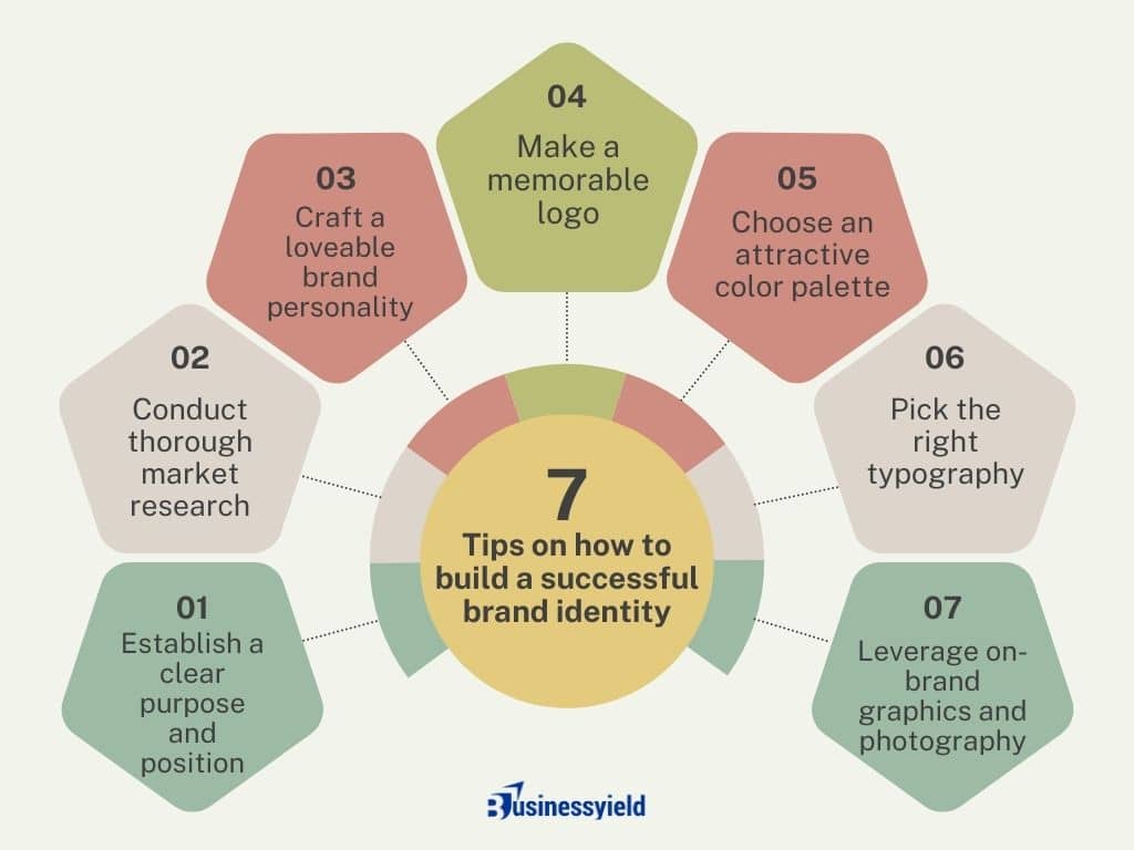
There is more to crafting a memorable brand than putting together a quick logo and color palette. Instead of calling it a day there, successful brands take the time to design a well-rounded brand identity – one that combines a strong purpose with intentional visual and written elements.
Below is a checklist outlining seven elements you’ll need to build a brand identity your audience will love:
Building brand identity
Brand identity examples to inspire you
1. Coca-Cola

When you hear the name Coca-Cola, no doubt you picture its well-known logo shown above. However, you also might think of the polar bear, the color red, its “Share a Coke” campaign, or the classic ribbon-like imagery featured on its cans.
Here are two things that comprise Coca-Cola’s brand identity:
- Coca-Cola’s brand identity begins with a red logo in script text. The red color elicits confidence in the person who drinks a Coke, while the script typeface is all about enjoyment. Coffee, for example, is a drink you have before work in the morning. Coca-Cola is a drink you enjoy when you’re done in the afternoon. This is the brand’s “face.”
- Coca-Cola prints its logo on a uniquely shaped bottle (it’s true, no other beverages have bottles exactly like it). This tells customers they’re not getting an imitation — this is the real thing. The brand develops credibility and trust this way.
SEE: Cultivating Unique Brand Identity: Custom Embroidery
2. POP Fit

POP Fit is a beautiful brand with bright pinks, purples, and yellows, but that’s not even the main element of its brand identity. Perhaps one of the most stunning things about this brand is the radical representation found in all their messaging.
According to their website, “POP Fit Clothing was built on the idea that representation, inclusivity, and body positivity matters in both fashion and media.” This is why their sizes range from XXS to 4XL and feature signature fabric with a four-way stretch.
- POP Fit’s advertising supports its message of inclusivity, featuring women of color, wheelchair users, and diverse body types. Their images are also un-retouched, showcasing their diverse models realistically and respectfully.
- Their products solve for massive pain points in the athletic clothing industry, such as sizing issues, lack of pockets, and transparency or rolling while doing squats and other exercises.
READ: BRAND IDENTITY: How To Build a Strong Brand Identity
3. Hootsuite
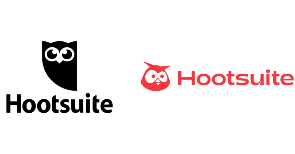
If you look at a lot of tech brands today, you’ll notice that many tend to use similar no-fluff, utilitarian branding principles. While there’s nothing inherently wrong with this, it can become hard to differentiate brands after a while.
I like Hootsuite’s redesigned logo as it injects some new color and personality into the social media marketing platform. It’s friendlier, more approachable, and most importantly, more human.
READ: Branding Beyond Logos: Unveiling the Power of Holistic Strategies
4. Marcella NYC

Marcella NYC started out of founder Siyana Huszar’s apartment before growing to a notable brand, blending classic silhouettes with an effortless look. Her goal was to make affordable, high-end clothing and also take a more sustainable approach to fashion.
“I really wanted to dress a woman like me: someone who wanted to feel empowered and strong and understated but not afraid to stand out in a crowd,” Siyana said in an interview with Forbes. “My designs are very minimalist, very simple, but there’s always a little bit of a twist or a cool edge to it.
Empowering women and girls became an integral part of Marcella NYC’s brand identity.
- The clothing takes on a monochromatic, uniform look: black, gray, white, and camel. Perfect for building a capsule wardrobe with a cohesive look.
- Staying true to their women’s empowerment ethos, each item of clothing customers buy supports a full week of school for girls in need: books, supplies, uniforms, and hygienic items.
- Keeping their commitment to sustainability, the brand uses organic and sustainable fabrics when possible, and uses recycled materials in addition to biodegradable packaging.
Each of these facets work together to create a cohesive brand identity.
SEE: Best Brand Extension Strategies for Expanding Your Brand Reach (Plus Examples)
5. National Geographic
In a world brimming with information, one brand stands out as the leader in exploration and discovery — National Geographic. Their brand identity revolves around the awe of discovery, the respect for nature, and the pursuit of knowledge.
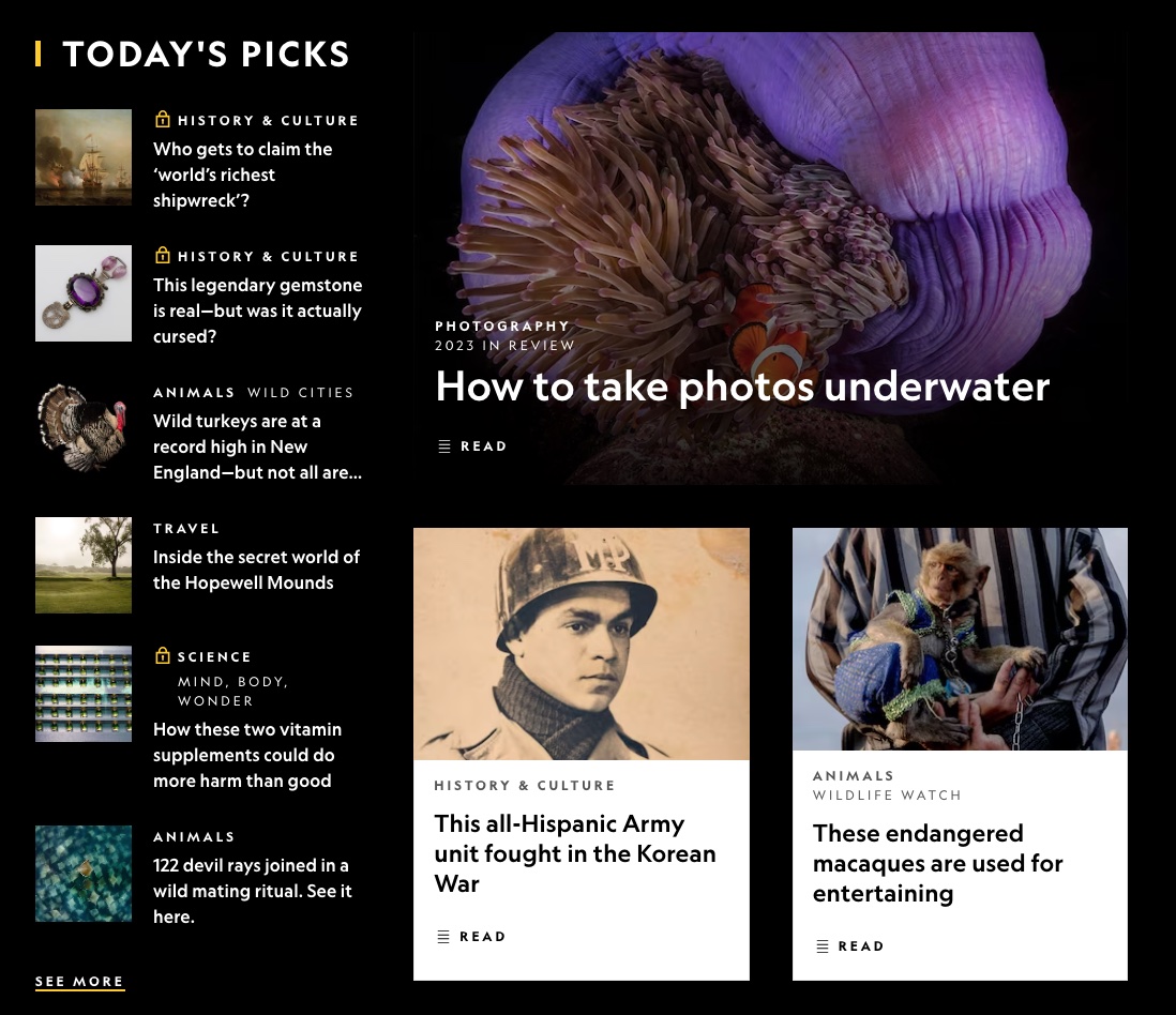
National Geographic’s brand highlight is its commitment to bringing the wonders of the world to people’s living rooms. Their iconic yellow border logo and breathtaking imagery have become synonymous with exploration and storytelling.
They also have a strong sense of responsibility for preserving the planet and its inhabitants.
The key takeaway from National Geographic? Create a brand identity that stands for something bigger than just your products or services. It should inspire and educate. Strive to create a sense of wonder and curiosity with your brand.
READ: How Brand Partnerships Can Improve Consumer Engagement and Business Growth
6. Hustle & Hope Greeting Cards
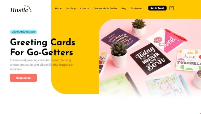
Hustle & Hope is a brand that positions their products as more than a greeting card. Their stationery and cards tackle more difficult topics such as job hunting and personal development.
Here’s how this brand’s identity is executed:
- All the paper products use modern, colorful designs that pop off the page and slogans that go beyond generic well-wishing.
- The experience of scanning the code is a novelty that makes an impression, both with the product itself as well as its mission to drive an idea home.
By pairing simple inspirational messaging with a code on the back of the card that leads to digital content and tips, the cards are meant to “level up” the recipient in some way.
Founder Ashley Sutton always wanted to start a stationery company, but after a career working in some of the top Fortune 500 companies, she became passionate about empowering people to be their best professional selves.
That’s when she had an epiphany that would later become the basis of what makes her company unique: “Why not sell cool greeting cards AND help people!”
SEE: Cheapest Business Cards Design & Printing Services 2024
7. Quiksilver
Imagine the thrill of riding the perfect wave. Or gliding down a snowy mountain at high speed. That’s what Quiksilver embodies.
The brand identity is deeply rooted in surfing and snowboarding culture. Quiksilver doesn’t just sell clothing; it sells the surfing and snowboarding lifestyle.
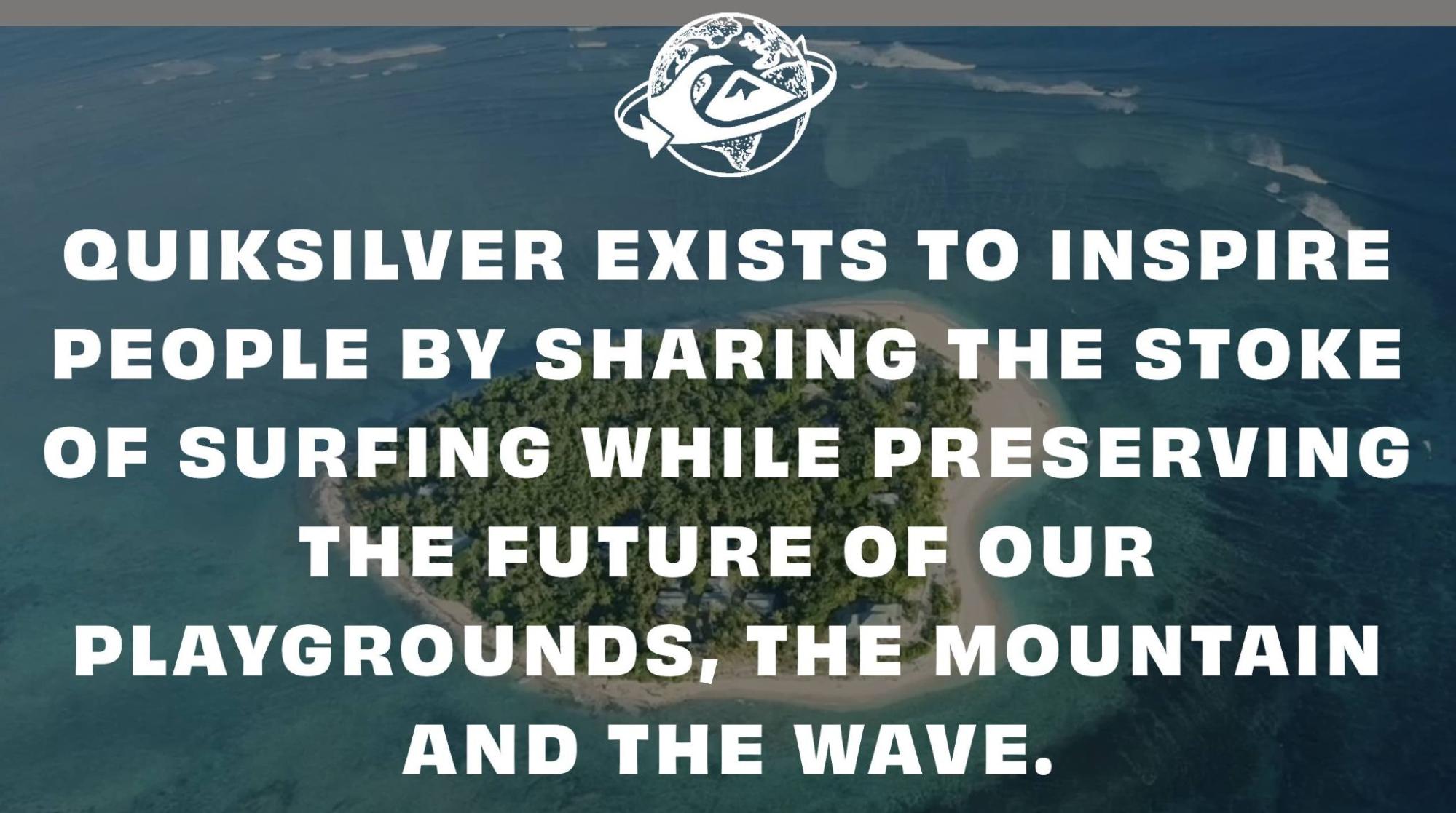
Quiksilver’s brand identity shines through its commitment to the boardsport community. The iconic logo—a wave against a snow-capped mountain—perfectly encapsulates the brand’s love for nature and adventure. It has consistently stayed true to its roots, appealing to the adventurous and free-spirited.
So, what can you learn from Quiksilver?
Stay true to your roots. Your brand should reflect what you stand for. Authenticity resonates with people and helps build a strong, loyal customer base.
SEE: APPLE BRAND AND LOYALTY: Creating a Brand the Apples Way
8. Semicolon Bookstore & Gallery
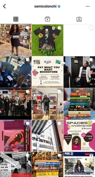
Semicolon Books was born when owner/operator Danielle Mullen chose to seize the day. After being diagnosed with a tumor on her ocular nerve, she started thinking about legacy. Then, without expectation or intention to open a store, she walked by the perfect space for lease. Not long after, the spot was hers, and she was building shelves.
The bookstore’s mission is “nurturing the connection between literature, art, and the pursuit of knowledge; while also using the power of words to better our community.” Because of this, the brand is committed to the Chicago community and cultivates a welcoming space for its customers:
Their #ClearTheShelves initiative allows local students to take home any books they want, free of charge, to impact literacy rates in Chicago. Residents are encouraged to BYOB, chill in the store, and talk with the owner, creating an air of friendliness and camaraderie.
Semicolon Bookstore also supports local creators by featuring local artists in the gallery and showcasing local authors.
SEE: 10+ Best Real Estate Books Every Investor Should Read in 2024
9. Burt’s Bees
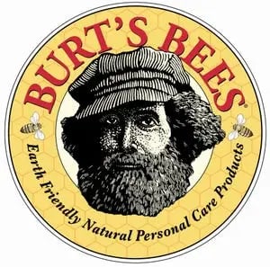
After humble beginnings in beekeeping and selling honey, Burt’s Bees grew to meet the need for all-natural and sustainable personal products. The company seeks to “make thoughtful choices to reduce our impact on nature and work to protect biodiversity, which preserves our own place in the world.”
Their initial logo (pictured above) depicting the bearded founder underscores the feeling of simplicity and modesty. This is in stark contrast to the aesthetics that other beauty and personal care products embody.
Here’s how else the brand distances itself from flashiness, sticking to its nature-obsessed focus:
- Burt’s Bees responsibly sources ingredients for their products and uses recyclable packaging.
- They donate to conservation projects and other green initiatives.
SEE: How To Open A Profitable Cosmetic Skincare Business In Nigeria
10. Kodak
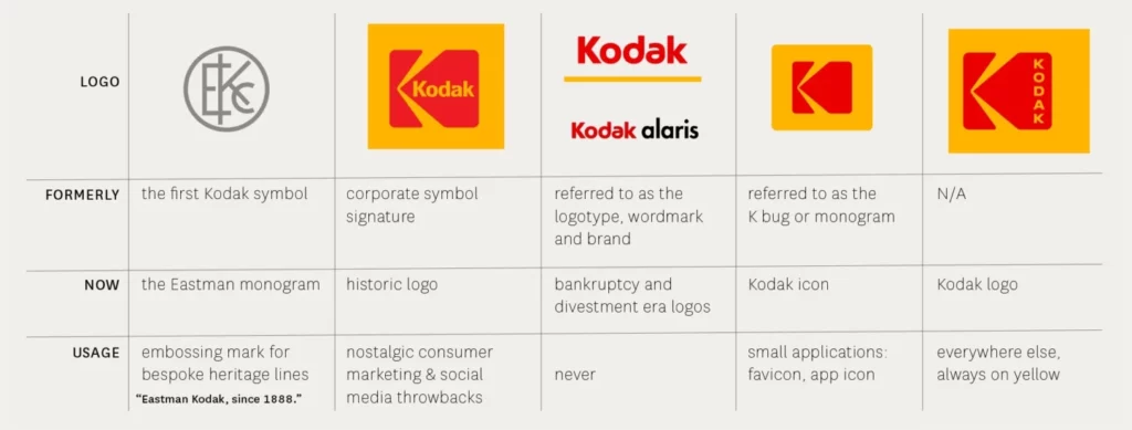
Sometimes, the best rebrands happen when you go back to your roots. In 2006, the company had already eliminated the big red “K” block in favor of a simpler wordmark, but then they decided to reverse the decision. Using a fresh sans-serif font, they were able to create a simple and fresh new take on their logo and typography. It just goes to show that sometimes the smallest of changes can have a big impact.
These guidelines make it easy to view the history of Kodak’s branding, along with the when/how/why to use each design.
READ: Brand Building: Best Strategies and Insights from Leading Brand Consultants
11. Asana

In Sanskrit, “Asana” refers to a specific pose in which yogis sit, and the company name is in homage to the Buddhist principles of focus and flow. Asana’s mission is “to help humanity thrive by enabling the world’s teams to work together effortlessly.”
The founders began at Facebook, where it was clear that they needed a project management and collaboration tool that would enable the teams to work together more fluidly. This, along with their values of “doing great things, fast” and teamwork, is manifested clearly in their visual brand, as well:
- Asana uses a lot of white space for focus with bursts of color to “inject energy” into the workspace.
- The three dots in the logo are arranged together, signifying balance and collaboration.
SEE: The Benefits of Stakeholder Engagement in Agile Project Management
12. Peter McKinnon
Picture a world where photography isn’t just about capturing images, but about sharing stories and inspiring creativity. This is the world Peter McKinnon has created. His brand revolves around passion, authenticity, and the joy of creating.

A key feature of Peter’s brand is his personal touch. He shares his knowledge, for example, through YouTube tutorials. Also, he doesn’t just teach techniques; he offers a window into his creative process. His friendly, approachable style makes learning feel like an exciting adventure, not a classroom lecture.
This is how he managed to get millions of subscribers on YouTube within a few years.
The key lesson here? Like Peter McKinnon, you can infuse your brand with your personality and passion. Authenticity resonates with audiences and helps create a personal connection. Make your customers feel like they’re part of your journey, not just bystanders. This will create a lasting connection with your audience.
SEE: Best Books for Entrepreneurs: Top 10 to Read and Expand Their Business Mindset
Brand identity: In conclusion
As the embodiment of almost everything your business is and does, a brand identity can inspire customers and increase a sense of loyalty for your brand. Brand identity, therefore, is crucial to your business’s future.