When we talk about branding, we’re talking about the medium of sensory connection that serves as a link between the product and the customer. This often includes customer satisfaction, emotional connection, personality, and goals. Branding is more than just a logo; it’s a way of expressing your principles, personality, and values through a variety of sensory products like Netflix has done.
A brand provides a story that helps a customer form a bond with a product. This includes the following:
- Choosing a location
- Customer advantage
- Individuality
- Determination
- A strong emotional bond
Netflix is one brand that has succeeded in creating a distinct and instantly recognizable offering.
Netflix’s logo is simple, clear, and straightforward, and it flows seamlessly throughout its entire offering. Although technology has grown in leaps and bounds in ways no one could have predicted when they first started, their brand structure has stayed stable and mostly untouched in terms of ideals.
Netflix has established itself as the world’s most popular “on-demand” video streaming service.
To put things in perspective, Netflix got 20 million additional customers in the first month of quarantining alone! These figures demonstrate the enormous power and influence that globalization can and has had on businesses such as entertainment, allowing them to reach audiences who were previously unavailable.
Let’s take a deep look at how Netflix got to this point…
Netflix Logo: Overview
Over the years, the Netflix logo has changed a few times. The evolution of the Netflix logo is shown above. The initial logo was designed between 1997 and 2000. Because of the movie reel, it had a cinematic air to it. The logo was streamlined in the year 2000, to just letters and a shadow behind the word NETFLIX. It was redone in 2014 with a bolder look, but this time, without the shadow.
Netflix felt compelled to update its logo once more. Netflix had to come up with a short and basic version of their brand that looked nice on any device.
For the most part, the expression “necessity is the mother of invention” has shown to be true time and time again. With the internet as a tool, each excellent idea has the potential to challenge the current quo.
Great firms have fascinating tales for their concepts. These stories are often inspired by moments of dissatisfaction or challenges. Let’s look at two companies and their triumphant moments. Remember, this isn’t your typical tale of the titans – Apple, Google, Amazon, and so on.
Read Also: HOW TO TRADEMARK A LOGO: Best US practices, Requirements & What you should know
Suneera Madhani launched Fattmerchant, a subscription-based merchant company, out of her displeasure with the deception and high fees offered to business owners in the financial sector. She expressed her dissatisfaction to her boss, who just laughed and dismissed her feelings.
Daniel Kane and his father founded the Ridge Wallet in 2013. This was after he was fed up with carrying a big wallet in his back pocket. According to the reports, he had an epiphany. Aluminum, carbon fiber, and titanium are used to create the wallet. It weighs two ounces and can contain up to 12 cards and a small amount of cash.
Basically, people are fascinated by stories.
So, what exactly is the backstory of Netflix, the world’s most popular online streaming service?
Some say Hastings came up with the idea for Netflix after Blockbuster, the king of home entertainment rentals at the time, charged him a $40 late fee for the movie Apollo 13. This story is untrue, despite the emotional connection.
Netflix’s Background
Netflix was founded by Reed and Marc.
Reed Hastings holds a Bachelor of Arts degree from Bowdoin College, where he graduated in 1983. He obtained his Master’s Degree in Computer Science from Stanford University five years later. In 1991, he started Pure Atria, a software company that specialized in developing tools for software engineers. In 1997, Rational Software Corporation paid $700 million for the company.
Marc Randolph, on the other hand, earned his bachelor’s degree in geology from Hamilton College. His past mail-order and direct-to-customer businesses provided him with a wealth of experience. One of his start-ups was the magazine Macworld, and he has mentored many young entrepreneurs.
Marc and Reed decided to provide their target demographic with movie rental services after brainstorming various company ideas. Netflix, originally known as Kibble, was founded in August 1997 in Scotts Valley, California, as a result of this choice.
They sent DVDs to their customers’ homes to see if their business concept worked. Reed and Marc were set to launch their product when the goods arrived without a hitch. Netflix was the world’s first online DVD rental service when it launched in 1998. The company began with only a few employees and roughly 900 film titles.
Customers can order movies from the company’s website and have them delivered to their homes. They will return the DVDs in an envelope provided to them after seeing them. The cost of a single rental film, including postage, was $6.
Read Also: NIKE LOGO: The Story Behind Great Branding!!!
The company adopted the subscription model a year later, after experiencing significant growth. Customers could rent an infinite number of DVDs for a cheap monthly fee under this strategy. Up to four movies at the time cost $15.95, with no time limit.
In the year 2000, Netflix created CineMatch, a system that recommends movies to subscribers with similar tastes and preferences based on a five-star rating scale of roughly 20 films. The data acquired from the rating was shared with studio executives in order to assist them in developing efficient marketing strategies. Columbia TriStar and Warner Home Video struck a revenue-sharing deal with the corporation the same year.
Netflix received additional investment from a Venture Capitalist in 2001 to expand its operations. With 500,000 subscribers expected, the company also began offering a free six-week trial membership through the Internet Movie Database.
Netflix filed for an Initial Public Offering (IPO) in 2002 with roughly 600,000 customers. The corporation first offered 5.5 million shares for sale. The price of a share was $15. The corporation raised $82.5 million, an extraordinary amount, to pay off a $14.1 million debt and fund advertising costs. Netflix, Inc. was the new name for the corporation.
Netflix’s membership soared after its successful Initial Public Offering (IPO). In 2003, the company had roughly a million customers, followed by two million in 2004, 4.2 million in 2005, and 6.3 million in 2006. These are astonishing figures for a corporation that is only ten years old.
Read Also: STARBUCKS LOGO: Evolution, Significance, Branding Models & Tips
Netflix’s streaming service debuted in 2007 with 1000 titles. “Watch Now” was the name of the game. Subscribers could watch live movies on their laptops or any web-enabled device with this revolutionary service. Independent filmmakers began streaming their work on Netflix not long after.
In 2008 and 2009, Netflix reached new highs of 9.4 million and 12 million subscribers, respectively. The company secured a contract with Microsoft and Sony to stream its content on various devices, including the Xbox 360, Blu-ray disc player, and PlayStation 3. It was a huge step forward.
Netflix expanded its services to Canada in 2010. It teamed with Apple in the same year to make its streaming content available on the iPad, iPhone, and iPod Touch. By the end of the year, the company’s subscription had grown to 20 million.
Netflix kept working hard from 2011 to 2015, growing, inventing, and expanding into new countries. The United Kingdom, Ireland, Austria, Belgium, France, and Germany were among those countries. In 2014, the business received seven creative Emmy Awards for its outstanding work.
Netflix’s services gained a downloadable capability in 2016, allowing customers to download material for offline watching. In the same year, the corporation expanded to 190 countries and 21 languages.
Read Also: 7 SMALL BUSINESS BRANDING IDEAS THAT WILL YIELD YOU MORE PROFIT
As they continue to dominate their chosen field, the company shows no signs of tiredness. Netflix has received 160 nominations for the 72nd Primetime Emmy Awards in 2020, indicating that it is not giving up on its prior achievements.
Netflix has produced and released some of the industry’s top films. Platform, Wrong Missy, Triple Frontier, Irishman, Old Guard, and Murder Mystery to mention just a few.
More on NETFLIX’s Logo Evolution
According to the Greek philosopher Heraclitus, change is the only constant in life.
You must adapt to changes in your environment in order to remain relevant. And Netflix appears to be a master of adaptation, having changed its name from Kibble to Netflix. Second, with its logo design and services.
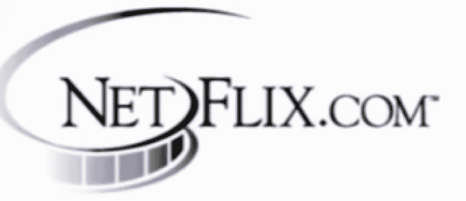
Netflix is made up of two words: net (from the word internet) and flix (from the word flick, a shortened form for movie or film). So it’s no surprise that the company’s first logo design in 1997 included (.com) and a film reel. The company’s name was broken into two parts on the film reel: ‘Net’ and ‘Flix.’
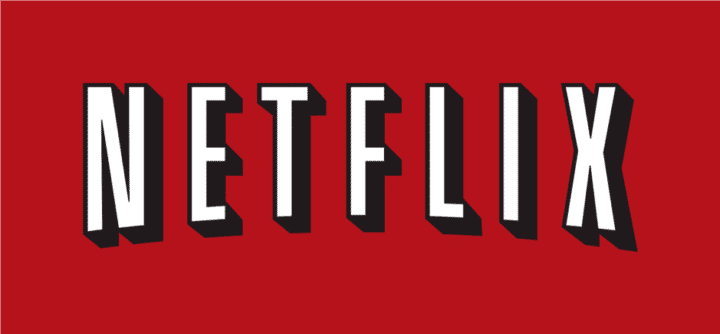
Netflix changed its logo in 2000. It had a solid red background with white graphique lettering. It had a convex curve at its base, and it appears to be three-dimensional. This logo design has become well-known.
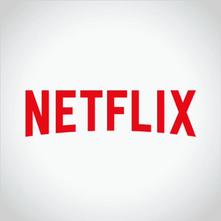
Gretel, a New York-based design agency, was, however, commissioned to revamp the logo in 2014 to convey a new brand identity. The old logo’s dark shadow was removed by the design firm. The designer chose a red script and a translucent background but kept the convex curved base.
There’s something magical going on.
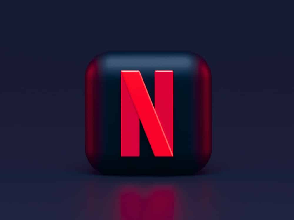
Along with the third logo, Netflix has simplified its logo even more. It allowed the letter ‘N’ to stand alone this time. The lone ‘N’ looks to be a folded ribbon over itself, thanks to its typical red tint. This new logo is elegant and bold, with the same typeface, color, and curving base as the previous one.
I believe we can forecast Netflix’s logo design in the future.
Elements of the Netflix Logo Design
The Netflix logo is a well-thought-out design. From the beginning, it has deliberately used design aspects to promote its goals and services. The spiral cinema loop in Netflix’s first logo is a clear indication of what the firm is offering. The corporation also included (.com) to demonstrate how it uses the internet to serve its customers. A purple color was used to symbolize creativity and inventiveness.
The second logo’s design, color, and font choice were also excellent reflections of the company’s values at the time. Security, stability, and dependability are all conveyed by the rectangle. This feature of the design ensures that consumers are safe while working with a reputable corporation like Netflix.
The black and white graphique typeface was designed to have a fashionable and theatrical feel. It performed as expected. The color black conveys strength, elegance, and formality. White, on the other hand, is associated with simplicity, cleanliness, and joy. Netflix is in the entertainment industry, which means it makes people happy.
Netflix appears to be a fan of red, which is the dominant color in its design. This must be a one-of-a-kind option for the home entertainment trailblazers. To make their envelopes stand out in the mail, the company utilized red instead of purple. The color red is also associated with authority, vitality, excitement, and love, according to the company.
The N-logo represents Netflix’s connections and never-ending innovation in the home entertainment business, and it is instantly identified with the firm. This N-logo, like Apple’s iconic logo, will soon be in people’s thoughts when they think of movies—that’s if they aren’t already.
Read Also: 10 SMALL BUSINESS BRANDING BOOKS
The Recognition of Netflix’s Logo
Netflix is one of the world’s most well-known, acceptable, powerful, extensive, and influential brand identities. It’s become a household name, if not a verb, for streaming services all around the world. Netflix is used by an estimated 37 percent of the world’s internet users, according to Statista.
It is the most popular internet entertainment provider in the world, with 192.95 million customers watching 125 million hours of Netflix video per day. Television shows, documentaries, movies, and other forms of entertainment are available in a variety of languages and genres.
Netflix’s brand identity was reinforced in 2013 in the minds of the public. The premiere of Netflix’s first original series, “House of Cards,” cemented the company’s reputation as a content powerhouse.
Netflix’s brand has grown in popularity around the world as a result of its ability to provide high-quality, quick, and affordable entertainment. In addition, the organization provides a wide range of titles for its customers to enjoy. Honesty, transparency, and ease of use are all hallmarks of the brand.
With a brand income of $20.2 billion in 2020, Netflix was recognized as the world’s 26th most valuable brand. These rankings were published on Forbes’ websites.
Learn from this adage to create a lasting brand: "Loyalty is not acquired by being first." It can only be won if you are the best.” – Persson, Stefan
Understanding the Design of Netflix’s Logo
We can only assume as to why Netflix opted to make the change because we’re not on the Netflix marketing team, but knowing logo design does provide us some direction. Paul Rand, a graphic designer who designed logos for companies such as ABC, IBM, and UPS, had this to say about logos:
“A logo is a flag, a signature, and an escutcheon all rolled into one.
It identifies rather than sells (directly).
A logo is rarely used to describe a company.
The quality of the object a logo represents determines its meaning, not the other way around.
A logo is less important than the product it represents; what it represents is more important than how it appears.”
Netflix’s service has evolved from being a disc distributor for a monthly charge to much more. As products have evolved, so has the competition, and the potential of the Netflix brand to stand out. It might be argued that the bright red logo helped Netflix stand out from competitors such as Blockbuster and Hulu (both of which are now defunct). The typographic style and prominent black outlining, on the other hand, are far too reminiscent of old Hollywood posters to adequately represent Netflix’s burgeoning model of streaming TV shows and even privately licensed Netflix productions.
Mobile Device Responsive
We’d also like to believe Netflix did its homework before rebranding. According to the findings, more individuals are watching shows on smaller devices like tablets, reducing the size of their logo to just a few inches. While the unusual red backdrop helped it stand out, the text was more difficult to read. Their logo was likewise jammed into modules within a gaming system like the new Xbox One, and while the distinctive red background helped it stand out, the lettering was more difficult to read. Given how consumers today perceive Netflix’s offering, it’s understandable that the bold black outline was reconsidered.
The end result is a logo that is simple, adaptable, and distinctive. It isn’t so dissimilar from the original logo that it gives the impression that Netflix is a new firm, but it does break some of the company’s past ties to competitors and avoids being tied to a single product (movies).
Read Also: THE COCA-COLA BRAND STORY: 5 Growth Attributes
Making Decisions About Digital Branding
While you may not have the same motivations as Netflix for wanting to change your logo, there are some things to think about:
#1. Can you give an explanation for it?
Nobody can deny that Netflix has a strategy and a motive for its overhaul. However, before you begin yours, you should have a solid, rational purpose for doing so. Will it, for example, provide you an advantage over your competitors? Is the quality of your present items reflected in your current logo? Is it in line with how your target market utilizes your products or perceives your brand? Do you need to break your brand’s ties to an out-of-date industry, a stale competitor, or a false image?
#2. Is it up to date?
Netflix had a good reason to re-evaluate their logo after shifting from delivering DVDs to individual homes to transmitting data to household televisions to streaming media on tablet devices. So the questions you should ask are;
Are you launching a new product line or redirecting your target market to a demographic that doesn’t match your present logo? Is your organization wanting to change the purpose or vision of its brand? Is there a change in the market or in customer behavior that you need to address?
#3. Will it improve your company’s image?
Even though their original business model didn’t account for the emergence of tablets, Netflix wanted a clear, basic logo that could appear excellent on displays of all sizes, much like their product.
Do you still use the logo that your niece made in design school when you could only afford to pay in pizza? Because you are unlikely to be the same firm you were when you first started, your logo should be updated to represent who you are now. That can imply reducing the logo so that it can stand out from the crowd with a powerful statement. It could also imply a total revamp in order to convey your message.
Read Also: Writing a brand story the right way. (Detailed guide)
What Does Netflix Logo Mean?
The Netflix logo is a stand-alone letter ‘N’. For the most part, the lone ‘N’ looks to be a folded ribbon over itself, thanks to its typical red tint. However, the N-logo represents Netflix’s connections and never-ending innovation in the home entertainment business, and it is instantly identified with the firm.
What Was the Original Netflix Logo?
Netflix’s original logo design in 1997 included (.com) and a film reel. Also, the company’s name was broken into two parts on the film reel: ‘Net’ and ‘Flix’.
Does Netflix Have a New Logo?
Yes, Netflix has a new logo. For starters, the new logo is the letter “N” in red color. Furthermore, it looks like a ribbon that folds over itself.
Why Is the Netflix Logo Purple?
The original Netflix logo was purple to represent the company’s originality, and it had a film tape in addition to the “Netflix” words.
Who Created the Netflix Logo Animation?
Kevin Parry Uses Yarn to Recreate the Netflix Logo Animation – Motion design – STASH: Motion design – STASH.
Is the Netflix Logo Copyrighted?
Netflix has been closely associated with iconic slogans, sounds, and even their logo over the years. It has over 200 active trademark filings with the USPTO to protect these many features of its brand.
What Was the First YouTube Logo?
The initial YouTube logotype was introduced in 2005. The logo was divided in two. The black “You” formed the first half of the logo, while the white “Tube” was put within a rectangle box formed the second half. The gradient box had rounded corners that reminded me of a television.