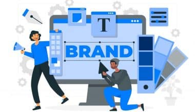
Creating an eye-catching logo is a combination of art and science. As a designer, I’ve honed a deliberate approach to creating logos that become cherished brand icons. In this article, I’ll walk you through the free techniques I use to create eye-catching, client-pleasing logos that are suited to each individual company.
From researching the brand to injecting creative flare, you’ll learn how to create a logo that feels like it was designed to represent that business from the beginning. Let us get right to it!
What is a Logo?
A logo is more than just a design. It’s a powerful symbol that embodies the very soul of a business, capturing its purpose and personality in a single image. Your logo has the power to become the unmistakable symbol of your brand, much like the iconic Nike swoosh or McDonald’s golden arches. It will serve as a visual representation that audiences will come to know and trust, solidifying their connection with your services, content, or products.
There is a wide range of logos available, varying from text-based to image-based and everything in between. Once complete, it gets imprinted on a business’s marketing assets, including its website, business cards, and packaging materials.
Key Takeaway:
- Creating a compelling logo requires a combination of creativity, research, and strategy.
- A logo is more than just a design; it’s a powerful symbol that represents a company’s soul.
- From corporate identity to consumer interactions, a well-designed logo is essential for global business marketing.
Reasons Why You Need a Logo
Although it may seem insignificant, your logo has a significant impact on promoting your business globally. Ultimately, it will convey your brand’s distinct mission and set it apart from others in your industry. Your logo enables this by serving as a visual symbol that new and potential customers can easily recognize. It helps establish a connection with audiences, fostering engagement, loyalty, and growth in both online and offline settings.
Let me share with you a few of the typical applications for your logo:
#1. Online
Headers for websites, favicons, email signatures, presentations, invoices, landing pages, web browsers, online advertising, and concept icons such as computer and online icons. Also, recruitment and job posting ads.
#2. Printed Materials
Throughout my experience, I’ve witnessed clients incorporating their logos into a wide array of printed materials. Business cards, t-shirts, packaging, brochures – anything you can think of. A well-crafted, polished logo is essential for maintaining a consistent brand image across all of your company’s printed materials. I always consider the impact of different mediums, such as posters, billboards, and merchandise, when designing a logo. It is crucial for the logo to be easily recognizable and impactful, regardless of its size.
I find social media to be quite fascinating. It has become such a prominent part of our lives, allowing us to connect with others and share our thoughts and experiences. I ensure that the logos I create have a polished appearance and effectively represent the brand across various platforms, such as Instagram and Twitter, including profile images, cover photos, and ad creatives.
When strategizing social campaigns for clients, I request that they provide logo files that are optimized for each platform, ensuring a smooth and consistent brand representation. An instantly captivating logo is crucial for achieving digital marketing success.
Types of Logo
It’s quite astonishing that, with millions of logos around the globe, they can all be categorized into just seven main categories.
Every type of logo has its own unique characteristics, strengths, and weaknesses. Therefore, it is important to carefully consider which variety aligns best with your brand values and goals when designing your logo. I will guide you through these various types of logos:
#1. Wordmarks
Creating a sophisticated wordmark using only typography can be a classy choice when a client already possesses a powerful company name. Companies such as Apple and Coca-Cola continuously enhance their wordmark logos to maximize recognition. Choosing the perfect font and styling is essential for making the name memorable to customers.
#2. Letterforms
When it’s fitting, I take pleasure in crafting letterform logos using only initials. It enables the creation of abstract, geometric designs. I designed a sleek and modern logo for a tech client, using only their initials in a clean sans-serif font. The client was impressed by its memorable and modern appearance.
#3. Logo symbol
Symbolic logos feature an image or icon that represents the brand. Effective brand marks have the power to spread like wildfire, but it’s important to remember that establishing recognition can be a daunting task initially, especially without incorporating your business name. I once assisted a sportswear startup in creating a “swoosh”-style icon that captured the essence of speed and motion.
#4. Abstract logo
Departing from the realm of pictorial representation, an abstract logo employs the use of geometric shapes to craft an image that is genuinely one-of-a-kind. With the passage of time, this seemingly random symbol will gradually become synonymous with your unique brand identity.
Being unique in nature, an abstract logo has the potential to attract international companies. This is because it eliminates the need for localized references or reading text in a non-native language, making it accessible to a global audience.
#5. Emblems
An emblem logo exudes a timeless elegance, crafted with intricate badges, seals, or crests that encase a carefully chosen text. Emblem logos have managed to retain their classic charm while also adapting to the modern era, making them a popular choice for branding from the late 20th century onwards.
#6. Combination
Just like its name suggests, a combination logo incorporates both text and imagery. There are various options available when it comes to designing a logo. You can choose to have a lettermark with a mascot, a wordmark with a logo symbol or abstract design, or even a combination of these elements. Starting with a combination mark is a great choice for beginners. It allows the imagery and text to work together seamlessly, enhancing the recognizability of your brand.
#7. Dynamic
A dynamic logo possesses the remarkable ability to effortlessly adapt and transform its color, shape, and text, seamlessly adjusting to the specific context in which it finds itself. Dynamic logos are in a constant state of change, unlike their static counterparts. Take, for instance, the discrepancy between a printed logo version and its online counterpart.
Consider the ever-evolving nature of Google’s logo, which effortlessly adapts to mirror the latest happenings and festive occasions. Just like the iconic MTV logo, which has gone through numerous iterations to reflect the ever-changing pop culture and societal trends, it serves as a perfect example of a dynamic logo that truly captures the essence of its brand.
How to Design a Logo
I’ve created a thorough 9-step approach for making logos that end up being adored brand icons. Using this methodical technique has enabled me to continually produce visually striking logos that are customized for each individual business.
In this section, I’ll walk you through the step-by-step method I follow when designing truly remarkable logos:
#1. Understand the brand
When I start coming up with ideas for a new logo, my first step is to conduct extensive research on the client and their intended audience. I’m eager to grasp the brand’s fundamental essence—its vision, values, and personality.
For instance, I delved into the brand voice of a children’s book publisher and discovered its whimsical and imaginative nature. The insight I gained influenced the playful and whimsical logo that I ultimately created for them.
#2. Brainstorm descriptive words
Once I become familiar with the brand, I start noting down all the descriptive words that come to mind. If it’s an athletic apparel company, certain words like “strength,” “endurance,” and “motion” may come up.
I effortlessly allow the words to flow, capturing the essence of the brand. It serves as a useful reference for me when I’m sketching logo ideas.
#. Explore ideas
With those descriptive words on top of my mind, I start sketching all kinds of logo concepts. At this stage, I focus on generating ideas rather than perfecting anything.
The goal is to explore various avenues, ranging from symbolic to abstract logos, while ensuring the brand remains prominent in people’s minds. I find rough sketches really unlock creativity.
#4. Select and perfect a design
Once I have pages of sketches, I carefully select the logo that I believe holds the greatest promise. For a recent camping brand, an emblem concept resonated most.
I then went through several rounds of revisions to perfect the intricate details, typography, and overall aesthetic, all while preserving the essence of the outdoorsy vibe. Refining is the crucial stage where a solid concept transforms into something truly exceptional.
#5. Wrap up the design
After perfecting my logo sketch, I carefully bring it to life using Illustrator or any other vector software. I am able to explore and refine every element of the design, from alignments and spacing to color gradients, in ways that are not achievable on paper.
Witnessing the logo come to life in its digital form is an incredibly gratifying experience following the extensive creative journey. The brand identity feels tangible and complete.
#6. Select your preferred colors
With the structure in place, I turn my focus to colors that will resonate with the brand’s essence. For an elegant jewelry company, deep blues and greens come to mind, evoking a sense of luxury and nature.
I rely on those initial descriptive words as a guide, aiming to use colors that evoke the desired emotions for the brand. Rich and dynamic colors can breathe life into a logo.
#7. Select a typography
When it comes to the logo, selecting the appropriate font is absolutely essential. I steer clear of using generic system fonts and instead, I actively search for distinctive typefaces that enhance the visual identity. I selected an angular, bold typeface to enhance the modern aesthetic of the avant-garde brand.
The objective is for the typography if utilized, to create a sense of harmony with the overall essence that the logo seeks to communicate. It seamlessly integrates into the larger narrative.
#8. Ensure the ability to handle growth and expansion
I create logos that are versatile and adaptable to any size or resolution. In order to test this, I will enlarge the logo to the size of a billboard and then reduce it to the dimensions of a business card. This will allow me to verify that every element remains easily readable and distinct.
Scalability allows clients to effortlessly utilize the logo across various branding materials, whether in digital or print form. It must excel in every medium or platform.
#9. Seek input
Before I finalize a logo, I make sure to involve the client and stakeholders in the process. Their valuable feedback helps me make the necessary revisions. Their unique insights contribute to the success of the logo among its target audience.
Updates can be swiftly implemented at this stage if necessary. Collaboration is essential in refining exceptional design into something truly extraordinary.
Just to help, this free checklist can serve as a quick reference guide when creating your logo.
Logo Design Best Practices
While much of your logo’s final form will emerge as you work on it, there are a few things you should know right away. Therefore, when you start your own graphic design business, make sure you remember these important logo design guidelines:
#1. Keep it simple.
Logo design thrives on simplicity. Strive for a sleek and minimalistic design that effectively conveys your brand’s identity in a straightforward manner. It is important for viewers to be able to instantly recognize and understand your logo.
Consider the logo of Nike, for instance. The sheer simplicity of it is what makes it truly iconic. There’s a clear explanation for why it hasn’t been updated since 1995.
#2. Make versatility a top priority.
It is important for your logo to have the ability to adapt to different backgrounds and colors. Ensure the legibility and clarity of your logo in all possible scenarios by testing it against multiple backgrounds and mediums.
It is important to have different color palettes and logo orientations to adapt to various situations.
#3. Consider your audience when designing.
It is crucial that your logo design aligns with your brand’s identity and resonates with your customers’ existing perceptions.
It’s crucial to take into account the buyer persona of your target audience, which involves conducting thorough research on their demographics and interests. Only then can I meet their expectations and needs with my design.
#4. Embrace your creativity.
You should know that it is crucial to distinguish oneself from the crowd. Nowadays, it seems like every market is overflowing with competition and a plethora of options. The design of your logo plays a crucial role in establishing your unique identity and setting yourself apart from the competition.
#5. Stay timeless.
Your logo should have a lasting and memorable quality. Simple, isn’t it? Iconic logos, such as Coca-Cola’s, are both rare and highly impactful. However, that doesn’t mean you can’t strive for a logo that stands the test of time. A timeless logo signifies its eternal appeal, ensuring it remains fashionable for years to come.
Logo Design Tools
Let’s look at some online logo design tools I use when creating a logo; they can also help you a great deal too.
#1. Canva
Canva is an incredible web-based graphic design tool that empowers you to create stunning designs for anything you can imagine, including logos. Canva’s user-friendly interface and vast collection of templates and design assets make it accessible to everyone. This is one of my favourite tools to use.
#2. Adobe Illustrator
Illustrator stands out as the top-notch vector-based graphics software from Adobe, the creator of renowned tools such as Photoshop, Lightroom, and InDesign. Illustrator is an essential tool for numerous professional design groups, enabling the creation of top-notch logos and a wide range of other designs.
Illustrator operates on a vector-based system, which implies that graphics are constructed using precise mathematical formulas to define points, lines, shapes, and curves rather than relying on a fixed number of pixels. As an Illustrator logo, it has the amazing ability to be scaled up or down without any loss in image quality. This is another option that makes the process of creating a logo much easier.
Read Also: POSTER MAKING SOFTWARE: Best 11 Free & Paid Options For Beginners
#3. CorelDRAW
CorelDRAW is an incredibly powerful vector design program that operates seamlessly on both Windows and macOS operating systems.
CorelDRAW is a fantastic alternative to Adobe Illustrator, providing a wide range of functionalities that enable you to effortlessly transform your sketches and ideas into professional logos.
Given the option to purchase CorelDRAW outright instead of subscribing to it, it can prove to be a more cost-effective alternative compared to Adobe. Trust me on this.
Mistakes to Avoid in Logo Design
On the other hand, there are certain actions to avoid when creating a logo:
- Keep it simple, please. If your logo is overly intricate or challenging to decipher, it will not effectively convey your brand message. An ideal logo is characterized by its simplicity and memorability.
- Avoid excessive use of colors. An excessive amount of color can be quite overwhelming and can divert one’s attention. Consider using a limited color palette that harmonizes well with one another.
- Avoid using trendy fonts. Using fashionable fonts can make your logo appear outdated in no time. Opt for timeless fonts that will endure for generations.
- Please refrain from replicating or imitating other logos. It’s important to avoid plagiarism, especially when it comes to logos. Imitating someone else’s logo will only give your business an unoriginal and unprofessional appearance.
Is it Easy to Make a Logo?
Utilizing a logo maker can greatly streamline and expedite the process of designing and creating a logo. However, selecting and creating a logo that truly captures the essence of your brand. Mastering the art of managing both personal and professional affairs, especially as they continue to expand, can be quite challenging.
How Can I Create a Logo for Free?
Opting for a free logo maker is the most effective approach to creating a logo without any cost. You have the option to select from a variety of pre-designed logos, or you can utilize the tool to refine and perfect your own unique design. Logo makers that are available for free offer a level of customization when it comes to the coloring and design of the logo. In addition, you have the ability to design your own logo using either a computer or a phone.
How Can I Create a Logo as a Beginner?
Creating a logo as a novice might seem intimidating, but it doesn’t have to be. Starting with a logo maker is a wise choice. Even prior to this, it’s worth examining competitor logos to gain insights into what you may desire for your own logo design. Consider your logo’s color palette and typography based on your branding needs and identity. Feel free to generate ideas and find inspiration in your mind or on paper before using a logo maker.
Final Word
You are all set to start designing the ideal logo for your business, having learned about the many kinds of logos, how to create one, best practices, and the tools you may use.
Make a logo that people will remember, one that conveys your brand’s values, and one that stands out.
- Chain Of Title: A Comprehensive Guide, Updated!!!
- TOP 50+ QUESTIONS TO ASK AN EMPLOYEE IN AN INTERVIEW IN 2023
- Incorporating Mission Statements into Branding: A Comprehensive Guide for Businesses
- Short-Term Career Goals: What Are the & How Do You Set Them?