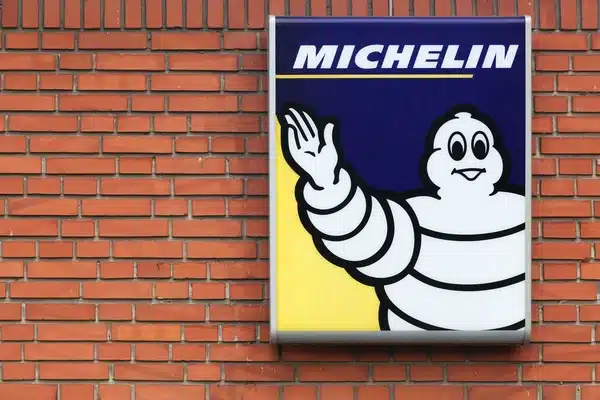
Everyone, not just auto experts, is familiar with the instantly recognizable Michelin logo. Michelin is home to one of the best mascots in the business, the iconic Michelin man logo (also known as the “tire logo marshmallow man”).
However, a lot of individuals are unfamiliar with the origins of the picture.
Despite a few logo redesigns over the years, the Michelin brand has maintained many of its hallmarks for the better part of four decades. The Michelin Man has been around since the company’s inception in the 1930s when tires were first being mass produced.
This article will examine the origins of the Michelin Man logo and its use in the company’s marketing campaigns. Let’s set the ball rolling…
Overview
Bibendum, also known as the Michelin Man Logo, is the iconic logo of the Michelin tire company. He is one of the world’s oldest trademarks, introduced in 1898 by the Michelin brothers. Bibelobis or Bibendum are other names for Bibendum. He debuted as a Michelin commercial poster with the slogan “Nunc est Bibendum,” which translates as “Now is the time to drink.”
Michelin is a French tire manufacturer headquartered in the Auvergne region. It is one of the world’s two largest tire manufacturers, along with Bridgestone. The Michelin company, officially known as SCA Compagnie Générale des établissements Michelin, owns several tire brands, including Taurus, Uniroyal, BF Goodrich, and Riken.
The original concept for the Michelin Man came to the founding brothers, Edouard and André Michelin, in 1894 while attending a colonial exposition in Lyon. Edouard noticed a tire stack that resembled the figure of an armless man. But it would be another four years before the symbol was created. André met the French cartoonist O’Galop (real name Marius Roussillon) at this time.
O’Galop had previously created a logo concept for a Munich company, but it had yet to be accepted. It featured a royal figure holding a large beer glass and the slogan “Nunc est Bibendum,” a quote from Horace. Andre liked it and suggested replacing the man in the drawing with one made out of a stack of tires. O’Galop recreated the symbol with the first Michelin Man, and the rest is history.
Now, only a short time after his birth, Michelin Man began to play an important role in the company’s marketing efforts. He became the brand’s face in advertising, presenting products and assisting drivers whenever possible.
What Is the Name of the Michelin Man?
O’Galop, a French cartoonist, created the first version of the Michelin man.
The cartoonist showed the Michelin founders, Andre and Edouard Michelin, a rejected design he had created for a brewery and proposed replacing him with a tire man.
The Actual Name of the Michelin Man
The name Bibendum is derived from the phrase “Nunc Est Bibendum” from the original brewery cartoon design. The iconic character, often called “Bib,” became an important part of Michelin’s identity.
Though his shape has changed slightly over the years, and the character has been depicted in various scenarios, he remains an important part of Michelin’s image.
The design from 1936 to 1968, featuring the Michelin man running with a tire over his arm, is perhaps the first and most iconic example of the Michelin man logo in action. The wordmark “Michelin” is written in cursive above the waving mascot, with a streak extending from the end of the “N” to represent a road.
Michelin Conquering Europe
In 1905, Michelin opened its first sales office in the United Kingdom, in London. The Michelin branding team reimagined him as a knight armed with a helmet and shield, ready to conquer new territory. The London Michelin Man also wore spectacles, smoked a cigar, and held a cup, all of which are common elements in British culture. The English market’s slogan was “My strength is as strong as ten because my rubber is pure.”
Over time, the company employed various artists who added their spin to the character. Bicycle tires inspired his form. Hence the narrow appearance of the tires and his demeanor reflected the culture of the typical customer, depicted as bespectacled and smoking a cigar.
Michelin began to rely more on in-house artists for brand image in the 1930s. Although there were country-specific variations, this resulted in more standardized symbols and images. With the evolution of tires, the Michelin man became thicker. He also became less flashy as his wealth image no longer matched their large customer base.
The Meaning of “Bibendum”
By chance, the character’s name, Bibendum, became well-known. It happened once at the Paris-Amsterdam-Paris races when Léon Théry, a competitor, saw André Michelin approaching and exclaimed, “Here comes Bibendum!” about the word on the Michelin poster. Even though Théry had no idea what the Latin term meant, the name stuck and eventually became the character’s official identity.
Questions have also been raised about Bibendum’s white appearance, even though the tires are black. Tires were white before 1912 when manufacturers began to add soot and preservatives to the rubber material. Originally, the rubber was ivory in color. On the other hand, the Michelin Man has kept his original white depiction to this day.
The shape of the Bibendum character has changed over time. He was running with a tire by the 1980s, and for his 100th birthday in 1998, he was slimmed down to reflect modern tires, which were smaller and lower profile. However, by this time, the Michelin Man had entered common vocabulary to describe someone with a plump appearance.
The Michelin Man has even made it beyond the confines of advertising and into popular culture. His popularity skyrocketed more than a century ago, and Michelin capitalized on him as early as 1911 with the opening of their new Bibendum Building in London.
The Evolution of the Michelin Man Logo
Since its debut more than 120 years ago, the Michelin logo has undergone numerous changes. However, its Mascot, Bibendum, has largely preserved and reinforced its visual identity. Bibendum has remained the central figure in each redesign of the logo.
The Michelin Man’s shape and contours changed from the first version in 1898 until 1936, when the figure that is now widely recognized was introduced.
1936 – 1968
The running Bibendum was featured in the logo, along with a Michelin wordmark. The character is running with a tire, and the wordmark’s final letter, “N,” has been stretched to represent the road. The black and white logo brilliantly reflected the brand’s playful, friendly image.
1968 – 1997
The company changed its logotype in 1968 to a more modern sans serif typeface with capital and extra-bold letters. In stark contrast to Bibendum’s casual personality, the letters’ edges were traditionally straight, reflecting an image of seriousness and stability. Bibendum, on the other hand, would appear alongside the lettering at times and not at others, depending on the context and medium.
1997 – 2017
The color palette was altered in the 1997 iteration. The logotype was now white on blue with a yellow line beneath it. The Michelin Man was also reintroduced as part of the symbol, saluting to the left of the logotype. The “Michelin” inscription was italicized and had more space between the letters than its predecessor.
2017 – Today
The symbol was given a lighter, more straightforward appearance in the 2017 version. The logotype has been changed to blue, with the yellow line moved above it. The Mascot is now larger and placed above the lettering, with Bibendum’s friendly smile and salute.
Elements of Michelin Logo Design
- Michelin Symbol: With each new version, the designer added their interpretation of the Bibendum character. The most recent version, from 2017, shows the Mascot saluting motorists as they pass by.
- The Michelin Man has become the company’s brand ambassador and one of history’s most recognizable brand symbols.
- Michelin Logo Font: The current wordmark typeface is a solid sans-serif in italics. The letters are all capitalized.
- Michelin Logo Color: The Bibendum character is in his traditional white and black color, while the wordmark is blue on a white background. A yellow line runs above the lettering as well.
Michelin’s Evolution
Michelin’s story begins in the 1880s with a rubber factory owned by the Michelin brothers, Edouard Michelin and André Michelin. A cyclist came to the plant in 1889 to have his pneumatic tire repaired. The tire was attached to the rim, and it took the brothers over three hours to detach and repair it.
The following day, Edouard took the bike for a test ride, and the tire failed after only a few hundred meters. Despite their failure, the brothers were intrigued by the then-new pneumatic tire and began developing their version. They also desired to create one that did not require attachment to the rim.
The Michelin Company was founded soon after, in May 1889. After two years, the company patented its removable pneumatic tire, which Charles Terront used to win the world’s first long-distance cycling competition.
Michelin During the 1930s
Michelin was running massive rubber plantations in Vietnam by the 1920s and 1930s. The working conditions on these plantations were heavily criticized, leading to the rise of the Phu Rieng Do labor movement. In 1930, Phu Rieng Do workers went on strike to protest the company’s poor working conditions, but the strike only lasted a week.
In 1934, Michelin introduced a new type of tire. The tire had a special form lining that allowed it to continue running in the event of a puncture. It is now known as a run-flat tire.
Radial Michelin Tire
In addition, the company created and patented a key innovation in tire history. The Radial Tire, introduced in 1946, propelled Michelin to the top of the world tire manufacturers.
It was originally designed for Citroen vehicles and was known as the “X” tire. Michelin purchased the struggling Citroen Company in the 1930s. Because of its improved handling and fuel consumption, the radial tire eventually became popular throughout Europe and the rest of the world.
In 1966, the company partnered with Sears to manufacture radial tires under the Allstate brand in the United States. By 1970, the company was selling one million units per year.
Michelin established its first North American sales office in 1968 and quickly gained a market share. By 1989, the company’s OEM tire market share (used by American automobile manufacturers) was 10%.
Michelin struggled to market their invention in the United States until 1967. Sales of their radial tires skyrocketed in 1968 due to an article in Consumer Reports, a powerful magazine at the time. The article recognized Michelin’s superior technology, and it wasn’t long before its competitors began to decline.
Acquisitions
Michelin purchased the American company B.F. Goodrich and Uniroyal in 1989. The tire and rubber manufacturing divisions of the two companies had recently merged. With this acquisition, the Michelin Company became one of the largest tire manufacturers in North America and the rest of the world.
Michelin made another significant acquisition in 2018 when it purchased Camso, a manufacturer of off-road tires. Michelin also owns a 90% stake in the Hungarian company Taurus Tire and several other European brands.
After trailing Bridgestone for two years, Michelin reclaimed its position as the world’s largest tire manufacturer in 2008. The company manufactures tires in countries like France, Germany, Spain, Poland, Canada, India, Serbia, Thailand, Japan, the United Kingdom, and the United States. Some of these operations, such as BF Goodrich and Taurus, are acquisitions that have continued manufacturing and selling tires under their original brand names.
Michelin’s Participation in Motorsport
Michelin took part in MotoGP races from 1972 to 2008. In 1984, the company introduced radial construction technology to the competition, followed a decade later by multi-compound tires. Michelin won 360 races during its 36-year participation. The World Championship was won by a Michelin rider for 13 years, from 1993 to 2006.
Casey Stoner won the World Championship on Bridgestone tires in 2007, prompting competitors such as Valentino Rossi to claim that Michelin tires were inferior. When it was announced that a control tire would be imposed in 2009, Michelin withdrew from MotoGP. Following Bridgestone’s withdrawal in 2015, they returned to the competition in 2016.
What does the Michelin Man represent?
Since his birth in 1898, the Michelin Man has developed into a contemporary and socially responsible icon. This is analogous to how Michelin as a company has evolved to outfit vehicles and meet the changing needs of consumers while simultaneously maintaining its position as the leader in tire innovation and technology for more than a century.
What is Michelin famous for?
Michelin, in full Compagnie Générale des Établissements Michelin is a well-known French manufacturer that specializes in producing tires and other rubber goods. Clermont-Ferrand serves as the organization’s primary location.
Conclusion
The Michelin Man Logo and the Company have become synonymous with its iconic symbol, the Michelin Man (Bibendum). The Michelin logo was voted the best created by a panel of 22 designers in a competition by the Financial Times in 2000. This report, it could be argued, only served to strengthen the public’s perception of the brand.
However, the invention of the radial tire in 1946 contributed significantly to Michelin’s growth and dominance. Radial tires became the standard in Europe, Asia, and North America due to their superiority.
Another factor contributing to the brand’s popularity is its Michelin Guides publication. These are travel guides that the company has been publishing since its inception by the Michelin brothers. André wanted to promote tourism through automobile travel, and the principles provided an excellent opportunity.
Related Articles
- BEST AGE TO RETIRE: Retirement for Social Security, Men & Women
- Iron Man Logo: The Evolution & What It Really Symbolizes
- HOW TO SAVE MONEY ON GAS: The Best 15 Methods that Work!!!
- WHEN IS THE BEST TIME TO BUY A CAR IN 2023 (Updated)
- Which Tire Brands Have the Best Reviews for All Season? (Detailed Guide)


