Since 1923, Disney has been making magic, and it is the undisputed leader of the entertainment business. Disney now has a hand in practically everything, from movies and TV shows to merchandising and theme parks. And it all started with a cartoon mouse as its official logo. The Disney logo has been updated several times over the years, with the first logo appearing in 1937.
In this post, we’ll look at the amazing history of Disney Inc., where the world-famous Disney Logo came from, and how it helped the company become so successful.
Overview
The Disney logo is one of the world’s most famous company logos, with a history as rich and detailed as its design. The logo we know now is not the same as the one that was established in its early days. This blog is dedicated to the Disney logo and its evolution over time.
It’s difficult to have missed the atmosphere of Walt Disney, whether you’re a 90’s kid, a millennial, or someone who’s into the realm of dreams, fantasies, and comic books. The Walt Disney Pictures Company has been making magic since 1923. They are the undisputed leader of the entertainment industry around the world. The company was started by two brothers, Walt and Roy Oliver Disney, as a small animation studio. It grew to become the biggest media company with its huge broadcast networks and amusement parks.
The brand is well-known for its stunning visual identity and distinct brand position, among other things. Disney has a role in practically every sector, from TV shows and movies to retail and theme parks, and it all started with a cartoon mouse. Below are the origins of the iconic Disney emblem and its role in the company’s unrivaled success.
The Story of Walt Disney
Walt Disney is now known as one of the most successful artists and businesspeople in the world, but that wasn’t always the case. In fact, Walt Disney’s early career was so hard that his success is now seen as one of the best examples of how hard work and persistence can pay off.
Walt Disney’s first firm, Laugh-O-Gram Studios, failed in 1923. With only $20 in his pocket, Disney returned to Hollywood to start anew. Walt Disney began producing two animated shorts, Alice and Oswald the Lucky Rabbit, with the help of his brother. People liked these cartoons, but Walt Disney didn’t protect his legal rights to the characters, so in February 1928, he lost the contract to use them.
Still undeterred, Disney created the Steamboat Willie cartoon, which included a mouse figure that would ultimately be known as Mickey Mouse. The Steamboat Willie cartoon was a sensation, and Walt Disney Productions was founded in 1929 to capitalize on its success.
Since that time, Disney has been involved in nearly too many successful initiatives to count. From hundreds of movies and TV shows to billions of dollars in merchandise to two of the world’s largest theme parks, Disneyworld and Disneyland, the firm has had no shortage of achievements, and it shows no signs of slowing down.
Disney earned $9.39 billion in 2016, marking the seventh consecutive year of growth. It’s an incredible amount of accomplishment, but what role did the Disney logo have in getting the firm to this point?
The Evolution of the Disney Logo Over Time
The Disney emblem has changed dramatically over the years. The logo design that we see and adore today is the consequence of several changes, particularly the influence of 3D animation in filmmaking.
Changes to the Disney mascot and programming continue to have an impact on the evolution of the emblem.
Disney, who is an artist, created the first iterations of the company’s logo. He started out as a designer at an advertising agency. Later, he became a cartoonist, which led to a very successful art career. Even though the Disney logo is a big part of their brand and is displayed prominently at the entrances to their famous theme parks, it didn’t have a specific sign or emblem for the first 48 years.
On the large screen, the audience watched “Walt Disney Pictures Presents” or “Walt Disney Presents.” They were sometimes joined by a figure of Mickey Mouse, which in the animated form was surrounded by a different color and shown in a different way. “Walt Disney Pictures” was used as a logo in 1937. While it is still useful in some situations, the designers have made several adjustments to it.
The current Walt Disney Company logo design was introduced in 2011. It is a condensed version of the previous designs, with only one wordmark: “Disney.” It also has ornate towers, windows, balconies, flags, and a star that casts an arc across the skyline.
From 1929 to 1937
The very first official logo was a clear representation of what the organization was all about. In the center, Mickey Mouse, as it was called back then, could be found. “Mickey Mouse” was divided in half and placed on either side of the mascot. Other aspects of the design were the corporate name ‘Walt Disney Productions,’ its location, and so on.
From 1937 to 1948
In this logo design, the founder’s name, Walt Disney, was written in an interesting way. It is one of the founder and artist’s own signatures. The text was styled and extended to meet the degree of branding and used a superb combination of upper and lower case letters.
The twisted and stylized “W” and “D,” as well as the lowercase I and “y,” are visually suggestive of Mickey Mouse’s tail and ears—the logo’s principal cartoon character. The wordmark “Walt Disney” looked like it was written by hand, but it didn’t have an italic slope. The only part of the design that could be a problem is the “t” in “Walt,” which could easily be read as a “y.”
From 1948 to 1979
The logotype was slightly updated ten years later to give it a cleaner, more realistic appearance. Unfortunately, while it appeared to be an autograph, it was barely discernible.
From 1972 to 1983
The designers decided to stick with the original Disney logo style this time. The word “Productions” was added in a simple sans serif font while the logotype was adjusted to make the wordmark legible.
From 1983 to 1985
The wordmark “Walt Disney” remained unchanged this time, however, the word “Productions” was replaced with “Pictures.” The designers used a serif font (similar to the old universal) and enlarged the letters. The top inscription, on the other hand, was unaltered; it still employed the Waltograph font.
From 1985 to 2006
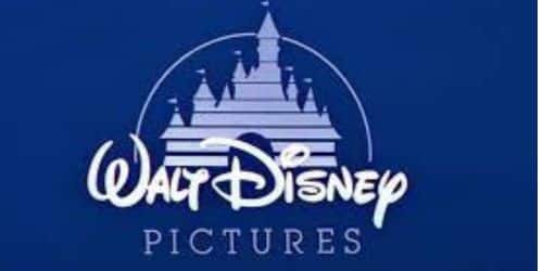
The iconic Cinderella’s castle initially appeared in the 1985 logo. The castle was used as a fairytale icon, placed above the wordmark “Walt Disney.” The palace was surrounded by a massive arch and had several horizontal stripes. At the top of each tower was a triangular flag. The word “Pictures” was still printed in a serif font, but it was larger than in the previous version.
From 2006 to 2011
The designers redesigned the symbol in 2006, creating a clear and refined picture of magical castles. The stripes vanished, the gates opened, and more realistic elements, such as a shooting star, appeared. In the full-color versions, the towers, luminous rooms, and stars are incredibly alluring and depict the most fantastic fairytale desires.
The text “Walt Disney Pictures” shrank in comparison to the castle. The word “Productions” was made smaller with a new capital typeface, and the writing “Walt Disney” was made thinner.
From 2011 to the Present Day
Except for the wordmark, the current edition isn’t significantly different from the prior one. This time, a shorter version is utilized instead of the complete one, with the word “Disney” replacing the phrase “Walt Disney Pictures.” The insignia is richly detailed, with windows, towers, flags, and balconies.
The Disney logo’s shooting star creates a lengthy arch in the skyline. Clouds and pyrotechnics are also used to emphasize the brand’s mystical realism. The castle represents love, passion, fairy tales, and all things magical. But when Toy Story came out, a lot of big changes were made to the world of cartoons. Designers began associating other cartoons with their version of the logo, so the image looks in tune with the movie’s theme.
For example, it resembles Tron’s City of Lights and Maleficent’s Cliffside Castle. The stunning animation of the castle and its surrounding elements demonstrates Disney’s incredible breakthroughs in graphics, detailing, animation, audience appeal, and branding tactics.
By focusing on continuous quality delivery, Disney has established one of the world’s most recognizable logos and trademarks. Who knows at this rate? Perhaps you’ll see a Disney logo without any content!
People said that the different fonts on the Disney logo were caused by the fact that Walt Disney changed his signature a lot. However, this is doubtful because none of Walt’s several signatures matched the Disney emblems.
What is the Meaning Behind the Disney logo?
The majestic castle centerpiece in the Disney Logo serves as a reminder of what the company has done flawlessly from its inception: producing larger-than-life stories with relatable people.
Its inspiration, the Neuschwanstein Castle, established a concept for subsequent theme parks, and the logo highlights those built by Disney around the world.
The logo is inspired by Disney movie princesses and princes. The Disney logo references the palaces that Sleeping Beauty, Cinderella, Snow White, and all of the legendary Disney princesses lived in or eventually migrated to.
Children grew up wanting to be princes and princesses thanks to Disney, and the brand values acknowledging this significant cultural impact.
Outside of the film industry, the logo refers to Disneyland and Magic Kingdom; the first theme park opened in 1955 and featured the Sleeping Beauty Palace as one of its main attractions
Even as technology develops and the logo evolves, the emotions Disney wishes to evoke will remain constant.
Typography’s Complexity
The best changes were the new typographic components. The word Disney was highlighted and given a bounce using extrusions that cause it to bubble out from the center. A 3D feel and the addition of the Mickey Mouse ears was a creative touch that really lends the logo its Disney flair (especially because the body of the I looks like the body of Mickey Mouse).
Aside from the bubbliness of the “channel,” the hand-drawn font deviates from its simpler predecessor and contributes to the child-friendly message aimed at its target population. The previous version attempted to provide a more refined sense of the channel’s smacking of computers and savviness (honestly a bit of desperation as well).
This new version returns Disney to its heritage while yet remaining current and digital.
Effects’ Complexity
The effects utilized to create a more advanced version of the name ‘Disney’ provide the required depth. The gradient in particular was an eye-catching feature. The way it tracks across “Disney” grabs your attention to it, and the impact is memorable as you leave the “channel.” The fact that the gradient is limited to the top half allows the childish handwriting to stand on its own. “Disney” is given additional prominence, while “channel” is spared the burden of that emphasis. It was a nice, subtle touch that made this new logo a great choice.
Elements of the Disney Logo Design
As previously said, most of Disney’s logo design is devoted to demonstrating its breakthroughs in graphics and animation. It is critical for a company that bases its image on cutting-edge visuals to have a logo that lives up to its reputation.
Aside from that, the Disney logo is intended to evoke a sense of wonder and imagination. When you view Cinderella’s beautiful castle, you can’t help but wonder what lies within all of those turrets and bright rooms. Through the worlds that they have built, Disney provides a ticket inside, a chance to discover places and possibilities that extend the mind and put a grin on your face.
Because the Disney emblem and the entrance to its theme parks are so similar, the Disney logo can also act as an advertisement for Disneyland and Disneyworld. Because every Disney film begins with an animation of the emblem, visitors to one of the Disney theme parks feel as if they are entering a real-life Disney film.
The font used to spell out the term “Walt Disney” has also received a lot of attention. Because the full Disney emblem is so intricate, Disney wanted a solution to brand specific products and productions without having to print the entirety of Cinderella’s castle over them. To accomplish this, Disney created a highly distinctive and recognized font to spell out “Walt Disney.” As a result, the streamlined emblem, which is nothing more than a line of text, is instantly recognized and inextricably linked to the company and its broader message.
The shooting star that arcs across the castle in the current Disney emblem generates a sense of amazement and conveys a message of wishes coming true.
The Disney Logo’s Popularity
The Disney emblem is ingrained in popular culture as a sign of amusement and whimsy. From its use on apparel to its introduction at the beginning of each Disney film, the logo is ubiquitous and instantly identifiable today.
Disney has so skillfully associated its purpose and message with their emblem that when they see the Disney mark linked to a production, product, or event, they know precisely what they are in for. While Disney’s characters are the driving force behind the brand’s goods sales, the logo is also an essential aspect of Disney’s merchandising.
Disney has made its emblem a significant aspect of its marketing and branding activities in both animated and unanimated forms. Their use of different versions of their logo is a great example of how a company can attach its message to many logos. It is also a good example for other companies that want to use more than one version of their logo at the same time.
Overall, Disney has created an immensely successful design and seamlessly integrated it into its marketing activities, making the history of the Disney logo an excellent example to follow.
Why Does the Disney Movie Logo Work?
Disney’s logo is fun, innovative, and instantly recognized. It is popular with both adults and children all over the world. There is no doubt in my mind that it works. We might wonder why the logo is so powerful. The answer would be the company’s commitment to develop and evolve, constantly appealing to new consumers.
The original emblem was popular among cartoon and comic strip fans. However, as the world evolved, the idea of romance and fantasy grew in popularity among both boys and girls. Disney’s new animated logo caters to a creative and growing population that is fascinated by technology.
Disney provides a world of fantasy and possibilities, and the logo, which changes with the years, embodies this ambition.
What the Disney Logo Can Teach You
Taking design elements from Disney can help you create an effective logo.
If your logo can elicit the desired emotion, you’re on the right track. In the case of Disney, the logo evokes happiness. Your logo can evoke emotions in people, but the design, fonts, and colors should also be able to match that emotion.
Despite numerous alterations to the logo, this has remained the case. Consumers still recognize Disney as a family-oriented company that creates magnificent stories for viewers. In every logo, the design is always secondary to the messaging.
A beautiful design that serves no purpose will offer no value to your brand. Every company should keep this in mind while creating new logos!
Finally, Some Views on the Disney logo
Understanding the evolving universe of Disney would be impossible without addressing Walt Disney, a passionate artist, and company creator. Walt Disney died at the age of 65 in 1966. He was certain that the Disney Corporation would grow beyond his wildest dreams.
He was right. Disney is now made up of several different corporations or departments. It consists of a film production firm, merchandising company, and a theme park world.
People all across the world are now familiar with the Disney brand. From movies to cartoons and animated shorts, the company is well-known in the film industry. Disney is a powerful company, and many of its animated characters have come to live in the minds of the kids who buy its products.
The Disney logo continues to represent expansion, wonder, and entertainment. The corporation is still a strong force because it keeps growing and changing, adapting to the needs of the people it serves. May it continue to evolve for a long time.
For nearly a century, Walt Disney’s baby has brought joy and entertainment to families! It began with layoffs and a few failed enterprises, but Walt Disney’s perseverance paid off.
Related Articles
- DISNEY JUNIOR LOGO: What is the Logo History & All You Need to Know
- NETFLIX COMPETITORS: Who are they? (Competitor Analysis & Stock)
- BEST PARK: All You Need to Know and Extra
- Mergers and Acquisitions 2022: Differences and Examples
- MERGERS: Types and Examples of Business Mergers
