You can’t possibly make a list of American baseball teams without mentioning the Cleveland Guardians. They are one of the best baseball teams in history. Since its inception in 1901, the Cleveland Guardians have been through rough times, but more importantly, none of their challenges have demotivated the team. From the change of its name to that of ownership and even logo, the baseball team has indeed been a great one. There are three symbols that represent the Cleveland Guardians baseball team, the fastball G logo, the diamond C logo, and the script logo. Each of these speaks volumes in expressing all that the team stands for. All three came as a surprise, but the unveiling of the team’s new name is traceable to the change of its logo at the end of the 2021 season.
New Cleveland Guardians Logo
Everyone was ecstatic when the Cleveland Indians announced at the end of the 2021 season that they would no longer use the name Indians in the following season. For one, we know the sad history of the former name, so it was a good thing. It was funny when they revealed the name Guardians as a nod to the old Guardians statues in the city. Later on, the new logo was unveiled with a video. When the new name was announced, three new logos were also introduced. The first was a script logo with a flag underlined. The second was the Fastball G logo and the Diamond C logo. An updated uniform font was also announced by management.
#1. Fastball Wing G
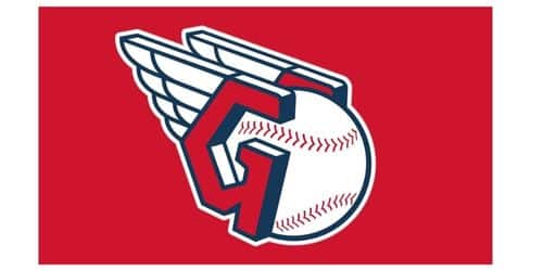
The Cleveland Guardians have a new logo called the “fastball wing G”. The letter G is wearing something that looks like a helmet or a wing on both sides of a baseball. The baseball is at the center while the “G” with a wing appears on both sides of it. On second thought, you can liken the wing to the swift speed of a baseball. The winged “G” logo, which is also called the “Guardians Fastball Logo,” was based on the helmets that the Guardians statues were wearing. The location talks about a split-finger fastball as well as the franchise’s “strong pitching legacy.” that looks like a letter “G” with wings on both sides. Native American art is where these wings got their start.
The whole logo is made from a single line with a single weight. The width of a line that goes around the wings is the same as the width of a line that goes around the letter G, which is the same as the width of a line that goes around a baseball. Additionally, all of these lines are the same size and distance apart. Until all of the stitches on the baseball are done.
#2. Guardians Script Logo
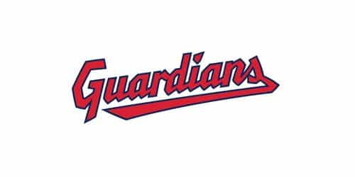
The Script is the Cleveland Guardian wordmark logo. The new logo looks like a tribute to the old one rather than the start of a whole different team. The designs lean to the left and feature an underscore in the shape of a flag that tucks itself in behind the final letter. The only noticeable difference between the old and new logos is that the new one features rougher, sharper characters.
#3. Cleveland Guardians Diamond C Logo
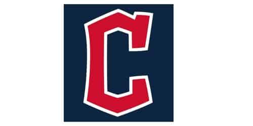
The Cleveland guardian “C” logo is called the diamond “C”. You can see the new Cleveland Guardians Diamond C logo all around town since Block C is so ubiquitous. The simple Block C logo appears on uniforms and in other places. It is also displayed on television during sporting events. It makes it logical to have a little replacement that looks just like the original.
Meaning Of The New Cleveland Logo
The Cleveland Guardian’s new logo, the “G fastball,” stands for strength, speed, weight, and confidence. It also describes the journey on the road ahead, the end result, and the need for focus. Amazingly, the design was able to show both the spirit of baseball and the passion of Cleveland sports fans. Interestingly, it does this without showing any specific people.
Inspiration for the makeover came from multiple sources. The most important ones are as follows: Respect for the game, appreciation of the champion’s past, anticipation for the future, and representation of the people of Cleveland. Intangible parts of this picture include a sense of safety and support. It also includes a sense of belonging to a large group of people who share values and principles.
The logo is easy to understand and easy to remember, and it also looks good. Individual and physical skills (like speed and endurance) and the game’s potential to win (like speed and endurance times player power) are all letters next to each other in this analogy. This includes drive and determination to succeed (wings), group cohesion and synergy (like letters next to each other), individual skills and physical skills (like speed and endurance), and so on (ball).
The watchers are now finally able to live up to their responsibilities as protectors thanks to this symbol. No one will ever again mistake a visual symbol for a clothing label or a fast-food chain’s logo. A contemporary look will attract more people to the ballpark, where they may take in a game of baseball that is both aesthetically beautiful and beneficial.
Criticism Against The New Cleveland Guardians Logo
The logo for the Cleveland Guardians Fastball shows a baseball between two Gs with wings. There isn’t enough room between the Gs with wings for a baseball-sized ball to fit. As a result, the baseball looks like a ball. Moreover, the two Gs with wings will be better if they are farther apart from each other.
Aside from the above, Insomniacstudio said the new logo is a tribute to the Indians with little or no differences, which isn’t something that is expected from rebranding. According to them, the Cleveland team ought to have done away with anything that has to do with the Indians, since one of the reasons it changed the name was because of the racial issues they kept experiencing. They went as far as re-adjusting the team’s current logo, and the result was stunning if you look at it from their perspective.
History Of The Cleveland Guardians Logo
The Cleveland Guardians have a very rich history when it comes to their logo, ownership, success, and also accomplishments. For the record, the team approved the modification of its logo several times. Let’s take a look at each logo, the reason behind the changes as well as what each of the new logos represents;
1901-1902
The initial logo for the Cleveland Indians was created in 1991. It was a wordmark. A bold handwritten sans-serif font was used to write the word “Cleveland” in full capital letters on a straightforward arch that had been constructed. The first emblem’s color palette was centered on a bold and vivid blue, which helped the straightforward design stand out and provide the impression of power. The first Cleveland Guardians logo color shares some similarities with the team’s former name, the Bluebirds. Generally, the Cleveland Guardians were known as the Bluebirds in 1901. Besides the name, reporters did shorten the name to Blues, because the team’s uniform then, was all blue.
1902 – 1903
In the year 1902, the Cleveland Guardian changed its logo. The name Cleveland was removed and replaced with a single letter “C”. The letter “C” was big and also appeared in blue on the background of white. Once again, the blue color was retained. The letter was crafted using a one-of-a-kind font that featured thick lines, geometric curves, and a large square serif on the very top.
1904
In 1904, the squad used the same emblem as in 1902. However, they changed the color. The large letter “C” was written in red, which gave the Indians’ identity a powerful appearance. Aside from the appearance, it also caused people to feel energized and emotionally charged.
1905 – 1908
1905 was the year that the team debuted another new emblem, and they retained it for the next three years. This time, it was another blue capital “C” written in cursive, with a long and curved upper part, giving it an attractive and entertaining appearance.
1909
The lines of the emblem were altered in 1909, and the tail of the “Cup” was trimmed down to be shorter. As a result, the new logo has a more contemporary appearance. However, it maintained the same beauty and elegance as the previous iteration.
1910 – 1920
In 1901, the typeface was altered, and with it came the addition of another “C.” The font used this time was a geometric sans-serif, and the lines of each letter were repeated in an octagonal pattern. Even though the lines were much thinner than they were in the 1903 design, the symbol still looked strong and solid.
1921 – 1927
The Indians’ “C” was modified in the year 1921. This time around, the letter was formed into the shape of a wishbone, with the ends of the letters being rounded and larger than usual. The club kept showing how skilled and professional it was by using blue and white everywhere.
1928
In 1928, the club went through a big change that gave it a new look. The Cleveland Indians decided to go with a depiction of a Native American man that was red and black for their new team emblem. He was positioned such that he was looking to the left. Additionally, he was wearing three black feathers on his hair.
1929 – 1932
In 1929, the painting was redone in black and white, and a big feathered hat was added to the scene. In comparison to the earlier, less-than-professional sketch, the lines on the face were both smoothed out and made to appear more delicate and lovely.
1933 – 1945
The colors of the insignia were modified in 1933 when they went from being red and white to yellow, brown, and red. In addition, extra features were added to the photograph, and the Native American’s face was given sharper lines.
1946 -1972
In 1946, a new and funny picture was chosen to be the official symbol of the Indian people. This time, it was a smiling Native American in beige, black, and red with some white highlights. The smile as well as the tip of the feather made it look like a cartoon.
1973 – 1979
The baseball club wanted to demonstrate how devoted and patriotic they are, so in 1973 they updated their emblem and changed the colors to red, blue, and white, which are the colors of the American flag. This alteration was made in 1973. The overall effect was that the portrait became more contemporary and vibrant, with features that were made to look cleaner and more emphasized.
1979 – 2019
The Indian person was put on a white and blue baseball with huge text around the edge during the redesign in 1979. The primary color of the logo is blue, which reminds me of one of the earliest club logos to originate in Cleveland. Chief Wahoo was pictured on this emblem wearing baseball gear and holding a bat. The text in blue was created using a one-of-a-kind sans-serif typeface that was influenced by Mayan art and features strong lines and straight letter cuts.
2013 – Today
The team will be using its original logo, which was designed in 1904 and has a bold “C” shape in red and white, for the 2013 season. The outline of the letter is still being refined, and an updated version has been created with a bright red “C” set against a serene blue background.
2021 to Date
It was to be anticipated that the Cleveland Guardians would adopt a brand-new logo concurrently with the adoption of their new team name. As was expected, the team introduced a completely new set of logos, which includes new script versions of the Guardians name for home jerseys, a new “Block C” called the “Diamond C,” script writing for away jerseys, and a new primary logo with two winged g’s guiding a two-seamer to the zone’s outer boundary. All of these new logos can be found on the team’s official website.
When you look closely at this logo, you will see the letter G wearing what looks like a helmet or one side of a wing. The helmets worn by the statues of the Guardians served as inspiration for the design of the winged “g” emblem, which is formally known as the “Guardians Fastball Logo.” The location makes a reference to a split-finger fastball as well as the “strong pitching legacy” of the franchise. The Cleveland Guardians have a logo called the fastball wing “G,” which features wings on both sides of the letter “G.” These wings have their origins in the art of Native Americans.
The logo for the Cleveland Guardians Fastball shows a baseball between two Gs with wings. There is not enough space between the Gs that have wings to accommodate a ball the size of a baseball. In order for the baseball to have the appearance of a ball, the two Gs that are depicted as having wings should be spaced further apart. Because of how close the two Gs were to each other, there was a change in how the baseball was made. Rather than appearing like a baseball, he ball at the center of the G was more of an ellipse or a cirlce.
Delicate Features Of The 2021/2023 Logo
A single-weight line is used to create the logo. The width of the line that circumnavigates the wings is equivalent to the width of the line that circumnavigates the letter G, which in turn is equivalent to the width of the line that circumnavigates the baseball. These lines are all consistent in their thickness and evenness. Until such time as the baseball’s stitching is completed. As a result, the heavy lines transform into lines that are only about a third of the thickness of the rest of the insignia.
The old Cleveland Indians logo, which was a block letter C, has been replaced by a new design that looks like a diamond. The simple Block C logo is shown on TV broadcasts of games, on the players’ clothes, and in a few other small places. It makes perfect sense to have a successor that is comparable and straightforward. The new Cleveland Guardians Diamond C logo can be found in all of the places where Block C was implemented.
The Block C serif from the old Cleveland Indians logo is now part of the new Cleveland Guardians C logo. It is located at the very beginning of the letter. The idea behind the Guardians of Traffic was used to make the new C logo. The following is taken directly from the official website of the team: “The new typeface highlights Cleveland’s unique traits with its angular letters and numbers that look like the bridge and the Guardians of Traffic.” The story is shown next to a picture of one of the Guardians of Traffic sculptures. Moreover, you can see Progressive Field at the background of the picture. The diamond-shaped pylon that is located behind the statue now has vibrant colors, although the statue itself does not.
Cleveland Guardian
The Cleveland Guardians are an American baseball team based in Cleveland, Ohio. They are members of the American League’s Central Division team, which competes in Major League Baseball. Since 1994, they have been putting on shows at the venue. In 1900, when the American League (AL) was still considered a minor league, the team competed under the moniker of the Lake Shores.
The major league franchise of the club was established in Cleveland in the year 1901. It was one of the American League’s (AL) original eight teams when This was important, and the fact that reporters sometimes shortened it to “Blues” because the players’ uniforms were all blue because the color was also important. This was important, and the fact that reporters sometimes shortened it to “Blues” because the players’ uniforms were all blue because the color was also important. There was an attempt made by the players to give the tea a new name, but it was unsuccessful.
Cleveland Guardians Founder
The Cleveland Guardians baseball team was founded by Somer Charles in 1901.
Cleveland Guardians Ownership from Inception To Date
The Cleveland Guardians team has changed its ownership rights a good number of times since its inception in 1901. Charles W. Somer, who founded the team in 1901, sponsored it with the money he made from his coal business. Unfortunately, his business began to dwindle and the team’s bad performance didn’t add up. So he had to sell it to Jim Dunn, barely 15 years after its inception. Let’s see the names of the past and present owners of the Cleveland Guardians, as well as how long they held ownership of the team.
| Names Of Owners | years |
| Charles W. Somers | 1900 – February 21, 1916 |
| Jim Dunn | 1916 – June 1922 |
| Estate Of Jim Dunn | 1922 – November 1927 |
| Alva Bradley | 1927- June 1946 |
| Bill Veeck | 1946 – November 1949 |
| Ellis Ryan (President) | 1949 – December 1952 |
| Myron H. Wilson | 1953 – February 1956 |
| Williams R. Daley | 1956 – 1962 |
| Gabe Paul | 1963 – August 13th, 1966 |
| Vernon Stouffer | 1967 – 1972 |
| Nick Mileti (President) | 1972 – 1976 |
| Ted Bonda(President) | 1977 – 1978 |
| T. J Steve O’Neill | 1978 – August 1983 |
| Estate of F.J Steve O’Neil | 1983 – December 1986 |
| Richard E. Jacobs | 1986 – 2000 |
| Larry Dolan and Family Trusts | 2000 – to date |
Financial Challenges
During their first two seasons, which were both bad, it was hard for the Bluebirds to make money. Somers began to seriously think about moving to either Pittsburgh or Cincinnati. These two cities are both in Ohio. But in 1902, just a little more than a year after it was made, a war between the National League and the American League brought some relief. At the time, these were the two biggest baseball leagues. Napoleon “Nap” Lajoie was one of the most famous players to switch from the National League to the American League in 1901. He played second base for the Philadelphia Phillies and was known as “Nap.” He decided to leave the Phillies and sign with a team in the American League because his annual pay could not be more than $2,400.
When you think about how good he was as a player and how he was one of the Phillies’ best, you can’t really blame him for leaving the team. After that, the Phillies asked the Pennsylvania Supreme Court for permission to get an injunction to force Lajoie to come back, and the court agreed. But the lawyer found out that the injunction could only be enforced in the whole state of Pennsylvania for it to be legal. At that time, Mack decided to trade Lajoie to the Blues, who were having a lot of problems. In exchange, the Blues would pay Mack $25,000 over three years. Many people thought that it was his way of thanking Somer for all the help he had given him over the years.
When Lajoie moved to Cleveland, the people there liked him right away. This shouldn’t have been a surprise because the person in question is knowledgeable in the field.
A New Manager Emerges
In 1905, Lajoie, who had been the team’s captain before, was moved up to the position of team manager.
The club’s performance started showing signs of improvement after they made certain changes. They came up a half-game short of capturing the pennant in 1908, which was the year in question. For reasons that are not entirely clear, Lajoie quit as manager of the team in the middle of the 1909 season. However, he continued to play for the team, even though their success did not last.
The franchise made the decision to sell Lajoie back to the A’s as a result of the tension that had developed between Lajoie and manager Joe Birmingham.
From BlueBirds To Cleveland
The Cleveland Indians were selected as the new name for the franchise after it was requested by Somers that a new name be given to the team. The request was made in response to the ideas that were provided by the local baseball journalists. Well, the players may be happy that the team finally decided to change its name, but not the reporters. Many people said the new name has a connection with the defunct CleveSpiders team.
After that, the proprietors of the Bluebirds renamed the team the Cleveland Broncos for the 1902 season, and then they renamed the franchise yet again as the Cleveland Naps for the 1903 season. The Bluebirds played their first season as the Cleveland Broncos. The Naps were rebranded as the Cleveland Molly Maguires in 1912, and they were renamed the Cleveland Indians the following year, in 1915.
1916 to 1926: Change Of Ownership
By 1916, Somers had reached his breaking point. He sold the club to a company led by James C. “Jack” Dunn, a Chicago railroad contractor. When Lee Fohl took over as manager in early 1915, he traded for Tris Speaker, who was in a wage dispute with the Red Sox and obtained Stan Coveleski and Jim Bagby to throw in the lower leagues. In the end, Cleveland’s ability to win a championship would depend on all three of these factors.
Glimpse Of Victory
1919 was the year when Speaker took over as player-manager of the team, and 1920 was the year that they won the championship under his leadership.
Why Did Cleveland Change to Guardians?
The name was changed because they wanted a name that powerfully expressed how proud, strong, and loyal Clevelanders are, according to Paul Dolan, the owner of Cleveland. He said that changing the name of the company was done for many reasons, but this was one of the most important ones. As a consequence of this, they decided to call the group “Guardians.” The role of the Guardian demonstrates what gives the squad its identity. The well-known status of the Guardians of Traffic, which is located just outside the ballpark on the Hope Memorial Bridge, served as the muse for this name. One of the most important things that anyone will take away from this is that the new name demonstrates how proud Clevelanders are of their city and how they collaborate to assist anyone who wants to be a part of the Cleveland baseball family.
Why Are There No More Cleveland Indians?
The baseball team, the Cleveland Indians, still exists, but now under a new name. The new name is Cleveland Guardians. The owner, Paul Dolan, was moved by the social unrest that was sweeping America in the wake of the murder of George Floyd in Minneapolis. In 2021, he said that he was going to look into using Indians in his business. This announcement made the name change inevitable, and it took place in 2023.
Conclusion
Generally speaking, the decision to change the team’s name from Cleveland Indians to Cleveland Guardians was a great one. Some of the team’s past sad stories can easily be forgotten, while Cleveland will remind them of their success. Indeed, it is a new dawn and a new beginning for the entire Cleveland Guardians team, fans, and management.
- RED SOX LOGO
- PHILLIES LOGO: Meaning, History, and Why They Changed Their Logo
- GOLDEN STATE WARRIORS LOGO: Meaning, Tickets, Rumors, and History
- CELTICS LOGO: Old/New, Rumours And History
- CONVERSE LOGO: Meaning, and History