Cadillac is a famous American car company that is famous for making big, luxurious cars that celebrities and billionaires from all over the world love. The Cadillac is just the right amount of stylish and high-class. The high-end brand was named after Antoine de la Mothe Cadillac, who founded the city of Detroit, which is the main manufacturing center in the United States. This article talks about the history of the new and old Cadillac logo emblems.
What Does the Cadillac Logo Mean?
The colors stand for “skill and courage in action” (red), “purity, charity, virtue, and plenty” (silver), and “knightly valor” (blue) (blue). During the Crusades, a knight with a repeated crossbar, or “fess,” showed that he was braver.
The coat of arms was first used on a Cadillac car in 1905, and the company registered it as a trademark the next year. It stands for creativity and leadership in the car business. A coat of arms has two parts: the coat and the shield. The crown, or couronne, was a symbol of the six old French courts.
Old Cadillac Logo
Cadillac’s visual identity is instantly recognizable and is still based on the brand’s first logo from 1906. However, the famous logo has been changed about 30 times in its history. Below are more of the old Cadillac logo;
1902 – 1905
In 1902, the first Cadillac logo was made. It was a crest with swans and parallel lines, a crown on top, and an ornate circle around it. The founder of Detroit’s coat of arms was the inspiration for the crest. The logo now reads “La Mothe Cadillac.”
1905 – 1906
The 1905 Cadillac logo was based on the old crest, but it was stylized and redrawn in round shapes. It was a simplified form of both the black crest and the ducks. It was enclosed in a thin, round frame with a stylized crown on top and some flower decorations on the sides. The whole piece was put on a larger white circle with a black frame that looked interesting.
1906 – 1908
The 1906 redesign brought back the logo’s original look by refining the edges of all the parts and cleaning up the background. The crest got bigger, so all its small parts became easier to see. They had to set the lettering at the bottom of the logo in a medium-weight sans-serif typeface with modern shapes for the characters.
1908 – 1914
In 1908, the Cadillac logo got bolder and more graphic. The frame now has clean lines, and the nameplate has a thicker font and is now on top of the emblem, right above the crown.
1914 – 1915
In 1914, there was a small change to the logo from 1908. The letters “Cadillac” were replaced by a large, elegant crown, and the. More arched lettering at the bottom of the badge, surrounded by an elegant leaf wreath. The round medallion was put between two pieces that looked like wings and were made of long leaves in different shapes.
1915 – 1920
In 1915, the American brand brought back the badge that was made in 1908. It has the famous crest in the middle, surrounded by strong, bold black letters with elegant serifs. The uppercase “Cadillac” was slightly bigger and arched above the crest, while the letters in “Standard of the World” were smaller and arched from the middle of the medallion’s bottom edge.
1920 – 1925
The Cadillac emblem lost its letters in 1920. An elaborate ring of tulips, similar to the one worn by the original brand, was added. And there was a slight modification in the crown. There are now seven points on it. The crest itself didn’t change much, but there has been a slight improvement
1925 – 1926
The company made the badge in 1925, and it has been on Cadillac cars for less than a year. To see what would happen, we tried resting the medallion’s round surface on the octagonal base. Above and below the logo were the words “Cadillac” and “Standard of the World,” respectively.
1926 – 1930
Cadillac’s logo went through a major change in 1926 when they took off the circular shape and set the crest on a larger crest with long lines and sharp corners. The new badge looked sleek and powerful, and it stayed with the brand for four years.
1930 – 1932
There was yet another modification of the Cadillac emblem in 1930. This updated version of the main crest is bigger and clearer, and it doesn’t have any distracting frame effects. It was a little longer than it was wide, and the top edge was straight. Both the left and right edges of the bottom border were convex, but the center was sharp.
1932 – 1933
In 1932, the company tried out a new version of the badge. This version has a strong silver border around a round medallion on a solid black background. Cadillac only used this version of the logo for a few months.
1933 – 1939
In 1933, when the car was redesigned, a new and sharp Cadillac badge was added. The legendary crest was redrawn with darker colors and put between two stylized Li gated wings that were made with wide, sharp lines and were spread out far to the sides. Thin black lines were added to the white winds to make them stand out. Seven little pieces represent the crown on the crest’s top line.
1939 – 1942
In 1939, designers came up with an interesting geometric version of the Cadillac logo. This time, they had to put the famous coat of arms on top of the sharp, narrow triangle, which had a long, downward-pointing peak. The triangle had a black-and-white geometric pattern made of rectangles arranged in rows and separated by thick white lines. This version of the badge had a more traditional crown. It was circular in form, and it stood atop the crest.
1942 – 1947
The 1942 Cadillac logo is a great example of the Art-Deco style in logo design. The crest was placed on the wider one, which had smooth sides and a pointed bottom. Two stylized white wings spread up from the larger gray crest, making an interesting shape that got longer toward the top and looked like a feathery crown. It was something totally new, not just for the brand, but for everyone. Cadillac’s use of this logo was brief, lasting for only five years.
1947 – 1949
Since 1947, the Cadillac logo has gone through some big changes. It now had straight lines and sharp angles, like the V-shaped symbol below the crest.
1949 – 1952
The logo was first used in 1949. It was a sharp, bold tick that went horizontally under a larger Cadillac crest with a gold, red, white, and black color.
1952 – 1953
In 1952, there was an update to the Cadillac’s logo. The halves were shrunk and set on a medallion of blank white with a thin circular border. On either side of the crest were the inscriptions “Golden Anniversary” and the year.
1953 – 1956
There were modifications to the Cadillac emblem in 1952. The pieces were reduced in size and placed in the center of a white medallion with a narrow circular border. There were banners with the words “Golden Anniversary” and the year on either side of the crest. Even though the idea was simple, this crest was very strong and showed the brand at its best.
1956 – 1960
There were changes in the V-logo in 1957. Because of the change in the crest, it got bigger and more expensive. There was a total revamp of the coat of arms, including the crown. And you can hardly read the swans. The frame of the shield became stronger and smoother.
1960 – 1963
There was an update on the badge in 1960, merging the crest and tick into a single symbol. It was a silver symbol with a sharp V-shape part that has sharp bars on the top of the famous Cadillac crest. The crest’s horizontal stretching elongated the crest’s body.
New Cadillac Logo
The most well-known Cadillac logo was made in 1963 and has been a part of the brand for more than 40 years. There was a bright crest in the center and a silver wreath around the whole thing. The yellow, fuchsia, and blue colors of the crest, along with the white and black details, gave the logo a creative and modern look.
1964 – 1965
In 1964, the company goes back to the design idea from 1953, but this time the crest is in silver, and all of the elements are the same color. This badge had a very simple design and looked very cool.
1965 – 1971
Cadillac’s logo, made in 1965, brought back the tick, but this time it was thinner and looked sharper. The gold and silver bars and red and white crest were exquisite.
1971 – 1980
The 1971 redesign put the silver Cadillac crest under a vertically extending geometric element that looked like straight-up wings with a triangular top border. This badge was used by the company for almost ten years. It was something new and different from what the brand usually did.
1980 – 1985
In 1989, the Cadillac badge got a new look. Gold, red, and black were added to the surface of an enlarged silver crest, which was placed on a clear background and surrounded by a circular frame drawn as a leafy wreath with its top open. It was a classy version of the badge that didn’t change for another five years.
1985 – 1995
1985’s redesign brings back the golden color scheme and gets rid of all the silver ones. As for the logo’s shape and idea, they have stayed almost the same. But everything started to look more delicate when the gold was warm and shiny.
1995 – 2000
In 1995, the company changes the emblem into two-dimensional lines above a large cursive “Cadillac” lettering done in a smooth custom typeface, with the rounded title case characters written in a calm but deep shade of blue.
2000 – 2009
They had to clean up the logo and change the colors to be more traditional. In the 2000s, the Cadillac logo was sleek and modern, reflecting the brand’s high-end market and confidence.
2009 – 2014
At the beginning of the 2010s, the American automaker Cadillac used a badge that was pretty much the same as the one they had used before. However, they had to refine the shapes with darker colors and more distinct lines inside the crest, as well as in its outline and the wreath that surrounded it.
2014 – 2021
In 2014, the wreath will no longer be part of the company’s logo. Now, the visual identity of Cadillac consists of a modern crest and an elegant wordmark written in cursive. The sharp, brutal shape of the crest has smooth, elegant lines of lettering.
The Cadillac logo is one of the most powerful and easily recognizable things in the car business. The brand isn’t afraid to use colors, which makes its three-dimensional logo interesting and creative. The different widths of the lines on the crest make it look like a mosaic and honor the brand’s long history and rich heritage.
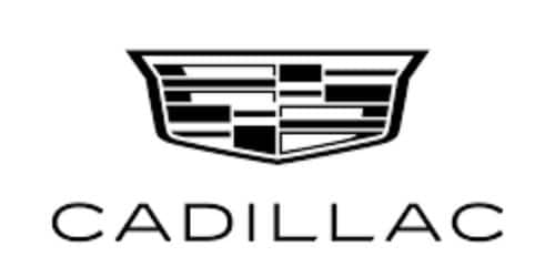
2021 – Today
The 2021 redesign took the cursive wordmark off the primary badge and changed the colors of the crest to black and white, making the Cadillac logo very simple and strong. The new logo is sharp and harsh, giving a sense of professionalism and excellence.
Cadillac Logo History
Cadillac was founded in 1902, which is more than 100 years ago today. That’s when the Cadillac logo history began. Since then, the evolution of the Cadillac logo has built on the idea of an image as a “family crest” for the company. Cadillac’s logo is often called the “wreath and crest.”
1906
In 1906, the Cadillac logo looked more like the symbol of a royal family than the symbol of a car company. However, the swans and parallel lines on the family’s shield showed that they were related to the royal counts of Toulouse.
However, the fancy circular frame and crown on top of the shield helped show that the company was a high-end one. At the bottom of the image was the wordmark “La Mothe Cadillac.” Between 1906 and 1955, there were different versions of this logo, including one with a circle of tiny crowns and fewer angles.
Also, in the early 1900s, the Cadillac “Standard of the World” logo was the one that stuck around the longest. This Cadillac emblem replaced the first wordmark with the name of the brand above the crown and “Standard of the World” written below.
1920
In the 1920s, Cadillac brought back the “tulip bulb wreath” from one of its earlier designs. The crown also changed a bit. It used to have nine points, but now it only has seven.
Also, in 1933, Cadillac tried to update its logo by adding a pair of sleek, angular wings on either side of the shield and getting rid of the circle and wreath. The colors of the legendary crests got darker, and the seven points on the crown got smaller. However, the wings were made with thin black lines, while the six swans on the shield stayed the same.
1939
At the end of the 1930s, the Cadillac emblems once again went in a different direction. The shield lost its wings and became a thin triangle with a long point. In this version of the Cadillac logo, the crown was also more noticeable.
In 1942, the team seemed ready to try out a whole new set of changes to the Cadillac logo, so they made the badge a completely different shape. However, in the 1940s, the logo took on an almost “Art Deco” look, looking like a crown with feathers. This was a new idea for Cadillac and for the car industry as a whole.
1948
However, the old Cadillac logo began to fade, and newer, more modern parts began to take their place. The shield was placed over a silver V and away from background decorations.
The sharp, angular lines of this Cadillac design helped the brand look more modern. In 1957, the new V-shaped Cadillac logo changed again. This time, it got a little wider. The crown changed its shape, and so did the coat of arms, making it harder to see the swans on the crest.
1963
In the history of the Cadillac logo, the design from the 1960s may be one of the most well-known ones. However, this new logo brought back the style of a wreath around the Cadillac shield in the middle. The Cadillac brand has kept this modern, sleek, and easy-to-remember look for more than 40 years. This is also where we first saw the colors that make the Cadillac symbol stand out.
2009
In 2009, another modern change was made to the Cadillac emblem. The picture was of a colorful crest inside a silver wreath. However, some of the colors on the crest were blue, fuchsia, and yellow. Details in black and white gave the design depth, making it look very textured in any marketing campaign. This Cadillac emblem’s color choices changed a little bit. Yellows and reds became softer and more classic.
2014 Cadillac Logo History
In 2014, the team decided once again to leave the wreath part of the Cadillac symbol out of the new design. In this logo, we see a much more futuristic image that had the coat of arms look almost like the grille on the front of a car. Most of the colors and shapes are the same as the old logo, but they are a bit more polished.
Even though the Cadillac symbol doesn’t always come with the wordmark “Cadillac,” there is a version of the symbol that does. When it is used, the Cadillac wordmark is written in a beautiful cursive font under the central shield.
What the Cadillac Emblem Means?
People have different ideas about what the Cadillac logo means. People say the corporation chose a wreath and shield to represent monarchy, excellence, and detail. However, the original coat of arms that the Cadillac team chose was based on the family crest of Antoine de la Mothe Cadillac, who gave his name to the company.
The Cadillac wordmark logo is not a must in modern applications. Even though this symbol is a little more complicated than some of the other car logos on the market, it is still easy to recognize. However, the depth added to the mosaic of colors in the shield of the Cadillac logo makes it look almost like a part of a car.
How Does the Cadillac Logo Look?
The font on Cadillac’s logo is easy to read. But again, if you look closely at the calligraphy-style writing, you can see that it has a font that is similar to the English 157 font. Also, Vladimir Yefimovi made this font for handwriting.
Cadillac Logo Colors
- Black Color: Black, the color of mystery, is one of the custom colors that Cadillac offers. In addition to the nameplate, it is also on the coat of arms. Black is a sign of class, power, and authority.
- Silver: The Cadillac logo looks like metal. This feeling is a result of the color silver, which stands for wealth and riches. Again, it’s a sign of sleekness, modernity, high technology, and the industrial world. Because it’s in the logo, it makes it look lively and fun.
- White Color: The logo has a lot of white in it. Without it, it would be hard for the Cadillac logo to make people want to raise their eyebrows. White is a neutral color that stands for cleanliness, simplicity, and modesty. Also, other brands use it to show purity, loyalty, and peace.
- Blue: Four of the checkers on the Cadillac’s famous crest are blue. color Blue is a popular color when it comes to technology and new ideas. It’s also the color that stands for the ocean. And it means peace, calmness, and loyalty.
- Gold is the color that is always used to mark the 50th anniversary. Three of the checkers on the Cadillac’s crest are gold. The color of precious metal is a sign of luxury, wealth, and wealth. But it can also stand for wealth and grandeur.
- Red Color: Four of the squares on the emblem are red in color. Red means courage, vigor, joy, and strength, among other good things.
Shape and Symbols of the Cadillac Logo
A Crown
A crown was used in most Cadillac logos. It was one of the most admired parts of the design. A crown is a sign that a king or queen is hungry. So it stands for glory, power, and being a noble person. Throughout history, kings, queens, and emperors used it to show who they were and how powerful they were.
A Wing
Sometimes, a company will use a wing to tell the story of its brand. In 1915, the first logo with wings was shown to the public. People often think of angels, fairies, and demons when they see wings. And wings are a symbol of strength, speed, and being free.
A Wreath
The laurel wreath is another well-known part of the logo that has done its job well. In 2014, the wreath went from being abstract to have a metallic feel. This shows how important it was to the business. Most of the time, a wreath represents the circle of life. It also stands for honor and victory.
Cadillac History
Henry Leland started Cadillac in 1902. He named it after Antoine de la Mothe Cadillac, who is also known as the founder of Detroit. Just 6 short years later, Cadillac brought the idea of swappable parts to the auto industry. So, Cadillac became the first American car to win the Royal Automobile Club of England’s prestigious Dewar Trophy. Cadillac chose the slogan “Standard of the World” after getting so much praise.
Cadillac is one of the world’s most admired and well-known brands. It is also the second oldest car company in the United States. And for more than 100 years, the American car brand has led and been the first to try out many new ideas in the car business. That’s why it’s mostly about expensive cars. Also, Cadillac’s founder, Henry Leland, used the city’s coat of arms as the company’s logo.
This trademark, which came out in 1902, is different from the logo we use today. Today, the 2014 Cadillac logo looks classy because it only has the refined crest. You can see its charm in colors like silver, white, red, yellow, blue, and black.
Find Out More
In 1910, Cadillac was the first company to make a passenger car with a fully enclosed cabin. This was a big change from the cars of the time. In 1912, the company made the Model Thirty, a car that didn’t have a crank. It was the first mass-produced car with an electronic self-starter, ignition, and lighting system.
By getting rid of the crank starter, Cadillac made it possible for women to drive and brought the prestigious Dewar trophy back to Detroit. This made Cadillac the only car company to win the award more than once. Almost three years later, Cadillac introduced the V-shaped, water-cooled, eight-cylinder (V8) engine, which would become the brand’s signature.
Why Did Cadillac Have Ducks in the Logo?
The ducks are actually Merlette swans, and they were part of the first Cadillac logo. The swans come from the family crest of Antoine de la Mothe Cadillac. They are a knightly symbol that dates back to the Crusades. The other three swans show the lineage of the explorer’s mother, and the other three show the lineage of his father.
Is Cadillac a luxury car?
Cadillac is a brand of a luxury car that makes and designs high-end luxury cars. In the early 1900s, Cadillac became the best luxury car company in America because it was at the forefront of technological changes.
What Animal Is on the Cadillac Logo?
Merlettes: People often call these birds “the ducks.” They appear in groups of three to represent the Holy Trinity, with three on one side representing the noble lineage of the mother and the other three representing the noble lineage of the father. They have been using the birds since the time of the Crusades.
The Cadillac coat of arms doesn’t have a shield like a car’s logo. Instead, it was completely round and had three merlettes (birds), which were a sign of knightly service in the Crusades. It also had a black bar (or “fess”), which was also a sign of service in the Crusades, and a red band, which meant that the person was brave.
Why Did Cadillac Get Rid of the Ducks?
The Merlettes took off the crest about 10 years ago to make it look more like the new generation of Cadillac cars.
Why Did Cadillac Remove the Wreath?
The objective was to modify the design of the emblem so that it fit with the new shape of the vehicle while keeping the core graphic elements that make it easy to recognize.
When Did Cadillac Remove the Ducks?
In 2000, when Cadillac introduced its sharp-edged Art and Science design language, there was a change in the crest. The coat of arms became more geometric, and they took off some details, like the swimming ducks on the crest.
When Did Cadillac Stop Using the Wreath?
The wreath was one of the parts of the Cadillac logo frequently in use. But it didn’t come up again after the year 2000.
What Was the Old Cadillac Emblem?
Detroit: The Cadillac Crest, one of the most famous symbols in the car business, comes from the coat of arms of Le Sieur Antoine de la Mothe Cadillac, who founded the city of Detroit in 1701.
It was an instantly recognizable symbol with a crown, crest, ducks, parallel lines, and a wordmark in 1902. The designer kept all of these parts together in a fancy circle. This frame looks like a chain of petals, and it was in charge for about three years.
Conclusion
Cadillac is an American luxury car brand that has been around since 1902 and is now owned and run by GMC. It is one of the most well-known high-end car companies in the world, and each year it sells about 400, 000 cars. Since the beginning, Cadillac has tried to make only the best-looking and best-made cars.
Related Articles
- List of the Best NET 30 ACCOUNTS FOR NEW BUSINESS in 2023 (Updated)
- POULTRY BUSINESS: Beginners’ Guide to Launch a Lucrative Poultry Business
- NEW KIA LOGO: Why Kia Changed Their Logo & Best Branding Practices
- Best Gel Nail Polish Brands: Comprehensive List Of The Best Brands
- ROLEX LOGO: Meaning, and the Whole Story About the Famous Crown on the Logo
