You’ve probably come across a Gap or one of Gap’s seven brands at some point in your life. Gap has a strong marketing and media campaign; their stores can be found in practically every mall or shopping center; you or someone you know almost certainly has a piece of Gap clothing, and their emblem is entrenched in your memory. Even if you aren’t a big Gap fan, you are familiar with the brand. And you’re familiar with the brand because its emblem is everywhere. Every recognized logo has a story about how it came to be, and Gap has a fantastic one!
Continue reading to learn more about not only this legendary brand but also the story behind its logo’s history and how a simple logo created in 1969 has evolved to become one of the world’s most recognizable trademarks.
Overview
Gap Inc.’s wordmark is black and white. It’s one of the most recognizable logos in the apparel industry. It has some key characteristics that make it effective: it is simple, readable, memorable, and versatile. The company debuted it in 2016, with only uppercase letters.
The original Gap logo, on the other hand, emerged in 1969. It was also a wordmark that used a black-and-white color scheme. In contrast to the present logo, the designer used lowercase letters. Furthermore, this trademark had a slanted article—the above it. It serviced the company for roughly seven years.
Gap has had five logos since its inception in 1969. However, the modifications were small, and the personality remained stable. The corporation launched its fourth logo in 2010, but it received significant outrage. As a result, it reigned for only seven days before succumbing to its predecessor.
The Gap logo is the face of Gap Inc. Mr. and Mrs. Fisher raised approximately $63,000 in order to launch this garment line in San Francisco. With their Levi’s trousers and records, they first catered to a younger audience. As demand grows, they quickly expand into new markets.
Despite the fact that they have closed certain locations in the United Kingdom, they are still present in France, Canada, Brazil, Ireland, and other countries. The concept of “Generation Gap” inspired the moniker “Gap.” Sonia Syngal currently serves as the company’s Chief Executive Officer.
The Evolution of the Gap Logo and Its Incredible History
The Gap logo has evolved four times in just over five decades. The initial logo debuted in 1969, while the first modification occurred seven years later. Then came the subsequent modifications. That occurred in 1986, 2010, and 2016. However, something remarkable occurred in 2010.
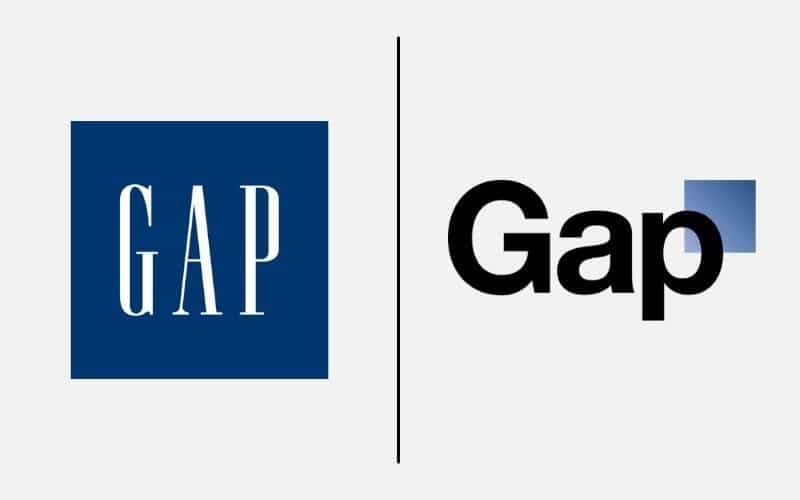
The Gap logo for 2010 was developed by Laird and Partners. And it was revealed on social media by Gap management. Then, unexpectedly, professionals and customers spoke out strongly against it. As a result, Gap reverted to its 1986 logo style. After laying the groundwork, let’s look into these updates.
The Meaning of the Gap Logo and the History of the Gap Logo
The Gap logo has only been altered four times since its inception in 1969. When you look at the logo history below, you’ll notice that while the first three updates changed the logo, the final update was a return to the 1986 logo.
The Gap logo has continually focused on simple aspects over the years. The corporation has always used a wordmark as the focus point, with no other visual components added.
Below, we’ll look at the evolution of the logo as well as each of the components that make up this simple design.
1969-1976: The First Gap Logo Design
The first Gap logo was unveiled in 1969. This logo featured a slightly tilted lowercase wordmark. The “the” was above the “gap,” and if you look closely, you’ll notice that the “g,” “a,” and “p” each form an even-sized circle. At the same time, the lines on each side of the letter make them appear slightly different. This one-color logo was used until 1976.
1976-1986: The Gap Logo in its Second Incarnation
In 1976, Gap unveiled the second iteration of its logo. This updated logo was similar to the original logo, but the tilted lettering was removed. Instead, the “the” was straightened out, giving this logo a bold appearance. The first logo lasted seven years, but this one lasted ten.
The Third Version of the Gap Logo Was Used From 1986 to 2010
The company’s logo underwent another redesign in 1986. This one was done in a different style than the previous two. Gap chose to put a white wordmark inside a blue square for the third iteration. Unlike the previous wordmark, which was written in lowercase letters, this time the wordmark was written entirely in uppercase letters. Another change was the deletion of the word “the.” The logo was changed to simply “GAP,” and with it came a new nickname: “Blue Box.”
The Fourth Version of the Gap Logo Was Used From 2010 to 2016.
While the third logo lasted nearly 25 years, Gap hired Laird and Partners to update their logo for the third time in 2010. Following a decline in revenue, Gap believed that redesigning its logo would help to restore sales. The blue square was retained in this version, but unlike the previous one, the wordmark was placed in front of the square. The wordmark remained bold, but the frame became less visible. Following the release of this update on social media, there was a lot of criticism from experts and consumers about the change and the look of the new logo. Gap returned to its 1986 logo design after a week to appease its customers.
2016-Present: The Fifth (And Most Recent) Version of the Gap Logo
The final logo update occurred in 2016, and the result was the logo we know today. With only one minor change, this iteration retained many of the prominent features of the iconic 1986 (and 2010-2016) version. Because of this removal, there is now more white space between the serif font letting. The logo managed to stand out despite using a monochromatic color palette.
Colors and font
The corporation’s trademark exemplifies minimalism. It captures Gap’s essence because it only shows the name of the store chain without any unnecessary decorative elements.
The font used in the logo is very similar to Ann Pomeroy’s Spire Regular. Because the designers worked with serifs and stroke weight, this is an adapted version.
Colors of the Gap Logo
The color scheme is as simple as the logo’s structure. Previously, there was a large dark blue square behind the inscription until 2016, but now the background is white. The word “GAP” is black in contrast.
The color black:
The color black represents mystery. It’s also a neutral color that represents elegance, formality, and authority. These are some of its positive emotions. However, it can also convey the energy of fear, evil, death, and sorrow. The gap appears to enjoy using this amazing color.
The color blue:
Blue was introduced by Gap in 1986 and reigned for a long time. Blue conjures up images of the sky and the sea. It conveys the spirit of loyalty, safety, and stability effectively. It also represents serenity, trust, and tranquillity. Blue is the most popular color in the branding world.
The color white:
White, like black, is a neutral color. It has a prominent place in the Gap logo. Its presence balances the other essential colors used by Gap. White represents positive energy in most cultures. The color of heaven, once again, represents goodness, humility, simplicity, and loyalty.
Why Does the Gap Logo Work?
The Gap Logo Is Easy to Recognize:
The Gap logo works because it is simple. Minor design elements are used to convey key messages. It can also easily take on different colors. Take this humble route if you want an effective logo. Remember that using too many elements will not help your brand.
The Gap Logo Can Be Read:
Gap Inc.’s logo is a wordmark. It’s basically readable. It was also created with the end-user in mind. That is why it is effective. The Gap logo is easily identifiable on any medium. While you own the logo, you created it for your target audience. Never, ever forget this!
The Gap Logo Is Easy to Remember:
A powerful logo is always memorable. And the Gap logo is just one example. Customers will remember it because it has a clean personality. Choose a simple logo design to imprint your brand on the minds of your customers. Keep in mind that simple logos will save you a lot of money.
The Gap Logo Is Multipurpose:
The Gap logo is useful because it is adaptable. It can be tailored to fit all marketing channels. It can dazzle from outdoor to print to digital with ease. Remember that you have several platforms to improve your brand’s identity. Take advantage of this!
The Gap Logo Is Classic:
No savvy business owner would create a logo for the sake of profit. You should not do the same. There are no trendy elements in the Gap logo. That is why it is so effective. Avoid using trendy graphic elements to achieve this level of quality. In the end, you’ll be glad you listened to this piece of advice.
Gap’s History
1969: Gap Inc. is Created.
Donald and Doris Fisher launched Gap Inc. in San Francisco, California on April 21, 1969.
1970-1973: Gap expands its shop network and establishes a corporate office.
Doris and Donald opened their second store in San Jose in 1970, just one year after launching their first. This second store was 6,600 square feet in size, with half of the space dedicated to inventory storage. After barely four years in business, Gap opened around 25 retail stores by 1973.
Gap established its corporate headquarters in Burlingame, California, in 1971.
1972: The Gap logo is trademarked.
While the company’s original logo emerged in 1969, the logo was not trademarked until 1972. This monochrome logo has become one of the most widely recognized trademarks in the country, therefore Gap needed to trademark it. On February 29, 1972, Gap filed a patent application with the United States Patent and Trademark Office. On October 10, 1972, the application was approved, and the Gap logo was legally registered. While their logo has varied over time, the present one is likewise trademarked, hence none of their logos are in the public domain.
1974: Gap boosts its inventory.
Gap began selling private-label products five years after its founding.
1976: Gap goes public.
Gap went public in 1976 as a result of its expanding success and continued growth. When the company went public, 1.2 million shares were priced at $18 each. This move forced Gap to adopt an expansion strategy, thus they continued to grow and grew to encompass two retail chains.
1983: Gap acquires the Banana Republic.
The Banana Republic in 1983 was not the Banana Republic you know today. It was a safari and travel-themed retail store with two locations back then. Gap took an interest in them because they were also based in California and purchased the store in 1983.
A year later, Gap debuted its signature pocket-t-shirt in 21 different colors. Two years later, Gap opens its first Gap Kids store in San Mateo, California.
1991: Gap discontinues the sale of Levi’s items.
While Gap’s collaboration with Levi’s helped create the company, Gap officially discontinued selling Levi’s clothing in their stores in 1991.
1999 Till Now: Gap’s new leadership and publicity.
The San Francisco Chronicle honored Gap “Company of the Year” in 1999. This aided them in increasing sales and expanding further.
Donald stayed on the board until 2004, serving as Board Chairperson. Donald passed away in 2009, and his family took over the management of Gap. Gap is now led by Sonia Syngal, the company’s CEO.
Obstacles in the Way
Gap, like most businesses, has faced comparable challenges such as navigating competition, purchase negotiations, and partnership agreements. Gap has encountered a particular barrier due to its distinctive logo. Gap’s logo was never severely altered, but following a fall in revenue, they decided to remodel it more dramatically in 2010. The unforeseen barrier they discovered was that their customers despised the revised logo and resorted to social media to express their displeasure. This forced Gap to revert to their previous logo, which they had to re-release to their customers.
Is the Gap logo trademarked?
The Gap logo does not belong in the public domain. On February 29, 1972, Gap filed an application with the United States Patent and Trademark Office. Gap’s application was approved by the office on October 10, 1972. Despite the fact that this information pertains to the first trademark, the current one is also registered. To utilize this mark, contact the brand owners to avoid legal complications.
In what font is the Gap logo?
The Gap logo has employed legible fonts throughout its existence. For example, the Helvetica font was employed in the 2010 logo design. It was clear, readable, and assured. The typeface in the current edition, however, is similar to Spire Regular. Ann Pomeroy created this serif typeface with clarity in mind.
What’s the Story Behind the Gap Logo?
You’ve asked a delicate question. So, let’s go back in time a little. Gap was founded in San Francisco in 1969. It was a time when sexuality was a prominent problem in the United States. Sodomy laws were strictly enforced. People were gay and proud despite the law and stigma.
As a result, several individuals associated the term with the brand. To them, Gap stood for Gay and Proud. While it appears to be true, it is not. Gap refers to the generation gap that existed during the time, primarily in clothing preferences.
Clothing companies, for example, sell things that do not appeal to younger customers. As a result, the unmet demand-supply imbalance sparked the creation of Gap as a clothing line. In a nutshell, Gap means to fill a void. Yes, Donald and Doris Fisher exploited their brand to bridge the generational divide.
What Caused Gap to Change Its Logo?
A company’s logo may be changed for a variety of reasons. Examples include outdated logos, sales effects, expansion, mergers, and so on. Furthermore, Gap identified the necessity to update its visual aid in 2020. First, they felt the logo had served them well for nearly two decades. As a result, it required some retooling.
Second, income decrease compelled them to replace their graphic emblem. As a result, they commissioned Laird & Partners to rework their logo. So they obtained a wordmark with a square behind the letter P. Unfortunately, it did not win over fans’ hearts. As a result, Gap reverted to its original logo.
How Did the Gap Begin?
The Gap Inc. is a clothing company based in the United States that was started on August 21, 1969. It was founded in San Francisco, California by Donald and Doris Fisher. The company has a worldwide presence. According to legend, Donald Fisher was inspired by the popularity of the Tower of Shoes.
He consulted with Walter Haas Jr., president of Levi Strauss & Co., about replicating its business strategy. Walter referred him to Bud Robison, his Director of Advertising. Both guys collaborated on a legal strategy, which resulted in the establishment of Gap. The name Gap was created by Doris Fisher.
Donald agreed to sell solely Levi’s products as part of the agreement. Similarly, Robison agreed to pay a 50% advance on radio advertising for the Gap. He promised to keep the Gap store stocked at all times. The Fishers used this deal to open their first store near City College in San Francisco.
Read Also: APPLE MUSIC LOGO: History, Evolution & All You Should Know
They inserted LP recordings beside Lev’s clothing to attract young shoppers. The Gap then launched its second store in San Jose. Approximately half of the 6,600 square feet was used to stock merchandise. Finally, in 1971, Gap established its corporate headquarters in Burlingame, California.
By 1972, Gap had established 25 stores. Gap then began offering private-label products in 1974. Finally, the company went public in 1976. It sold 1.2 million shares at $18 a share. In 1977, Gap announced two shop chains: Logo and Brands, as part of its expansion strategy.
In 1983, Gap purchased Banana Republic. It was a safari and travel-themed retail store with two locations. It began in Mill Valley, California. The company then released the iconic Pocket—T in 21 colors in 1984. Gap built its first kids’ store in San Mateo, California, two years later.
In 1991, Gap discontinued selling Lev’s clothing. The San Francisco Chronicle then awarded Gap the company of the year eight years later. Fisher then stepped down as board chairperson in 2004. Unfortunately, he died in 2009, leaving the company in the hands of his family.
What is the size of Gap Inc.?
Gap Inc. is a worldwide clothing conglomerate based in the United States. It operates in Canada, the United Kingdom, China, Japan, and Ireland. France, Mexico, Taiwan, Italy, and Hong Kong are all represented. Old Navy, Gap, and Banana Republic are among the company’s seven primary brands.
Athleta, Intermix, Janie $ Jack, and Hill City are also likely to be found. Gap employs 117,000 people worldwide as of 2020. This is a 129,000 decrease from the prior figures. In addition, the corporation runs 3,100 outlets worldwide.
In 2020, these locations contributed $13.8 billion in net sales for the company. Sonia Syngal, the CEO of Gap, currently oversees a brand valued at $9.28 billion as of September 29, 2021. Despite its difficulties, it remains one of the world’s largest and most famous clothing brands.
What Is the Meaning of Gap?
Doris Fisher, a co-founder of Gap Inc., chose the company’s name. Initially, it was difficult to find clothing for young clientele. Fortunately, the couples discovered a one-of-a-kind gap in supply and demand. As a result, they set out to bridge the generation divide by focusing on the younger generation. In short, Gap is a reference to the generation gap rather than an acronym.
What Gap Looks Like Today
Gap Inc. has steadily developed to become the retail clothes tycoon we know today in the 50+ years after it was started. Gap and its logo have a global presence not only in the United States, but also in Canada, the United Kingdom, China, Japan, France, Mexico, Taiwan, Italy, Hong Kong, and Ireland.
Beyond Gap, the Gap Inc. brand includes six key brands: Banana Republic, Old Navy, Athleta, Intermix, Janie and Jack, and Hill City. In 2020, these brands will have produced $13.8 billion in sales. In addition, Gap reported 117,000 employees worldwide in 2020. It’s worth noting that this is a decrease of 129,000 from prior years, yet the corporation is still operating strong and runs 3,100 locations worldwide. Despite a drop in physical shop locations, Gap remains one of the world’s largest and most well-known clothing brands.
Sonia Syngal, the CEO of Gap Inc., currently leads the company. Gap Inc. had a stated net worth of $9.28 billion as of September 29, 2021.
Lessons from the Gap
When it comes to redesigning, Gap is a firm that we can all learn from. Because they haven’t made dramatic modifications to their emblem and yet it is instantly identifiable around the world, what they’ve done is effective! So, what did they do?
For starters, Gap has kept its logo simple. Their designers have always employed simple design components to accentuate the brand’s messaging. Other companies choose a variety of elements, and as a result, their messaging is frequently missed. Second, their wordmark and font selection make their brand extremely legible. The logo is easy to read no matter what medium it is printed on! Along the same lines, it is highly adaptable and may be easily scaled up or down.
Above all, the Gap logo is iconic and ageless. The clear features allow consumers to instantly identify the identity, and because the designers avoided trendy components, the logo has withstood the test of time.
In Conclusion,
Donald and Doris Fisher started Gap in 1969 in San Francisco, California. Their inspiration originated from being unable to find a pair of pants that fit. So, with a seed fund of $63,000, the pair built their first store. They put it on Ocean Avenue in San Francisco and sold Levi’s pants and LR albums.
Doris Fisher gave the name Gap. It also refers to the generation gap. In 1970, the Fishers opened their second store in San Jose. They had roughly twenty-five outlets by 1973. Furthermore, the success of these locations prompted the Fishers to service customers outside of the United States.
Gap currently operates seven brands. Gap, Banana Republic, Old Navy, and Intermix are among them. Athleta, Janie and Jack, and Hill City round out the list. Despite the decline in its workforce, Gap continues to employ 117,000 people. It also has over 3,100 stores worldwide.
Related Articles
- Resource Management: Definition, Importance, and Planning
- GAP HEALTH INSURANCE: Coverage, Plans, & What You Need!!!
- Sales Pitch: How To Write Sales Pitch (+Detailed Examples)
- USED CAR INSURANCE: What It Is And How It Works
- PAY EQUITY: Importance of Pay Equity Policy
