RAPP Motorenwerke was started in 1913. It is a famous car company that is now best known for making engines for airplanes. In 1916, it changed its name to Bayerische Motoren Werke, or simply BMW. So, it makes sense to start talking about the history of the BMW logo by talking about the RAPP version. This article would shed more light on the meaning of the BMW logo to you. Read along.
The History of BMW
The Bayerische Motoren Werke was started in 1917. It is also known as the Bavarian Motor Works (BMW). The aviation engine firm Rapp Motorenwerke, which had its headquarters in Munich, the state capital of Bavaria in southern Germany, was renamed to become BMW. Despite the name change, the technological assets, assets, and original workforce all stayed the same.
There was no corporate logo when the name BMW was first entered into the commercial register in July 1917. The first ad from the same month didn’t have any BMW logos or symbols on it either. However, it did include its future intended product line, which included engines for cars, farms, and boats alongside aircraft engines.
History of the BMW Logo
This is a history of the BMW logo and how it changed over the years. Read through to find hidden things you don’t know about the BMW logo.
The BMW Logo Today
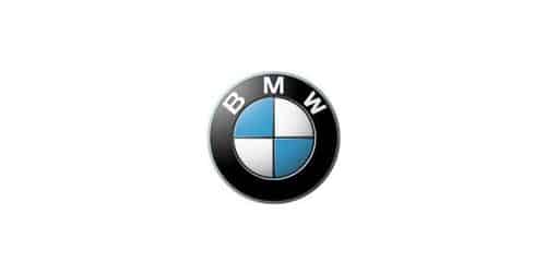
The current BMW symbol consists of a badge with two circles on it. The BMW logo’s inner circle is decorated with a white and blue check pattern. You can see the letters “BMW” on a transparent background in the larger circle surrounding this core image.
The BMW logo is also written in a straightforward sans-serif font using only capital letters.
BMW has long had a logo that is quite similar to those of several other well-known automakers. All BMW products, including the vehicles themselves, now bear the white and blue logo. The “BMW roundel” is the name of the emblem, according to the official BMW brand.
BMW Logo Over the Years
Over the years, the BMW logo hasn’t changed all that frequently. Even though the business has occasionally changed how it looks, the evolution of the BMW logo makes it simple to trace the design’s roots back to the automaker.
In 1916, the BMW logo’s first iteration was created. This is a lot like the famous blue and white symbol that is used in the current design.
BMW Logo (1913)
The RAPP logo was made in 1913. It was a round medallion with a thick black border. Inside the medallion were two thin white stripes and two white stars. The wordmark “RAPP MOTOR” was in capital letters.
A black horse’s profile was also seen inside the circle. The ceramic chess knight was also tilted to the left.
BMW Logo (1916)
The color choices make a big difference between the current BMW logo and the one that was formerly used by BMW. In this instance, the BMW lettering is written in gold, with both the circles and the fonts of the BMW symbol on a black background.
Here, the font has also seen a slight change. Like many older businesses, BMW decided on a serif typeface to project elegance.
In 1923, the company tried out gold lines that were thicker and script that was much bigger. However, this led to a small change in the pattern.
BMW Logo (1936)
One of the biggest alterations to the BMW logo was done by the company in 1936. To meet the growing demand for a chrome, futuristic look, the golden decorations were switched out for silver ones. A slightly lighter shade of blue was used in the core white and blue motif.
The silver edges of the logo from the 1930s were much thinner, which made the black circle around the core design look more important. The “BMW” font’s lettering was now in a classy gray with more pronounced serifs.
BMW Logo (1963)
In the 1960s, BMW updated its appearance with a more contemporary BMW logo symbol. The letters were changed from serif to sans-serif in a strong white font, and the badge’s edges became more defined. Once more, the hues in the center circle altered, this time to a deeper shade of blue.
A thin double white-and-black line was also used in place of the silver framing that surrounded the BMW sign to create a cleaner appearance.
BMW Logo (1970 – 1989)
The second logo design for the well-known German carmaker was created in 1970. It was a vibrant and colorful badge with the official emblem from 1963 centered within a larger circle made of thick lines in various shades of blue, white, and pink.
BMW Logo (1997 – 2020)
The BMW logo which is the most recognizable and distinctive was designed in 1997 and stayed in use until 2020. But even when the new design is introduced in 2020, the old badge continues to be shown on the iconic German cars’ bonnets.
The 1997 design is a three-dimensional circle with a thick black edge and a silver-gray outline around a white nameplate. The segments of the propeller are now divided from one another by the black lines in the inner blue and white designs. This gives the logo a rigid, modern, and polished appearance.
BMW Logo (2020 – Today)
In 2020, the company changes to a minimalist style and makes its logo two-dimensional instead of using black. The blue and white checkered circle now has a thin gray outline and a thick white frame around the gray “BMW” written in a contemporary, somewhat enlarged typeface.
The sleek and modern look of the BMW logo shows how the brand has grown and how willing it is to move into a new era.
The BMW Logo Features Inverse Bavarian Colors
Nevertheless, the new organization was given a logo on October 5, 1917. The original Rapp logo’s round shape was carried over into this round BMW insignia, which was filed in the German Imperial Register of Trademarks. On the outer ring, which was now surrounded by two gold lines, the letters BMW were written.
The company’s emblem was also supposed to have a representation of Bavaria; the colors of the State of Bavaria—white and blue—are displayed in the quarters of the inner circle on the BMW logo. However, their order is reversed (at least as far as heraldic rules are concerned, where you read clockwise from the top left). At the time, the local trademark law said that state coats of arms or other signs of sovereignty couldn’t be used in commercial logos. This is why the blue and white in the BMW logo are in the wrong order.
What Is the Meaning of the BMW Logo?
White and blue, the colors of the German state of Bavaria, where BMW is based, are the first clue to the logo’s meaning. The BMW logo, complete with the four colored quadrants, is shown on a spinning airplane propeller in a 1929 BMW advertisement. Since then, the idea that the BMW logo symbolizes a propeller has persisted.
Where Does the Propeller Myth About the BMW Logo Come From?
Even now, many individuals still think that the BMW logo shows a rotating propeller even now. Why is that? Years after the debut of the original business emblem, the tale of the BMW propeller emerged. A 1929 BMW advertisement featured an airplane with the BMW logo embedded in the propeller. The advertisement was attempting to market a new airplane engine that BMW was manufacturing under license from Pratt & Whitney during the start of the world economic crisis. The interpretation of the propeller, which highlighted the firm’s roots and its skill in aircraft manufacturing, blended extremely well with the advertising image of the fledgling company.
BMW Logo Colors
The primary components of the BMW logo have largely remained the same over time. Since the beginning, the company has used circles as its main shape and the colors of the Bavarian flag as its brand.
But there have been a few changes to the font’s color and the logo’s surrounding outlines.
The white and blue of the Bavarian flag, with the colors, switched to stay in line with trademark laws, are the most important colors for the BMW logo right now. BMW sometimes changes the shade of blue it uses, but the overall color scheme of the company stays the same.
BMW’s font color is either white or silver right now, although in the past it has alternated between silver, gold, and white hues.
What Font Is the BMW Logo?
Many facets of the BMW logo’s font haven’t changed over time, just like the logo’s overall style. BMW, like many other businesses, realized how important it was to give its clients a “modern” impression, so it switched from its original serif font to a sans-serif one.
The original font had a striking design that was often printed in gold or silver. The typography changed with the company, becoming cleaner and more contemporary. Though BMW claims the type isn’t exactly the same as the original Helvetica typeface, the font for the BMW logo is occasionally referred to as Helvetica.
Symbol
Nearly 90 years after the firm was founded and the logo was designed, people disagree about the symbolism of the BMW logo today.
An airplane rotating quickly against a background of blue sky is the first and most obvious metaphorical significance of the image.
However, there is another chess-related symbolic reason behind the design. In fact, the founders of BMW were able to “outplay” competitors and the winners of the First and Second World Wars. They were also able to keep and grow production, even when things were hard.
Why Does the BMW Logo Works?
Here are some reasons why the BMW logo works:
#1. The BMW Logo Is Simple
Customers praised the BMW logo for being so straightforward. The logo’s message isn’t cluttered by any excessive design features. People don’t need much time to figure out the meaning of the logo because it is clear and recognizable.
#2. The Logo Is Memorable
Like other iconic symbols, the BMW logo is instantly recognizable. Anyone can memorize the visual symbol thanks to its simple design and minimal graphic elements: a circular frame, typography, two colors, and quadrants.
#3. The Logo Is Attractive
Humans are drawn to attractive things and enjoy being around them. The understated blue and white logo is balanced, appealing, and simple to look at. People are drawn to it because it is visually appealing wherever it appears.
#4. The Logo Is Unique
Most people are aware that the BMW logo design was influenced by the Rapp Logo. The two symbols are different from one another, though. There is no visual identity in the branding industry that resembles BMW distinctive design. The logo also stands out from the crowd and is distinctive.
#5. The Logo Is Versatile
A logo needs to be adaptable in order to reach more consumers. The BMW logo is easily scalable across all marketing platforms. This is so that it may fit on any channel without losing its quality and brilliance thanks to the logo’s simple structure.
What Is the New BMW Logo?
The previous BMW logo, which was unveiled in 1997, has been replaced by the new flat one. The trademark black ring that has ringed the company’s emblem since it was initially registered in 1917 has been replaced with a transparent ring, allowing it to change color and pattern depending on the background.
Are All the BMW Logos the Same Size?
BMW logos are not only not all the same size on one model, but they are also not all the same size on different models. As a result, the steering wheel emblem and wheel badges are even smaller than the trunk badge, which is smaller than the hood badge.
The BMW Symbol and Shape
Let’s talk about the BMW shape and symbol. Be ready to get the information you need about them.
#1. Circles
BMW seems to have a circle of addiction. Since its inception, circular frames have been the main components of its logo. Circles are frequently used in graphic design to represent unity and infinity. It stands in solidarity with the extended family of devoted clients it serves. It also represents the company’s lengthy existence of roughly 105 years as a mark of infinity.
#2. Quadrants
The four quadrants created a distinctive sign that resembles an airplane propeller, despite being dismissed. This story has a close connection to the company’s history as a manufacturer of aviation engines. Another perspective shows that the inner blue and white quarters resemble chess pieces. It represents a tactical choice made by the company’s directors to compete with other significant companies in the automobile industry.
The BMW Logo Colors
Colors provide nonverbal messages to those who are aware of psychology. Therefore, the BMW logo designer incorporates a couple of them to convey the brand’s individuality. Let’s quickly review three of the colors used in the logo below:
#1. Black Color
The BMW brand is viewed as elegant, opulent, and powerful by car enthusiasts who are aware of the feelings that colors evoke. Why do you think this? since these emotions are associated with the color black. The color can also convey power, neutrality, and simplicity.
#2. Blue Color
Buyers of automobiles seek out brands that can guarantee their comfort, safety, and dependability. In order to let them know that it understands their anxieties, BMW selected the hue of the sky. Blue is a symbol representing assurance, peace, and tranquility.
#3. White Color
White balances out the other colors—black and blue—on the BMW logo. Purity, cleanliness, and goodness are connoted by color. White can also represent purity, wholeness, and safety. The color designer used to add negative space to the logo is a fantastic decision.
The whirling airplane blades that make up the BMW logo’s center portion represent the company’s early background in aviation technology.
Who Started BMW?
BMW is a renowned automaker with headquarters in Munich, Bavaria, Germany. This well-known company, which makes some of the best vehicle brands in the world, was started by three people. Karl Rapp, Franz Josef Popp, and Camillo Castiglioni are all present here.
In Ehingen, Germany, on September 24, 1882, Karl Rapp was born. He established the aero-engine manufacturing business, Rapp Motorenwerke. Most people consider him to be an indirect founder of BMW because his business became BMW AG. He passed away on May 26, 1962.
Franz Josef Popp was born in Vienna, Austria-Hungary, on January 14, 1886. He served as BMW AG’s first general director from 1922 to 1942. He contributed to laying the company’s groundwork. Franz passed away on July 29, 1954, in Stuttgart, Germany.
Camillo Castiglioni comes next. On October 22, 1879, he was born in Trieste, Austria-Hungary. Many people believe Camillo to be an Italian-Austrian. He was the richest man in Central Europe and the funder for BMW. He passed away in Rome, Italy, on December 18, 1957.
How Did BMW Begin?
BMW was formed by the merger of three different companies: Rapp Motorenwerke, Bayerische Motorenwerke, and Fahrzeugfabrik Eisenach. It all began in 1913 when Karl Friedrich Rapp founded a business specializing in the construction of aviation engines.
The company built aircraft engines for the Prussian army, which placed an order for roughly 600 engines. However, due to misunderstandings, Karl Rapp was ejected from the company, and soon after, it adopted the name Bayerische Motorenwerke.
The business produced its first item, the BMW IIIa, in 1918. Due to a limitation on the production of aviation engines following World War I, the company instead produced motorcycle engines and railway brakes. BMW produced its first motorcycle, designated R 32, in 1923.
BMW acquired Fahrzeugfabrik Eisenach in 1928, allowing them to expand into the auto industry. The majority of its first automobiles were produced in this German facility in Thuringia. A license from the Austin Motor Company allowed for the first tiny BMW to be produced in 1929.
Part of the BMW factory was destroyed following World War II, and the remaining portions were forbidden from producing either automobiles or motorcycles. However, the company concentrated on making bicycles, pots, and pans out of recycled materials.
BMW received approval to manufacture motorbikes in 1947, and five years later the company started producing automobiles. The R 24 was the first motorcycle produced after the war, and the BMW 501 was the first automobile.
The company’s situation was terrible in the middle of the 1950s. The corporation reformed thanks to short-term government assistance and Herbert Quandt raising its stock. At the 1961 Frankfurt Motor Show, BMW unveiled the 1500 model under Herbert’s direction.
The Propeller Myth
This myth originated from a 1929 BMW advertisement that featured an airplane propeller moving while bearing the BMW emblem. However, this was many years after the debut of the company’s first logo.
How Big Is BMW?
BMW is one of the international brands that are focused on producing and marketing luxury and sports cars on a global scale. It has 31 manufacturing and assembling plants spread over 15 nations. Germany, Mexico, China, and the USA are just a handful of these countries.
Its brands include BWM, MINI, and Rolls-Royce, among others. The business overtakes other premium automobile manufacturers in the world because of these brands. As of December 2019, it had a global workforce of around 126,016 employees across approximately 140 countries.
BMW was ranked as the 61st global brand in 2020, according to the Statista Research Department research, with a market worth of roughly $20.5 billion. 2,564,025 cars were produced by the corporation in 2019; this production capacity generated €104.2 billion in income for the business.
What Does BMW Stand for?
Bayerische Motoren Werke GmbH, or BMW, is a corporation that has been building vehicles, motorcycles, and aircraft engines since 1917. Rapp-Motorenwerke in Munich is transformed into BMW as a successor company, and BMW is registered twice.
Who Owns BMW?
The BMW Group is made up of premium model lines and BMW brands. The Quandt family and the general public share ownership of the international German automaker. Stefan Quandt, Susanne Klatten, and the general public jointly own 50% of the company. Stefan Quandt owns 29%.
“Attitude-based communications”
While BMW has benefited from its image as a status symbol, it is now looking for new customers who have different ideas about what a car should be. According to Mielau, the typical BMW client is a “business athlete.” He characterizes this as a “well-educated individual” who used his car to signal his “status” in society.
However, Mielau thinks that in the future, “people want to say more than just: I’ve made it.” BMW buyers in the “new generation” are far more “diverse.” It contains “younger customers, female customers, and non-typical business clients.” Mielau claims that will have an impact on the brand’s long-term strategy, however, specifics are not yet clear. They are “something you haven’t seen and perhaps hadn’t even expected from the brand,” he merely states.
The company also intends to create more editorial content in the near future in order to appeal to these new audiences.
BMW just revealed a partnership with the esports team Cloud 9. Esports, or videogame-based events, reach a completely new demographic; “we’re actually talking about digital natives.” They have different expectations for cars and mobility than professional athletes, he continues.
BMW wrote a piece about the 30th anniversary of the Berlin Wall’s fall in October of last year. It detailed the tale of two buddies driving a customized BMW Isetta out of East Germany.
Adopting this “attitude”—supporting people’s right to freedom—adds a unique element to the brand and demonstrates that “it’s about people,” according to Mielau. It links in nicely with the newly translucent logo, an effort to establish a brand that is both more open aesthetically and conceptually.
Is the BMW Logo an Aircraft Propeller?
The most contentious matter confronting the company is the genuine significance of the “sky blue and white quartered” BMW logo. There are two traditions around the meaning of the BMW logo and trademark, presenting two alternative interpretations of its sky blue and white fields, according to Dr. Florian Triebel, Executive Board Member of BMW AG. One interpretation suggests a propeller in motion. The other links the BMW logo to Bavaria as the location of the goods’ production.
According to legend, the round shape of a revolving airplane propeller served as inspiration for the modern BMW logo. The stylized image of a white/silver propeller blade whirling against a clear blue sky is intended to be represented by the white and blue checker boxes.
The BMW logo’s association with the Bavarian flag’s colors and the company’s roots was considered “a lucky coincidence” by BMW. The Trademark Act forbade the use of “national coats of arms or other logos of national sovereignty” in trademarks at the time the BMW logo was initially designed. The BMW marketers responded by “incorrectly organizing the color parts in the BMW logo from a heraldic standpoint,” maintaining the brand’s association with Bavaria while doing so.
BMW Speaks Out on “Misinterpretation” of New Logo
A two-dimensional “pared back” logo was developed as part of the new identity just for communication. Mielau emphasizes that media representatives would have seen the logo everywhere, including on various pieces of material and hanging from the ceiling. According to him, journalists would have perceived the company’s goals for the new logo as “approaching a new form of communication.”
However, an incorrect interpretation of the logo’s intended meaning has occurred instead.
An image the business published of the logo on a concept car, the i4, may have added to the confusion. The potential of the roundel’s newly translucent feature was demonstrated in three dimensions besides a genuine car.
Mielau explains, “Of course, it’s something we tested on that car, but it’s also part of a multi-stage process.” “How do you accept responsibility for such a great heritage?” he continues. Care must be exercised when moving forward. These actions include taking into account client opinions and feedback as well as monitoring media coverage. “Soon after, we can form our opinion for later.”
Like many significant brand adjustments, feedback has been contentious. The flattened, simplified logo has drawn criticism from internet critics, despite some claims that it appears better on physical applications. Mielau says, “Obviously, some people enjoy it and some people detest it. I’m simply thrilled people are talking about it.”
The BMW Logo Design Elements
In their graphic assets, BMW’s founders and directors demonstrate their aptitude for designing both vehicles. They also designed a straightforward yet timeless and potent logo by combining the proper colors, fonts, and shapes with an eye on simplicity.
BMW’s “New Design Principles” Explained
Most of the news regarding BMW’s new identity focused on the logo. The other essential components, according to Mielau, are a new typeface and visual language.
In contrast to the previous, more “traditional” font, the new design, called BMW Type Next, is “open, edgy, and recognizes what we stand for,” according to him.
The visual language also includes photography and images, which, according to Mielau, will be more person-focused in line with the movement toward developing a more individualized brand identity.
Conclusion
For a century, the German company BMW has performed admirably. Otherwise, its devoted customers would have abandoned it in favor of another fantastic brand. And it would not have conducted any business.
It has also propelled itself to enduring greatness because of the perceived value of safety, dependability, comfort, and prestige that comes with owning a piece of one of its brands.
The brand and its supporters would continue to go to their separate destinations via the potholes in the roundel blue and white logo.
Related Articles
- GERMAN CAR BRANDS: The Most Reliable Brands in 2022 (Updated)
- EUROPEAN CAR BRANDS: Top 19+ Luxury European Car Brands in the USA
- BEST MOTORCYCLE BRANDS: Top 21 Brands in the World for Beginners & Pros
- STAR LOGO: The Meaning and Brands With the Logo
- CHARGERS LOGO: Facts That You Didn’t Know About The Chargers Team