
Did you know that 46% of people can’t sit through a presentation without losing focus? Also, 90% of the anxiety people feel before giving a presentation comes from not feeling prepared. This is where the importance of your creativity with your PowerPoint presentation ideas shines through.
When it comes to PowerPoint presentation design, there’s no shortage of avenues you can take. However, not all of these design combinations are a match for guaranteed success, which is why you must be careful with your selection.
Key Points
- A great PowerPoint presentation gets the point across succinctly while using a design that doesn’t detract from it.
- You should start planning your PowerPoint presentation ideas as you are planning your talk.
- The simplest designs are sometimes the best designs.
- You should also catch the eye of your audience from the beginning with a compelling background image or a color gradient.
- Use text that is pleasant to look at and easy for your audience to read when you are giving your presentation.
- Stay engaged with your audience by resisting the temptation to read from your slide. Practicing your PowerPoint presentation in advance will make this easy.
What makes a good PowerPoint presentation?
Personally, I think the idea behind a great PowerPoint presentation is the ability to get the point across succinctly while using a design that doesn’t detract from it. Here are some of the elements I like to keep in mind when I’m creating my own.
Cohesive color palette
A cohesive color palette uses complementary and analogous colors to draw the audience’s attention and help emphasize certain aspects at the right time.
Contextualized visuals
An image is worth 1000 words. And it’s been proven that the human brain is wired to process visuals much faster than words. I take advantage of that by including graphs, photos, and illustrations to help me build upon my point.
However, don’t just drop them there. When you include visuals, make sure you contextualize them by explaining verbally why the image is there. That way, you don’t risk confusing your audience.
Minimal animations & transitions
Believe it or not, animations and transitions can take away from your PowerPoint presentation. Why? Well, they distract from the content you worked so hard on. Yes, they can be flashy and add life to your presentation, but that’s the issue: they can be too flashy, and consequently, distract your audience
A good PowerPoint presentation keeps the focus on your argument by keeping animations and transitions to a minimum. I suggest using them tastefully and sparingly to emphasize a point or bring attention to a certain part of an image.
Types of PowerPoint templates
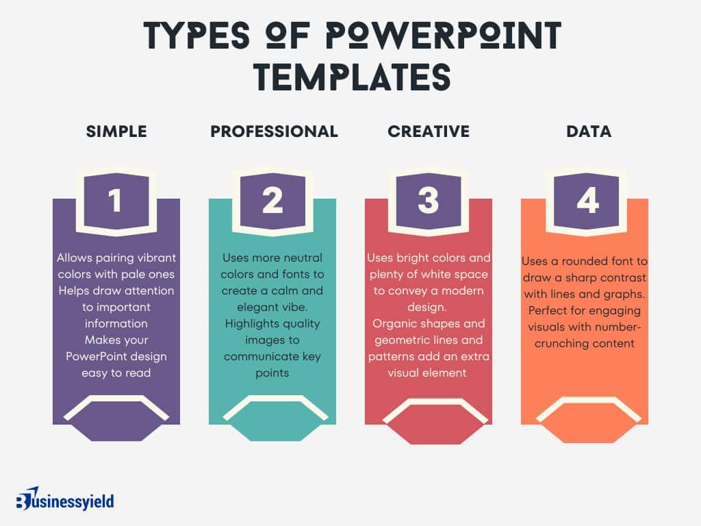
Simple PowerPoint templates
By pairing vibrant colors with pale ones, this PowerPoint gives an understated feel. I’d go with this one if you want to draw attention to your content while still being visually engaging.
You can combine multiple images with vertical or horizontal formatting in this template for dynamic and beautiful slides. Play with contrasting typography styles. Try combining a bold heading font with a simple body font. This can help you draw attention to important information and make your PowerPoint design easy to read.
Professional PowerPoint templates
These PowerPoint slides use more neutral colors and fonts to create a calm and elegant vibe. It also highlights quality images to communicate key points, which is great in my opinion.
This template works best with subtle pastels and muted colors. You can try non-traditional color combos, like peach and mint green, for a unique PowerPoint presentation.
Creative PowerPoint templates
This presentation template uses bright colors and plenty of white space to convey a modern but fun design. Organic shapes and geometric lines and patterns add an extra visual element (and personality) to the slides.
You can create custom graphics or textures and layer them on top of this template’s image layers to create beautiful slides for your brand. Be sure to use consistent styles and colors for a cohesive design.
READ: Who is a Digital Creator? Insights into Content Creation, Platforms, and Monetization
Data PowerPoint templates
This template uses a rounded font to draw a sharp contrast with the lines and graphs that will populate the presentation. If you want to offer engaging visuals with number-crunching content, I think the slide design ideas in this template are a great choice.
Try an on-brand duotone color scheme or use a dark background with this template to give your slides a simple but trendy look.
30+ creative ideas for your next PowerPoint presentation
After looking at hundreds of different authors, topics and designs, I’ve assembled over 100 presentation ideas and tips on how to design a compelling presentation for:
- Social media
- Meetings
- Classrooms
- Webinars
- Online courses
- Pitch decks
- Lead generation
1. Plan Ahead
Start planning your PowerPoint presentation ideas as you are planning your talk. This gives you the time you need to look for quality photos, create infographics that simplify any data you are presenting, and decide on the best colors, fonts, and themes that will connect with your audience.
However, do not create your slides until after your talk is fine-tuned and ready. Instead, jot down ideas of visuals, stories, videos, and demonstrations you may want to include in your presentation.
Your presentation slides will come together as you formulate your talk. The ideas will come to you as you keep your slide presentation in the back of your mind.
Once you’ve written and revised your talk and you are happy with it, create your slides to complement and help reach the goal of your talk.
2. Browse PowerPoint templates and themes
Some PowerPoint templates focus on a specific industry, topic, or theme. Search the web for some examples of PowerPoint ideas in your field and browse the choices and templates available to see if one will resonate best with your audience.
Within the PowerPoint app, you can search for keywords, such as education, business, sports, travel, healthcare, medical, history, and many other topics related to your talk. Use these presentation templates to your advantage to create crisp, clean, engaging slides.
Along with PowerPoint ideas and templates, you can also access ready-made themes. These consist of a background and complementary fonts and graphics.
READ: Enhanced Graphics and Engine in CS:GO 2
As you are searching for a presentation template, browse PowerPoint’s charts, diagrams, and infographics available through the app. These are contained within certain presentation templates to give you customizable layouts for charts, tables, timelines, and more that you can use to make your data come alive.
3. Use a minimalist & consistent presentation theme
The best designs can also be some of the simplest you see. In the Airbnb pitch deck below, they use a minimalist color scheme and font selection.

A minimalist design is sleek, and organized and places the most important thing in focus: your information. There are no distracting stock images, icons, or content. Everything in this unique presentation feels like it belongs and works together perfectly.
While it’s important to stay consistent, you do still, however, want to alternate slide layouts to prevent your audience from predicting exactly what’s next and possibly tuning out your presentation. This creates a polished look to your creative presentation and makes it easier for your audience to focus on the content instead of being distracted by slides that don’t seem to relate to each other.
A quick and easy way to create a consistent theme for your presentation is to use PowerPoint templates. PowerPoint has dozens of presentation templates you can choose from within the app. You can also access many more templates online for a fee.
4. Use a consistent design motif throughout your presentation
Here’s a go-to tip for a cohesive presentation design: use a design motif. The motif could be a recurring shape (like circles, lines or arrows) or symbol (like a leaf for “growth” or a mountain for “goals”).
For example, the presentation below uses circles as a design motif. The same circle icon is used in three different colors to add a bubbly touch to the design. The team photos are also incorporated using circle frames:
5. Use a black-and-white color scheme for a corporate presentation design
The presentation below only uses two colors: black and white. Now, you might be worried that only using two colors is boring, but it all comes down to balance.
Playing off the ideas of classic minimalism, the designer made this presentation look sleek and professional. And now your content can be the main attraction of your presentation as well!
6. Make your presentation cover slide count
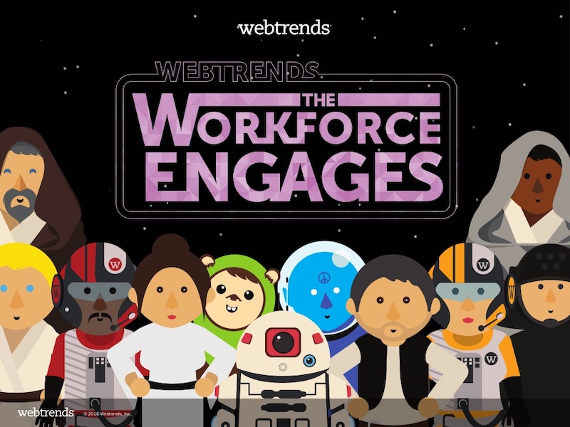
As I was scrolling through all of the presentations, this one made me stop in my tracks. I might not be a Star Wars fan, but even I cannot deny that this presentation cover slide was designed to do just one thing: grab your attention. And grab my attention it did.
That’s why you should not stick with a boring, text-only title slide. Don’t be afraid to use icons and illustrations to make a statement.
READ: WHAT IS THE 80/20 RULE? The Game Changer For Your Business
7. Use duotones
Duotone doesn’t exactly mean “two colors,” it actually means “two tones.” The idea behind this design angle is to use two contrasting tonalities which can have different shades. The difference between duotone and two colors is that it has a more edgy look. Depending on what two tonalities you choose, it can be subtle or very powerful.
The photos used in the design also need to be customized to the duotone color you chose.
8. Use an eye-catching presentation background image
Like with any type of design work, you should want to catch the eye of your audience. In a presentation, this should be done from the beginning with a compelling background image or a color gradient.

In this presentation template, the creators were able to do just that with a landscape photo. When a presentation like this is seen on social media, during a webinar or in person, your audience will definitely listen up.
9. Add a video in different shapes or snippets
Videos can be a powerful tool in your arsenal for engaging your audience during a presentation. Not only do they help to break up the monotony of a lecture-style presentation, but they can also help to explain complex concepts, add visual interest, and evoke emotions.
One way to make your videos stand out is by using different shapes or snippets. Rather than presenting a standard rectangular video, consider incorporating shapes such as circles, triangles or diamonds. These shapes can add a unique and visually appealing element to your presentation.
Another way to incorporate video snippets is by breaking up a longer video into smaller, bite-sized pieces. This can be particularly useful if you have a lengthy video that you want to show but don’t want to lose your audience’s attention. By breaking it up into smaller segments, you can keep your audience engaged and prevent them from losing interest.
10. Use a color theme for each idea
Color is another extremely powerful nonverbal tool that you can use to guide your audience. By using a different color for each section of your creative presentation, Dell is able to clearly indicate when they are switching points or ideas. Going from green to orange, and even red almost effortlessly.

This is a great way to design a list, guide, or a how-to presentation as well. Each color can be assigned to a different step or number with ease.
11. Personalize your slides
One of the most important elements of writing a good talk is to know your audience. The same principle applies to creating your PowerPoint presentation.
To help you craft a creative presentation, choose images, colors, themes, and so on that would appeal to your audience. Anything that will trigger the opposite effect? Avoid it!
This requires researching your audience. Get to know what is important to them and what their background is. Knowing age, gender, educational status, and career choice is helpful. What experiences have they had that are related to your presentation?
Personalize your PowerPoint presentation to the expectations and tastes of your audience.
In the same regard, add your personality to the presentation as appropriate. Sharing personal experiences helps the audience connect with you and build trust — and therefore connect with your message.
SEE: CUSTOMER CONNECTION: Meaning, Importance & Best Practices
12. Alternate slide layouts to keep your presentation engaging
Keeping your audience engaged throughout an entire presentation is hard, even if you have been working on your presentation skills. No one wants to look at slides that look exactly the same for an hour. But on the other hand, you can’t create a unique masterpiece for each slide.


That’s why I’m very impressed with what the designers did in the presentation example above. They use a consistent visual theme on each slide, but alternate between vertical and horizontal orientations.
The swapping of orientations will show people that the presentation is progressing nicely. It can help you make a strong, almost physical, distinction between ideas, sections or topics.
13. Unify transitions horizontally
Unifying the transitions between slides is always a great idea, but doing it horizontally is especially effective. By keeping all the movements going in one direction, it’s both easy to follow and will look great. You don’t need to just apply horizontal transitions to the switch between slides, you can also apply animation to the titles and images.
As long as they all go in the same direction, you are gold.
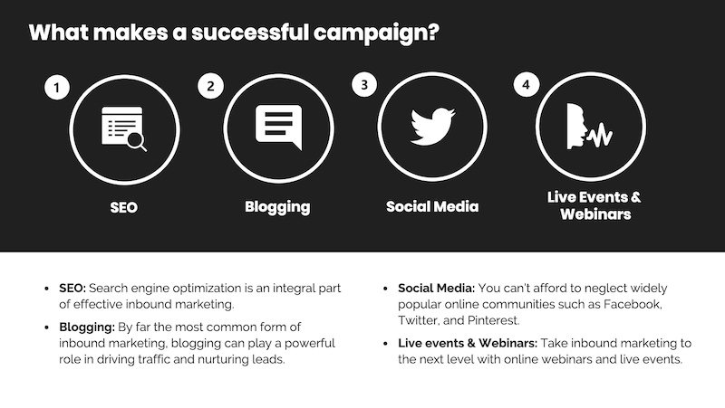
14. Only use one chart or graphic per slide
Having too much information on a slide is the easiest way to lose the focus of your audience. This is especially common when people are using graphs, charts or tables.

In this creative slide deck, the author made sure to only include one focal point per slide, and I applaud them for it. I know this may sound like a simple presentation tip, but I have seen many people lose their audience because the slides are too complex.
15. Keep it simple
Avoid “busy” slides. There is no need to have fancy borders or too many images, gifs, or animations in your PowerPoint presentation. Too much to watch on one slide can be distracting.
Limit yourself to what is most essential for the audience to understand your message.
As a general rule of thumb, try to include just one idea per slide. This will likely mean you’ll have more slides, but it will help your audience follow along and increase their understanding. Consider making some slides just a photo with no text at all. One word or phrase on a slide can make it stand out so your audience knows it is important.
When using infographics, keep words to a minimum and verbally explain the graphic. Use numbers, percentages, icons, or small phrases to label each part of your infographic instead of sentences.
16. Use illustrations instead of pictures
An easy way to keep your design consistent throughout your unique presentation is to use illustrations like in this slide deck by Domo.

They used illustrations instead of pictures to show off their subject on slide numbers 4-10 and it looks fantastic. This will ensure that the audience focuses on the content, instead of just the photo they could have used.
It also helps that illustrations are a top design trend for 2020.
READ: BAG BRANDS: Top 25+ Luxurious and Designers Bag Brands
17. Use bullet points
Use bullet points to list the main points and highlight important information that you want your audience to remember. This lets your audience visualize key points from your verbal presentation. It also gives you speaking cues, in case you lose your train of thought.
Bullet points should be short and easy to scan. As a general rule, keep your bullets to four per slide and eight words per bullet point. This will keep your audience engaged with you and what you are saying instead of reading your slides and tuning you out.
Your talk is the main event, and your PowerPoint presentation is there to complement what you are saying. Your slides shouldn’t do the talking for you.
18. Visualize your points with icons
Icons are the perfect visuals to include in presentations. They’re compact and can convey a concept to your audience at a glance. You can even combine multiple icons to create custom illustrations for your slides.
19. Use all caps
Another creative presentation idea is using all caps when you feel like the topic of your presentation can be delivered with few words. Using all capitals in your slides will give the message importance. This design might not be suited for a text-heavy presentation but maybe one with an audio narrative that goes along with it or bullet points.
Also, this kind of presentation design is suitable for captivating introduction slide ideas.
20. Choose easy-to-read text
Use text that is pleasant to look at and easy for your audience to read when you are giving your presentation. Font styles such as Arial, Times New Roman, or Helvetica are simple and easy to read.
Make your font big enough to be read easily in a large room. A font size of 30 points or higher is optimal.
If you want to use fancier text, save it for larger headlines in your presentation. And remember to be consistent across your slides.
Avoid backgrounds and fonts that are complementary colors. For example, red and green are complementary colors, so red font on a green background would be very hard on the eyes. Dark text on a light background, or vice versa, has the best visibility.
Play around with bold, underlining, italics, and colors for added emphasis on keywords or phrases. Use these features strategically — instead of overusing them — to help your audience focus on what you want them to gain from your presentation.
21. Use more than one font weight on your presentation cover slide
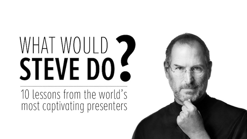
Just like you would never use one font on an infographic, you should never use just one font on your presentation. In this presentation example from HubSpot, they use a bunch of different font weights to add emphasis to keywords and ideas.
As you can see, they use a bold font on the presentation cover to bring attention to Steve Jobs’ name. This makes it easy for the audience to know what your presentation is going to be about from the beginning as well.
READ: APPLE LOGO: Why Did Steve Jobs Use An Apple? What You Should Know!
22. Supplement your presentation with printed materials
Printed takeaways (such as brochures and business cards) give audience members a chance to take home the most important elements of your presentation in a format they can easily access without using a computer. Make sure you brand these materials in a way that’s visually consistent with your slide deck, with the same color scheme, icons, and other iconic features.
Otherwise, your recipients will just end up scratching their heads.
23. Repurpose your slide deck into an infographic
Different types of presentations serve different purposes and sometimes it helps to work smarter, not harder when you are creating a unique presentation. In fact, the spacing, layout, and style used in your presentation will make it easy to repurpose the same images into an infographic.
This allows you to create two unique pieces of content from one idea.
24. Make your audience laugh, or at least chuckle
Sometimes you need to not take your business presentations too seriously. Not sure what I mean? Go check out slide number 10 on this slide deck:

If you did not actually laugh out loud, then I don’t know what to tell you. Small illustrated embellishments can be very powerful because they evoke an emotional response and gain your audience’s trust.
SEE: Building Trust Through Quality: Small Business Edition
25. Use pop culture references

Using a meme or pop culture reference is another way that you can jive with your audience. It can be used to quickly get a point across without saying a word or create a moment that you can connect with the room. For example in this presentation, they used Napoleon Dynamite to give the audience feelings of nostalgia.
26. Bring your own hardware
It is best practice to bring your own laptop or device that you want to use to give your presentation. That way you are familiar with it and you will not run the risk of having compatible hardware at your venue.
Also, make sure you have prepared how to connect your device to the AV equipment at the place where you will be giving your talk. For example, do you need a USB or RBG cable, iPhone dongle, or other hardware to present your slides? If so, bring it along.
You should also have a backup of your presentation just in case something goes wrong at the last minute with your hardware. Put your backup on a USB flash drive, send it to yourself by email, use Dropbox or Google Drive, or add it as a file on your phone.
Ask ahead of time what equipment will be available at the venue. This helps you know what to expect while also bringing your device and backup of your presentation in case they are needed. Preparation helps calm your nerves and ensure your presentation goes on without a hitch.
27. Call on your leadership skills
The purpose of your talk is to improve the lives of your audience in some way. You will either want to motivate, inspire, inform, persuade, or entertain them. The same qualities that make you a good leader make you a dynamic public speaker. Become familiar with these skills and develop them.
Some of the top qualities of good leaders in my experience are vision, courage, integrity, humility, focus, and clear communication.
As you create, practice, and present your talk and your PowerPoint presentation, use these leadership skills to have a positive effect on your audience and reach the goal of your talk.
Just in case you feel you don’t have leadership skills or you want to develop them better, below is a simple guide I have put together for you:
How To Improve Leadership Skills
28. Engage instead of read
Stay engaged with your audience by resisting the temptation to read from your slide. Practicing your PowerPoint presentation in advance will make this easy.
Your presentation should help to supplement what you have to say and provide emphasis on your key points. Elaborate on the information in your slides instead of reading them word for word. Keeping your bullet points short will help ensure you engage instead of read.
With each bullet point or main idea, you can elaborate by telling an interesting story, giving an example, telling a joke, or doing a demonstration.
Even if you have an inspirational quote, memorize the quote so that you are maintaining eye contact with your audience instead of gazing at your slide. This will help the audience connect with you and your message even more.
READ: USER ENGAGEMENT: Meaning, Strategies & How-to-Increase Guide
29. Ask a question
Asking a question during your talk engages your audience so they are actively thinking and involved in what you are presenting.
Use questions at strategic points in your presentation to capture their attention and draw them into your talk. Devote a slide to write out a question, and then pause to give the audience time to think about it. You may want them to keep the answer to themselves or ask for volunteers to share theirs out loud and promote discussion.
Posing a question first allows the audience to think about the topic. They will likely be more interested in what you have to say next and be able to personalize your message to themselves.
30. Add inspiring quotes
Try to use a few inspirational quotes or other anecdotes to help relate your message when you want the audience to remember a key point. Quoting a phrase by a respected or influential person can lend credibility and familiarity to your message.
Inspirational quotes also help set the mood and tone of your presentation. They can provide encouragement, calm nerves, add humor, and give your audience ideas they can use to make improvements.
Since quotes are usually short, they are easy to remember. Use them to help your audience take action or drive home the main message of your presentation.
SEE: Top Quotes About Life Lessons To Help You Grow
31. Offer quality over quantity
Don’t waste your audience’s time with fluff and nonsense. Use your slides for quality information and only use them to enhance your presentation.
Less is more. The more words and fluff on a slide, the more chances your audience will have to tune out. You don’t want that.
Limit your slides to the most important points of your talk and slides that will help bring clarity to what you are saying.
32. Make your PowerPoint presentation actionable
Provide something at the end of your presentation that your audience can do immediately to take action. This is the exclamation point at the end of your talk. It is where you wrap everything up and bring everything together.
Ending your presentation with a thank you slide may leave some audience members wondering what to do next.
Instead, tell them directly.
What can your audience do when they walk out of the room to put what they learned into action? In other words, what was the goal of your talk? To help you craft your call to action, put yourself in the shoes of your audience and ask, “What’s in it for me?”
Make your call to action clear, specific, and easy to follow. Write it on a slide so the audience can both see and hear it.
SEE: CALL TO ACTION: Definition & Examples
33. Consider PowerPoint alternatives
If you don’t have PowerPoint, you don’t have to worry. Unless you already have Microsoft Office, you will have to pay to get PowerPoint; but you have alternatives. You even have free options that can help you make great presentations.
Canva is a photo editing tool that makes professional-looking presentations. Its free version includes plenty of fonts and filters to easily create powerful, engaging, custom presentations. Canva gives you access to hundreds of design templates and gives you the ability to customize your presentations to your exact specifications.
Google Slides is another free PowerPoint alternative. It offers many of the same features as PowerPoint, including templates, transitions, animations, and inserting images, videos, and documents. It is also compatible with PowerPoint if you want to create in Google Slides but present or share using PowerPoint.
Prezi is another powerful presentation option that has a free version. Try its templates or start from a blank slate. One of its unique features is the ability to record videos, create designs, and make infographics with the Prezi online editor.
In conclusion
Adding a PowerPoint presentation to your talk and spending the time to create and practice it can increase your confidence and help get your message across to your audience. However, with most people tuning out of a PowerPoint presentation within the first 10 minutes, coming up with ideas that will keep your audience hooked till the end can be a challenge.
You can use these PowerPoint presentation ideas for business meetings, webinars, classrooms, online courses, pitch decks, and more.
GOOD PRESENTATION: Best Ideas, Examples & Free Tips on How To
BUSINESS PRESENTATION: Meaning, Types, and How to Start Example
How to Deliver a Successful Business Presentation?(