The YouTube logo hasn’t changed dramatically over the years. In fact, compared to some of the social media and internet companies that started up around the same time, it’s been a lesson in how not to change a logo. This may be why it hasn’t gotten the backlash that many logo changes do. The majority of YouTube’s logo redesigns have been so subtle that you may not have noticed them at all, but the logo has changed several times—and we’ll show you every version that’s been used to date, as well as what inspired these changes.
Youtube Logo: Overview
The video-sharing platform has been around for an incredible 17 years, and you’re probably familiar with the black logotype and red square. With the exception of a series of more radical temporary Black History Month logos in February of this year (which we’ll look at below), the YouTube logo has only ever changed as much as YouTube felt was necessary to stay fresh and relevant, ensuring that it’s always been easy to recognize in the process.
No, it may not be among the best logos of all time. However, the YouTube logo history can teach us a few things about how a successful logo can be improved and streamlined almost imperceptibly over time.
Let’s get the ball rolling started…
History of the YouTube logo
Chad Harley, Steve Chen, and Jawed Karim, who worked together at PayPal, founded YouTube. After a party in February 2005, the friends wanted to share a video but realized there were no easy ways to do so. The photos were quickly uploaded to the internet, but where could the video be found? Nowhere. That’s when they decided to fill the void.
Chen and Karim were both excellent computer programmers, and Harley had a creative flair. He created the iconic YouTube logo, which has remained largely unchanged since 2005.
Few people are aware that the original concept of YouTube’s creators was a dating site. The main difference between it and Facebook was that users could not only get acquainted but also upload videos to their profiles. This feature was instrumental in determining YouTube’s future history.
In 2005, dating services began to operate on a symbolic date, St. Valentine’s Day. This is when YouTube’s history began: the trademark, logo, and domain were all registered at the same time. Instead of posting videos of themselves for dating, users began recording and sharing videos about what was going on around them. As a result, the “romantic” aspect of the portal concept faded into the background and then vanished entirely.
A year later, in 2006, Google became interested in the service, and the company was sold for $ 1.6 billion in November of that year.
In terms of visual identity, few people on our planet are unfamiliar with the YouTube logo, which is one of the most iconic emblems ever created. Until 2017, when the new symbol appeared, the visual identity of the world’s most famous online video portal was fairly consistent and based entirely on the original version, created in 2005.
Meaning of the YouTube Logo
What began as a simple video-sharing platform nearly 17 years ago has evolved into the primary platform for businesses and marketers to promote their products and services. The platform’s diversity is unparalleled.
YouTube is often the first place brands and influencers go to promote themselves, whether it’s through video marketing or making their own content. Various YouTube channels also provide inspiration to startup founders and entrepreneurs.
On the other hand, the rectangular box with the play button in the center represents video-sharing and the power shift. You might be wondering how it depicts the power shift. Here’s how it’s done:
Until YouTube, the power of broadcast was limited to large corporations. From news to entertainment, you had to rely solely on TV broadcasters or movie theaters for everything. Since YouTube came along, you no longer have to watch TV or listen to the radio.
The platform ensured that you could find anything you wanted at any time. The platform shifted power away from a few broadcasting companies and toward individuals. You could not only watch different videos, but you could also make your own and upload them for all to see!
The YouTube logo stands for an open platform that isn’t controlled by a few broadcasting companies that only want to make money.
History of the YouTube Logo
Now let’s go over the historical background of the famous YouTube Logo.
From 2005 to 2011
It’s difficult to remember a time when no one knew what YouTube was, but that was the situation when former PayPal employees Chad Hurley, Steve Chen, and Jawed Karim launched the platform on Valentine’s Day in 2005. This meant they needed a logo that captured the essence of YouTube. And the design they chose did exactly that.
They chose a logotype with the brand’s name in an old font called Alternate Gothic number two. Despite being branded as a single word, YouTube was divided into two parts: the first half of the name was in black, while “Tube” was in white, in a rectangular box that was rounded enough and had just enough of a gradient to clearly be interpreted as a television.
From 2011 to 2013
It would be six years before the YouTube logo was changed at all—and when it was, it was only a minor change.
By 2011, everyone had heard of YouTube. People were also switching from cathode-ray tubes to flat-screen televisions. As a result, the YouTube platform flattened that red box a little, making it less glossy, 3D, and obviously resembling an old television.
The logo appears to have been designed with a matte finish to look more modern, fresh, and relevant. However, take note of the shadow at the bottom of the white letters. That would be out of date in a couple of years.
From 2013 to 2015
That shadow effect, as I previously stated, would not last long. In 2013, the YouTube logo underwent another minor change. The shadow was removed, and the red background became brighter. Here, YouTube made sure to stay up-to-date by following the trend toward simpler, more minimalist logos.
From 2015 to 2017
Only two years later, YouTube changed its mind about that lighter shade of red and darkened it again.
On the other hand, it appears that YouTube became restless with its branding – after six years of using the same logo, it was now making minor changes every couple of years. However, it was again following the general trend – perhaps even the necessity – of simplifying and flattening logo designs. This modification appears to be intended to communicate the platform’s maturation into something more serious and professional.
From 2017 till Date
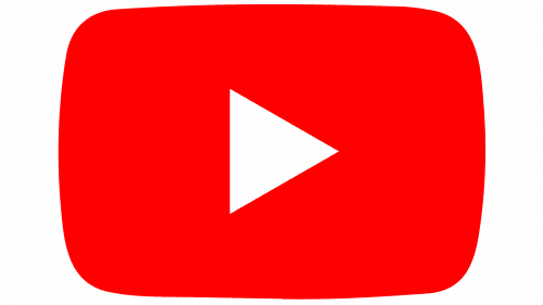
In 2017, the YouTube logo underwent its first and only major redesign in two years. The new, in-house design finally dropped the TV shape surrounding “Tube,” moving it to one side to make room for a cleaner, clearer wordmark. With the type run together and all in black, it is finally clear in the logo that YouTube is meant to be spelled as one word with no space.
Instead of “Tube,” there is now a white play button in the red box. This had the benefit of making it possible for the icon to stand alone and be used in places where a wordmark would be too big, like a mobile app icon. It made the new logo easier to use in a variety of situations.
It was a clear improvement over the previous logo, and there were more changes than many people realized. The typeface was changed to a new bespoke font, and the color of the rectangle was changed yet again, to #FF0000, which YouTube claims represent the “RGB of video.” When used on smartphones, the brighter color makes the icon alone instantly recognizable.
Symbol and Emblem
The red plaque was always meant to represent the screen, even if the color choice doesn’t tell you much about it. It became clear when the company added the triangle shape to the plaque’s top. They now use this emblem independently of the writing, which has greatly expanded the design possibilities.
YouTube Black History Month Logos
The most drastic change to the YouTube logo happened earlier this year, but it was only for a short time, like Google’s doodles. Every week in February, the platform commissioned black artists to reimagine the platform’s logo in honor of Black History Month (BHM).
Every Monday, a new design was added to the site, beginning with the contribution of Brazilian artist Leandro Assis. Assis’ logo has YouTube’s well-known red “play” button, but instead of the YouTube wordmark, it has stylized letters that say “BHM.”
Over the next three weeks, Assis’ logo was followed by designs by North Carolina-based artist and designer Keisha Okafor, Louis-based designer and illustrator Marco Cheatham, and Brooklyn-based illustrator Shanée Benjamin.
“What inspired me to create this piece were the black people around me,” Assis said in a blog post introducing the BHM project on YouTube. “The significance and significance of our hair, how we dance, the rhythms we create, and the beauty of our various skin tones.”
The history of the YouTube logo teaches us that a good design stands the test of time. When it does need to be updated, it should be done slowly, subtly, and for good reason.
Who Made the YouTube Logo?
Returning to the three YouTube founders, we can say that they all contributed to the creation of the YouTube logo.
Jawed Karim became the project’s main ideologist and idea generator. He and Steve Chen created and programmed the future website. Chad Hurley, in turn, was involved in the project’s design. He is known for making the YouTube logo and designing the site’s look and feel.
After Google bought the video hosting company, the work on the logo was given to people who were just as good. It is now the turn of Christopher Bettig, the head of YouTube’s art department.
Here’s what he has to say about the logo’s recent changes:
We wanted to preserve the history and tension of a 1903 media typeface, typeset manually on a digital platform that reaches further than any newspaper of the time could ever imagine.
What Font and Colors Does the YouTube Logo Use?
Without a doubt, YouTube’s logo is very successful. The world’s best graphic designers admit that these heights would not have been possible without the right color palette.
We have red, black, and white, as you may have noticed. These colors are thought to represent optimism, perseverance, elegance, passion, and purity.
The Helvetica font is instantly recognizable and distinct. Helvetica was a very popular typeface in the 1950s. So this font takes us back to the beginnings of television and gives us the retro feel of television tubes.
YouTube Logo Typeface
The YouTube font is a customized sans serif typeface used by the popular video-sharing platform. Because of its clean appearance, the simple typeface appears to be ideal for the brand.
What Makes the YouTube Logo Different?
Logos that have become iconic over time share a few characteristics. Aside from bringing various design aesthetics together in harmony, iconic logos have stood the test of time and remained relevant over time. The YouTube logo, like other iconic emblems, has many great features that make it truly stunning. The following elements distinguish the YouTube logo:
- Relevant
- Memorable
- Simple
- Timeless
Let us go over each one carefully.
#1. Relevant
If a logo is relevant to the market that the company targets, it is well on its way to becoming iconic. A relevant logo not only clearly communicates the key personalities of its brand, but it also informs the audience about what they can expect from the brand. The current YouTube logo clearly communicates the personality of the brand. When a user first sees the YouTube logo, he understands that the play button represents video!
Marketers and designers achieve relevance by combining the appropriate colors, fonts, and symbols. The red rectangular box with the white play button distinguishes and differentiates the YouTube logo.
The iconic YouTube symbol conveys the brand’s personality clearly.
#2. Memorable
A memorable logo is one that is distinct, appealing, and piques the audience’s interest in the brand it represents. The primary characteristic of a memorable logo is that it is easily remembered.
The modern world is defined by speed and the plethora of options available to people. To stay ahead, a brand must create the various elements of its visual identity in such a way that they capture the attention of its audience in a matter of seconds. The YouTube logo catches the user’s attention and stays with them for a long time.
A logo that is memorable and has the ability to make an impact is regarded as an extremely valuable asset of a brand. Such logos remain in the minds of the audience indefinitely.
#3. Simple
It pays to keep things simple, whether you’re making music, painting, or creating content and design. A simple, clutter-free design can easily connect with the audience. Some of the most recognizable logos, such as Nike and Chanel, are ridiculously simple. The current YouTube logo is simple and devoid of extra design elements, which are characteristics that distinguish a logo.
Several studies have shown that the brain simplifies complicated patterns so that it can remember them. Based on the findings, you can conclude that creating simple designs is the best way to stand out in a crowd. Simple designs are specifically designed to be retained by the brain. The iconic YouTube logo is both simple and effective.
#4. Timeless
Another feature that distinguishes the YouTube logo from its competitors is its timeless nature. While there are no hard and fast rules for creating a timeless logo, following some guidelines can help. The following trend is a common mistake made by designers and brand owners. Yes, following trends can be appealing, but consider this for a moment. Will you update your logo once the current trend has passed? I am confident that your answer is a resounding NO! You should avoid following the latest fads unless they are extremely relevant.
Instead of following current trends, the YouTube logo focuses on highlighting the brand’s key characteristics. The YouTube logo can teach you a lot as a designer.
Interesting YouTube facts
- YouTube offers a free production space in Los Angeles to users with at least 1000 subscribers.
- Every year on April Fool’s Day, YouTube plays a prank.
- Every day, YouTube users watch over 4 billion videos.
- “How to Kiss” is the most popular video tutorial.
- Music is the most frequently searched topic on the video-sharing platform.
- Tony Blair, the British Prime Minister, was the first world leader to launch a YouTube channel in 2007.
Bonus: The Impact of YouTube on the World
YouTube, which was founded in 2005 by three unassuming young men, has grown to become a major player in the digital space. The platform has grown so large that it has not only influenced but also reshaped our world in numerous ways. YouTube has influenced our lives in the following ways:
Showbiz
Many professional and amateur actors, comedians, musicians, animators, designers, and filmmakers have benefited from the video-sharing platform. The platform paved the way for all types of artists to showcase their talents and earn a living simply by creating YouTube videos.
Artists on YouTube create attractive logos in addition to videos to distinguish themselves from their peers.
Education
From TED Talks to professors from various American universities speaking about specialized subjects, the video-sharing platform has it all. And the best part is that it’s all free! You don’t even have to send your children to evening classes because YouTube has thousands of educational videos for children of all ages.
Politics
From Syrian rebels using the platform to inform about their uprising to a Russian rock band using the video-sharing site to stage their protest against Putin, YouTube has been a popular space for people to show their disapproval of their governments. The platform has made it easy for people from various backgrounds to express their political views.
Business
YouTube is at the heart of the digital marketing space. Unless a company creates compelling marketing strategies with YouTube in mind, the chances of the brand succeeding remain slim. From FMCG to the automobile industry to various online marketplaces, different sectors rely on video-sharing sites to promote their brands and products.
News
According to a Pew Research Center study published on the Search Engine Journal website, 26 percent of adults in the United States searched YouTube for news. 59 percent of those who got their news from the video-sharing platform considered it a reliable source. An overwhelming 13 percent thought it was the most important way to get their daily news fix.
Takeaway
The YouTube logo is a work of art. It depicts everything related to the company’s business while also providing simplicity and straightforwardness of thought.
This story teaches future business owners the value of having a top-notch graphic designer on hand. However, young artists should keep in mind that their talent will not be recognized unless they demonstrate it to the entire world.
Conclusion
YouTube has changed the world in a variety of ways, from assisting businesses to providing a platform for artists and creators. And the YouTube logo represents everything that the video-sharing platform has dared to reinvent! So, if you haven’t already started a YouTube channel, now is the time. Who knows, maybe you’ll be the next Justin Bieber or Alessia Cara!
YouTube Logo: Frequently Asked Questions
What did the original YouTube logo look like?
YouTube’s first logo was designed in 2005. It had a logo that was made up of two parts: a black “You” and the first letter capitalized. The word “Tube” was written in white on a rounded gradient rectangle.
Who made the YouTube logo?
Bettig has been with YouTube for three years after joining Google six years ago. He was the driving force behind the logo redesign. As YouTube expanded into a variety of services, Bettig and his team attempted to create a dynamic brand.
What happened to the 2021 YouTube logo?
On February 1, 2021, YouTube added the letters BHM to its logo. Companies, especially those as large as YouTube, do not change their logos on a daily basis. People are frequently perplexed about the significance of the change and whether or not it is permanent.
When did the YouTube logo change?
The icon that is part of the iconic Youtube logo has undergone a few changes over time. The name was included in the original version. Since 2011, the icon has included a play button. The triangle and rectangle proportions were changed in 2013.
Related Articles
- BEST YOUTUBE IDEAS FOR BEGINNERS
- TOP 17+ VIDEO MARKETING SOFTWARE: 2022 Reviews
- How to make money online for beginners 2022
- CHANNEL MANAGEMENT: Meaning, Examples & Why It Is Important
- CREATE A COMMUNITY: Best Guide to Building a Strong Community