Reebok is one of the oldest and most enduring sportswear brands with its unique and remarkable logo. The Reebok logo has been in existence since the 1950s, undergoing several changes over the years. Reebok is a sportswear company that has been producing shoes since 1895, from sportswear for your neighbor to internationally renowned events.
Although the brand has seen ups and downs like any other corporation, it is one of the most enduring sportswear brands in history. Additionally, in this piece, you will understand why Reebok is a good example of a brand with a lasting impact.
What Is the Meaning of the Reebok Logo
The Reebok logo serves as an identity for its products. Reebok’s iconic logo embodies the brand’s core values of legacy and progress by representing the Union Jack as it crosses a racing track. The reason why Reebok uses the triangle logo is to represent the trinity of physical, mental, and social well-being that the company seeks to provide through its philosophy and products for people all over the world.
In the first few years of its existence, the Reebok company logo featured a Union Jack, honoring the nation from which it was derived.
Although the logo was changed in 1958 to something more abstract, the label went back to its original design in the 1970s. That emphasizes the reason why till today the British flag serves as an inspiration for the logo.
Reebok Logo History
Nearly a century has been spent using the British flag logo. The business didn’t decide to replace it with the vector logo which was in 1986. It displayed a streak of an illegible Union Jack crossing a racetrack. Reebok’s desire to build itself as a worldwide brand and a performance brand serves as a justification for this action.
In 2013, Reebok started a process of reinventing itself as a fitness brand rather than a business associated with particular sports. One of the most important parts of the new strategy was the launch of the Delta logo. The official statement from the company says that the Delta triangle was chosen to show transformation and change. The triangle’s three sides represent the three facets of a person’s transformation: social, mental, and physical.
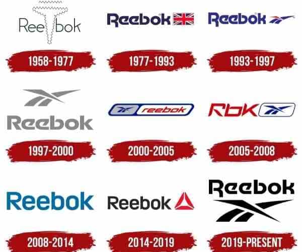
#1. 1958-1977
The meaning of the brand’s name, Reebok, which translates to “African Antelope,” was split into two sections by an abstract geometric structure with thin zigzag contouring in the design that followed the Union Jack in 1958. Above the sign were two horizontal zigzag lines.
#2. 1977-1993
In 1977, the British flag returns to the brand’s visual identity, this time to the right from a bright blue wordmark in a special sharp sans-serif typeface with diagonal lines and rounded letters. The brand is still using this typeface now.
#3. 1993-1997
The distinctive Reebok logo was created in 1993. In contrast to the previous version, the picture was positioned to the right of the custom wordmark and was a lighter shade of blue. It comprises 2 blue smooth lines fusing into one and being split by a red sharp and narrow triangle.
#4. 1997-2000
In 1997, the image and logotype both adopt a light gray hue, and the symbol is shifted to the top of the mark. The new color palette made the logo appear beautiful and light, emphasizing the brand’s professionalism.
#5. 2000-2005
The iconic logo of Reebok did not change at all, despite a complete makeover of the logo in 2000. On a gray background, to the left of the logotype, is the sharp brand signifier in dazzling blue. The smooth parallelogram with a wide blue border contains both elements of the visual identity.
The frame is divided into two sections: one for the wordmark and one for the symbol. The typeface used for text has been changed to a clean, italicized sans-serif to represent speed and motion. The inscription’s rich red hue enhanced the overall look and created a sense of passion and fire. The inscription’s deep crimson hue boosted the overall design and infused it with passion and vigor.
#6. 2005-2008
Later, in 2005, the corporation begins utilizing the abbreviation “RBK” for its logo. The letters were positioned on the left side of the blue logo, enclosed in a rectangular blue frame with rounded corners. The inscription’s deep crimson hue boosted the overall design and infused it with passion and vigor.
#7. 2008-2014
By completely removing the logo and redoing the logotype in a timeless, clean sans-serif in a light shade of blue, the Reebok visual identity received a new, simple style in the 2008 overhaul. The organization utilized this test version for about six years before using it as the basis for the makeover.
#8. 2014
In 2014, Reebok created a new logo that features a new geometric brand mark made of a red triangle with three equal segments. It matches the clean, modern logotype, which is now black in color.
#9. 2019 — Today
The brand’s 2019 revamp, which changes the color scheme and placement of the logo, returns it to its 1979 logo version. Now that the iconic sign is under the wordmark and has been rendered in monochrome, the entire composition exudes strength and uniqueness.
The brand-new Reebok Delta logo symbolizes the impact that fitness can have on a person’s life for the better.
Reebok Logo Font
The 1970s saw the replacement of the original Reebok logo’s austere sans-serif typography with a modified Motter Tektura wordmark. However, Reebok ultimately decided on a whole new bespoke type. Despite being less identifiable than the previous one, the sans-serif typeface appears neat and basic.
Reebok Logo Color
The 1986 redesign of the Reebok emblem carried over the original blue and red color scheme, which was inspired by the hues of the British flag. Later, the business simplified the combo by using just a black wordmark on a white background. The red color returns in the 2013 makeover
Reebok Company
As a member of the Authentic Brands Group, Reebok International Limited produces athletic footwear and apparel in the United States. It was founded in England in 1958 as a support organization for J.W. In 1895, Bolton, Lancashire, saw the founding of Foster and Sons, a sporting goods business.
The company’s emblem, which was used from 1958 to 1986, included the British flag to represent its heritage. In 2005, German sportswear manufacturer Adidas purchased it; in 2021, Authentic Brands Group acquired it. In Boston, Massachusetts’ Seaport District, the company’s global headquarters are situated.
The Invention of an Iconic Sportswear Brand “Reebok”
JW Foster and Sons, which was founded in 1895, was the forerunner of the Reebok brand at first. They have a protracted track record of excellence. Although they produce shoes in the UK, their brand is not popular. At the 1924 Summer Olympics, participants used shoes provided by the Foster firm. The grandchildren of JW Foster, who desired to open their own store, provided the leadership and motivation for the founding of the Reebok corporation.
They gave it the name Reebok named after a gazelle. From further investigation, it appears that the name Reebok was chosen because it truly refers to an African gazelle. This was an effective approach to transmit the advantages of the shoe into the grace, quickness, and swiftness of the animal.
#1. Before 1979, Reeboks Were Not Widely Worn.
The Fosters toiled for notoriety until they finally got it in 1979 when Reebok began to get the attention of the globe. Paul Fireman first saw the brand while the shoes were on display at the Chicago International Sneaker Trade Show. He worked for an outdoor wholesaler and appreciated the quality and customization of the shoes
He believed that these elements were sufficient to boost the shoes’ appeal in North America. Reebok’s official debut in the USA occurred after Fireman secured a licensing agreement for the country.
#2. Reebok Was Successful in the US Market in 1981.
In the US, Fireman served as the face of Reebok. At the time, he put the price at $60 for each pair, which was an exorbitant amount. Reebok’s revenues in the US rose above $1.5 million in just two years. There were just three simple track shoe types available to the general public in this period.
#3. Reeboks for Women Weren’t Released until 1982.
Reebok had been on the market for three years before it introduced its first model specifically for women, despite the fact that in the 1980s, Reebok was still a relatively young brand in the US. It had a significant negative effect on sales in the US market. This would establish a new pattern in sales, enabling the Reebok brand to take control of the market in the early 1980s.
#4. The Pump Only Became Available in 1989.
With the launch of the pump design, the Reebok brand shifted its emphasis to basketball. When Reebok teamed up with Dee Brown, a rookie with the Boston Celtics squad in 1991, sales increased even further. He competed in an All-Star Slam Dunk competition wearing a pair of prominent Reebok pumps. Brown contributed to the attention-getting effect of the black, orange, and white heels by stooping to deflate them and show supporters how amazing they were. Kids and adults alike wanted their own pair of Reebok pumps following this single performance, and sales of the footwear skyrocketed as a result.
What Does Reebok Mean
Reebok wanted a name with no significance, which is why they chose the brand name. From further investigation, it appears that the name Reebok was chosen because it truly refers to an African gazelle. This was an effective approach to transmit the advantages of the shoe into the grace, quickness, and swiftness of the animal.
When Was Reebok Most Popular?
Reebok briefly had the title of leading sports brand in the 1980s. Now Nike and Adidas dwarf it. We examine the brand’s past through the eyes of the people who were there.
Who Is the Founder of Reebok?
Joseph William Foster, along with his older brother, Jeffery William Foster, co-founded Reebok on May 18, 1935. His grandfather, Joseph William Foster, likewise has the same name.
Joe Foster was raised by his grandfather, who also created J.W. Foster & Sons. In 1952, Joe started working for the family company. but quit the business a year later in order to do National Service. In 1955, after spending two years away, Foster started to worry about the family business’s future.
Foster and his older brother Jeff eventually decided to start their own company in 1958 as a result of leaving the family business. Six miles away in Bury, the two brothers launched “Mercury Sports Footwear.” After 18 months, the pair received advice to register their business name in order to safeguard it. However, they discovered that another business had already registered the name “Mercury Sports Footwear.”
They started looking for a new name and found Webster’s definition of the grey rhebok, a small South African antelope. The two used the American spelling, which was free to register because they loved the animal’s name.
As the Reebok company grew, Joe was in charge of sales and marketing as well as design, which included the iconic silhouette, outsole, and Starcrest emblem. Jeff was in charge of production. Joe traveled extensively over the UK in the early years to sell Reebok sneakers to different merchants.
Joe met American businessman Paul Fireman in 1979 at the National Sporting Goods of America Show in Chicago. The Reebok brand was then distributed and licensed by Fireman in the country. Reebok’s transformation into a top provider of athletic apparel was made possible in large part by this partnership.
Is Reebok Owned by Nike?
Reebok was acquired by the American holding company Authentic Brands Group, which owns over 50 different brands, including Volcom, Aéropostale, and Nautica.
Is Reebok a Luxury?
Nike and North Face are not luxury brands, and neither are Reebok, according to Woodhouse. “Nike is frequently paired with expensive clothing by people. Reebok and Nike essentially shared adolescence. Reebok and Nike both have an equally rich history and pedigree. They both stand at the nexus of fashion and athletics. There is no reason Reebok shouldn’t also be one of those companies.
Is Reebok Made by Adidas?
In order to broaden its presence in America and compete with Nike (NKE) in its home market, the German-based corporation purchased Reebok in 2006. The company, though, hasn’t done well lately.
According to Adidas, selling Reebok would allow the company to concentrate its efforts on bolstering its own brand’s position in the international sportswear market. Adidas stated that it would sell Reebok to ABG for $2.5 billion in August 2021.
Is Reebok Declining?
ts decline has been much more gradual as a result of declining sales and an owner who didn’t make investments in its expansion. Reebok has diminished over time to a small portion of what it once was. According to Euromonitor International, the brand only commands a 1.1% market share in the sports footwear category, placing it in 16th place.
Is Reebok or Nike Better?
- Conversely, Nike shoes seem light to wear and quite comfortable, while Reebok shoes appear to be very hefty and uncomfortably stiff.
- Although Nike is a publicly traded company, Rebook is a subsidiary.
- Reebok shoes are a better option for both walking and jogging. However, Nike is the best option for runners exclusively.
- Rebook is the most durable, but Nike is the greatest in terms of toughness.
- Reebok doesn’t have a great reputation for producing high-quality athletic boots. However, Nike has a solid reputation for producing the greatest athletic footwear on the market.
Do People Still Wear Reebok
People still wear Reebok even after its recent logo redesign. Since its introduction in 1987, the Reebok Workout has paved the way as a multipurpose workout shoe that has become an icon of contemporary fashion.
Reebok Shoes
The Reebok shoe is made for running, exercising, walking, CrossFit, and all other types of physical activity. Additionally, you can add customizations to make the shoes uniquely yours.
Reebok will start producing shoes from organic cotton and corn. The program aims to produce more environmentally friendly goods. The sole of the new shoe will be created using petroleum-free, non-toxic industrial-grown corn, while the body of the shoe will be constructed entirely of organic cotton.
Currently, most shoes are produced from oil-based plastics, but Reebok’s new shoes are made of both cotton and corn, which are both compostable. By composting the shoes after usage, the compost can become part of the soil to grow new materials for the next “series of shoes.”
Reebok Club C 85
Reebok Club C 85 is an iconic tennis sneaker from the 1980s but they are still widely recognized today. In 1984, Reebok made its debut in the tennis world by introducing the Phase I tennis shoe, which featured a terry cloth lining and garment leather.
In 1984, Reebok made its entrance into the tennis world by releasing Phase I, a tennis shoe made of garment leather and lined with terry cloth.
Paul Brown oversaw the creation of Club C, which was introduced in 1985. The shoe was first introduced to meet a necessity. It was “for the club player who needs a robust performance tennis shoe.”
The Club Champion, or Club C, is made of stronger garment leather for long wear, including the toe cap, eye stay, and backstay. In addition, it contains a terry fabric inner and a replaceable expanded urethane arch support system. The shoe’s sleek silhouette and distinctive appearance have helped it transition from a performance model to a mainstay of modern life.
When Did Reebok Club C 85 Come Out?
The Reebok Club C 85 Vintage is a well-liked model that is still on the market today. The Reebok Archive reports that this particular shoe type was introduced in 2016 to mark the 30th anniversary of tennis shoes from the 1980s.
What Does Club C Stand For?
Many people are unaware that the “C” in Club C stands for “Champion,” indicating the target market for these shoes. Despite the fact that this style does come in certain technically mid-cut variations, the shoe is most famous for its traditional low-cut design. It comes with a leather or suede upper and a rubber outsole with texture.
Facts You Want to Know About the Reebok Company Logo
Every brand has a distinct event or experience that sets them apart from the competition. We’ll talk about those encounters in this section and how they helped companies like Reebok advance to a better position.
#1. The Failing Exhibition
Following the 1991 exhibition, Reebok benefited from the Brown endorsement for a brief period of strong sales and respectable earnings. Sales decreased as soon as they had increased once fans had their fill of the pumps and the novelty had worn off. Without a significant selling point in the market for sneakers, Reebok was left behind.
The business had over-invested in only one model, and it had nothing to offer the public that would inspire significant buying events once more. You might describe it as a lesson learned. For the remainder of the decade, sales decreased. Reebok tried a few different tactics, but they still needed a new approach.
#2. Reebok Sought Endorsements from the NBA
Up until 1996, the sales weren’t exactly excellent. Reebok used a different approach and asked NBA star Allen Iverson to promote their sneakers both on and off the court. They had made a wise choice by choosing the profession’s relative newbie as their spokesman because of his growing notoriety.
The tactic was successful, and with sales once again on the rise, Reebok made the risky decision to sign a lifetime contract with Iverson to endorse the brand as long as he played in the NBA. Together, they created a new sneaker they called “The Answer.”
#3. More Celebrity Sponsorships and New Pumps
In 2005, Reebok created its second Above the Rim Pump basketball shoe. The rival that Reebok frequently faced up against was Adidas. Both sneaker firms believed that joining forces may enable them to overthrow the leading shoe producer and capture the top spot because that was the conventional wisdom at the time. Nike has thus far maintained its position as the market leader, although Reebok and Adidas are still competing.
#4. Reebok Sales Were Bolstered by the Aerobics Craze.
It was wonderful news for Reebok when the new fitness craze arrived in the United States in the 1980s. We have discussed their development of a model specifically for women. The women’s Reebok Freestyle shoe was the ideal choice because its target audience was women joining the aerobics craze. They managed to create a stylish shoe that was also cozy. The revenues were excellent because they increased the company’s annual sales from $4 million to $1.4 billion.
#5. Black Reeboks Were Worn by a Nun to the Royal Wedding.
If this isn’t the most effective form of brand promotion, we’re not sure what is. Photos from the wedding of Prince William and Kate Midleton show that a nun in attendance was wearing a pair of Reeboks in the color black. They’re comfy, even though they’re not commonly thought of as the most appropriate attire for such a grand occasion. The sister got into a little bit of trouble when word of the incident spread and the father exposed her identity, but she gets a pass on this one.
#6. Rebook and Crossfit Have a 10-Year Cooperation.
The Reebok corporation is constantly looking for appropriate alliances to market its goods and develop new models that the general public can find interest in. These frequently follow societal trends at the moment with their target being lifestyle trends.
In order to participate in the intense training and lifting subculture, they signed a contract with CrossFit. Reebok made a substantial contribution to the 2014 Reebok CrossFit Games as a promotional event by adhering to the Paleo diet, which many of them follow, and by giving away bacon
#7. They Employed a 25-Year-Old for the Creation of Ripley’s Shoes for Aliens.
Tuan Le was only 25 years old when Reebok hired him to join their creative team. He collaborated closely with 20th Century Fox before starting his work on a pair of sneakers for the Ridley Scott movie “Alien”.
Le was essentially working alone at the time because the rest of the design team was preoccupied with developing an aerobics model. Actually, the prerequisites were fairly straightforward. They had to be able to readily slink off the feet of Sigourney Weaver, the actress who would play Ripley. With the exception of the requirement that they must readily slide off the foot, the 20th Century Fox team wasn’t concerned with the colors or even the design.
#8. Le Chose a Velcro Strap for the Shoe’s Fastening.
Reebok keeps a fitness theme as part of its corporate culture. In the spring of 2016, Reebok underwent some modifications. They made the decision to launch a brand-new, corporate-wide health initiative. They eliminated from their cafeteria a number of foods they deemed unhealthy. These featured pasta, huge candy bars, drinks, and white bread. Employees were still permitted to bring these supplies into the office from home, but Reebok would not supply them.
#9. Speed Lacing Was First Introduced by Reebok.
Reebok was the first of the three companies that dominate the shoe market to introduce the reinforced eyelets used in their rapid lacing system. Prior to its appearance in the Shaq Attaq campaign in 1992, none of the others had given this concept any thought. They were, after all, the first basketball shoes to have this feature.
#10. Shaq Produced His Own Reebok Advertisements.
In order to promote its sneakers on television, Reebok worked with celebrity endorser Shaquille O’Neil to create a number of ads. Shaq took the initiative and insisted on being the one to direct the advertisements.
He took the initiative, and it worked out well for Reebok because the campaign was successful and did raise awareness of the company. It took a record amount of time to develop a pro basketball shoe from a concept to a fully functional, fine-tuned model. However, the staff managed to pull it off admirably; they simply had to put in a little bit more late-night work than usual.
Conclusion
The Reebok logo had its most recent change in 2013, which rendered it completely simple. Because it is so straightforward and generic, it has drawn a lot of criticism. Although it is by no means original, numerous designers point out that it looks great on clothing and performs admirably in most situations.
The brand has come up frequently in the minds of critics, both when Adidas bought it and when Adidas sold it upfront. It doesn’t matter, though, because this iconic athletic brand has contributed too much to the sports world and industry to ever fade.
It goes without saying that the brand is a remarkable example of how perseverance and consistency can contribute to branding, but only when combined with all types of designs, including its logo.
References
- SKATE SHOE BRANDS: List of the Best Skate shoe Brands in 2023 (Updated)
- Vegan Brands Clothing: Top 21 Picks Updated!!
- HEALTH INSURANCE CALIFORNIA: Top 10 Most affordable California health insurance
- NIKE AFFILIATE PROGRAM: Commission, Requirements & Everything You Need
- SONIC LOGO: All You Must Know, Font & Menu)
- TITANS LOGO: Meaning, Font, and History
