The Miami Dolphins are an American football team that has been around since 1965 and now competes in the National Football League’s Eastern Conference. The Miami Dolphins didn’t start playing until 1965. They played in the American Football League for their first three years as a team. They first played in the NFL in 1970. Since they joined the AFC, they have always been in the AFC East. They helped start the NFL as one of the first teams from the Southeast. Everyone in Miami knows this team, whether they are their favorite NFL team or not. But then everyone has a history, a story of their achievements, major changes, and overall success. Let’s see some of the scripts behind the Miami Dolphins as well as their logo.
Overview Of Miami Dolphins
The Miami Dolphins have won five conference titles and two Super Bowls because of their hard work (1972, 1973). Only the 1972 Miami Dolphins won the Super Bowl without losing a single game during the regular season or in the playoffs. Dan Marino, Jason Taylor, and Larry Csonka are just a few of the best players of all time who have played for this team.
The Miami Dolphins have been a sports team in Florida for longer than any other team, and they were the first professional football team in the Southeast. Only two teams in NFL history have won the title more than once.
The Dolphins have had a lot of success, but they have also had their share of bad luck. Even though the Dolphins have been through a lot of ups and downs, they have always been able to come up with a new logo. Over the years, the Miami Dolphins logo has changed a lot and is now one of the most recognizable in the country.
Since they started playing in 1966, the Miami Dolphins’ logo of a teal dolphin and an orange circle that looks like the sun has brought them a lot of success. But the symbol has been changed several times.
The New Look
In 2013, the Dolphins got a whole new look, with a new logo, color scheme, and uniform. The logo took the dolphin’s head off. The dolphin was less of a living creature and more of a silhouette in its new shape. CEO Tom Garfinkel thought that the team’s new name brought it into the 21st century while still showing respect for its long history.
In 2015, the Miami Dolphins took away a tool that could have been useful. Just two years ago, the team’s uniform and logo went through their most important change in the team’s history.
Fans aren’t all on the same page about the new look. People who liked it, didn’t mind it, or didn’t care either way, didn’t hesitate to talk about it on social media. The Dolphins gave a real nod to the past when they brought back the teal throwback jerseys from 1966 as alternates in 2015. After that, things got crazy. It’s not clear if the next move was made because of how the fans reacted or not. People liked the throwback look, and some even said that the team did better when they wore their throwback uniforms.
In 2019: The Big Win
The Dolphins wore these uniforms when they were honored for the best sports moments of 2019 (The Mountaineer Shot) and 2018 (The Miami Miracle). In both wins, the division winner, the New England Patriots, and the division runner-up, the Philadelphia Eagles, lost.
The design of the team’s logo makes it clear that it came from Miami, and the team mascot is featured prominently. Such instantly recognizable designs can only be made by professional logo design services that know how to add many details to a logo without making it look cluttered.
The Dolphins have the same symbol. The design, which also has the name of the city, is based on the sunny beaches of Miami, Florida. Find out where the NFL team’s logo has come from so far.
Miami Dolphins Logo History
The Miami Dolphins are one of the football teams that put a lot of value on its history. Because of this, the team still uses a modernized version of its original logo, which still has the same two main parts and the same bright, eye-catching colors but with updated shapes.
The Dolphins’ first season in the NFL was in 1966. The team was started by actors Danny Thomas and Joe Robbie, lawyers, and politicians. (AFL). The Miami Dolphins dominated for a long time after Don Shula led them for most of their first few years in the league.
The Dolphins are known not only for their long and interesting history but also for the fierce competition that goes on within the team. The New York Jets, the New England Patriots, and the Buffalo Bills are the teams that the Dolphins play against most often.
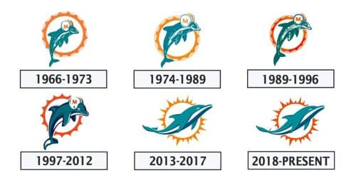
1966 – 1974
The original logo for the Miami Dolphins was a white sun with an orange ring and several orange rays coming out of it. On top of the sun was a white and orange football-helmeted dolphin with a smile. Orange was used to show vitality, passion, and speed, while intense turquoise was used to show creativity, kindness, and care.
1974 – 1979
The logo was changed in 1974 by making the dolphin and its helmet a little bit bigger. The serif font makes the orange “M” on the white helmet with blue and orange stripes stand out more. The edges of the sun’s rays were smoothed and their lines were made longer.
1980 – 1996
The 1980 redesign made small changes to the classic logo and colors of the Miami Dolphins. To make the color scheme look better, we made the orange darker and richer, and we gave the turquoise a hint of green. The typeface of the orange “M” on a white helmet has changed, making it much bigger and bolder than before.
1997 – 2012
The club’s new logo, which was designed in 1997, showed all that was cool and fun in a clean, modern way. Both the dolphin and the sun have been redrawn with thicker, smoother lines, and the dolphin’s body now has a touch of dark blue. The mascot’s face and the helmet he wore got more attention. The stripes and the letter “M” were made smoother and stronger. The shape of the sun was changed by getting rid of its thin rays and replacing them with a bold circle with pointed parts that looked both simple and confident.
In a second logo, the same dolphin was used, but this time it was on a white background and didn’t have a sun disk. It was holding a white football with four orange lines coming out of it to show speed and power.
2013 – 2017
In 2013, the Miami Dolphins got a new logo as part of an effort to change their brand. Even though it is an exact copy of the original, the sun disk and dolphin have been cleaned up and polished to make them look and feel more modern. The lines of the sunburst were made longer and sharper, and the dolphin was redrawn with turquoise, blue, and white colors instead of a helmet.
2018 – Today
The colors of the emblem were changed in 2018. The only color that changed was orange, which got darker and got closer to red. The Miami Dolphins’ brand already stands out against the white background, but the new color scheme gives it more drama and strength.
Miami Dolphins Logo Element: Font
The only letter in the logo, “M,” was taken out in 2013. This makes it hard to talk about the typeface. Even today, the only letter in the Miami Dolphins logo is the letter “M.” Even though the clear serif type was changed a few times, it was not part of the club’s 2013 visual identity makeover.
Miami Dolphins Logo: Color
The Dolphins’ well-known logo is made up of a lot of different colors. The Dolphins’ team color is orange, which is the color of the bright Florida sun.
People think that the color teal shows that you have a sharp mind because it was inspired by the Atlantic Ocean. The teal dolphin on the logo is now known all over the U.S. When navy blue was added to the logo in 1997, it was meant to give it an air of power and authority. In later logos, however, the shadow was taken away.
What Does The Miami Dolphins Logo Mean?
The Dolphins’ logo has stayed mostly the same for as long as it has been around. The team’s first color scheme of aqua and coral came from the coral reefs in Biscayne Bay.
Biscayne Bay is home to the third-largest stretch of barrier reef in the world. However, climate change and pollution in the ocean are having a big effect on it. Even worse, people are hurting the reefs through things like overfishing and anchoring. Still, there are a number of groups working hard to keep the coral reef safe. There’s nothing like looking at the logo and being reminded of the beautiful beaches and Biscayne National Park’s coral reefs in Miami, Florida.
The original logo for the Dolphins was a sunburst with the letter “M” in the middle and a leaping dolphin in the middle. The logo is the perfect way to show what the Dolphins stand for, which are courage, kindness, success, and defense. The dolphins and the sun quickly bring to mind the natural beauty of the Biscayne area.
Before it got its first big makeover in 2013, the Dolphins’ logo hadn’t changed much since the team was founded in 1972. The visual identity of the Miami Dolphins was updated again in 2018, and it has been telling the brand story well ever since.
Evolution And Significance Of The Miami Dolphins Wordmark Logo
Along with the logo, the Miami Dolphins wordmark has been changed several times. The list below shows how the Miami Dolphins logo has changed over time;
Miami Dolphins Wordmark 1980 Logo
The first version of the wordmark came out in 1980. It was a curvy design that spelled out the name of the team and looked like water moving. It was a simple aquamarine, just like the first logo for the team. The text in the logo was made to look like it has depth by making it look three-dimensional.
The Dolphins’ Logo Was Changed in 1997
The wordmark in the new logo was orange and had straighter lines. The team’s name was written in a thinner font on the new logo, and the orange shadows were a nod to the old colors. The word “Miami” was written in tiny blue letters under the name, and to the right was a silhouette of a hot sun.
The New Dolphins Wordmark Logo Came Out in 2009
In 2009, the wordmark got a new look that was sleek and simple. The sun and the name of their hometown were taken off of the emblem, among other small changes. The design was the same in every other way, though.
The Official Wordmark Logo for the Miami Dolphins For 2013
The current wordmark is a simple sans-serif font with the name of the team in white and orange on an aquamarine background. This simple design goes well with the current main logo for the Miami Dolphins.
Miami Dolphins Logos for 25th Anniversary
The dates below show important moments in the Miami Dolphins’ history.
Logo Anniversary in 1990
The logo for the 25th anniversary is a simple design in aqua and silver with a border of orange. There was a celebration for people who had competed in sports for 25 years.
Image to Celebrate the Year 1997
In 1997, the team’s logo was changed to mark its 25th year in the National Football League. This happened after they had been in the AFL for a while, where they played professional football for the first time.
Logo Anniversary in 2002
The logo for 2002 was made by putting aqua and orange together in a simple way. The logo was centered on a shield-shaped design. Also, this was their only perfect season, which is still a record.
Logo Anniversary Of The Year 2005
In 2005, to celebrate its 40th year in the sport, the team showed off a new shield logo with its now-iconic color scheme. The logo, which was filled with a greenish-blue color, was framed by thin bands of white and orange.
Concerning the Miami Dolphins
The Miami Dolphins are a professional American football team that plays in the greater Miami area. They are part of the American Football Conference (AFC) East and play in the NFL. The team’s home games are played at Hard Rock Stadium in Miami Gardens, Florida. Stephen M. Ross is the owner right now. The Dolphins are the only team in the AFC East that did not join the American Football League when it started (AFL). Two of the first professional football teams in the southeast were the Atlanta Falcons and the Miami Dolphins.
Danny Thomas, an actor, and comedian, and Joe Robbie, an attorney and politician, started the Dolphins together. The first time they played in the AFL was in 1966. Ever since the Miami Seahawks, who played in the All-America Football Conference in 1946 before becoming the first Baltimore Colts, went out of business, there had not been a professional football team in the area. At first, the Dolphins had their permanent training camp and practice fields at Saint Andrew’s School in Boca Raton. After the AFL and NFL joined together in 1970, Miami joined the NFL.
Super Bowl
In Super Bowl VI, the team played for the first time in the big game, but the Dallas Cowboys beat them 24–3. The next season, the Dolphins were perfect from the start. They won all 14 regular-season games and all three postseason games, including Super Bowl VII, making them the first team in NFL history to do so.
They were the first team in the Super Bowl era and the third team in NFL history to go undefeated in the regular season. When they won Super Bowl VIII the next year, the Dolphins became the first team to go to three straight Super Bowls. They were also the first AFL/AFC team to win back-to-back championships. Also, Miami has been to Super Bowl XVII and Super Bowl XIX, where they lost both times.
Don Shula was the Dolphins’ head coach for most of the team’s early years. He is the NFL’s all-time leader in wins as a head coach. In only two of the 26 years that Shula was the Dolphins’ coach, the team had a losing record. Dan Marino was one of the best quarterbacks in the league from 1983 until the end of 1999. He broke a number of passing records during that time. Before Marino retired at the end of the 1999 season, he led the Dolphins to five division titles, 10 trips to the playoffs, and Super Bowl XIX.
Since Marino left, the team has only been to the playoffs four times (in 2000, 2001, 2008, and 2016) and won two division titles (2000 and 2008).
History Of The Miami Dolphins
In 1965, attorney Joseph Robbie and actor Danny Thomas paid what was said to be $7.5 million for a Miami Dolphins expansion franchise. Later, Thomas would sell Robbie his share of the team. In 1966, the Dolphins trained at St. Pete Beach in the summer and at Boca Ciega High School in Gulfport in August.
Before Don Shula was hired as head coach, the Dolphins were the worst team in the NFL. In George Wilson’s first four years in charge, the Dolphins went 15-39-2. After the Baltimore Colts lost Super Bowl III to the AFL’s New York Jets two years in a row and then went 8-5-1 the next year, the Miami Dolphins tried to get them to hire Shula, who had worked for Paul Brown. George Wilson, who used to be the head coach of the Detroit Lions, gave Shula his first job in the NFL as his defensive coordinator. In 1970, the AFL and the NFL joined together to form the American Football Conference. The Dolphins were put in the AFC East division.
Under Shula’s leadership, the Dolphins were one of the most successful teams in the NFL for the rest of the century. From 1970 to 1999, they only had two losing seasons. In 1972, they went 14-0 during the regular season and were the first team in NFL history to win the Super Bowl. This was the first of three straight trips to the Super Bowl and the first of two straight wins. The 1980s and the 1990s were both pretty good.
Challenges
The teams from the early 1980s went to the Super Bowl twice but lost both times. They were led by Dan Marino, who later became a Hall of Fame quarterback and set and held numerous NFL passing records until the late 2000s. In the 1970s, the Denver Broncos beat the Buffalo Bills three times in a row. In the 1980s and 1990s, though, as Jim Kelly’s star rose in Buffalo, the two teams began to fight hard for the top spot in the AFC. The Miami Dolphins and the New York Jets have been bitter rivals for most of the time they’ve been around.
The Dolphins’ downturn in the 2000s and 2010s may be traced back to the absence of their two all-time great quarterbacks, Dan Marino and Don Shula, as well as to Tom Brady and the ascent of the New England Patriots. The team’s performance during this time was widely panned as below average.
They’ve struggled to find a reliable replacement for Marino as a quarterback, and as a result, they’ve only made the playoffs four times since he retired. In 2007, the team finished with its worst record ever, 1-15. They bounced back the next year to become the only team in NFL history to win their division and reach the playoffs after finishing last in the league.
Victory At Last
In Week 3 of that same season, the Dolphins surprised the New England Patriots on the road by using the Wildcat offense as a trick. It was their first regular-season loss since December 10, 2006, when they lost to the Dolphins. During this time, the 2008 season was the only time the Dolphins won the AFC East.
This is still the only time the team has ever done this. Even though the Patriots have been losing lately, the Dolphins have been good, with big wins in 2004, 2008, 2014, 2018, and 2019. In 2008, they won the division title for the AFC East
How the Miami Dolphins Logo and Uniforms Have Changed Over Time
Here are some things to know about the Miami Dolphins:
Leaping dolphin (1966–2012)
From 1972, when the team was first formed, until 2012, the Dolphins’ logo and uniforms were mostly the same. By using aqua and coral, the original team colors paid tribute to the Miami Seahawks. It also includes many natural coral reefs in Biscayne Bay. The first logo for the Dolphins was a flying dolphin with an M on its football helmet.
When they first came out in 1966, they were a much lighter and brighter shade of orange than the deep coral they are now. The dolphin’s head was in the middle of where the sunburst was. During the 1967 season, the dolphin moved to the middle of the sunburst, but from 1968 to 1973, it went back to where it was before. The 1974 logo was smaller than 1967 one, and the dolphin’s body was in the middle of the sunburst.
White pants with orange and aqua stripes were worn with a white or aqua shirt. A white shirt with block numbers and names in aqua and aqua stripes on the sleeves stood out. Because South Florida is so hot, these uniforms became the main ones for road games and daytime home games starting with the 1972 “Perfect Season.”
The team also had an aqua jersey that was worn at night or on the road when the other team wore white. The aqua jersey had orange and white stripes on the sleeves, and the names and numbers were written in white block font with an orange outline.
In 1997
In 1997, the logo was changed. The sunburst was taken away, and the dolphin was given a darker, more serious look for the game. The block numbers stayed the same, but the font was changed. Additionally, drop shadows in the navy were added to the uniforms.
When the orange jersey did show up in a prime-time game, it was a rare sight. In 2003, the Dolphins beat Washington on a Sunday night while wearing an orange jersey for the first time.
In 2004, the orange jersey was brought back for a Monday Night Football game. Some Dolphins fans still refer to it as “The Night That Courage Wore Orange.” In 2009, they beat the New York Jets on Monday night while wearing orange jerseys. The Dolphins’ first loss in orange happened on a Sunday night in 2010 against the Jets. After that, the team never wore the classic orange uniforms again.
In 2009
The Dolphins hadn’t worn black shoes since their glory days in the early 1970s. In 2009, they changed to fit in with the rest of the league. But by 2011, they were back to wearing white soles.
Their 2012 season ended with a loss to the New England Patriots in Foxboro, where they were shut out 28-0. This was the last game played in the team’s original uniforms. It had block numbers and the famous leaping dolphin logo. People had been talking about a new uniform scheme, so many people at the game knew that the white uniforms they were seeing were the last time the leaping dolphin logo would be seen.
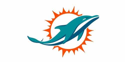
Stylized Swimming Dolphin (2013–Present)
Just before the 2013 NFL Draft, all of the logos and uniforms were changed. In the new logo, an aqua dolphin with a stylized look swims in front of an orange sunburst. Because the logo is just the outline of a dolphin in aqua and navy, the dolphin is left unmasked for artistic and creative reasons.
For the first time, the navy was used as the main color, and orange was toned down a lot. All of the players wear white or aqua pants with a white or aqua jersey. As with the old uniforms, home games will still be played in white, but aqua will be worn instead. On the white jersey, the names and numbers are written in a special typeface in a contrasting aqua color. The numbers are outlined in orange and navy, but the names are only outlined in navy.
The numbers on the aqua jerseys are white with an orange and aqua outline. While the names are white with a navy outline. The helmets are white with a white facemask, just like the last few years of the old style. However, the helmet stripe is now mostly navy, with aqua and a less prominent orange.
The back numbers of both jerseys are written in big “Dolphins” letters in the team’s new script font. On the pants, there are no logos or words, just a small team wordmark that is either aqua or white. In 2018, the team used orange and aqua in its logo and uniform set. Navy blue was taken out of the uniform set and only used in the logo.
Old Uniforms
It was a throwback to the 1970s when the Dolphins played a few games in 2015 wearing their aqua uniforms from the 1970s. During the same four years, they also brought back the original white version as a second uniform option. In 2018, the aqua throwbacks were worn during the Miracle in Miami game against the Patriots.
The Color Rush Uniform
On September 29, 2016, the Dolphins played their first game in their new Color Rush uniforms against the Cincinnati Bengals on Thursday Night Football. The last time the Dolphins wore an orange jersey was in 2010, so their all-orange outfit this year was a welcome return. Still, the Dolphins only wore the shirt for one game before they put it away. In later years, when the NFL changed its rules about hosiery, the Dolphins sometimes wore all-aqua or all-white jerseys.
Why Did Miami Dolphins Change Their Logo?
The new logo was inspired by the one from 1966, but it looks very different from that one. The new Miami Dolphins logo was made to better show how the team has changed over time than the “throwback” logo. The helmet was taken off the dolphin’s head, and its body was polished to show off its natural beauty.
What Company Has a Dolphin Logo?
Joy the Dolphin is the new mascot for the clothing company Esprit. He represents the company’s history, values, and spirit by showing how the company’s products celebrate life, love, and unity.
Did Miami Dolphins Change Their Color?
The 1980 makeover made small changes to the Miami Dolphins’ classic logo and colors. To make the color scheme look better, we made the orange darker and richer, and we gave the turquoise a hint of green.
Do the Dolphins Have a Real Dolphin Mascot?
The Miami Dolphins joined the American Football League in 1966 as an expansion team. Due to the name of the team and how close it is to the setting of the TV show, a real dolphin from the show was chosen as the new mascot.
Are the Dolphins Getting New Uniforms?
The new Miami Dolphins jerseys are a slight change from the old ones. With a cool aqua and bright orange color scheme, their new uniforms are a new take on their traditional look. You should look at their most recent posts.
Conclusion
The logo for the Miami Dolphins is one of the most well-known in the NFL, which has 32 teams. The team joined the AFC Eastern Division in the 1970s. It was the oldest NFL team from the South.
- DOLPHINS LOGO: Meaning, What Was Changed and,History
- PACKERS LOGO: Green Bay Packers History and Timeline.
- PATRIOTS LOGO: What is the Meaning, Symbols, History & Evolution