The logos of various brands are quite important since they tell the full story of the organization. Designers give extra attention to logos because they are vital for branding as well. One of the interesting facts about KIA Motors is that it began as a maker of bicycle parts. The first KIA logo reflected their history of manufacturing bicycle parts and motorcycles.
Over the years, the KIA logo has been refined to look better on their vehicles. Let’s take a look at how the logo has changed over time.
What Exactly is Kia?
Kia is a South Korean car company that was started in 1944. Since then, it has grown to become one of the top automakers in the world, not just in South Korea. Kia manufactures not only passenger cars but also commercial vehicles and has companies on every continent.
The History of Kia
Kia has grown from a humble beginning to become one of the world’s largest brands and vehicle manufacturers. Kia is a company worth looking into because it sold 2.8 million cars in 2019 and has a good reputation as South Korea’s second-largest automaker, behind only Hyundai Motor Company. Kia’s link with autos was not always the case. It started out making simple things for people who rode bicycles, but now it makes beautiful cars for people all over the world. Let’s start with the man who started it all.
Kim Chul Ho was born in Korea in 1905. Little Kim came to Japan as an ambitious teenager looking for better possibilities, where he found work at a steel plant. Using the technical skills he learned in this job, he started a business in Osaka, Japan, that makes bolts and nuts for people who ride bikes.
Kim returned to his native Korea in 1944 and founded Kyungsung Precision Industry. After nine years, the company’s name was changed to Kia Motors.
Kia is not an abbreviation of the company’s old name, Kyungsung Precision Industry, or of any other name. Instead, it’s a moniker that embodies the founder’s enthusiasm and goal of bringing something fresh from his continent to touch the world: patriotism.
The name is derived from the Sino-Korean terms ‘Ki’ (meaning to come out) and ‘A,’ according to South Korea’s oldest vehicle manufacturer (standing for Asia). Kia literally means “to come out of Asia” or “to rise out of Asia.”
Read Also: NETFLIX LOGO: Evolution & Tips on Digital Branding
As an ambitious corporation, Kia has had a significant effect on the transportation business as an ambitious corporation, creating steel tubing and bicycle parts in 1944, the first Korean bicycle in 1952, Honda-licensed compact motorbikes in 1957, Mazda-licensed trucks in 1960, and their vehicles in 1974, among other breakthroughs. Unfortunately, Mr. Kim died in 1973, before the Kia Brisa tiny car line was introduced to the market.
Kia had some hurdles on its route to the top, as any seasoned businessman would expect. Before some of these problems, Kia built its first auto assembly plant, the Sohari Plant, in 1973 to make the Brisa line of small cars.
The new military dictator, Chun Doo-hwan, imposed industry consolidation in 1981, which halted manufacturing. To follow this order, Kia stopped making passenger cars and started putting more effort into making light trucks.
Kia sold its first fleet of cars in the United States in 1992. The Asian Financial Crisis struck the corporation hard five years later. Because of this bad effect, in 1998 they came to an agreement with Hyundai Motor Company to work together.
Hyundai Motor Company now owns around 34% of Kia Motors, outbidding Ford Motor Company, which has held a strategic interest in Kia Motors since 1986. Kia Motors also owns an interest in about 22 Hyundai Motor Company companies.
With a strong emphasis on design and the necessity to stay competitive in the European market, the company hired Mr. Tom Kerns from Cadillac and Mr. Peter Schreyer from Volkswagen as Chief Design Officers. These two designers were crucial in restructuring Kia’s production line. Mr. Peter Schreyer, for example, created the ‘Tiger Nose.’
Kia’s other models include the Kia Cadenza, Kia K900, Kia Optima, and Kia Soul.
History and Meaning
Kyungsung Precision Industry, which is currently known as KIA, was founded in 1944. It was a small factory in southern Seoul that manufactured bicycles and parts for them. The firm also manufactured industrial items. The business created the first bicycle, Samcholli-ho, in 1946. At the time, most of the bicycles on Korean city streets came from other countries, so this was a big step forward.
The company’s name was changed to KIA Industrial Company in 1952. It was named after one of the bicycle types produced by the company during those years.
In 1955, KIA became quite popular and sold a large number of bicycles throughout the country. This spurred the company to construct a new plant in Shaikhung and consider extending its operations. This is when the business realized the viability of making motor vehicles, and the first KIA scooter appeared in 1957, followed by the C-100 three-wheeled motorbike in 1961.
Read Also: SQUID GAME LOGO: Why It Is Famous & What it Symbolizes
In 1970, the company had nearly totally eliminated its need for imports, allowing it to focus on the advancement of its technology, which subsequently led to even greater success. The Titan and Boxer KIA four-wheeled trucks hit the market in 1971. In the same year, KIA changes its name to KIA Corporation and begins working with Mazda, a Japanese company that was already a well-known player in the Asian automaking market.
The company’s contemporary existence begins in 1972 when it acquires a license to produce automobiles. And it only took KIA a few months after receiving the license to develop its first automotive engine.
As we can see, the corporation altered a lot of operations before it began manufacturing automobiles, and its visual identity history depicts each key development in the KIA brand timeline.
The only constant in the KIA logo is the existence of the wordmark, but the style and typeface changed from redesign to redesign.
Kia Logo Meaning
As the firm continues to expand to meet the needs of an ever-increasing number of customers, the Kia logo symbol is designed to express a sense of enthusiasm, energy, and modernism. Kia logos have dependably maintained a strong image based on the company’s name over the years.
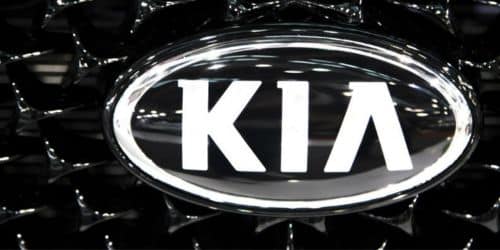
Kia’s emblem today is stunning, whether in black or red. It portrays thoughts of creativity, power, and exploration at a look.
Surprisingly, the Kia logo in the United States and other areas of the world isn’t usually the same as the one seen in Korean markets. In the brand’s homeland, the symbol includes a blue or black circle with a thick outline and a silver design designed to depict the letter K.
Notably, all of Kia’s logos are usually made of silver metal when they are used on cars. The precise insignia you see on your Kia vehicle will vary depending on where you buy it and when it was manufactured.
History of the Kia Logo
KIA Motors, a South Korean automaker, is one of the country’s leading vehicle manufacturers, yet it began as a bicycle manufacturer in 1944. It is well-known in the UAE for its non-luxury pre-owned cars, as well as its design methodology. Let’s take a look at how the KIA brand logo evolved into what it is now.
1944-The First Kia Logo
The first logo appeared in 1944 when the firm began producing bicycle parts. This previous KIA logo was made up of three diamonds arranged in a triangle with a gear in the center. Another diamond with the firm name inside it was found in the gear.
With a bold design, this KIA logo symbolized the beginning of the corporation. The logo was designed with a monochrome color palette to emphasize authority and professionalism.
1964-Change of Kia Logo With New Company Profile
In 1964, the logo was altered to resemble an inverted ‘Q.’
KIA modified its business profile and began manufacturing automobiles in the 1960s. Along with that, the logo was totally redesigned. The KIA emblem at the time was a green circle with a slanted line coming out of the top. This logo resembled an inverted ‘Q.’
1986- Kia Logo Evolution
In the 1980s, the logo underwent another transformation. This time around, the logo was a large, stylized word mark. The upper line of the letter ‘K’ was bent, and the tops of other letters were also lengthened.
1994-Kia Introduced Its New Logo
The foundation for the new logo was laid in 1994. This logo used a straightforward color scheme of red and white. The company’s name was inscribed inside an oval shape. The contemporary logo conveyed a strong statement about the company’s desire to serve customers all over the world. This KIA logo used a proprietary typeface, but it was still simple, with an ‘A’ letter that did not have a horizontal line.
2004- New Refined Kia Logo
The new KIA logo debuted in 2004 with a few tweaks such as bold and clear lines and a slightly darker color. Furthermore, the logo was an example of minimalist design, providing a basic and attractive spirit to KIA motors’ global presence.
2020 Marked the Debut of the Redesigned Kia Logo
This new KIA motors logo combines all of the letters to form a ‘K’ and an inverted ‘N.’
The most recent logo design has a trendy and modern appearance. All of the letters are linked together, for example, ‘K’ merges with ‘I,’ which merges with ‘A.’ Because the designers chopped the top and lower corners diagonally, the new KIA motors logo seems larger. The color scheme of red and white remains unchanged.
Kia Logo in Their Homeland
The KIA Motors company has always kept its logos for South Korea and other countries separate. South Korea’s logo is distinctive, having a black outline and the company’s symbol inside. The symbol resembles the letter “K” with an additional white oval-shaped line. In South Korea, the logo is elegant and sophisticated. The reason for the difference between the logos of local automobiles and those of other countries is that people are more drawn to the “KIA” logo. As a result, KIA Motors is gaining more notoriety and sales.
Also, the symbol is made of silver metal and has a black background on all vehicles. This was all about the KIA logo, which represents one of South Korea’s leading automakers. If you are a car lover, you can browse a variety of used cars for sale in the UAE of various types and models. Furthermore, KIA showrooms in the UAE sell both new and used vehicles.
The Logo’s Font and Colors
The most recent symbol change coincides with the implementation of the Plan S business plan. Its essence is that Kia is gradually transitioning to the production of electric vehicles. As a result, the brand’s logo appears ambitious and modern: upward lines signify expansion, and symmetry represents decisiveness. A wordmark has its own rhythm: it resembles a heart rate graph or a wave, which corresponds to the concept of mobility.
The company’s name is made to look like a signature, and the designers used their design font to do this. All three letters are linked, with the majority of the lines running parallel. The letter “A” is italicized. She, like before, lacks a crossbar. With new typography, the typeface now looks like the NASA worm from the 1980s. In contrast to the original NASA logo, Kia emphasizes stark angles and no curves.
The traditional red hue was replaced with black following the remodeling. According to the documents, the term “KIA” may seem white on a dark background. Along with a two-dimensional form, another aspect of minimalism is a basic palette.
What Distinguishes the Kia Logo From the Rest?
A logo is a company’s face, and the more attractive the face, the more people are drawn to it. So, if you want to attract more people to your brand, start by making the face more attractive. The Kia logo is appealing and distinct from its competitors. The following are some of the reasons why the Kia logo stands out from the crowd:
Simple
The simplicity of a fantastic logo is one of its distinguishing features. While an intricate-looking logo may appear intriguing, it is always the simple designs that stick out. A basic logo with few design components captures the attention of the viewer.
In this day and age of rapid social media updates and 5G internet, it’s important to keep things simple because the average Joe’s attention span is dwindling. In seconds, a simple logo reveals the fundamental personality of a brand.
The Kia logo is straightforward and well-balanced. With just one glance at the logo, you can see that the brand represents sophistication and happiness.
Relevant
The Kia logo is remarkable in that it possesses all five characteristics of a great logo. Pick any well-known logo and you will notice that they are all related. Relevant logos build brand identification by accurately expressing their businesses in the market and clearly communicating the brand personality to customers.
Kia’s logo is an excellent example of a relevant logo. The Kia logo is important not only because it is simple and easy to change, but also because it accurately represents the brand’s values and attitude. The wordmark is wonderfully matched, from the color palette to the typography.
Memorable
The goal of establishing a logo is to pique the interest of customers in your brand. And how does one go about creating a distinctive logo? A designer creates engaging designs by combining numerous design components such as colors, symbols, and typeface. He employs these design components in a manner that looks to be consistent with the brand’s vision and values. He also uses the brand book as a starting point for his work.
The Kia logo stays with a buyer long after he sees it for the first time. Customers are drawn in by the red and white color scheme and the bespoke typeface.
Timeless
People frequently enjoy following trends. This is also true when it comes to logo design. The problem with following trends is that they come and go, and if you do, you may have to change your visual identity every time a trend disappears. Following trends can be more fruitful than designing a logo with your brand’s mission and values in mind. A timeless logo is one that retains its effectiveness over time.
The present Kia logo was created in 2012. However, the basis was set in 1994. People are still moved by it after 28 years. The logo retains its freshness, making it timeless.
The Kia logo stands out from its competition because it is current and uncomplicated, rather than following trends.
Bonus: 5 Reasons Why Your Business Needs a Logo
A business without a logo is analogous to a person without a face. The logo and packaging designs are the first things that spring to mind when we think of a brand. Getting a logo may not be high on your priority list if you are a startup or a small business owner. In that case, here are some reasons why you should consider getting one done as soon as possible.
Logos Make a Powerful First Impression
A logo introduces the brand to clients and potential purchases. People are drawn to a well-designed logo, and their interest in the company rises as a result. Strong first impressions are critical for the future of your business, which is why you must pay special attention to effectively communicate the core characters of your company through your visual design.
Logos Attract Attention
Nike and Apple both have the most appealing logos on the planet. But what makes them so unique? They are extremely simple and make their points in a matter of seconds. When you view these logos, they become indelible in your mind. You must attempt to build a simple but effective logo that will rapidly capture the audience’s attention.
Increases Brand Recognition
A logo not only represents a firm but also conveys a tale that influences the emotions of its clients. Logos are also the foundation upon which brand narratives are created.
Distinguishes You From the Competitors
When developing your logo, you must attempt to be unique. A distinct logo communicates to customers that you are distinct from your competition. Simply said, a logo allows you to communicate your brand values and demonstrate how you differ from your competition.
Logos Are Easily Remembered
The memorability quotient of a logo is critical. Customers will remember you by your logo. A simple and appealing logo can help to increase brand recognition.
What Is New Kia Logo?
Kia’s logo was updated in January 2021. The modification was met with criticism and consternation. The styled version, with its stylish, angular font, seemed like a space-age type signature. The K in Kia was obvious.
Is Kia and KN the Same?
There is definitely symmetry where the logo mimics a handwritten signature. In this relatively new logo, the letters “I” and “A” (which lack a middle line) appear united and are printed in an exceptionally angular and condensed font. Thousands of people have misread it as “K-backwards-N” instead of “KIA.”
What Does Kia Stand For?
In 1952, the company was renamed Kia Industries. What does the name Kia stand for? It is an abbreviation for “To Rise From” and “Asia.” To put it another way, it means to rise from Asia. Motorcycles and pickup trucks.
What Does the KN Logo Mean?
The sign is a “stylized Korean script K,” representing a renewed emphasis on “quality and innovation.” Under this emblem debuted the Brisa pickup in 1973, a vehicle that was spun out the following year to manufacture the Brisa sedan, the company’s first passenger automobile.
In Conclusion
A distinctive logo will help you stand out from the crowd and communicate to clients what they can expect from you. The Kia logo embodies everything a great logo should be. Its distinctness stems from its simplicity, which never fails to captivate the audience.
Related Articles
- KOREAN CAR BRANDS: Best 19+ North & South Korean Car Brands in USA
- VOLKSWAGEN LOGO: Meaning, Font, History and Cars
- COMPANY CAR: Uses, Insurance, Leasing, and Guide
- NEW KIA LOGO: Why Kia Changed Their Logo & Best Branding Practices
- EBAY LOGO: Meaning, Font, and History


