Chick-fil-A is an American fast-food restaurant chain founded in 1946 in Georgia. It has since grown to become one of the largest chains in North America, with over 28,000 locations across the United States and Canada. The chain is known for its chicken sandwiches. But part of its success, over the years, has been attributed to the well-thought design of the Chick-fil-a brand logo. The Georgia-based fast food restaurant chain Chick-fil-A logo gives away the restaurant’s “chicken” specialty. So to help you make better brand and logo decisions, let’s go over the story behind this logo.
Chick-Fil-A Logo: Evolution
Chick-Fil-A’s visual identity is based on a simple yet powerful color combination of red and black, which can make any lettering and images look modern and robust. Though the brand’s relaxed and friendly emblem stands on its own, it is a brilliant example of how redesigns, which have occurred only a few times in the company’s history, elevate the image without losing individuality and reflect the brand’s progress and growth.
1960 – 1963
The fast-food chain’s initial logo was introduced in 1960 and only lasted three years, despite being a fun and brilliantly executed badge consisting of a black and red chicken’s head in profile placed on the left from the handwritten logotype. The chicken was drawn caricatured, with a smiling face and cunning eyes, looking to the right.
1963 – 1964
The new logo kept all of the previous version’s elements. The chicken’s head, on the other hand, was smaller and placed lower. The inscription “Best Thing That Ever Happened to a Chicken” in all capital bold letters at the bottom had vanished. In addition, there were two red hyphens, one “L” was removed from the phrase, and the letter “A” was enlarged and colored red. The addition of additional red elements resulted in a well-balanced brand visual identity.
1964 – 1975
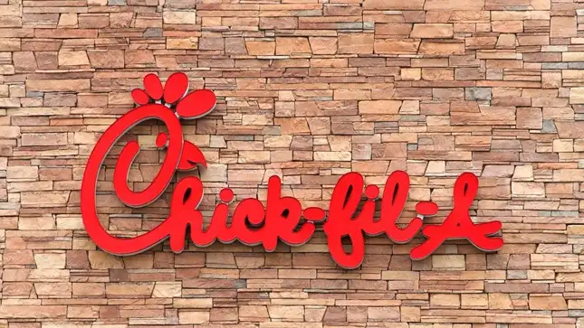
Chick-Fil-A’s iconic logo, which everyone knows today, was introduced in 1970 with a redesign. The new logo was instantly recognizable due to the same color palette and illustration of a chicken’s head. The latter, however, was now incorporated into the inscription, as the capital “C” was stylized as a chicken. The stylized letter “C” had a black open beak on the right, a small red eye inside, and four solid red ovals above it, forming the profile of a bird. The inscription was no longer as bold and was written in a more elegant style. The updates gave the restaurant chain a more sophisticated appearance.
1975 – 1985
The previous logo version had only minor changes. The black lettering was created with the same custom cursive typeface, which featured rounded shapes and sleek lines that were now bolder. The new version was more visible from a distance and gave the logo a more grounded and confident appearance.
1985 – 1998
The logo’s color palette was slightly altered in 1985 by darkening the shade of red. This did not affect the appearance or recognizability of the emblem; it simply made it look more balanced and professional.
1998 – 2012
In 1998, the company began drawing its logo in red on a white background. The logo has no black details, and the new red and white palette looks powerful and passionate, representing the brand’s love and warmth to its customers.
2012 –Today
The 2012 redesign refines the contours of the iconic logo and closes the chicken’s beak. The color of the new emblem has been brightened, and the lines have been modernized, so it now looks fresh, stylish, and very modern, brilliantly reflecting the essence and purpose of the company.
Old Mascot
Doodles was the name given to the chain’s original mascot, an anthropomorphized chicken. A cow eventually replaced him, but he still appears as part of the “C” on the logo.
Chick-fil-A Logo and Advertising Disputes
Chick-fil-A is well-known for its overly protective branding policy, described as “corporate bullying.” Several businesses, in particular, received cease and desist letters from the company for using the “eat more” phrase, which is part of Chick-fil-A’s slogan “eat more chicken.” Surprisingly, the company successfully protested not less than thirty opponents who used the “eat more” phrase.
However, some opponents were successful in defending their rights. For example, the Vermont artist Bo Muller-Moore, who printed T-shirts with the phrase “Eat More Kale,” had this phrase trademarked by the United States Patent and Trademark Office in 2014.
How Chick-Fil-A Started
Chick-Fil-A is a well-known restaurant chain with locations throughout the United States. However, the first standalone location opened in 1986, paving the way for all their new locations today. Currently, the restaurant chain has over 2,300 locations across the country. It also has over 24 drive-through-only locations. Furthermore, restaurants are available through licensing agreements through airports, universities, and hospitals.
Chick-Fil-A grew out of the Dwarf Grill (later renamed Dwarf House—a business name that the chain still uses), a restaurant founded in 1946 by S. Truett Cathy in Hapeville, Atlanta. This restaurant was located near the former Ford Motor Company plant. The hotel’s staff is said to have once caught metals while working shifts. In 1967, the first Chick-Fil-A restaurant opened in a shopping mall.
Chick-Fil-A’s current slogan, “We Never Invented the Chicken, Only the Chicken Sandwich,” was inspired by a true story. Burgers dominated the fast-food market when the restaurant opened its doors in 1967. Cathy is credited with inventing and perfecting the chicken sandwich that made the restaurant famous.
His brilliant chicken sandwich concept arose from wanting to find a quick way to serve meals. Cathy discovered that preparing the chicken in a pressure cooker with peanut oil saved significant time. The sandwich also has two pickles because that was the only spice Cathy had on hand when he made the sandwich.
Read Also: Supreme Logo: Controversy, Evolution & History
Chick-Fil-A made headlines in October 2003 when it announced the opening of a new location in Goodyear, Arizona, that would offer free meals every week of the year to the first hundred customers who entered the newly-launched restaurants. Coupons were to be used to claim the promotion.
Along with this promotion (widely publicized online), the restaurant company organized a massive opening day party with karaoke, klieg lights, free ice cream, and prize raffles. Chick-Fil-A now holds its “First 100” promotion at the opening of every new restaurant, with people camping out for days to secure their promotion.
Chick-Fil-A has sponsored the Peach Bowl, a yearly college football game held in Atlanta, since 1997. That competition was renamed the Chick-Fil-A Bowl beginning with the 2006 season. The restaurant chain is also a significant sponsor of college athletics at the ACC, Big 12, and SEC levels.
11 Interesting Facts About Chick-Fil-A
Chick-Fil-A has evolved into one of America’s most popular fast-food restaurants. However, you may be unaware of a few facts about this chicken sandwich heavyweight. Here are eleven facts about Chick-Fil-A that you probably didn’t know.
#1. Chick-fil-A’s early success is credited to Ford.
Dwarf Grill was located near Ford Motor Company’s now-demolished Atlanta assembly plant, and many of their early customers were Ford employees. This built-in customer base aided in the survival of Dwarf Grill.
#2. The letter A in the company logo stands for “grade A.”
According to their Beginner’s Guide, the A in Chick-Fil-A stands for “grade A,” as the company strives for high quality.
#3. All of their potatoes come from Washington State.
According to the restaurant’s website, all potatoes are sourced from Washington State farmers near the Columbia River Basin.
#4. The first chicken sandwich appeared 15 years after Dwarf Grill was founded
It wasn’t until 1961, after 15 years of Dwarf House operation, that Cathy discovered the pressure cooker that would allow him to branch out and launch Chick-Fil-A six years later, in 1967. Nobody ever imagined that developing recipes and ideas would be simple!
#5. Chick-fil-A’s Chicken Doodles is a mascot for a logo
Before the 1995 debut of “eat mor chikin” cattle, the Chick-Fil-A mascot was the chicken still appearing in the restaurant chain’s logo. It’s known as Doodles.
#6. The restaurant chain began in food courts and spent 19 years there.
The first Chick-Fil-A restaurants were only found in suburban shopping mall food courts. The first standalone restaurant opened nineteen years later, in 1986.
#7. The largest Chick-Fil-A restaurant in the world is located in New York.
Lower Manhattan, New York, is home to the world’s largest Chick-Fil-A restaurant. It is over 12,000 square feet and can accommodate up to 140 customers. There is also a rooftop terrace.
#8. There is a Hawaiian-themed Chick-Fil-A restaurant in Georgia
Truett Luau, a Chick-Fil-A restaurant in Fayette, Georgia, is themed around Hawaiian culture. Truett Cathy’s last location, which opened in 2013, was here.
Traditional Chick-Fil-A fares, such as waffle fries and chicken sandwiches, are available, as are Hawaiian-themed classics such as mahi-mahi and plate lunch. According to Chick-Fil-A’s website, Cathy chose almost all of the restaurant’s decor.
#9. Chick-Fil-A sauce is made up of three sauces.
Chick-Fil-A revealed in 2012 that their sauce combines ranch, barbecue, and honey mustard. Sounds like something you could make yourself!
#10. Chick-fil-A’s pickles are made in-house.
The restaurant chain brines its pickles on-site for three days before slicing them and stacking them on sandwiches.
#11. The “secret menu” at Chick-fil-A includes a quesadilla
Chick-Fil-A, like many other restaurant chains, has a secret menu. The restaurant’s secret menu has a chicken quesadilla and tasty shake flavors.
Is there a new Chick-fil-A logo?
The Chick-Gil-A logo has undergone several changes over the years, the most significant of which occurred in 1970 when the first version of the current badge altered the chain’s visual identity.
What is the significance of the cow in the Chick-fil-A logo?
The Chick-fil-A logo is a chicken, a restaurant symbol, a representation of the chain’s name, and a graphical representation of the chain’s specialty — chicken sandwiches.
Who designed the Chick-fil-A logo?
The Chick-fil-A logo was designed by Louie Giglio, who collaborated with Evan Armstrong in the mid-1960s to create the iconic image.
What does the Chick-fil-A logo represent?
Chick-fil-A’s logo symbolizes the company’s warmth and care for its customers and its main specialization, chicken fillet-based sandwiches.
What is the brand message of Chick-fil-A?
One of the largest American fast food restaurant chains’ brand messages is “We Didn’t Invent the Chicken, Just the Chicken Sandwich,” The restaurant chain’s name has become synonymous with sandwiches with chicken fillet.
What is the history of Chick-fil-A?
S. Truett Cathy founded Chuck-fil-A in 1946 in Georgia, USA, when he and his brother Ben opened a small restaurant called “Dwarf Grill,” which was later renamed “Dwarf House,” and the name “Chick-Gil-A” (derived from the “chicken fillet”) did not appear until the 1960s.
Is there always a beak in the Chick-fil-A logo?
Since 1967, the Chick-fil-A logo has included a beak. The company was founded in 1946 as “Dwarf Grill,” so it was a completely different concept; however, the beak appeared in the Chick-fil-A badge shortly after the company was renamed.
What is the significance of the Chick-fil-A logo?
Chick-fil-A’s logo, one of North America’s largest fast-food restaurant chains, represents the company’s specialization: its ” cuisine ” cuisine based on chicken products.
Who designed the first Chick-fil-A logo?
Louie Giglio and Evan Armstrong, two well-known American designers at the time, created the original Chick-fil-A logo. On a napkin, the first scratch of the logo was made.
Why does Chick-fil-A use the color red?
Red is a symbol of warmth and love, and the most potent and memorable color for branding. This color makes one feel at ease; it represents coziness and hospitality, which are core Chick-fil-A values.
Related Articles
- How To Open A Restaurant In 2023:& Free Tips & How to Open It with No Money
- RESTAURANT MANAGEMENT SYSTEM: Guide to Effective Restaurant Management
- RESTAURANT MARKETING: What You Should Know and Strategies
- CHUCK E. CHEESE LOGO: Meaning, Font, Evolution and History
- 27 BEST FRANCHISES TO OWN IN 2023: Top US Practices & Free Tips


