The name Budweiser refers to an American lager beer that is currently produced by AB InBev. After being first made available in 1876, beer quickly gained enormous popularity all over the United States. The well-known beer is currently sold all over the world and is among the top brands in its industry. In this article, we’ll examine Budweiser’s history, the logo’s genesis, and how it helped the brand achieve the kind of success it now enjoys.
Budweiser, what is it?
Anheuser-Busch Companies, LLC owns the rights to the North American lager brand Budweiser, which was made by Carl Conrad & Co. and first sold in 1876. The Czech Budweiser should not be confused with the American Budweiser. Not only is it made in a different country, but it also has different ingredients. This US beer, for example, is made with barley malt, hops, and up to 30% rice.
Since the previous century, the brand has grown in popularity as a result of an active marketing strategy. She had a strong and visually appealing logo that inspired consumer confidence, which was one of her advertising success elements. It has experienced at least 15 alterations over the years. However, the design was constant—each new iteration resembled the one before it in some way. Despite the trademark’s repeated changes, this enabled the brand to become identifiable.
The Company’s History
The Budweiser logo has changed over time. It has undergone about 15 changes since the original logo was created in 1876. In 1963, it changed from a complex design to one that was more playful and approachable, and then in 1968, it became somewhat more straightforward. The new, current logo is easy to read, simple and clear, and excellent for branding.
Budweiser’s ancestry George Schneider, a German saloon owner, and brewer founded the Bavarian Brewery in South St. Louis in 1852. Later, Schneider would grow and open a second brewery in St. Louis, but in 1857, Schneider’s businesses would struggle financially. Schneider had to sell his brewery to several different people because he was about to go bankrupt. William D’Oench and Eberhard Anheuser bought the brewery in 1860; by 1869, Anheuser was the only owner. But soon after, Anheuser changed the name of the business to Anheuser-Busch after selling 50% of it to Adolphus Busch, a company salesman.
Busch would soon change the American beer industry. He was the first American to build a refrigerated automobile firm to increase its market share and pasteurized beer.
The first national beer brand in the US was created using their distribution skills and the delicious beer they made. He gave the brew the name Budweiser.
Busch undertook an extensive marketing campaign from the 1880s through the 1890s, giving away free bottle openers, corkscrews, pocket knives, calendars, and other items to advance his company’s reputation. Because of the campaign’s popularity, Anheuser-Busch had to fast grow to meet the demand for Budweiser beer.
1910s__1930s
Anheuser-Busch was having a terrific time before prohibition started. From the 1910s until the 1930s, Anheuser-Busch fought to survive prohibition. The business started selling non-alcoholic beer, brewer’s yeast, and ice cream in order to survive. The business managed to survive the Prohibition period, putting them in a position to resume regular business as soon as it was over.
Anheuser-Busch went on to establish breweries all over the world as well as various theme parks in the years that followed. Anheuser-Busch is still employing a combative advertising approach, including the sponsorship of everything from horse events to NASCAR to Super Bowl commercials. Of course, the instantly recognizable Budweiser logo has been a crucial component of this advertising success from the beginning to the present.
The Evolution
The Budweiser logo has seen numerous changes over time. However, the primary components of the company’s first logo, which was unveiled in 1924, have largely remained the same. Although the current Budweiser emblem is cleaner and more contemporary than earlier versions, it is nonetheless comparable to all of the other versions. Budweiser has maintained its prestige and recognizability from generation to generation in large part due to its design constancy, which has also been crucial to its marketing.
Elements of the Budweiser Logo Design
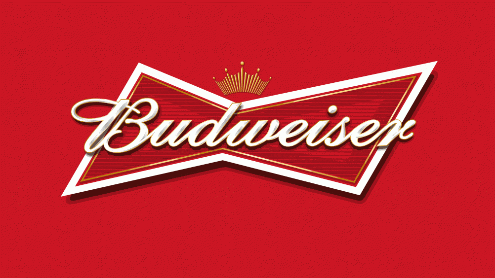
The Budweiser logo, which has a gold crown on the top of the label, conveys the image of “The King of Beers,” which is one of the brand’s catchphrases. The logo’s bow-tie style, meanwhile, exudes sophistication and elegance.
The colors of the Budweiser logo include a bold red, a clean white, and hints of gold. The logo may be quickly observed and recognized from a distance thanks to its vivid red hue. Additionally, studies have demonstrated that the color red stimulates appetite, which benefits Budweiser. White also evokes purity and cleanliness, and the addition of gold enhances Budweiser’s regal and sophisticated image.
The combination of the colors red and white evokes a sense of American history and patriotism, which Budweiser has long included in the themes for their marketing campaigns.
Last but not least, the font used in the Budweiser logo was created especially for the business to further enhance its distinctiveness and branding. Any business that relies as much on advertising as Anheuser-Busch will need to rely on its logo to be successful.
More Information
Budweiser never considered it sufficient to merely promote the benefits of their beverage. Instead, they had to develop a message, a brand identity, and an association in the minds of their clients. Even now, if you look at most Budweiser ads, you’ll see that the brand’s most recognizable features, like the Clydesdale horses and the instantly recognizable logo, are front and center. In its commercials, Budweiser doesn’t always strive to emphasize how delicious or reasonably priced its beer is. Instead, they make an ad that is funny or emotional, put their brand in it, and then put it in a prominent place at the end.
Budweiser has oversaturated the market with images of their emblem through this kind of promotion. When Budweiser broadcasts an advertisement, it is not their desire for the viewer to go out and buy a Budweiser drink right now. Instead, they want to foster familiarity and pleasant associations so that when people think of a bar or store, they immediately think of Budweiser.
As a result, the Budweiser logo’s familiarity and the themes it stands for have played a significant part in the beer being one of the most well-known brands in the United States. Success is certain to follow if a business can design a fantastic, identifiable logo and develop a theme and association around that brand, as Anheuser-Busch has done.
The Budweiser Logo History
Budweiser, often known as The King of Beers, has a stunning and instantly identifiable logo that has undergone numerous redesigns over the course of the brand’s existence. It looks great and contemporary against any background thanks to its vibrant color scheme and simple, sharp design.
The famous beer’s first three logos were extremely ornate and built around seals and coats of arms with a lot of extra typography. But in 1952, the business began to make it bolder and more basic in order to appeal to the tastes of the younger audience and advance the project as a whole.
In 1876 – 1942
The new logo has the appearance of a label or promotional item. It looks nice because there are a lot of inscriptions and small decorations on it. But because it was written by hand, it is challenging to read. The center portion, which is an extended oval in a diamond with three red “C” characters, sticks out the most. A rectangular business card with the manufacturer’s contact information is shown below. It is surrounded by a floral design.
1910 – 1945
Instead of a separate logo, the brand now has a new business card. It provides the most details about the product and its maker. As before, the text is italic, written by hand, cohesive, and set against a bright background. It lacks a frame, unlike the previous version, and simply has rounded bottom corners on the right and left. Additionally, the words “Genuine” and “King of Beers” are written in block letters to balance the wording. An artistic element is placed above it and consists of a tape with pointed ends, a circle in the center, ears, leaves, wreaths, and the initials “AB” (derived from the name “Anheuser-Busch”). Red serves as the background color.
1945 – 1987
To avoid seeming like a business card, the designers enlarged the rectangle and positioned it vertically rather than horizontally. They expanded the text portion to include details on the item and the factory where it was made. There are now five different types of typography because the developers modified the typeface in several areas. The corporate round sign with ornaments and the acronym “AB” in the center stands out clearly since the authors kept the top zone parts the same but made them more compact and aesthetically obvious.
1952 – 1957
A triangle-shaped logo with rounded corners and a thick black outline was chosen by Budweiser in 1952. “King of Beers” and the brand name were printed inside. The Anheuser-Busch trademark emblem, an eagle in the letter “A,” complimented them. A gradient of red and white is used for the backdrop color.
1957 – 1961
The business has been using rectangular logos with a black frame for eleven years. The character first debuted in 1957 as two inverted triangles joined together to make a bow tie.
1961 – 1963
The 1961 trademark also features the bow tie logo shape, but this time the “King of Beers” statement was eliminated, and the backdrop was embellished with five-pointed ellipses instead.
1963 – 1968
The Logo design is entirely different from its 1963 iteration. There is only the term “Budweiser”; there is no fabled “butterfly.” Different colors are used for each letter. Green, blue, and red are all colors in the pallet.
1968 – 1987
Two inverted red triangles that were included in earlier logos were changed to the 1968 version of the trademark. The brand name of the beverage caught everyone’s attention at the same moment. In 1987, a minor adjustment was made: the geometric figure’s shape was modified, and the font was made italic.
1987 – 1994
The 1957 logo has been stylized for use in this version. To make the logo as straightforward as possible, the designers eliminated any superfluous features. Only a red geometric shape in two interconnected triangles and a white message with printed lowercase characters and a slight slant is visible. A shadow in the shape of a thin, beveled black line is present on the right side of the logo, giving it a three-dimensional appearance.
1994 – 1999
The slopes of the Budweiser logo and word were flattened. Its shadow was removed; the letters were lengthened, and the phrase “Biere Beer” was added. The geometric form doesn’t change.
1996 – 1999
The logo shows a horizontally positioned, multi-structured figure with an extended shape. It has a white label with the brand name on it. The words “Classic American Lager” are below. A circle-shaped business sign with an ornament and a talisman is shown above. The Logo Also has multiple lines that are different colors and a 3D look.
1999 – 2011
A butterfly-shaped logo with italic text that extends outside of the geometric figure was approved by management. The margins of the sign are bordered by two thin lines, and a five-pointed crown is located above them. Red serves as the primary backdrop color and transitions to black in a gradient (in the corners).
2011 – 2016
On the aircraft, the logo was given a little spread, a pastel color scheme, and an additional edge line. On the right, a shadow also formed, giving the insignia its previous three-dimensional appearance.
2016 – Today
The shortest version is currently in use. Only the word “Budweiser” and an oblique geometric butterfly shape are present.
Logo’s Font and Color Scheme
The logo went through a lot of changes in a short amount of time. For a few years, it was a square, then it was a complicated shape, and finally, it was a butterfly. At first, it was hard to tell it apart from the sign for the Anheuser-Busch brewery. Only the name of the beer kind remained after the rebranding; this became the branding. The abbreviated name of the parent firm had vanished. The logo progressively changed from being intricate to being straightforward. Later on, it became just a red butterfly with white italic letters.
For Budweiser, Michael Hagemann created a unique lettering style. He started with the Brewmaster typeface. The word was clearly handwritten, slightly skewed, and coherent. The beer company’s logo occasionally used chopped typography. The color palette is typical. Red and white make up the majority of it now; previously, it also had gold, blue, and black.
Anheuser-Busch spent $449 million on advertising the Budweiser brand in the United States alone in 2012. promoting Budweiser as the most marketed beverage brand in the US. with a third of the company’s US marketing expenditure spent on advertising. Since the 16th century, Budweiser from Budjovice has been referred to as “The Beer of Kings.” This catchphrase was changed to “The King of Beers” by Adolphus Busch. Despite this background, Anheuser-Busch is the registered owner of these slogans’ trademarks in the US.
Marketing Strategies of the Brand
Bud Light sponsored an ad campaign from 1987 to 1989 that featured Spuds MacKenzie, a canine mascot.
A six-year licensing arrangement with the NFL cost $1 billion and was purchased by the Bud Light brand in 2010.
Each year, Budweiser spends $20 million on MLB licensing rights. There have been many TV ads for Budweiser, including ones with the Budweiser Frogs, who act like lizards, the “Whassup?” campaign, and the Budweiser Clydesdales, a team of Clydesdale horses.
Additionally, Budweiser supports motorsports, from sponsoring the Budweiser King Top Fuel Dragster driven by Brandon Bernstein to Bernie Little’s Miss Budweiser hydroplane boat.
The CART championship is sponsored by Anheuser-Busch. It was the “Official Beer of NASCAR” from 1998 to 2007 and is now the “Official Beer of NHRA”. The Budweiser Shootout, Budweiser Duel, Budweiser Pole Award, Budweiser 500, Budweiser 400, Budweiser 300, Budweiser 250, Budweiser 200, and Carolina Pride / Budweiser 200 are just a few of the motorsport competitions it has supported. [24] But starting in 2016, A-Busch B’s brand became the primary emphasis of its NASCAR sponsorship.
NASCAR teams like Junior Johnson, Hendrick Motorsports, DEI, and Stewart-Haas Racing have all had Budweiser as a sponsor. Dale Earnhardt Jr. (1999-2007), Kasey Kahne (2008-2010), and Kevin Harvick are some of the drivers who have been sponsored (2011–2015). [27] Budweiser sponsored various IndyCar drivers from 1983 to 1984, including Mario Andretti, Bobby Rahal, Scott Pruett, Roberto Guerrero, Scott Goodyear, Paul Tracy, Christian Fittipaldi, and Richie Hearn (1998–1999).
Budweiser sponsored the BMW Williams Formula One team from 2003 through 2006
The Los Angeles Galaxy and Major League Soccer both have Anheuser-Busch as official partners and sponsors. Budweiser was also the main sponsor of the British Basketball League in the 1990s. Anheuser-Busch has also made Budweiser the official sponsor of the Premier League and the presenting sponsor of the FA Cup.
The business commissioned the wordplay song “Under the Anheuser Bush” in the early 20th century, and numerous pioneering phonograph firms recorded it.
In 2009, Anheuser-Busch worked with the popular Chinese video-sharing website Tudou.com to hold an online video contest for users. The competition invites participants to submit concepts for a Bud TV commercial that will air in February 2010 during the Chinese New Year and feature ants.
The 2010 FIFA World Cup was held in South Africa, and Budweiser sponsored an online reality TV series called Bud House that followed the lives of 32 international football enthusiasts who shared a home there. One fan represented each participating country in the World Cup.
Anheuser-Busch requested that the Budweiser emblem be covered up or removed from the Denzel Washington and Robert Zemeckis movie Flight (2012) on November 5, 2012.
Budweiser promoted itself as “Proudly A Macro Beer” in an advertisement named “Brewed the Hard Way” that ran during Super Bowl XLIX, differentiating it from smaller volume artisan brews.
Prior to the presidential debate on October 7, 2016, the Budweiser Clydesdales made a special appearance on the Danforth Campus at Washington University in St. Louis. For the occasion, a unique batch of beer called Lilly’s Lager was brewed.
Budweiser gave customized beer bottles to each goalie Lionel Messi has scored on in December 2020.
Brands of Budweiser
In addition to the standard Budweiser, Anheuser-Busch also produces Bud Light, Bud Ice, and Bud Light Lime under the Budweiser name.
Anheuser-Busch introduced Budweiser 66 in the UK in July 2010. Inbev UK Limited produces and sells the 4% alcohol by volume Budweiser Brew No. 66 in the UK.
Bud Light Seltzer was introduced by Budweiser in 2020. In August 2020, they added grapefruit, cranberry, and pineapple flavors to the black cherry, mango, lemon-lime, and strawberry flavors they already had.
Bud Light Seltzers will introduce Apple Crisp, Peppermint Pattie, and Gingersnap in October 2020, with “ugly sweater” images on the cans.
Budweiser released Bud Zero, their first low-calorie, alcohol-free beer, in July 2020.
Temporary Labeling
Advertising Age reported on May 10, 2016, that the Alcohol and Tobacco Tax and Trade Bureau has approved redesigned Budweiser labels to be used from May 23 through the November elections on 12-ounce cans and bottles.
America has replaced “Budweiser” as the brand name. E Pluribus Unum and “Liberty & Justice for All” were among the patriotic American sayings that took the place of a large portion of the packaging’s text.
Worldwide Logo Production
Labatt Brewing Company holds a license for, manufactures, and distributes Budweiser in Canada (also owned by AB InBev).
14 of the 15 Anheuser-Busch breweries located outside of the US are found in China. In China’s beer market, Budweiser ranks as the fourth most popular brand.
Packaging and Containers
Containers
Budweiser has been sold in a variety of sizes and containers over the years. Budweiser was typically sold in kegs, 12 US fl oz (355 ml) bottles, and 1 US quart (0.95 l) bottles until the early 1950s. Sales increased after the 1936 introduction of cans. In order to increase the national brand and distributor presence of Budweiser, August Busch Jr. made a calculated decision in 1955. With this growth came better automation for bottling, new materials for bottling, and better ways to get the drinks to customers.
These innovations led to the development of numerous novel packaging and container designs. 2011 saw the introduction of four big container sizes for the distribution of Budweiser: half-barrel kegs (15.5 US gal; 58.7 l), quarter-barrel kegs (7.75 US gal; 29.3 l), 1/6 barrel kegs (5.17 US gal; 19.6 l), and 5.2 US gallons (20 l) “beer balls.” The range of cans and bottles produced by Budweiser is 7 to 40 US fluid ounces (210–1,180 ml). Anheuser-Busch unveiled its twelfth can design in 1936 on August 3, 2011, emphasizing the bowtie.
On occasion, packages are made to reflect regional traditions and customs. The preferred packaging in St. Mary’s County, Maryland, is 10 US fl oz (300 ml) fluid-ounce cans.
Bottle Logo
Since it was first introduced in 1876, the Budweiser bottle hasn’t changed all that much.
Cans Logo
Budweiser started bottling their beer in 1936 in an effort to revive interest in their beverage following the lifting of Prohibition. Sales increased as a result of the new packaging, and this trend continued until 1939, the start of World War II.
Budweiser cans have undergone a number of design changes throughout the years in response to market trends and consumer preferences. Without excluding the short-term special logo designs, there have been 12 significant alterations to the can design since 1936.
Historically, patriotic American images like eagles and the tricolor have been included on Budweiser cans. Some of the dated artwork was dropped after a branding overhaul in 2011. The new look was partly a reaction to the sharp drop in sales that put Budweiser’s position as the best-selling beer in America in jeopardy. The firm attempted to modernize its design by giving the can a more current style in an effort to reclaim the domestic market share that Budweiser had previously lost. The business anticipates that the new look will counteract the negative effects that unemployment had on sales. Although the more contemporary design was made with young American males in mind, it was also an effort to concentrate on the global market. In 2010, Budweiser started selling beer in Russia, and it is currently growing its business there.
Why is it called Budweiser?
According to legend, a brewery in St. Louis began producing a lager in 1876 that it named Budweiser, which is German for “from Budweis,” after the well-known beer from the old Czech town.
Who is the king of beer?
You can usually count on the beer nerds to roll their eyes when you refer to Budweiser as the “King of Beers.” Many beer connoisseurs view Budweiser as the beer equivalent of a Big Mac a thin-tasting symbol of corporate hegemony.
Why does Budweiser use a horse?
The origins of the Budweiser tradition may be traced back to 1933 when beer maker August A. Busch Srsons .’s presented him with a beer cart and six Clydesdale horses as a celebration of the repeal of Prohibition.
What makes Budweiser unique?
By design, the beer is uncomplicated; others claim that its incredibly mild flavor is what makes it lovely. One of the most popular beers in the United States now is Budweiser. However, before Budweiser rose to prominence, it was a nimble start-up brewery with a talent for using new technologies.
Is Budweiser a beer or whiskey?
Beer brands from AB InBev include Budweiser, Corona, Hoegaarden, and others. India is currently one of the top five markets for Budweiser worldwide, said the business.
Which is better beer or Guinness?
Hops and barley’s polyphenols have been shown to lower cholesterol, cut the risk of heart disease, and shield you from free radicals.
Conclusion
The Budweiser logo has gone through a number of changes. But the main parts of the company’s first logo, which was shown for the first time in 1924, have mostly stayed the same. Even though the current Budweiser logo is cleaner and more modern than the ones that came before it, it is still the same as the ones that came before it. Budweiser has maintained its prestige and recognizability from generation to generation in large part due to its design constancy, which has also been crucial to its marketing.
Related Articles
- BUD LIGHT LOGO: Meaning, Font and History
- ADIDAS LOGO: The Invaluable History Around Great Branding.
- German Beer Brands: 15+Best German Beer Brands In USA
FAQs
Who is the richest beer company?
Anheuser-Busch InBev is the world’s largest beer company, with sales of approximately 62.09 billion US dollars in 2023.
What dog is the Budweiser mascot?
Spuds MacKenzie is a fictional dog (bull terrier) character who appeared in a Bud Light beer advertising campaign in the late 1980s. Jon Moore, a 23-year-old art director, created the Spuds MacKenzie mascot and campaign.
Why does Budweiser use Clydesdales?
Budweiser’s tradition dates back to 1933, when beermaker August A. Busch Sr. was surprised by his sons with six Clydesdale horses and a beer wagon to commemorate the repeal of Prohibition. They quickly realized the horses’ marketing potential and sent a second, six-horse hitch to New York to help mark the event there as well.