Arsenal is a popular British football club founded in 1886 by David Danskin. Today, it is one of the most powerful clubs in England, having won numerous trophies throughout its history, including FA and UEFA cups using one of the most iconic logos in sports. But how did the logo become this popular and recognizable? This article will go over the history of the Arsenal logo, and how it has evolved over the years. We will also discuss the meaning of the logo, and how it represents the club and its fans.
Overview
The Arsenal logo has been through a number of changes over the years. The first logo, which was used from 1886 to 1922, featured a shield shape with the words “Royal Arsenal” written across it. The logo was designed by the club’s founder, David Danskin.
In 1922, the club changed its name to Arsenal Football Club, and the logo was updated to reflect the new name. The new logo featured a cannon, which was a symbol of the club’s military heritage. The cannon was placed in the center of a shield shape, with the words “Arsenal Football Club” written above it.
The cannon logo has been used by the club ever since. It has been updated a few times over the years, but the basic design has remained the same. The cannon logo is one of the most recognizable logos in sports, and it is a symbol of the club’s history, tradition, and success.
What is Arsenal?
Arsenal is a soccer club with a history dating back over 130 years. Its headquarters are in London, and it competes in the Football Association Premier League Limited. The club has won dozens of cups and championships. Arsenal was named one of the world’s most valuable soccer organizations in 2020.
History of the Arsenal Logo
The club was founded in 1886 in the London neighborhood of Woolwich, near the Royal Arsenal, the Royal Artillery Regiment, and numerous military hospitals. The Arsenal went two years without a logo before adopting the Woolwich coat of arms, which depicted guns.
The guns were left as a brand on the logo when the club relocated to Highbury in 1913. The barrel depicted on the Arsenal logo was initially oriented eastward before turning west. Today, the gunpoint has been redirected to the east. Why? Nobody knows.
The image of this weapon remained the club’s main symbol for the next 17 seasons when the “western gun” was slightly altered and transformed into a new emblem with the Latin phrase “Victoria Concordia Crescit.” From 1949 to the present, the image has existed in this form.
Dial Square was the club’s first name because of the nearby Dial Square Park. When the club relocated to the fashionable, Highbury executives decided to keep only the Arsenal as a tribute to the area where the club first appeared.
From the first match of the 1949-50 season, when the public saw it on the pre-match program, the coat of arms of Victoria Concordia Crescit was the official image of the club.
Read Also: Chelsea Logo: Why is the Logo a Lion?
Two years later, the club’s management adopted the related Latin phrase, which became Arsenal’s official motto in the 1949/50 season. The new Arsenal logo also featured the inscription “Arsenal” in Gothic style turned to the west and the coat of arms of the London district of Islington.
The first coat of arms of the Victoria Concordia Crescit remained unchanged for the next 53 years, despite several cosmetic repairs. Initially, the logo was more colorful, and the decorative motif of the Victoria Concordia Crescit motto was replaced with a more modern one. After a while, different colors of gold were also added to the coat of arms.
Thus, the football club Arsenal has almost not changed its traditions regarding official emblem respect for more than half a century. Nonetheless, in 2002, the leadership decided on a true revolution in primary symbolism. The decision was made almost completely to modernize the Arsenal logo for two reasons. To begin, the Victoria Concordia Crescit coat of arms contains several elements about which there are disagreements, so the club management cannot be fully responsible for copyright. Second, the club’s future promotion has always been a fundamental idea of leadership, and it was decided to create a new Arsenal logo due to the construction of a new stadium and the change of millennia.
Read Also: NHL Logo: Evolution, History & Meaning
In honor of the club’s 125th anniversary, the team’s T-shirt samples for the 2011/12 season were released with a new coat of arms. The new Arsenal logo was a hybrid of the modern and 1888 versions. The 15 oak leaves represent the 15 founders who first met at the Royal Oak Pub. Another 15 sheets of the laurel were depicted on six penny coins, which were placed in the general treasury by the 15 founders in 1886. Forward is the motto, which is associated with armament and battles. Previously, this military draft was used in the army.
Arsenal FC’s symbolism traces its historical roots. The majority of logos depict guns that are deployed either east or west for unknown reasons. The club badge from the 1930s is the only exception: the abbreviation AFC in art deco style.
Evolution of the Arsenal Logo
1888 – 1922
The club began using a logo inspired by the coat of arms of the London district of Woolwich two years after its debut. Three lion-headed columns serve as guns. They are related to the fact that Royal Arsenal factory workers founded the team.
1922 – 1925
The club took nine years to develop a new logo after changing its name in 1913. This time, there is only one logo, which is a gun. Large wheels inside an inverted oval support the gun. The gun barrel is facing to the right. The Gunners is the team’s nickname, derived from a connection with the Royal Arsenal factory.
1925 – 1930
The gun is deployed to the left on the 1925 emblem. Over the next five years, this option was used.
1930 – 1936
Artillery weapons were placed on a white shield with a red outline by the designers. The lower portion is occupied by the inscription “A. F. C., 1930.”
1936 – 1949
Herbert Chapman’s manager proposed a new art deco logo in 1936: a monogram hexagon. The initials of the AFC club are formed by the letters C and A intersecting with the soccer ball. For decades, the same sign adorned Highbury’s stadium.
1949 – 1994
A gun reappeared on the logo in the late 1940s. The cannon is located in the center of the heraldic shield. Above is the Gothic inscription “Arsenal.” Under the horizontal line is the Islington area coat of arms with the Latin dictum “Deus Per Omnia.” The tape is even lower, with the motto “Victoria Concordia Crescit.” Use the phrase suggested by Harry Homer, the editor of the pre-match program.
1994 – 1996
The logo was painted and placed inside a blue quadrangular shield with a round base by designers. The club’s nickname is written in the upper part: “The Gunners.”
1996 – 2001
Minor changes to the logo included the removal of the thin frame in the middle and the addition of a broad golden outline around the large shield.
2001 – 2002
The 1949 emblem reappeared. The symbol is painted in the same style as the small shield on the logo from 1996.
2011 – 2012
The team’s 125th anniversary was commemorated with a new logo for the 2011/2012 season. Designers augmented the shield with elements from the 1888 emblem. Fifteen oak leaves represent the club’s founders. Fifteen bay leaves – coins assembled by the founders as a symbol of unity.
2002 – Today
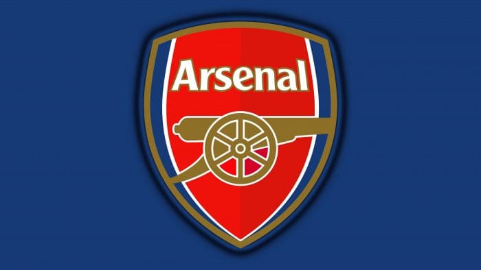
Arsenal FC was unable to patent club symbolism and was forced to replace it. The gun is still there, but it now faces to the right. It is surrounded by the word “Arsenal.” Because of the coloring, the coat of arms appears convex. The collection has five colors: red, burgundy, white, blue, and taupe.
Arsenal Emblem’s Font and Colors
The main feature of the Arsenal FC emblem was and continues to be an artillery cannon. When the club decided to use the Woolwich crest as a graphic sign in 1888, it first appeared on the logo. But the weapon did not look like it does now: it was pointed upward and had lion heads on its lower part. Artists have modernized the design over time, turning the cannon sideways to the viewer and making it two-dimensional.
The military theme, reflected in the football team’s name and emblem, is due to the club’s proximity to two strategically important sites – the Royal Artillery Regiment and the Royal Arsenal, both of which were located in the same area. The heraldic shield in a triangle with rounded sides is another traditional part of the emblem.
Arsenal Font
Arsenal FC’s logo is written in a sans-serif font similar to Clearface Gothic Roman. The designers adapted Morris Fuller Benton’s original typeface, which he created in 1984, and redesigned individual characters.
The graphic aspect was not overlooked by the developers. Because of the successful color combination, the club sign appears three-dimensional. Burgundy and red are combined in the center of the shield, with white and blue along the edges. The word “ARSENAL” is white as well. The letter outlines, cannon, and frame around the shield are all gray-brown.
Arsenal Symbol
A new Arsenal symbol was adopted at the start of the 1926/1927 season. While it still had the cannon theme, it looked completely different now. The Cannon was narrower and pointed backward. Although it is unknown what inspired the design, there is a striking resemblance between the cannon on the logo and those depicted on the crest of the Royal Arsenal Gatehouse in Woolwich. The logo was used for 17 seasons, with a few minor changes. Furthermore, the narrow cannon has remained the club’s most important symbol.
The Victoria Concordia Crescit logo first appeared in 1949. The narrow cannon was enclosed in a shield shape, with the words “Victoria Concordia Crescit” beneath. The words were Marksman’s motto, which impressed the players, so they decided to incorporate it into the club’s identity. The word “Arsenal” was also in an intricate gothic font in the logo. The coat of arms of the Borough of Islington could be seen on the smaller shield visible beneath the cannon.
While the logo was an essential part of the club’s identity, it wasn’t until 1990 that it was first used on the kits.
Arsenal Emblem
By the end of the previous century, it was clear that the club’s logo needed to be updated to reflect current design trends. As a result, the Arsenal logo was altered in 2001. As a result, the gold gradient was replaced with solid yellow, and the intricate lettering font was simplified.
Related Articles
- Mexican Beer Brands: 13 Top Best Mexican Beer Brands You Need To Know
- TERMINATION FOR CAUSE: Reasons That Could Lead To It
- TOP WOKE COMPANIES IN 2023
- ADJUSTABLE RATE MORTGAGE (ARM) Loan: Definition and 2023 Rates


