The Autobots are a fictional race of sentient, transforming robots from the Transformers franchise. They are the heroic protagonists of the franchise, and their logo is one of the most recognizable symbols in pop culture.
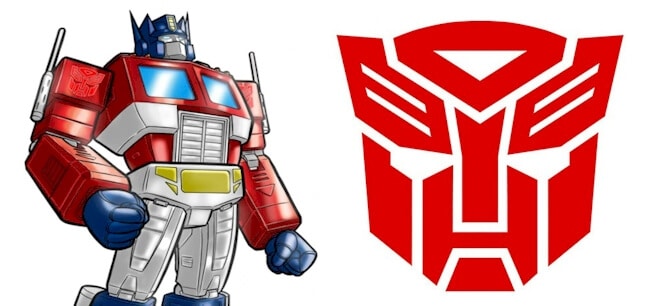
The Autobots logo is a red mask with a blue spark in the center. It is based on the face of the Autobot character Prowl. The logo has been used in all forms of Transformers media, including cartoons, comics, movies, and toys.
The Autobot logo is a symbol of hope, courage, and freedom. It represents the Autobots’ commitment to protecting the innocent and fighting for what is right. The logo has inspired generations of fans, and it continues to be a powerful symbol of the Autobots’ legacy. But what is the story behind the iconic logo and brand? And what does it stand for?
Let’s find out…
Overview
Autobots are fictional self-configuring intelligent life beings from the planet Cybertron. They are a modular robotic sub-race that has evolved through biological evolution and technological engineering. Their structure comprises a live metal with a genetic code and self-replicating cells. And because their design lets them take on any shape, they create the Transformers universe.
Optimus Prime is their leader.
The toys were originally seen in 1984. It is now a series that includes toys, comic books, books, movies, cartoons, and graphic novels.
Who are Autobots?
Autobots are benign robotic entities with the ability to self-configure. They are from the fictitious planet Cybertron. They are the main characters in the Transformers universe, which includes a variety of other collections of toys, cartoons, graphic novels, books, and films led by Optimus Prime. The “Evil” Decepticons are on the opposing side.
Autobots and Decepticons are robotic characters who can morph into machines, automobiles, and other mechanical objects. Occasionally, they can also morph into biological forms, such as Dinobots.
Autobots often morph into conventional vehicles like cars and trucks, but they can also transform into military vehicles, aircraft, weaponry, and even animals. These Autobots are frequently organized into special squads with the suffix “-bot.” Decepticon names, on the other side, terminating in “-con.”
In the Transformers series, the protagonists and antagonists have an emblem representing the organization as a whole. Each of these appears to be a transformer’s head. The Autobot symbol is based on the picture of a character known as Prowl. According to Transformers Lore, this logo is also known as “Autobrand” and portrays the visage of the Last Autobot.
The Soundwave character most likely inspired the Decepticons logo. Other Transformer types, such as Clench, Ultracon, and Security Services, have their emblems.
With each generation of the Transformers series, each emblem in the franchise has developed throughout time. Many variants are typically identical in terms of style, with the face consisting of small geometric shapes to form a transformer’s head. Some logos have flattened colours, while others are more bevelled and have a chrome or metallic appearance.
According to official sources, the Autobot emblem was created in allusion to the face of the Last Autobot, Primus’ protector prepared for the day he could not command his army.
Meaning and History of the Autobots Logo
The Autobots logo is a red mask representing the Autobot army. The original Autobot emblem was inspired by toys from the first year of the Transformers toy line. The Autobot insignia is a strongly stylized rendition of Prowl’s face, while the Decepticon emblem is based on Soundwave’s figure.
In the cartoon series, the Autobot and Decepticon logos have been depicted in metallic colour schemes with bevelled edges on toy packaging and scene transitions.
Autobots’ Current Logo
Since its creation in 1984, the Autobots symbol has remained unchanged. However, Autobots used a more spartan logo for the first three years. This was most likely the visage of an old robot who conversed with Rodimus Prime in The Matrix.
Although fresh Autobot and Decepticon emblems were produced ahead of Transformers: Generation 2, featuring the Autobot insignia based on Optimus Prime, the new versions still needed to catch on. When the Transformers franchise was relaunched as Beast Wars in the mid-1990s, new logos were created for the hero and evil factions. These were known as Maximals and Predacons, but they didn’t catch on either.
Transformers’ Current Logo
The film franchise has taken a more traditional approach to treating its logo. The current logo incorporates the letter “A” in the distinctive design used in the brand’s prior logos. The Autobot’s “Autobrand” emblem is also frequently used, which aids in recognizing the Transformers brand. The Autobrand symbol is generally customized for films based on the objective and theme of the film.
The Evolution of the Autobots Logo
The most significant modifications in the Autobots logo over the years have been the use of the insignia and how the name “Transformers” is portrayed. Despite the designers experimenting with other features, lines, and colors, they always maintained these components intact, building on them to evolve the brand to what it is today.
1984 and 1989.
The Transformers logo was established for the first time in 1984. It took the brand five years to decide to remodel it. Like later logos, this original logo had a three-dimensional impression due to its metallic elements and an inscription in red and gradient blue.
The words were cleverly arranged on two levels for the lettering, with “Trans” above and “Formers” below. The Autobots signature insignia was downsized to match the size and colors of the letting, in addition to the phrases.
1989-1991
The Transformers brand ditched their three-dimensional components in favor of a simpler, flat look for this second version. To make the emblem more visually appealing, the words “Trans” and “Formers” were combined to form one word: Transformers. That wasn’t the only difference. The color palette was also updated for this version, with white writing and a double black outline. To provide a distinctive impression, the company chose an italicized sans-serif typeface.
1991 – 1993
As the 1990s began, a new version of the Transformers logo appeared. The brand made the lettering lighter and thicker for this purpose. They also changed the logo’s colours, changing the outline to a lighter blue to contrast with the letters’ other blue and white shadowing. The designers also deleted the blue stripe in the body of the 1984 version wordmark to focus on the different design components with these adjustments.
1993-1999
After two models that lacked the iconic Transformers logo, the company reinstated it for this incarnation and the conspicuous red colour. The designers chose red for the typeface and yellow and red for the logo. With the text being a new, square, italicized, and capitalized square typeface, the logo was bolder than earlier incarnations and stood out more due to its dark, three-dimensional quality.
1999-2001
In 1999, it was evident that the designers were debating whether to maintain the emblem in the logo because they removed it again for this iteration. The lettering was also updated to a new sans-serif font. This was the firm’s first decision to make the writing yellow with a black outline. The new typeface increased energy while retaining the bold aspects of the previous, such as sharp features and rounded edges. It was distinct and robotic, just like the brand.
2001-2007
The sixth Transformers logo, 2001, was the first time the brand started from scratch, removing all previous design elements. This wholly new logo featured sparkling black and blue writing, two colors not previously used in previous incarnations. To match the colour palette, the wordmark was a blue and black gradient, with the writing outlined in a thick black border. This design had a neon feel to it. It emphasized the company’s creative drive, implying that the Transformers brand continually adds new characters, storylines, and innovative items, like its logo.
2007 and 2014
The Transformers brand returned to its roots in 2007. The brand revived the two-level design and metallic components by employing metallic letters with a thick black outline (again in a sans-serif bold font). This version’s design was more basic and modern than previous editions, and the logo encapsulated the characteristics of the Transformers characters.
2014 – Now
The most recent version of the logo that you see now was launched in 2014. This logo abandoned the previous version’s iconic metallic features in favour of more dazzling components. To make the emblem more eye-catching, the designers employed yet another font, this time a new, bold, narrow sans-serif font created just for the Transformers brand, as well as a darker shade of red. This new font has asymmetrical diagonal cuts, with some lines being longer than others.
With these recent changes, the logo has evolved into the one we know and love today.
Obstacles in the Way:
The most difficult challenge for the Transformers brand and Autobots has been keeping their fan base engaged. It has been a challenging road, and Autobots’ popularity has fluctuated from time to time. The Transformers brand and Autobots have overcome this by regularly upgrading their logo and developing fresh content to share with their fans.
The Meaning of the Autobots’ Logo and the History of the Autobots’ Logo:
The Autobots logo, like every other emblem and character in the Transformers franchise, has evolved. However, as logos have progressed, they have all become stylistically similar (such as the usage of forms and metallic characteristics), but they differ in colors and how the designers choose to use these shapes and lines.
The Autobot logo has a red mask representing the Autobot army.
Like the general Transformers logo, the Autobots logo has sometimes been different. Regardless of the variations, the Autobots emblem always depicts a mask. The logo is thought to be inspired by the Prowl’s toy, which is known as “Autobrand” in Marvel Comics. According to other reports, the Autobot emblem was designed to resemble the visage of the Last Autobot.
Elements of the Autobots Logo
Throughout the years, the font has used a sans-serif font that has been italicized, capitalized, and usually always bolded. Sharp cuts are frequently used in the font, with the angles nicely rounded to create energy and vitality. Whatever sans-serif typeface the business has chosen throughout the years, the font has always been clean and readable, with design elements that set it apart. The trademark fonts of the brand provide excellent brand identification, and the Autobots “A” is the most identifiable feature of the Transformers brand. Even in recent years, the Transformers brand has used simply the letter “A” in some of its advertisements.
The Color of the Autobots (and Transformers) Logo
The Transformers logo debuted in 1984 with a red and blue colour scheme before transitioning to white with double black text. The logo has always been a mix of red, white, gray, black, and blue.
In other cases, in addition to this color scheme, designers have used metallic tones to conjure 3D aspects and gradient features to make the logos feel different from previous iterations.
Today’s Autobots
The Transformers brand has recently chosen a more simplistic approach with its logo, employing only the letter “A” in the same sans-serif font used in previous logos. As new Transformers films are released, the Autobots logo evolves to reveal the purpose and subject of each film.
When a franchise has been operating for over three decades, keeping it current and engaging supporters is challenging. However, the Transformers brand has been able to do so. With the Transformers films, sequel after sequel is released to considerable fanfare and anticipation. They are always selling out to be blockbuster successes. Michael Bay’s film adaption of the Transformers storyline in 2007, followed by multiple sequels between 2009 and 2017. Following this, in 2018, the Transformers BumbleBee film was released. Each film release has contributed to the Transformers film franchise gaining momentum.
However, the series has not ended with BumbleBee. A new Transformers Cyberverse film is in the works, and the brand has recently expanded to encompass a cartoon series, internet fan clubs, an annual Transformers conference, and much more.
The Transformers franchise is one of the highest-grossing media franchises in history, with almost $709 million made solely from films! The franchise grossed more than $25 billion in sales in 2011, and this revenue does not appear to be slowing down anytime soon.
Lessons Learned
Going further into the Autobots logo, you’ll notice that the designs change significantly and that the designers switch back and forth between components over the years. While other companies use the same logo design and only change the text or color scheme, Autobots has done the opposite.
Even when the Autobots do the contrary, it works in their favour. That’s because, no matter what logo design Autobots pursue, they make certain that it always expresses nostalgia to their consumer base and that the Transformers brand is always visible.
Related Articles
- FRANCHISE OPPORTUNITIES: The Top Best 21 Options
- HOW TO START A FRANCHISE: Meaning, Examples and How to Get One.
- WHAT IS A FRANCHISE: Types, Tax & Advantages
- Best Google Fonts: Trending and Top Rated Font to Use in 2023


