Amazon grew from a small bookstore to one of the largest e-commerce platforms. The company talks to its customers every day through its logo, which is truly unique. The million-dollar question, however, is, “How much do you know about the Amazon logo?” If you stick with your device for a little longer, you’ll find just the right information to incorporate the best branding practices available in your business, regardless of your target audience.
Nowadays, it’s difficult to find someone who isn’t familiar with Amazon. Amazon has come a long way from its humble beginnings as a digital bookstore in 1994 to becoming one of the world’s top five digital brands.
While many things distinguish Amazon, one of the most memorable is the company’s logo. But how did it get there?
The Amazon logo is an excellent example of how brands can use simple shapes and designs to connect with customers emotionally. Unlike many other brands, this logo hasn’t changed much in recent years.
However, the Amazon logo has not always been the one that most customers are familiar with.
Let’s take a quick look at Amazon’s history and logo…
Amazon Logo Overview
Amazon is a major player in the eCommerce industry today. However, this was not always the case. Since 1994, Amazon has evolved from a small online bookstore into a large corporation that sells a wide range of products. Amazon sells everything from books to movies, DVDs, and other technology.
Also, Amazon has created some additional services, such as the streaming service Amazon Prime, where you can find high-quality movies and shows, and the Kindle, which allows you to read all of the books on a device. And it’s still growing, with no signs of slowing down.
In 2016, the company achieved its highest-ever revenue of $135 million. Amazon’s growth has undoubtedly been a fascinating journey, as has the evolution of the Amazon logo.
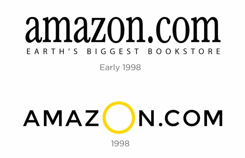
The Amazon logo has undergone three different iterations over the years, with neither of the first two lasting very long. The company’s first logo was simply the word Amazon.com in black font, with the “o” in a larger, yellow font.
This design was eventually replaced by one that featured the company name with a near-straight yellow line beneath it. The words “Books, Music & More” were spelled out in light grey font above the word Amazon.com. This design was used until 2000, when Jeff Bezos introduced the company’s current logo, the famous Amazon.com, with a curved arrow beneath it.
The History of Amazon
Jeff Bezos founded Amazon in 1994 under the name “Cadabra.” Bezos changed the name to “Amazon” a year later when he realized that the original name sounded like the word “cadaver.” This shows how important it is to be careful with branding.
At the time of its inception, Amazon only sold books. However, within the first two months of being online, Amazon sold books in 45 different countries and earned $20,000 per week.
Even with such early success, Amazon’s slow growth frustrated many investors. Amazon’s business plan said that the company didn’t expect to be profitable for four to five years and that all revenue should be spent on growth and expansion.
When the dot-com bubble burst in 2000, killing off many online stores, Amazon was one of the few vital players. This resulted in the company’s first profit of $5 million in 2001.
Since then, Amazon has become one of the world’s most influential companies. What began as an online bookstore has since expanded into a massive corporation involved in almost everything. Amazon now offers everything from grocery shopping to cutting-edge technology. It’s only natural that the company has a logo that conveys this exact message.
Amazon Logo History & Meaning
There were few redesigns in the company’s history, and the color palette was established in 1998, though the first two versions were made in black and white.
Jeff Bezos didn’t want to spend much money on branding, so the Amazon logo has always been simple. This hasn’t changed the logo’s modernity or the fact that it’s known worldwide.
First Iterations
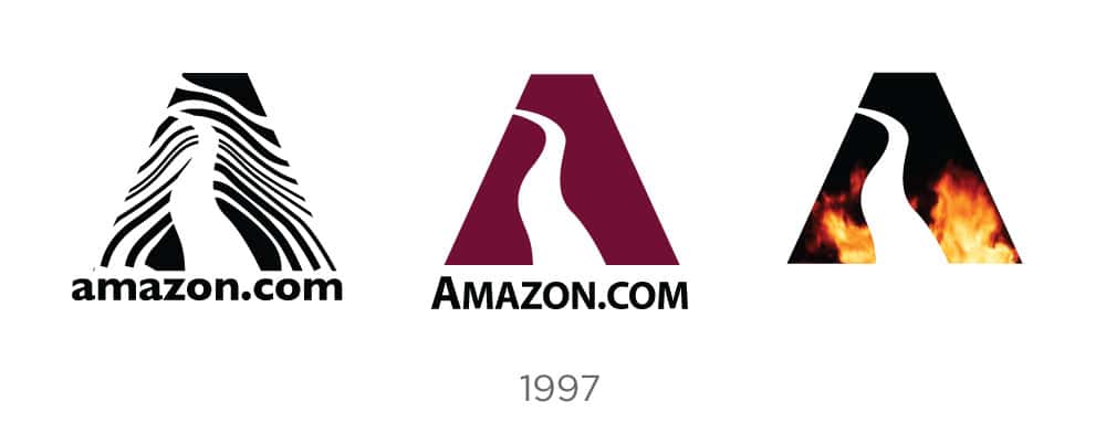
Initial branding attempts were not as refined or polished as the emblem we’ve come to expect over time. The initial concept depicted a massive, bold letter “A” with a winding river cutting through its silhouette and superimposed on an aquatic background. It didn’t win any design awards, but it did get the company’s momentum going.
There would be a few different takes on this theme, each trying out different color schemes, icon fills, and fonts.
By 1997, the capital “A” icon had been removed from the wordmark. The company started to show signs of the brand’s now-iconic color scheme by trying out uppercase, lowercase, serif, and sans fonts.

A New Direction
Amazon was rapidly expanding by 1998. Unlike many of its competitors during the dot-com boom, Amazon provided a slew of cutting-edge features, revolutionizing the industry. It was among the first e-commerce sites to offer one-click shopping and email order confirmation.
It made shopping easier than ever before, and it had a massive selection of books that would eventually make its brick-and-mortar competitors worldwide look small.
The company planned to add an audio library to its business model, given how well it did in this area. When Amazon’s music section opened, it would have more than 125,000 titles that artists, song titles, and labels could search. The site’s design would also be changed, starting a radical series of logo changes as the company tried to create a visual identity that was as widespread as its quickly growing services.

Initially, a lowercase serif logo was combined with a book and a global icon. Because this imagery would become obsolete as the product line expanded, changes were made.
A sans serif, all-caps wordmark with a large, golden “O” in the middle would last a few months before morphing into the familiar sans serif, lowercase font. With an eye to the future, the company’s ambitions were reflected in its new tagline, “Books, Music, and More.”
This logo would be used until the company could expand on the “More” part of the equation.
The Final Designs
The dot-com bubble had burst by 2000, and Amazon was riding high. Far from being content with its market dominance, Bezos was constantly looking for ways to expand and improve his company, eventually expanding far beyond consumable media into almost every product imaginable. You don’t make such a large industrial leap without updating your logo, and Jeff wanted to nail it this time – something timeless that would stick with the company in the future.
He turned to Turner Duckworth, a creative agency, to deliver something definitive and long-lasting:

The firm was successful in several ways here. To begin, a swooping yellow arrow points from the “a” to the “z” of the logo, emphasizing Bezos’ original brainstorm on why Amazon chose such a catchy name in the first place. The shape has a round-edged, organic quality, and the right side bends the bottom stem of the “z” upwards, hinting at a smile to represent the company’s stellar customer experience.
This design element emphasizes a custom font that resembles Officina Sans and uses a bold face on the “amazon” portion of the wordmark. The brand was so effective that it could be recognized even when the company name was replaced with an initial.
Read Also: STARBUCKS CUSTOMER SERVICE: Best Practices Explained!!! (+ Free Tips)

Under this timeless brand, Amazon remains at the forefront of its industry, pushing the envelope for online retail with everything from ebook readers to drone delivery and the astounding automated hub that manages its vast and ever-growing product inventory.
This is a company that has never been satisfied with the way things are. Its logo and overall mission, which the founder thought up on the way to Seattle all those years ago, show how it has always been moving forward and trying new things. To paraphrase Bezos:
“We are cultural forerunners. We enjoy upsetting even ourselves. Other companies have different cultures and don’t always like to do things that way. Our job is to move those industries forward.”
Amazon Logo Meaning (What does the Amazon Logo Symbolize)
Turner Duckworth’s iconic smile-arrow symbol is playful and friendly, evoking a sense of dependability and happiness. The black and orange color palette accentuates these feelings, making the visual identity bright and well-balanced.
The Amazon logo is an example of contemporary simplicity and style; its minimalistic composition reflects the company’s best qualities: professionalism, loyalty, and a commitment to high quality in everything they do.
The Amazon Logo’s Design Elements
The third and, ostensibly, the final design of the Amazon logo includes some inventive elements. The first is where the arrow beneath the logo begins and ends.
This design element of the Amazon logo, which begins with the letter “A” in “Amazon” and ends with the letter “Z,” is intended to convey the message that Amazon sells everything from “A” to “Z.”
When Amazon got this new logo, the company had come a long way from its early days as a bookstore and was now selling a wide range of goods.
Amazon conveys to its customers that the company can meet their every need by having the arrow in the logo stretch from “A” to “Z.”

This Amazon Prime Logo, on the other hand, represents those who pay a monthly fee in exchange for free shipping and quick delivery. The signature arrow with the word “Prime” after the word Amazon remains in the Amazon Prime logo. The Prime logo symbolizes speed, excellence, and the welcoming color blue. They nailed the Amazon Prime Logo, in my opinion.
But the arrow in the Amazon logo also looks like a smile, serving more than one purpose. The logo has a very subtle face shape when put together with the rest of the design. According to research, humans have incredible facial recognition abilities, and we place a lot of trust in smiling faces. Amazon can show that it is a trustworthy and friendly company by making its logo look like a smiling face.
Lastly, arrows have been used for a long time to show forward movement and speed. These are important parts of Amazon’s business model since they always come up with new ideas and have built Amazon Prime around the fastest shipping speeds.
Read Also: RED BULL LOGO: Meaning, Font, Company, and Owner
The Amazon Logo’s Popularity
You’ve probably seen Amazon’s logo if you’ve ever ordered something from them. The Amazon logo is prominent on every box, and the company says it “delivers smiles to customers’ doorsteps.” And because Amazon packages are easy to get, customers often use them to ship other things, which helps promote the Amazon brand even more.
It’s one of the best ways Amazon uses its logo, showing how important packaging is in branding.
A good logo also allows for good slogans, and as previously stated, Amazon has built one of its best slogans around the design of its logo. The company also has a “smile program,” which is a charitable branch of the company that donates money to a variety of different organizations. This is another example of how Amazon has built a brand segment around its logo’s design.
Amazon is undoubtedly one of the most exciting companies to study today, and it will be interesting to see what innovations they will pioneer in the coming years. Similarly, as a company that is still relatively young compared to retail behemoths like Walmart and Target, Amazon has plenty of room to continue defining its brand. It will be interesting to see what changes they make in the future and how they continue to use their logo as part of their distinct branding strategy.
Symbolism Behind the Amazon Emblem
When you look at the curvy orange line, you can’t help but smile. Turner Duckworth, the logo designer, had exactly this in mind! Amazon wanted to make the most of the smiling symbol. Jeff Bezos, the founder of Amazon, didn’t want to spend more money on packaging and other ways to brand the company. Duckworth then proposed putting a smile on boxes, bags, and other carriers.
That was an extremely wise marketing decision. The company was now delivering smiles to their customers’ doors!
The orange color of the arrow adds to the logo’s friendly and welcoming vibes. Did you know that Amazon has a charity fund called…”Smile”?
And we’re not even halfway through the hidden riddles! The smile also serves as an arrow that runs from A to Z in the word “Amazon.” This path from the first letter of the English alphabet to the last one shows that the e-commerce website has a wide range of products. The arrow also represents continuous growth and perseverance in achieving goals. These are the values that the entire Amazon team shares.
Read Also: DEMON SLAYER LOGO: What Does the Symbol Mean?
Why is Amazon’s Logo a Smile?
Amazon’s “smile” logo has been the foundation for numerous Amazon assets over the years. It is used with the “Amazon Prime” logo to represent the company’s unique subscription service for next-day delivery and entertainment.
Along with the original Amazon logo, “Prime” in blue italics shows reliability and quality.
Amazon App Logo Amazon’s smile inspired the company’s app logo. You can probably see why Amazon would want to use the smile as the app’s logo, as the word “Amazon” is a little too long for such a small icon.
However, the image has evolved slightly over time.
The first Amazon app logo featured a jagged blue piece of tape above the smile, which many customers said reminded them of a certain German dictator’s mustache. The blue mark was supposed to resemble box tape, but it caused quite a stir.
Amazon removed itself from these associations by slightly altering the design.
Other Design Elements of The Amazon Logo
The distinguishing feature of the Amazon logo is the smiling arrow. The unique design, which evokes the idea of a happy, smiling customer while also reminding you of the diversity of the company’s product collection, is a fantastic branding feat.
It’s easy to see why Amazon hasn’t changed its logo since the redesign.
The most well-known aspects of the Amazon logo are:
#1. Icon
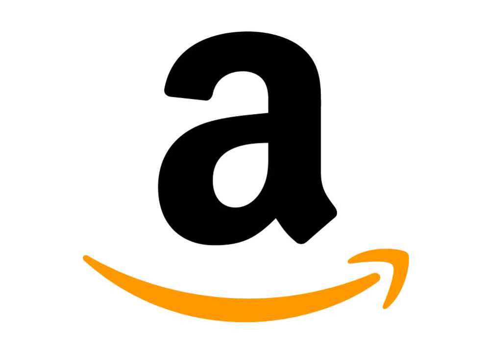
The Amazon icon, undoubtedly one of the most recognizable graphical icons in the world, is built around two simple symbols—a lowercase letter “A” in bold black lines and an arched arrow with a smile underneath it.
The curved orange line resembles a friendly smile, and the company made the most of this symbol by creating a legend out of simple lines. Jeff Bezos, the founder of Amazon, did not want to spend money on extra branding elements like package design. The designer Turner Duckworth then proposed using only a smile in the design, transforming ordinary boxes into smiley ones.
This decision transformed the packages into a marketing tool, allowing the company to claim that it delivered smiles to customers’ doors. The orange, associated with friendliness, warmth, and joy, adds to the overall impression. Smile, an Amazon charitable affiliate, also donates money to needy people.
The arrow part of the icon is stretched under the letters A and Z in the full logo version, symbolizing that customers can find any product in the online store. The arrow also represents progress and achievement, consistent with Amazon’s history.
#2. Color
The original Amazon logo was only black and white. The bright orange shading was adopted as the company evolved and the brand sought to become brighter and more approachable.
Blue is also used in Amazon Prime logos and on the Amazon app logo.
What Do the Different Colors Mean?
The colors black and orange represent certain values that Amazon strives to uphold. The black color represents Amazon’s dominance and elegance, while the orange color tries to convey happiness and pride.
These colors undoubtedly add significant value to the logo. As previously stated, the meaning of the logo is that Amazon sells everything from a to z and that they will make their customers happy.
#3. Font
Lowercase Amazon is done in a bold and traditional Sans-serif typeface with smooth thick lines, slightly curved tails of both “A”s, and straight cuts. Officina Sans Bold was used for the logo, similar to fonts like Dynamic Grotesk Bold and Capital Gothic Bold.
The new Amazon logo’s bold yet elegant typeface was designed specifically for the company but is based on a classy font that looks very similar to, for example, PF Das Grotesk Pro Bold or Grotesco Bold.
It has smooth arched lines, slightly curved playful tails of the lines and a very accurate and neat appearance. The letter “Z” is the most memorable part of the typeface, with its bottom horizontal bar arched to the center, as if “hugging” the arrowhead from the orange Amazon emblem. It also created a very balanced look between the inscription and the graphical part, making the two arched elements look harmonious.
Why Does the Amazon Logo Work?
The logo is effective because it is both simple and memorable. The logo instantly makes you think of Amazon and helps you remember the company just by looking at it. It also provides excellent insight into what Amazon brings to the table – it provides high-quality products from A to Z that will make you happy.
Conclusion
Whether you like Amazon or not, it’s difficult to deny the power of the Amazon logo emblem. Everyone is familiar with the Amazon icon’s distinctive arrow connecting A to Z.
Amazon’s smile has also had an impact on various aspects of the company’s growth. For example, the company has the Smile Charitable Program, which is in charge of donating money to various important organizations all over the world.
Amazon’s smile logo even explains the company’s slogan, “work hard, have fun, make history,” with the orange grin representing a forward-thinking, happy organization.
Don’t forget to read our other logo articles to learn more about the iconic symbols that shape the world today.
Related Articles
- NIKE LOGO: The Story Behind Great Branding!!!
- STARBUCKS LOGO: Evolution, Significance, Branding Models & Tips
- WALMART LOGO: Meaning, Evolution, and History
- AWS LOGO: Meaning, Certification, Career, and Uses.


