Except for the logo, which the company debuted in 2013, the iconic fast-food chain’s visual identity history has always been done in the same aesthetic and color scheme, with all seven iterations of the logo using the same typography color. This article will further explain more about the history of Wendy’s Logo, its Evolution, the history of the company, the color of Wendy’s logo, font, etc.
The History of Wendy’s Company
A well-known American fast food restaurant chain by the name of Wendy’s was founded in 1884 and, as of today, has about 7,000 locations globally, making it one of the biggest players in its sector (mostly in North America).
Along with Burger King and McDonald’s, the fast food restaurant company Wendy’s is one of the biggest suppliers of hamburgers in North America. In 1969, Dave Thomas established the business in Columbus, Ohio. In Wendy’s cartoon, of a happy redhead girl, who served as the inspiration for both the name of the fast-food business and one of the most recognizable logos in the sector,
The third-largest burger company in the world, Wendy’s is proudly represented by its logo at over 6,500 locations across the globe. The restaurant business is now valued in the billions of dollars and is a favorite of many people worldwide who adore their delectable fries and burgers. Whether someone is a fan of the firm or not, they will be fascinated by the amazing and unique history of Wendy’s.
Read Also: FORBES LOGO: Meaning, Font, Owner, and Magazines 2023
The Journey to Success
Dave Thomas’s dream served as the impetus for Wendy’s tale. At birth, Dave Thomas was adopted by Auleva and Rex Thomas; He was born in Atlantic City in 1932. When he was five years old, his adopted mother passed away, and his grandmother largely took care of him while his father toured the nation in search of a job.
Dave began working at The Regis in Knoxville, Tennessee when he was 12 years old. He was fired, but this event made him want to open his own restaurant even more.
Dream of Dave Thomas’s Past
After being fired from The Regis, Dave obtained a new job as a soda jerk at Walgreens. After his manager learned that he was under 16, that position didn’t last either. However, Dave was unfazed and, at the age of 15, he and his adoptive father moved to Fort Wayne, Indiana. He was hired by the Hobby House Restaurant there. Even though his family would soon be moving once more, Dave stayed there to continue working at Hobby House Restaurant. Dave left high school as a result of the situation.
Dave joined the Army when he was 18. Even though he was in the Army, he kept working at Hobby House Restaurant. Dave, then 23 years old, helped his boss open The Ranch House Restaurant, where he also got to know Colonel Harland Sanders, the man who founded KFC. The three parties agreed to a deal, and Dave ended up with four KFC locations.
Sanders was impressed with Dave’s work at Hobby House Restaurant at the time, so he offered him a business partnership in exchange for fixing up the failing KFC restaurants. In addition to saving the businesses and turning a profit, Dave had enough money to open additional eateries.
After selling back his KFC locations in 1968, when he was 35 years old, Dave finally fulfilled his lifetime dream of owning a restaurant in 1969. In Columbus, Ohio, he launched Wendy’s Old Fashioned Hamburger Restaurant.
The Beginning of Wendy’s
The very first Wendy’s restaurant, named Wendy’s Old-Fashioned Hamburgers after Dave’s daughter, created a reputation for itself in the fast-food sector by offering custom-crafted burgers cooked from fresh meat. Additionally, the business developed a reputation for offering high-quality fast food at reasonable prices. Although Wendy’s is and was known for its hamburgers, it also provided other choices for customers who were health-conscious, such as the salad bar, starting in 1979.
Wendy’s restaurants also served potato dishes, chicken sandwiches, chili, the Frosty, French fries, and a variety of drinks. Despite not having a signature sandwich, Wendy’s is better known for its square burger patties. Dave got the idea after he went to Kewpee Hamburgers in Michigan and saw how to square patties were used.
Dave launched a second Wendy’s restaurant in Columbus a year after the first one debuted in 1969. Further branches started to appear all around the United States. Before going all over the world, Wendy’s first restaurant opened in 1975 in Hamilton, Canada.
Wendy’s Competition
After doing well in the 1970s, Wendy’s started having trouble in the early 1980s because of its fierce competition. Clara Peller, an older actress who appeared in the company’s “Where’s the Beef?” advertising campaign, was hired by the company to launch a new advertising and marketing effort to combat this. The 1984 “Where’s the Beef?” commercials were such a smashing success that the term entered American popular culture.
Dave Thomas, the company’s creator, first appeared in Wendy’s advertisements in 1989. In actuality, Dave had quit overseeing the day-to-day operations of the business in 1982. The president of the business, nevertheless, urged him to get more involved, which is how he ended up in their ads. Beginning in 1989, Dave began to appear in a lot of Wendy’s advertisements touting their products. In later ads, Dave was shown as more real and humble, which helped him connect with viewers.
By the 1990s, Dave had become well-known thanks to his over 800 commercial appearances, which helped Wendy’s brand recognition reach heights unseen since the “Where’s the Beef?” ads first aired. According to a Wendy’s survey conducted in the 1990s, nine out of ten Americans were familiar with Dave Thomas.
Expansion and Advancement
A crucial turning point in Wendy’s history occurred in December 1995. This happened when the company combined with Tim Hortons, a network of fresh coffee shops and bakeries with over 1,900 locations, predominantly in Canada. Additionally, Wendy’s moved its headquarters to Dublin, Ohio, by the end of January 2006. The businesses combined in 2008 with Triarc, the parent company of the chain of Arby’s restaurants, to form the country’s second-largest sandwich maker. Wendy’s became Wendy’s/Group Arby’s following the merger with Triarc. Following the 2011 split of the Wendy’s group, Arby’s Wendy’s sold its Arby’s Roark Capital Group shares while keeping an 18.5% ownership position.
With more than 6,500 outlets, Wendy’s is currently the third-largest fast-food burger brand in the world. Over 57,000 people are currently employed at Wendy’s, which has assets worth over $9.45 billion. The majority of Wendy’s restaurants worldwide, or 77%, are franchised. In addition, they have franchisees all throughout the world. Even though Wendy’s stands out from its competitors with its high-quality food, varied menu, and attractive exterior, franchise owners are free to set their own prices, hours of operation, wages for employees, and interior design preferences.
Dave Thomas, the creator of Wendy’s, died of cancer in Fort Lauderdale, Florida, in January 2002 at the age of 69. His remains were interred in Columbus, Ohio. It’s hard to believe that one of the most successful and well-known fast-food chains in the world started out as a single man’s dream. Wendy’s success shows that Dave Thomas was able to make his idea come true, to the delight of millions of customers around the world.
Who Created the Wendy’s Logos?
Dave Thomas established Wendy’s in 1969 in Columbus, Ohio. Before deciding on Wendy, which is a nickname for his daughter Melinda, he thought about renaming the chain after all five of his children.
When the first restaurant in the chain opened, Wendy was in the third grade, but she later became one of the most recognizable young redheads in history in her child form.
The original Wendy recalled the day her father came home and said he had decided to start a restaurant with a figure associated with the brand in a blog post for the business on Friday.
He instructed Wendy to put her hair up in pigtails. Thus, I did. He snapped pictures of my sister and me with his camera and then confirmed that the food would be Wendy’s Old-Fashioned Hamburgers. Wendy posted a blog entry.
A young Wendy Thomas also served as the inspiration for the Wendy’s logo as we know it today.
History of the Wendy’s Logo
The Kewpee Hamburgers in Kalamazoo, Michigan, where he grew up, gave him the idea for this fast food chain. They offered malt drinks and large, square hamburgers. They so impressed him that when he established his restaurant, he began with a menu that was similar to theirs: a round bun with a square flatbread (not a cutlet) cooked with fresh ground beef. It was substantial and its
The roll’s sides had protruding, enticingly dangling corners. This suggested that there was a lot of high-quality meat served here.
Such a marketing strategy provided a solid justification for the network’s development. L.S. Hartzog was the first person to buy a franchise and say he would open a store in 1972 in Indianapolis, Indiana. The first Wendy’s television advertisements debuted at the same time. Then, in Hamilton, Canada, in In 1976, a trademark eatery was established (Ontario). The 500th fast food location opened that year (in Toronto), while the 1,000th did so two years later (in Springfield, Tennessee). The Wendy’s Company was the name given to the company after it merged with Triarc Companies Inc. in 2008 and Arby’s. In general, the chain has had a very rocky history thus far.
The Evolution of the Wendy’s Logo
Melinda Lou “Wendy” Dave Thomas’ fourth child, is specifically credited with coming up with the names of the eateries. Her innocent likeness served as the inspiration for the logo, which is still in use today. The network used seven different logos in total.
1969 – 1971
Because changes happened slowly and not very often, the first emblem set the style for everyone else. The first version’s four basic parts communicate both the visual identity and the idea behind the restaurant chain.
The title is the most important because “Wendy’s” is at the top in huge red text. Its shape is slightly wavy because of a thin ornament that winds around and becomes circular at the bottom. It shows the brand’s namesake, the owner’s daughter, as a cheery young lady with red hair, bright eyes, and two short pigtails intertwined with blue bows. She is wearing a dress with identical-colored stripes.
The words “Old Fashioned Hamburgers” are written across two lines at the bottom. An Old English script is used for the upper inscription (Old Fashioned), which has curled letters and a double-sided sharpening in the middle of the legs. The word “Hamburgers” is written at the bottom in Showguide Normal with very wide serifs to show how big the platforms are that the letters are printed on. Contrarily, the letters’ middle portions are lengthy and narrow.
1971 – 1972
After the opening of the second restaurant, which included a window to serve patrons in cars, the following insignia started to appear. The logo’s components are all still the same. The sole change to the Wendy’s circle was the designers’ placement of the phrase “Quality is our recipe” in a semicircle above the girl’s head.
1972 – 1977
The daughter of the company’s founder’s portrait was redrawn for the first time in a new aesthetic. The painters made the painting more formal by taking away the painting’s whimsical mood and strong feelings. Her collar had blue stripes, just like Wendy’s garment had. The girl and her huge circle were separated by the lovely curls. The motto was modified by the developers, and the words “Old Fashioned” were given a new typeface that was cut in half.
1977 – 1983
Since 1977, the red and yellow zones have been separated from one another on the logo. The first (with beveled corners) depicts Wendy on a white background in a circular black frame, with curls and the name of the restaurant chain shaped like a wave. The words “Old Fashioned Hamburgers” are written in two rows in the second section (bottom). The word “Old Fashioned” is positioned in the center by the developers.
1983 – 2013
This logo has been used the longest. This could be because of its unusual design, which has a portrait that sticks out. The location of the girl’s photograph was altered by the designers. Below, they positioned the word “Wendy’s,” enlarging it. Bright and crisp white letters with fine black curls appear on a crimson background. The people who made the slogan “Old Fashioned Hamburgers” changed the font again.
2007 – 2013
Along with the prior insignia, a different logo was utilized during this time. The “Old Fashioned Hamburgers” sign in the lower yellow section was taken out of the shorter version of the first one.
2012 – Today
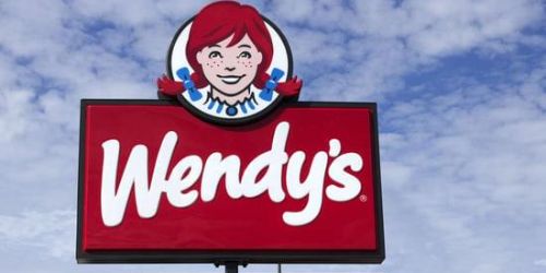
The fast-food franchise had a makeover as a result of Wendy’s transition to a higher-end hamburger restaurant, which was the first time in nearly 30 years that Wendy had a new logo. First shown in November 2012, the new logo was officially approved in 2013. The brand name and the illustration of the freckled child with pigtails are the two main components of this logo. The most obvious change is that the girl’s crown and blue-bowled braids now go past the black edge of the circle emblem. Wendy’s shoulders are no longer discernible. The brand name is scrawled with sloppy handwriting and broad strokes. On the collar of her costume, you might also detect the word “mom” in blue and white.
Many people don’t like Wendy’s new logo because they think it could mess with people’s subconsciousness. However, the corporation made it appear as though they were unaware of this. This is hard to accept because it’s unusual for a large company like Wendy’s to be unaware of the psychological implications of its emblem.
What the Wendy’s Logo Means and How it Works
The company, as they always do, has invested not just time and work into the new design, but also affection. The cute tiny kid is actually a grown woman. However, she is still the same young Wendy in the logo. The proprietor of the business, incidentally, later regretted naming the company after his daughter because it was negatively affecting her. She is still the restaurant’s resurrected icon, nevertheless. Now, the logo’s lines are all clean and contemporary.
Those are the lines that conceal information! It is in a waffle collar that is specifically blue and white. The word “mom” is discernible there. This is a very classy move, especially for logos with a single hue. These logos are frequently illustrated on food packaging. When you eat the dish, you unconsciously believe that your mother prepared it. It is the greatest because of this. Wendy’s has come under fire for a number of things since they directly influence subconsciousness, which is dangerous. The direction of the company suggested ignorance of it. However, it is unlikely for a huge firm to know that little about its own creation, therefore it is difficult to accept.
What is the Wendy’s Logo Surrounded by?
The Wendy’s logo is a circle with the brand name and a red-haired, happy girl with freckles on her face. The company’s creator Dave Thomas’ eight-year-old daughter served as the source of inspiration. The girl looks at you with a warm smile while sporting ponytails. The logo has a pronounced red color preponderance in addition to white, blue, and black hues with a black outline. The present logo, in contrast to the old one, shows Wendy in a friendlier and more casual setting, where she emerges from the frame and is no longer “imprisoned.”
Why is Wendy’s Logo a “mom”
Not everyone would notice it literally, but Wendy’s shirt collar contains a brief inscription. Although the word “Mom” cannot be seen as clearly, the general
Its concept affects the subconscious. Fast food restaurants are known for their hand-made burgers, so it might help to talk about Mom’s usual meals. If it was a dinner prepared by your mother, it should make you feel at ease and taste familiar.
What Is the Problem in the Wendy’s Logo
The main problem with the Wendy’s logo is that it doesn’t change with the times. The logo hasn’t changed in 30 years and is now seriously out of date. The western design trend is out of date and not really current, and the chosen design approach partially halts the flow of new clients. Despite the company’s efforts to rebrand, young people might find such a logo offensive. The company’s reputation was hurt by the fact that it didn’t follow modern fashion trends and stuck to old styles. In the quest for new ideas that change the world, you can’t make anything new out of an old design.
What Price Tag was Attached to Wendy’s Logo
The improvements started soon after the business was split up and transferred to new owners. In 2013, the business had set aside about $10 million to update the outsides of franchised restaurants. This included putting new logos on signs, staff uniforms, and packaging, among other things. The change to the logo was the start of a bigger marketing plan, and the project did not have a small capital cost.
Wendy’s Current Logo
The 2013 makeover gave the logo a softer, more welcoming appearance. The girl’s shoulders were no longer visible, but the top of her head and her braids were peeking out of the circle. Due to these changes, the face is given more attention, and her grin is more noticeable. The logo’s vintage frame has vanished. You may have noticed that Wendy’s collar says “mom.”
Symbol Font and Color Scheme
The daughter of the franchise’s founder is depicted in the Wendy’s logo and has been for all time. Even with the redesigns, nothing has changed. He constantly wore a female with two pigtails, freckles, and a striped collar. There was only a drawing style update. The latest version is much friendlier than the others because all the outside details have been taken away and everyone is looking at a warm smile. The word “mom,” which was written by hand, is hidden in the teeth of the collar as another form of encryption.
For the first logo, the designers used an old-fashioned font with Old English letters on top and Showguide Normal with wide, rectangular serifs on the bottom. Currently, a unique typeface is being employed that looks like handwritten text with large strokes.
The color scheme for the fast food chain is red, blue, black, and white. They do so in a novel way, producing an appealing contrast. Yellow was also used in the past. The corporation is run by executives from the company.
Key Components of the Wendy’s Logo
The daughter of the company’s founder has always been represented in Wendy’s emblem. Even after numerous redesigns and adjustments, the girl’s appearance has largely not changed. The smiling teenager with two pigtails and a striped suit, who was freckled and happy, always appeared in the logo. Only the drawing style, expressions, and skin and hair tones underwent periodic updates. The most recent version is nicer than the earlier ones because the superfluous background details are gone and the girl’s beaming smile is now the center of attention. The word “mom” is also scrawled in secret, and it is also encoded. It is on the girl’s collar.
The typeface used in the first designs was retro; the upper segment’s text was written in Old English, and the lower segment’s text was written in Show Guide Normal style with broad rectangular serifs. The current logo utilizes a distinctive typeface that looks like long-stretched handwritten notes.
Red, blue, black, and white is the colors that Wendy uses in all of her logos. Yellow was also employed in the past but is no longer by the designers. According to reports, the corporation is highly particular about the branding colors and style of each of its franchise locations.
Conclusion
The current Wendy’s logo captures your attention since it has a certain something that is new and clearly positive. The company’s spokesperson, Wendy, is unquestionably the best aspect of the logo. A closer crop, small hairstyle adjustments (the front portion), a nose job, and eyelash trimming are a few of the finer adjustments that gave the girl a more mature, businesslike appearance. The picture has a certain allurement about it. Overall, the organization benefited a lot from the well-planned and skillfully done change to its logo.
Related Posts
- The Top 15 Easy Single Mom Small Business Grants in 2023
- RESTAURANT MARKETING: What You Should Know and Strategies
- CHAMPION LOGO: The Early History of the Athletics Brand Champion
- BUZZ MARKETING: Definition, Best Examples & Strategies 2023
- HOW MUCH CAR INSURANCE DO I NEED: All You Need to Know
FAQs
What is Wendy's Old Slogan?
Between January 2010 and April 2012, you know when it’s real. March 2012 – 2016: Now that’s better. 2016-2019: Not just different, deliciously different. 2019-present: We’ve got you
Who is the girl in Wendy's logo?
The girl in the logo is Melinda Lou “Wendy” (born September 14, 1961). She is the biological daughter and fourth child of Wendy’s founder, American businessman Dave Thomas.
What does the Wendy's girl worth?
Wendy Thomas is a successful American businesswoman with a net worth of $100 million.
