Gmail, one of Google’s most popular tools, has gone through several logo changes since its beta version was introduced roughly 15 years ago. But despite the differences, all of the logos are based on the same “Envelope M” theme. Let’s find out how this was feasible over the years. But let’s start with the basics.
What is Gmail?
Google introduced this email service in 2004. It has grown to be the largest secure email platform over time. It is utilized by about 1.5 billion people globally.
Overview
In terms of popularity and a range of valuable features, Gmail outperforms other email providers. Like other Google products, it is always evolving: if users were given 1 GB for storing letters in 2004, this number has now been expanded to 15 GB. It all began in 2001 with a modest startup formed by Paul Buchheit.
The famous Gmail logo was created in just one night because the service was to be launched the next day. Dennis Hwang acted swiftly and decisively: he had previously created Google doodles and knew what style to use. Designers reduced the graphic sign nine years later by leaving a single “M” in the shape of a mailing envelope.
The Evolution of the Gmail Logo
Google launched a new multi-colored, streamlined Gmail logo in October 2020, replacing the red-lined envelope logo version that had been in use since the email service’s inception in 2004. It was part of Google Workspace’s broader rebranding of its G suite service.
According to Javier Soltero, general manager and vice president of Google Workplace, the reason for developing a new set of logos under a single color palette was that Google’s products had become so much more integrated that the distinctions between the various Google apps were no longer visible.
This rebranding created an international controversy by comparing the new designs to prior ones. The following is a brief history of the Gmail logo from its introduction in 2004.
2004
The new postal service began closed beta testing in 2004. During this time, an emblem with three inscriptions was used for several days, from which basic information about the service could be obtained. The word “GMAIL” was in the center, with the same multicolored letters as the Google logo. The crimson “M,” stylised as a paper envelope, was very noticeable.
The words “by Google” were in the lower-left corner, and the product’s version, “BETA,” was on the right. Dennis Hwang wanted to draw attention to the email’s subject line, so he made the backdrop labels drab and inconspicuous.
2004 – 2010
The word “BETA” has vanished as a result of the update. The colorful letters now have a gradient from light to dark (top to bottom). The original envelope concept remained because it perfectly matched the concept of the postal service.
2010 – 2013
In 2010, the service changed its home page and redesigned its logo to fit the freshly revised Google logo style. However, the developers only removed the shadows, reduced the gradient, and moved the “by Google” inscription to the right.
2013 – 2020
Gmail has simplified everything, leaving only the most important thing: the huge red “M” in the shape of an envelope. The rest of the letters were deleted because the designers thought the well-known symbol was self-contained. This feature was initially shown in a mobile application and is now exclusively available on the Google and Gmail websites.
The Gmail icon is in the shape of a rectangle with rounded corners. It appears to be an actual postal letter envelope. Furthermore, the logo shows the reverse side of the envelope because the middle lines “M” run along the edge of the closing flap. The gray shadows generated by the intersection of geometric shapes under the “M” accentuate the similarity.
Previously, the emblem was so simple and contained the word “Gmail” that it combined two different fonts. Dennis Hwang utilized the Serif Catull for “G,” which is most recognized as the Google logo. The designer used Myriad Pro sans serif for the “a,” “i,” and “l” since he didn’t like how the lowercase “a” looked in the Catull character set. “M” is not one of these typefaces; it was designed from the ground up for Gmail.
The color scheme, which is utilized to alternate colorful lettering, is another coincidence with the Google brand name. The palette is no longer as vivid, but it is still varied. Silver Sand, Gainsboro, Platinum, Bright Gray, Chinese Brown, and Jasper are among the four grays and two reds used. The creators required this combination to get a three-dimensional effect.
2020 – Today
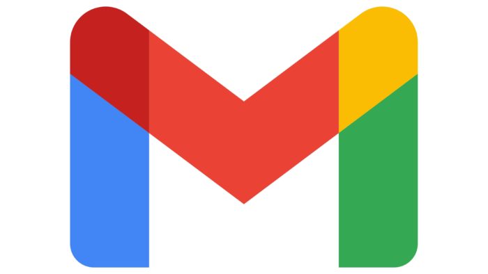
The current Gmail logo is a harmonic blend of five short stripes in blue, maroon, red, yellow, and green. The shape of the insignia remains the same and resembles the letter “M,” echoing the contours of a regular mail envelope. However, the designers did not remove the letter itself; instead, they colored the lines that ran alongside it. Furthermore, the stripes grew not only more colorful but also wider.
Elements of Gmail Logo Design
The new Gmail logo is simple in style. It’s an M-shaped emblem that everyone recognizes. There are a few other factors. The original logo included a lot of text. It displayed the company’s full name at the time. But it’s now just a plain M, and Google changed it to make the envelope seem different.
Gmail Shape:
The Gmail Icon is an important design element that influences the visual impact on the target audience. The redesigned Gmail logo’s M-shaped envelope is a standout feature.
The design team, led by Mr. Cyphers, conducted testing and received comments. Surprisingly, they realized that the “envelope” characteristic of the Gmail Icon wasn’t that important to the logo design.
The old red Gmail logo was streamlined, with some tints on top and inside. This creates a 3D effect. The new Gmail logo is much thicker now. The shoulders and legs of the letter “M” appear much thicker now. The shoulders appear wider and more rounded than before.
While the older Gmail logo had some shading, the newer design appears clean but lacks shading. However, the lack of shades is compensated for by overlapping colors. Because the Gmail logo is now in color, it no longer relies on shades to make an impression on viewers.
Gmail Logo Colors:
This is the most important design aspect in most businesses’ visual identities. Companies use brand colors to communicate with potential customers. As a result, colors play a significant part in creating a brand’s visual language.
When a firm chooses its brand color scheme, the colors are typically used throughout all goods, including business cards, brochures, websites, etc. This maintains continuity and demonstrates that the product/service is from the company, giving customers peace of mind.
Considering this, the Google Icon in the revamped Gmail version has also preserved the former color scheme. Its famous envelope M logo has been changed. The M shape remains the same, but the colors have changed significantly.
The redesigned Gmail logo now includes the Google corporate colors of blue, green, red, and yellow. Furthermore, these colors are used by all Google products, including Google Chrome, Google Photos, Google Docs, Google Maps, and many others.
As a result, the designers kept the M component but included all of the company’s typical trademark colors. The color palette has now taken over the Gmail logo. However, red is the most noticeable color in the logo. Blue, green, and yellow occur only on the logo’s arc.
Gmail Color Constancy:
Google maintained color constancy when redesigning the Gmail logo. All Google product logos have the same color scheme and shape as the new Google logo. The logos for Google Calendar, Google Docs, Google Sheets, and Google Meet have been updated to match the new Google logo style.
After upgrading its logo and other products, Google now has the same visual identity for all its products. However, some experts have criticized the new design’s color scheme.
Some experts, for example, claim that the colors were chosen without regard for order or direction. The unpredictability may be seen in the arrangement of the colors, which causes some confusion. However, the designers did not consider this when redesigning the various Google product logos.
Gmail Colors That Overlap:
Another feature of the new Google logo designs is overlapping colors. These logos may appear complicated and complex to some individuals.
In previous Google logos, the primary colors were green, blue, and yellow, with secondary colors separated. On the other hand, the new Google logos feature three primary colors and just one secondary color.
What Is the Significance of the New Gmail Logo?
The new Gmail logo was designed to fit the corporate Google style and color palette, replacing the solid red edge of the white envelope with a recognizable blend of blue, red, yellow, and green. In addition, the letter “M” that had been obscured in the contour became more obvious.
What Is the New Gmail Logo?
Gmail’s new logo is based on the previous iteration of the service’s logo, a gradient white envelope with a contrasting outline. The outline is a large and extended letter, “M,” which stands for “Mail,” and is set in the corporate Google color scheme of blue, red, yellow, and green.
When Did Gmail’s Logo Change?
The Gmail logo was last modified in 2020, but the Google-owned online email service’s badge was redesigned four times before that. The most recent updates to the emblem were done to strengthen the visual identification of the service to its mother corporation.
The Evolution of Gmail
Gmail is a free email service from Google Inc., the world’s most popular search engine. Google began providing online email accounts to many beta testers in 2004.
Gmail’s Beginnings
Although Gmail was officially launched in 2004, its history dates back several years. In 2001, an engineer named Paul Buchheit began developing an email service for Google employees. Buchheit previously worked on webmail services in the 1990s.
He examined the leading webmail providers at the time, Hotmail and Yahoo! Mail, and identified their major flaws. The slow and confusing interface, the lack of storage capacity, and the usage of out-of-date programming languages forced individuals to delete old messages when they reached the storage limit supplied by webmail services.
Google programmers also worked hard to integrate Google’s primary offering into the webmail service. With the Google search engine integrated into an email, users could easily discover previous communications, which became even more important given Gmail’s storage space.
As a result, on April Fools’ Day 2004, Google formally launched Gmail. Initially, just a few lucky consumers were invited to use the service. Those who were able to use the service were pleased. Gmail was feather-light, with a clean and simple interface that opened messages quickly regardless of computer capability. Furthermore, while top email services provided only 2-4MB of storage space, Gmail provided 1 GB.
Gmail’s success was fast, and it took a little while to become the world’s most popular email provider. Gmail has grown in importance over time. For example, presently, your Gmail account welcomes you to the world of Android.
Gmail Privacy Issues in the Past and Present
One extremely contentious Gmail feature remains how the Google search engine scans the content of every email that enters and exits Gmail accounts and uses that information to tailor adverts to end users.
While some users have complained that this violates their privacy, no one reads the messages that the system examines. This enables Google to sell advertisements at higher prices than they would otherwise be able to because they can reasonably ensure marketers that the targeted users will have at least a passing interest in their goods or services.
Today’s Gmail
Gmail, created by Paul Buchheit in 2004, has about 1.5 billion monthly active users. Gmail previously provided each user with 1GB of storage capacity. While Gmail remains a free service for users, it has now begun to offer a suite of paid enterprise products, including word processing and presentation software.
Gmail now provides users with 15GB of free storage space. Users can receive emails with up to 50MB of disk space, including attachments, and send emails with up to 25MB of disk space. You can embed Google Drive files within your message to communicate greater file sizes.
Yahoo! Mail, on the other hand, has only 228 million active users every month. Gmail has gradually dethroned major email providers such as Yahoo! Mail, Hotmail, and AOL Mail.
Google Maps, the world’s leading online map service, was released in 2005, a year after the launch of Gmail. Google also purchased YouTube and Android, the world’s leading video-sharing website and mobile operating system. The corporation also created the Google Chrome browser, which has surpassed Internet Explorer as the most popular web browser.
According to reports, each of the Google apps mentioned above has over 1 billion active users each month. Android powers almost 90% of all smartphones sold worldwide.
Gmail’s History in a Nutshell
For the most part, Gmail has revolutionized the face of email services and web apps. When the email service was originally made available to many beta testers in 2004, it was different from what users had come to expect from an internet tool.
It was the first time a web-based email service didn’t require a full page to reload every time you changed pages. You could search and sort your mail using the service. Most users had nearly unlimited storage space—and it was free! It’s no wonder that Gmail and the Gmail logo have become two of the world’s most popular email clients.
Related Articles
- EMAIL SYSTEMS FOR BUSINESS: 17+ Best Picks in 2023 (Detailed Review)
- STANDARD MAIL: How Long Does Standard Mail Take
- BEST EMAIL SERVICE FOR BUSINESS(+ Free Options)
- READ RECEIPTS: Meaning, Guide to Turn It Off, Gmail, Whatsapp & iPhone
- GMAIL BUSINESS: How it Works & How to Create it


