Most times, individuals routinely ask what GEICO stands for. The acronym stands for Government Employees Insurance Firm, the country’s second-largest car insurance company. And because of its funny and interesting ads, GEICO and its logo are well-known not only in the U.S. but also around the world. But let’s find out how it got so popular.
GEICO Logo: Overview
GEICO is an abbreviation for Government Employees Insurance Company. It is a private firm that specializes in auto insurance. GEICO is the country’s second-largest vehicle insurance company. It insures more than thirty million automobiles, has over eighteen million auto insurance, and employs over forty thousand people.
GEICO’s headquarters are in Chevy Chase, Maryland. It is also present in Belgium, Germany, Italy, and other western countries. As a result, it is now a global vehicle insurance corporation. The company has had five outstanding graphic identities since its inception. In 1936, the first GEICO insurance logo came out. It was a simple white and black logotype.
After approximately 26 years of service to the organization, stakeholders chose a different design.
Three further redesigns followed, including the current one. The most recent style, introduced in 1978, featured a large blue wordmark.
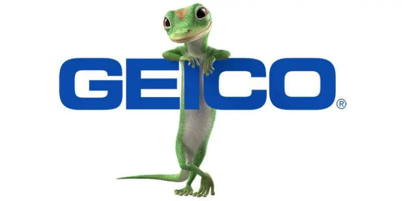
It offers a sense of security, stability, and tranquility. On certain occasions, it is escorted by a comical mascot, a gecko. The Eurostile Bold Extended #2 font is what gives this logotype its charismatic personality.
Aldo Novarese, an Italian typographer, created it. It’s also a sans-serif typeface.
GEICO Logo: History and Meaning
During the Great Depression in the United States in the 1930s, it made no sense to talk about starting new businesses. People thought that making them showed the most lack of understanding of how the economy works. Contrary to what most people think, the Goodwin family was brave and smart when they started a company in 1936 that insured cars, government workers, and military personnel.
Lorimer Davidson joined the company in 1948. A family friend who worked as an investment banker brought in new investors, which helped bring the investment scene back to life. Benjamin Graham is one of them, and he will bring together Warren Buffett, an entrepreneur and future investor in many American businesses. He bought up the stocks of other companies to get control of Berkshire Hathaway in 1965. In 1976, he bought about 1 million shares of GEICO to keep it from going bankrupt.
Buffett purchased his first shares in Public Employees Insurance Company in 1951.
Lorimer Davidson took up the reins from Goodwin, who decided to retire, as early as 1958.
In 1959, the company moved its headquarters to Chevy Chase, Maryland. This was after twenty years of success in the insurance business.
In the 1960s, the corporation expanded successfully, creating several new offices across the country.
Read Also: ALLSTATE LOGO: The Story Behind Allstate’s “Good Hands”
However, the early 1970s were a portent of doom. The fall of the Goodwin family and the wrong decisions made by the new management led to a crisis. The company’s stock fell from $61 to $2 in 1976. Buffett stepped in to help at this critical juncture, investing $45,713.
With such a big investment and careful underwriting, GEICO not only stayed in business but grew in the 1980s as well.
Olsa Naisley, the new chairman and CEO, directed a large percentage of the funds into advertising in 1993. Her actions led to great results, which increased the number of clients by making the company more well-known. Such actions drew Buffett’s attention once more, and in 1995 he offered to buy all remaining shares, and GEICO became a subsidiary of his company, Berkshire Hathaway, in 1996.
The new owner aggressively pursued an advertising campaign. Development of a new agency image and visualization, advertising in the media (TV, and the Internet), and mass mailings to mailboxes resulted in the universally recognizable brand GEICO Gecko®, which seldom left TV screens in 2000. The company’s logo became an advertising symbol and its most memorable logo. The company’s website, geico.com, which was launched in 2004, was also widely marketed, with the slogan “Geico.com – so simple that even a caveman can do it.”
GEICO is now a firm with consistent growth and monthly sales records. Original brand solutions based on the 1978 emblem add to this. As a result, the organization remains known, demonstrating its dedication to its successful past. Simultaneously, unique additions to the basic subject make it even more appealing and unforgettable.
Evolution of the GEICO Logo
GEICO has used five different logos during the course of its 80-year history. In 1936, the company presented its first logo. The first upgrade came 26 years later. Let’s take a short look at the various stages the logo has gone through throughout time.
The Original Logo:
In 1936, the insurance firm debuted its first logo. It was a slanted black wordmark to the right. There were two gray triangles at both ends of the truncated word—GEICO. Furthermore, the designer used uppercase letters for the words—Government Employees Insurance Company. This monochrome visual ambassador lasted over 26 years.
The First Logo Update:
After twenty-six years of use, GEICO revealed a new logo. It was a spherical insignia with an eagle perched on a plinth. A banner with the inscription “national service” was displayed beneath this pedestal. In addition, the logo featured seven stars and the complete name of the organization, Government Employees Insurance Company, in a circular format. It was seven years long.
The Second Logo Update:
In 1969, GEICO underwent its second logo redesign. With slight alterations, it maintained the identity of its prior logo. Although the spherical shape was missing, the designer inserted a rectangular shape beneath the eagle’s pedestal. The inscription—GEICO in bold caps with the registered mark—was inside this form. Surprisingly, this logo barely lasted a year.
The Third Logo Update:
In 1970, GEICO debuted its fourth logo. It had an exquisite shape with the message “GEICO and affiliates” in all uppercase. In comparison to its predecessors, this black-and-white symbol was clean and basic. It was useful to the company for nearly eight years.
The Fourth Logo Update:
In 1978, the firm launched a new visual identity with the goal of creating a simple logo. It’s a big blue wordmark with the abbreviated name—GEICO. This logotype is sometimes accompanied by the caption—Direct in capitals. There’s also a wordmark depicting a happy lizard. This bright mascot can be seen anywhere around the exquisite wordmark.
Why Does the GEICO Logo Function?
The GEICO Logo Is Straightforward:
Most well-known firms have simple logos. They make their designs more effective by eliminating the use of unnecessary design elements. In the same way, the GEICO logo went through a similar creative process. It is noticeable due to its neat personality.
The GEICO Logo Is Legible:
Readability is an important aspect of logo design. As a result, a good font allows customers to instantly identify the brand’s identity. The GEICO logo is more readable because of its simple, bold typeface. This powerful sans-serif typeface is tough to overlook on any marketing platform.
The GEICO Logo Is Customizable:
The GEICO logo is extremely adaptable. It is compatible with practically all marketing platforms. That is, it may blend in with both small and large surfaces. Its basic layout plays a crucial role in its ability to scale.
The GEICO Logo Will Never Go Out of Style.
For a long time, GEICO has had a clear identity, and its blue color and font have never changed. Surprisingly, most iconic logos share this property. The constancy of the design features has fostered trust, granting the logo a timeless stature.
GEICO Logo: Colors and Font
The previous logo, which is still in use today, solely shows text – the abbreviation of the company’s name. It’s written in a dark azure Pro Bold Extended font. The letter “O” has a ® sign at the bottom. The logo is designed to be as brief and easy to read as possible, not just in printed materials but also in digital television and online resources. The latter turned out to be important, so a small change had to be made to the image using modern technology. This version shows that a company is well-known enough that it doesn’t need extra visual features to get people’s attention. It is easy to recognize and remember.
With the rise of smartphones, it was important to make a mobile version of the site and make it easier to leave comments without going to the company office or calling an agent. A basic symbol was built to match the style of the brand mark for an application that was created. The icon is shaped like a square with sharply rounded corners. Its space is filled with the logo’s signature dark azure color. The first letter of the logo, “G,” is in white Pro Bold Extended typeface in the middle.
What Does the GEICO Logo Mean?
The logo of the American insurance company is simple. It’s a wordmark created with a geometric sans-serif font. It’s assertive, vocal, and convincing. It has a blue personality on a white backdrop and exudes cheerful vibes. The GEICO logo represents peace, security, stability, and freedom in many ways. It’s also one of the world’s most recognizable logos.
What Does the GEICO Symbol Mean?
GEICO employs distinctive funny characters to elicit a strong emotional response from customers. These include the GEICO Gecko, Maxwell the Pig, and Cavemen. The GEICO Gecko is the most well-known and important of the three mascots in the company’s marketing operations.
The GEICO Gecko, a comical lizard with an English accent, was designed by the Martin Agency. It first debuted in an advertisement on August 29, 1999, with actor Kelsey Grammer doing the voice-over. Later, the mascot’s voices were provided by Dave Kelly, Jake Wood, and Andrew Randall.
What is the font used in the GEICO logo?
GEICO has maintained a strong individuality. Because of the square-like sans-serif font. Aldo Novarese, an Italian typographer, developed it from its first font, Microgramma, in 1962. Eurostile Bold Extended #2 is the name of the pattern. This confident and honest geometric typeface is bold, readable, and appealing.
What Exactly Is the GEICO Catch?
GEICO is one of the most successful brands in the world. One thing that has contributed to its success in the industry is its innovative and hilarious marketing strategies. GEICO employs memorable catchphrases to instill lasting recollections in people’s brains.
“Fifteen minutes might save you 15% or more on vehicle insurance,” for example, has been ingrained in American culture and is one of the most effective advertising slogans in history. “GEICO: Real service, real savings” is another great company slogan.
What Is the Meaning of the GEICO Mascot’s Gecko?
To be fair, GEICO rhymes with gecko. As a result, using a different animal as an official mascot would be less significant. It all started when the Martin Agency realized that consumers frequently mispronounced GEICO’s name as “Gecko.”
So, at a brainstorming session, they recognized the necessity to capitalize on the current circumstances. As a result, a friendly animated gecko was born to manage the company. It debuted on August 29, 1999, and quickly became a popular figure. It has since resulted in other successful ads.
What Is the GEICO Mascot’s Name?
Almost every mascot has a unique and individualized name. It’s a lot of fun to give these animated figures human names. Surprisingly, these names are inspired by a variety of circumstances. The GEICO Gecko gets its name from the business that manufactured it.
So it’s called Martin after the Martin Agency. Furthermore, Maxwell, the company’s second mascot, is a lovable pig and the brand’s second most recognized mascot.
What Does the Abbreviation “GEICO” Stand For?
GEICO is an acronym that stands for Government Employees Insurance Company. Despite the word “government” in its name, it is a private enterprise. The brand began with a focus on government officials, therefore its inclusion. Berkshire Hathaway now owns it and it focuses on auto insurance. It is also the country’s second-largest auto insurance provider.
A Brief History of GEICO
GEICO was founded in 1936 by Leo and Lillian Goodwin. GEICO is an acronym that stands for Government Employees Insurance Company. This is because the company started out by focusing on government and military workers in the US.
Lorimer Davidson, an investment banker, joined GEICO in 1948. He assisted the company in attracting additional investors after joining it. Among these investors was Benjamin Graham, a professor at Columbia University in New York. Then, in 1951, Warren Buffet, a student at the same university, purchased his first shares in the company.
Lorimer Davidson took over after Leo Goodwin retired in 1958. After he was hired, the company moved its headquarters to Chevy Chase, Maryland, within a year. Then, in 1964, GEICO surpassed one million PIF. PIF stands for policies that are currently in effect.
In 1996, Warren Buffet bought the remaining shares of GEICO stock, making the company a subsidiary of Berkshire Hathaway, Inc. Three years later, the GEICO Gecko appeared in a commercial for the company.
It was a successful campaign that propelled the brand above the five million PIF mark in 2002. The company passed the nine million PIF threshold in 2009. GEICO also built an office in Massachusetts that year, servicing all fifty states.
GEICO now employs over 40,000 people and services over eighteen million policyholders in the United States.
In Conclusion,
The GEICO logo is one of the most recognizable graphic assets in the world. The logo is a blue wordmark with a geometric sans-serif font. It’s neat, appealing, and memorable. It debuted in 1936 and has been updated four times since then.
The GEICO logo can accompany a gecko, however, it usually stands alone. This animated mascot is called Martin, after the company that made it, the Martin Agency. It is a nice way for the company to get its name out there.
The GEICO Gecko first appeared in a commercial in 1999, upending the insurance business. Today, the logo and mascot reflect the United States’ second-largest auto insurer. GEICO’s headquarters are in Chevy Chase, Maryland.
It also has overseas offices in Germany, Belgium, Italy, Spain, and the United Kingdom. Furthermore, the corporation employs over 40,000 people, has 18 million policyholders, and covers over 28 million automobiles.
Berkshire Hathaway, Inc. owns the private corporation GEICO, which stands for Government Employees Insurance Company.
Related Articles
- BEST CAR INSURANCE IN FLORIDA: Best Car Insurance 2023
- Short Term Car Insurance: Best Insurers in the US
- LANDLORD INSURANCE: Coverages, And Costs
- Cheapest No Down Payment Car Insurance In 2023
- Cheapest Car Insurance For Low Income Drivers In 2023
