The Cleveland Indians are an American professional baseball team that has been around since 1894. They are part of the Central Division of the American League and play in Major League Baseball. The team’s home stadium is Progressive Field in Cleveland, and Mike Chernoff serves as general manager. This article showcases the history of the Cleveland Indians logo and the reason why they changed their name.
History of Cleveland Indians
Somers felt the team required a new name in 1915. He requested that local baseball journalists select a different one. Somers selected the Indians from among the available options.
One story says that the name was chosen to honor Louis Sockalexis, who was the first Native American known to have played professional baseball. Between 1897 and 1899, Sockalexis played for the Cleveland Spiders. Spectators and the sports media hurled racial epithets at Sockalexis, a star baseball player.
However, several sports historians contest the assertion that the name’s inspiration was Sockalexis. They claim that the moniker was decided upon following the Boston Braves’ championship season. Names with Native American roots gained popularity after their victory.
Regardless of where it originated, the name stuck and was used on the team’s clothing for more than a century.
Cleveland Indians Logo History
The notorious Chief Wahoo was not always a team mascot. He initially emerged in 1932 as a widely read newspaper cartoon. The cartoonist Fred George Reinert made the caricature for the Cleveland Plain Dealer to go with a story about the baseball team.
In the original cartoons, an angry Native American ran across a baseball field with a tomahawk and a knife in his hands. Below the game’s score, the original drawings were labeled “Full Details in Today’s Sports Pages.”
Readers liked the figure, and he started to show up more and more in stories about the squad very quickly. The Little Indian was the name Reinert gave to his character. Reinert and his persona gained enormous popularity. Children who went to the Plain Dealer offices often asked to meet the artist who made the well-known mascot, according to reports.
In Search of a Logo
Bill Veeck, the owner of the Cleveland Indians, requested a new logo in 1947. Walter Goldbach, a 17-year-old artist, was engaged by him to create it. A design by Goldbach is strikingly similar to Reinert’s “little Indian.”
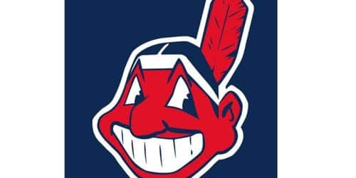
The picture showed a small Native American with a huge head, a big nose with a hook, and one feather in a headband. A bat was in the caricatured person’s hand. He had a mouth full of huge, grin-inducing teeth and dark, brick-red skin. This is Chief Wahoo, who was previously seen on Cleveland apparel and memorabilia.
Initially Big Chief
The origin of the name “Chief Wahoo” is unknown. From 1936 to 1947, a cartoon dubbed “Big Chief Wahoo” appeared in the newspapers. However, some sports historians point out that the moniker likely referred to Allie Reynolds, a player with the Indians.
Reynolds belonged to the Creek tribe of Native Americans. He became a rookie with the Indians in 1942.
Reynolds was a Cleveland favorite and excelled as a player. Later, the team traded him to New York, where he pitched in two no-hitters and won six world championships. Reynolds was frequently referred to as “Chief Wahoo” by fans and sports writers.
Officializing the Cleveland Indians Logo
In 1947, Chief Wahoo was adopted as the team mascot. When Cleveland won the World Series in 1948, the team gave Wahoo a crown.
The Indians modified their uniforms in 1954 to accommodate the new logo. On the left sleeve of their 1954 uniform was a picture of Chief Wahoo, and the word “Indians” was written in script across the front of the jersey.
Cleveland Indians Logo History (1901 — 1902)
The first Cleveland Indians logo was designed in 1991 and featured a plain, arched “Cleveland” inscription in all capital letters in a strong, handwritten sans-serif font. The original logo’s color scheme was centered on an intense, vivid blue, which gave the straightforward design a striking, powerful look.
Cleveland Indians Logo History (1902 — 1903)
The club’s logo was changed in 1902 to a single, simpler design that featured a huge, bold “C” in blue writing on a white backdrop. The letter was written in a unique font with heavy strokes, angular shapes, and a large square serif on the top.
Cleveland Indians Logo History (1904)
In 1904, the team still used the logo from 1902, but with a different color scheme. The big “C” was made out of scarlet, which gave the Indians’ identity a strong look and made people think of energy and fire.
Cleveland Indians Logo History (1905 — 1908)
The team unveiled a new logo in 1905, which was used by them for three years. It was once again a big blue “C,” but this time it was written in cursive. The top part of the letter was stretched out and bent, giving it a cute and playful look.
Cleveland Indians Logo History (1909)
In 1909, the upper tail of the “C” was shortened and the curves of the logo were changed, giving it a more modern look while keeping the grace and flair of the old logo.
Cleveland Indians Logo History (1910 — 1920)
With the redesign of 1901, a second “C” was added. This one was in a geometric sans-serif typeface with an octagonal pattern that repeated along the letter’s edges. Compared to the 1903 logo, the lines were smaller, but the logo still had a strong, solid appearance.
Cleveland Indians Logo History (1921 – 1927)
The Indians’ logo was changed in 1921 to a blue font with a Bruce Double-Pica resemblance. The city of Cleveland is symbolized by the letter “C.”
Cleveland Indians Logo History (1928)
An entirely new strategy for the club’s visual identity was established in 1928. A red and black profile of a Native American guy was the new Cleveland Indians logo. He had three black feathers in his hair and was looking to the left.
Cleveland Indians Logo History (1929 – 1932)
A new Native American depiction has a crimson face and black outline facial characteristics. He was wearing a black and white striped headdress.
Cleveland Indians Logo History (1933 — 1945)
The logo was red and white until 1933 when it was changed to yellow, brown, and red to show more detail and a more accurate profile of the Native American.
Cleveland Indians Logo History (1946 – 1947)
The Indians replaced the native American head in 1947 with a baseball player’s body. The native American has one red feather, a crimson face, and black hair. He is holding a baseball bat and is in the batting position.
Cleveland Indians Logo History (1948)
Chief Wahoo has black hair, and a red feather sticks out of the back of it. He stands straight ahead and smiles like a cartoon Native American.
Cleveland Indians Logo History (1949 – 1972)
In 1951, the logo changed, going from yellow skin with one feather to red skin with a smaller nose and black hair and skin. The logo’s outline is black. Since then, this logo has continued to be used, with only minor design changes made through 2014.
Cleveland Indians Logo History (1973 — 1979)
A new version of the logo is made in 1973, and the color scheme is changed to red, blue, and white, a repetition of the colors of the American flag and a representation of the baseball team’s loyalty and patriotism. The portrait itself changed over time into something more fun and modern, with sharper lines and more defined shapes.
Cleveland Indians Logo History (1979 — 2019)
In the redesign from 1979, the Indian man’s image was positioned on a baseball that was white and blue. It also featured bold text all around. The main color of the logo changed from red to blue, which reminded people of the very first Cleveland Indians logo. On this symbol, Chief Wahoo was depicted with a bat in his hand and a baseball outfit. The blue inscription was written using a unique sans-serif typeface with Mayan symbols, thick lines, and straight letter cuts.
Cleveland Indians Logo History (2013—Today)
The team’s 1904 logo, a large geometric “C” in the colors red and white, is still used in 2013. A second version was made, with a crimson “C” on a serene blue backdrop, and the letter’s edges are being tightened and polished.
Font of Cleveland Indians Logo
As the Cleveland Logo History just has one letter, it is difficult to talk about the font in this case. It looks like either original art or a font glyph that has been changed.
Colors of Cleveland Indians Logo
White, navy blue, and crimson are the recognized colors. Only two of them, red and white are used in the primary Cleveland Indians logo, Block C, while all three are combined in the secondary logotype (Chief Wahoo). Some of the colors used in the old logos were different shades of red, blue, brown, black, and gold.
Jersey of the Cleveland Indians
The team’s logos and jerseys were basic at the time. The word “Cleveland” appeared on the front of the team’s home jerseys in its first jersey from 1901. On the upper left shoulder of the jersey of the road uniform, there was a big letter C. Red and white were the team’s colors.
The C on the shirt of the opposing team evolved and curled up in 1906. There were few other changes until 1928.
Why Did the Cleveland Indians Change Their Logo?
The decision was made following a year of conversations between the Indians and Major League Baseball, the regulatory body. The regulatory body was headed by Commissioner Rob Manfred. This move may put pressure on other American sports clubs to drop comparable iconography.
MLB and the Indians said in a joint statement that MLB had put pressure on the team to get rid of Chief Wahoo, even though many of the team’s fans wanted to keep the logo, which had been used since 1947.
Even though many of our fans have known Chief Wahoo for a long time, Cleveland Indians owner Paul Dolan said, “I’m ultimately in agreement with Commissioner Manfred’s wish to take the logo off our jerseys in 2019.”
He said, “I’m glad the team decided to show the city, the country, and the world that Cleveland is a welcoming place that respects everyone’s differences. In this case, taking the Wahoo off the uniforms is a better way to honor our country’s first people.”
Chief Wahoo is the “ugliest” of the many mascots based on Native American caricatures used by American sports teams, according to Clyde Bellecourt, co-founder of the Minneapolis-based American Indian Movement, or AIM.
The cartoon character with red skin, a toothy grin, and a feather in his headdress that serves as the Indians’ insignia will still be present on products sold in the team’s retail outlets in Goodyear, Arizona, where the Indians’ spring training is located, as well as in northeast Ohio.
According to the statement, using the logo on items will let fans maintain their “relationship” with the figure. It also enabled the Indians to keep control of it as a trademark.
Controversy and Changes of the Cleveland Indians Logo
For many years, the logo has sparked criticism and debate. However, team owners resisted changing the name “Indians” or getting rid of the mascot until recently.
Chief Wahoo was taken off a few of the team’s batting helmets in 2009. It was still on the jersey sleeves despite the team’s announcement in 2016 that he would be removed from their caps.
However, the Chief Wahoo was formally removed as the team’s mascot in 2019.
Major Changes of the Cleveland Indians Logo
The Indians declared they would change their name in 2020. They were the second club that year to alter their name, following the old Washington Redskins. The organization declared that the Indians’ name and logo would be used throughout the 2021 season.
Owner Paul Dolan said he came to this conclusion after talking to Native American groups, academics, and community leaders. The change was made because more and more people thought that racist mascots and team names were offensive.
The Change the Mascot campaign’s founder, Ray Halbritter, told CNN that sports need to be inclusive since they have such a tremendous cultural impact on both this country and the rest of the globe
What Is the Symbol for the Cleveland Guardians Logo?
A professional baseball team from the United States chose a logo that was a stylized geometric letter “G” in a three-dimensional design, split in half. Also, a baseball is in the center, and two wings emerge from the letters. They did this to emphasize speed and velocity.
What Happened to the Cleveland Indians Logo?
The logo for the Cleveland Indians has changed many times over the years. Most of these changes were based on the letter “C” or a Native American figure. The club’s logo was totally changed from the representation of an Indian guy in 2019 to a more modern, minimalist badge with a bold red letter “C” in 2013.
Did the Cleveland Indians Change Their Name and Logo?
Yes, they did. It wasn’t until 2018 that the Indians formally got rid of their Chief Wahoo logo. It was a caricature of a Native American. The Indians’ names will be changed by the owners in 2020. They would start using the new name, “The Guardians,” for the 2022 season. And the official team logo is a character named Slider.
What Is the Cleveland Indian Mascot?
The Cleveland Indian’s mascot is Chief Wahoo.
The Secret History of Chief Wahoo
The Cleveland Indians’ Chief Wahoo logo is similar to Dracula’s. For what feels like an eternity, he has been showing off his pearly whites all over the city. Despite the fact that the team and Major League Baseball have subtly pushed the “block C” logo as the club’s primary visual identifier, Chief Wahoo can still be found on uniform sleeves, hats, batting helmets, and stadium decor. Let’s be real: Could Cleveland ever exist without Chief Wahoo? And by that, I don’t mean any potential changes to the name or logo, only how much the Chief has already been sewn into, ironed into, applied to, and inscribed on. In Cleveland, the wahoo is like infrastructure: it is buried deep into the system.
The Wahoo logo’s official origin appears to be much less controversial. Most people agree that the caricature was made by 17-year-old Walter Goldbach, who was hired by Indian owner Bill Veeck in 1947, 50 years after Sockalexis. Goldbach, a former employee of a nearby advertising business, continues to support Wahoo. After some adjustments in 1951, the Wahoo picture became what we see today. It was in significantly decreased use on the official uniform and around Progressive Field. He explains that “it was the last thing on my mind to upset someone.”
However, that is not where the well-known Wahoo cartoon actually started.
So What if We Are Wrong About Wahoo?
It appears that most of what we believed to be true about Chief Wahoo is incorrect. Even the name “Indians” has a questionable history. The Indian’s name, according to the organization’s front management, is in honor of Louis Sockalexis, a retired “full-blooded Native American” who played for the team in the late nineteenth century.
Cleveland baseball teams had a string of franchises in various leagues, but they never managed to settle on a moniker. The Infants, an old Players’ League team, may have been the worst, losing 75 of their 130 games in their lone season. The Blues were the name of Cleveland’s American League team in 1901, while the Bronchos were it in 1902. In 1903, the group decided on the name Naps in honor of the second baseman Napoleon Lajoie, a future Hall-of-Famer. However, the squad required a new hero after Nap left following the 1914 campaign, as well as a new name.
The squad would be called the “Indians” in his honor, according to a Plain Dealer article headlined “Looking Backward” from January 18, 1915, which reveals that “many years ago there was an Indian named Sockalexis who was the top player.” But many modern authors and historians condemn the action. The idea that the new name may have been influenced by the popularity of the 1914 Boston Braves, who magically improved from last to first in the middle of the season, was first put out by Ellen J. Staurowsky in a seminal 1998 paper. The Braves angle holds up to the logic test: It is as old a practice in sports to take ideas from a winning team. It makes perfect sense that “Indians” would be chosen to conjure up “Braves,”, especially in light of baseball’s penchant for superstition.
What Are the Cleveland Indians Changing Their Name To?
The Cleveland Major League Baseball team started taking down the scripted “Indians” logo from the scoreboard at Progressive Field. This was a big step in the team’s name change. Cleveland will use the name Guardians from now on after deciding in December 2020 that its prior name was offensive to indigenous people.
The 43-foot sculptures known as the “Guardians of Traffic” on the Hope Memorial Bridge served as inspiration for the transition, which will be Cleveland’s first season under a new name since 1915. By Opening Day, the “Guardians” logo that is now on top of the scoreboard at Progressive Field will be replaced by a new one that says “Guardians” in the script.
According to Cleveland’s president of business operations, Brian Barren, “through our research and discussions, we identified a few key themes that were most important to fans: connecting to the city of Cleveland, honoring our rich baseball history, and uniting our community, and we believe Guardians upholds all three of those pillars.”
Cleveland’s new name and merchandise didn’t come out as planned last week, even though the team had planned to do so in the coming weeks. The American League squad was sued in federal court for attempting to use the name of the Cleveland Guardians, a roller derby team from Cleveland.
The real Cleveland Guardians were the original owners of the name “Cleveland Guardians,” according to Christopher Pardo, the roller derby team’s main attorney. By calling themselves “Cleveland Guardians” overnight, the Indians broke these rights on purpose.
Even though the roller derby team complained, the MLB team in Cleveland said in a statement that it plans to keep using the name “Guardians.”
Things You Need About the Creation of the Cleveland Guardian
The Cleveland Guardians are an American Major League Baseball franchise that is based in Cleveland (AL). Six AL championships and two World Series championships, the first in 1920 and the second in 1948, have been won by the Guardians.
The team was founded in Grand Rapids, Michigan, as a minor league club, and it relocated to Cleveland in 1900. The Cleveland Bluebirds, or Blues, were the team’s new name when it was promoted to major league status in 1901. In 1902, they changed their name to Cleveland Bronchos, and the following year, they adopted the moniker “Naps” in recognition of Nap Lajoie, their new star player. Charles Somers, the franchise’s owner, asked the neighborhood newspapers to choose a new name in 1915, and “Indians” was the winner. Tris Speaker, who helped the Indians win their first World Series title in 1920, was acquired by the Tribe in a trade in 1916.
Although it had been 28 years since the Indians had last played in the postseason, their comeback was noteworthy. One of five future Hall of Fame players on the 1948 Indians, shortstop-manager Lou Boudreau was the AL’s Most Valuable Player that year. The other players were three pitchers: Bob Feller, Bob Lemon, and 42-year-old rookie and former Negro league great Satchel Paige. Outfielder Larry Doby was the first African American to play in the AL. Frank Robinson became the first African American manager in the major league thanks to the Indians in 1975. With the Boston Red Sox, who they defeated in the first one-game playoff in major league history, the Indians concluded the 1948 regular season tied. Then, Cleveland defeated the Boston Braves in six games to win the World Series for the second time.
More to Know About the Creation of the Cleveland Guardian
Although the Indians won 111 games in 1954, the New York Giants won the World Series, which featured one of baseball’s most iconic moments—Indian Vic Wertz’s towering drive to the deep center field being caught by Willie Mays over-the-shoulder in the opening game. The Indians then went through a long period of not being very good. From 1960 to 1993, they had a losing record in 27 of the 34 seasons. People say that this time was caused by the “curse of Rocky Colavito,” which hit the Indians after they traded Colavito, the best home run hitter in the American League, to the Detroit Tigers in 1960 for Harvey Kuenn, the best hitter in the league at the time.
The Indians reemerged and won five consecutive AL Central Division championships (1995–1999) under manager Mike Hargrove, twice making it to the World Series (the Indians lost in both World Series appearances). The Indians set a record for consecutive sold-out home games, 455 between 1995 and 2001, thanks to the success of those teams, which included players like Manny Ramrez, Omar Vizquel, and Jim Thome, as well as the popularity of Cleveland’s new ballpark, Jacobs Field (since broken by the Boston Red Sox). Soon after that streak ended, the team’s performance started to decline. From 2002 to 2012, Cleveland had just two winning records; however, one of those years, 2007, saw a dramatic seven-game loss to the eventual champion Red Sox in the ALCS.
In 2013
In 2013, when Terry Francona took over as manager, the Indians won 24 more games than the year before. They also surprised everyone by making it to the playoffs, where they lost in a one-game Wild Card playoff. Three years later, the Indians won their division even though a lot of their pitchers were hurt. Due to Francona’s great management of his thin roster, Cleveland only dropped one game in the AL playoffs on the way back to the World Series, where the Indians were defeated by the Chicago Cubs in a heartbreaking seven-game series. 2017 saw Cleveland win a second divisional championship. While doing so, the club put together a winning streak of 22 games, which is a current Major League Baseball record; however, the team’s season was once again cut short by the Indians’ loss in the first round of the playoffs.
In 2018, the Indians earned their third straight division title, but they once again dropped their opening postseason series. Cleveland’s three-year postseason streak came to an end in 2019 when it finished second in its division.
The team’s name, which many people deemed offensive or out-of-date, caused controversy for years before the 2022 MLB season when the name was changed to the Guardians.
How do Do Cleveland Fans feel About the Name Change?
Major League Baseball is still locked out, so the Cleveland baseball team’s first season as the Guardians will start later and end sooner than usual.
The team’s previous name, the Indians, has been changed to the Guardians. Some fans didn’t like it since they didn’t want change, even though they did it out of respect for Native Americans.
Conclusion
The history of the Cleveland Indians logo has changed a lot since it used to show Native Americans in a bad light. Even though it took them over a century, they ultimately made the decision to let go of that chapter in their history. The team also has a new name, a new logo, and a chance to start over.
Related Articles
- CLEVELAND GUARDIANS LOGO: History, Ideas, Evolution, Meaning
- NATIVE AMERICAN SMALL BUSINESS GRANTS Listings In 2022 Updated!!! (The Top 15)
- Chief Strategy Officer: Organization Chart, Job Description & Salary
- LIVING TRUST VS WILL: Best option in the US (+Major differences).
- CLEVELAND BROWNS LOGO: History, Meaning, Evolution
