Black Panther is a Marvel superhero film that was released in 2018. In the movie, an African hero tries to do his job as King of the made-up country Wakanda and deal with his past simultaneously. The movie was a big step forward for Marvel, and it was both a statement and a product at the same time. But I bet you had no idea why the Black Panther logo is a mask with horns or the brand’s backstory. Let’s go over the history and evolution of the Black Panther logo and the brand itself.
Black Panther Logo: Brand Overview
The exploits of heroes with superhuman abilities are the focus of Black Panther. The first film was shown in 2018, and the second was released in November 2022. This is a cinematic adaptation of the same-titled comic book written by Jack Kirby and Stan Lee about a superhero named Black Panther.
Joe Robert Cole and Ryan Kyle Coogler wrote the original film. Marvel Studios, on the other hand, became the publisher. Even though work had started years before, the film company didn’t start main shooting until 2017. In the 1990s, actor Wesley Trent Snipes proposed the project idea.
Black Panther Logo: History and Meaning
What Exactly is Black Panther?
Black Panther is a Marvel Comics superhero. Based on his exploits, a film of the same name was filmed in 2018 as well as an animated series in 2010. Screenwriter Stan Lee and illustrator Jack Kirby invented this character. He was envisioned as the patron saint of a fictitious East African kingdom.
The film crew focused on the story and the look, which they thought would help Black Panther and make it stand out from other superhero movies. The movie logo incorporates two eye-catching components. The first is the studio emblem, which controls the film and all of its characters, including the lead character.
The Black Panther superhero and the film’s insignia are depictions of a mask with cat ears, a W-shaped nose, and huge openings for the eyes. This emblem is similar to the main character’s mask but differs in various ways. To begin with, it is a simplified form because the elements are shown schematically. For example, the mouth has two short vertical lines that resemble a medial pause. The eyes are exaggeratedly swollen and irregularly elongated. The nose only loosely resembles that of a cat; it resembles a stylized letter “W.”
Wide white stripes cross the black mask at various angles, reflecting the facial expressions. They are symmetrically placed: what is on the right is always on the left. On the forehead, there are two horizontal lines. This is an attempt to resemble the joints of the plates on the superhero’s mask rather than the color of a panther. The complex curves over the eye sockets look like threateningly painted brows. Two stripes on the cheeks can mean the warrior has sunken cheekbones or that he has ceremonial markings on his face.
2014 (Pre-Release)
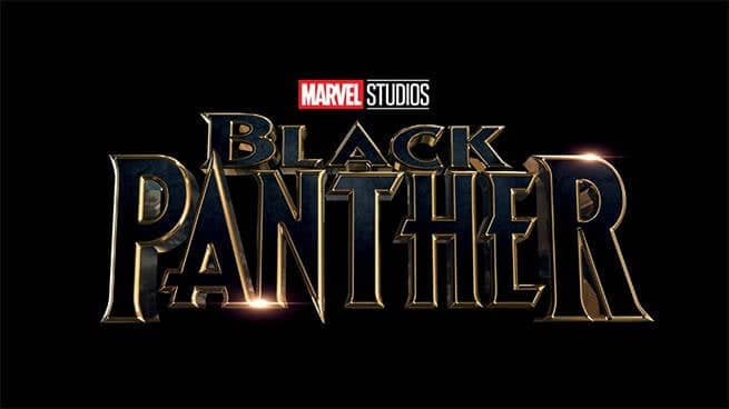
Blue lettering with gold outlining and sparkling highlights glow brightly on a completely black background. The sides of the letters have a chrome sheen that makes them look like they were made of that super-strong metal. This gave them three-dimensionality. Some of the letters end in huge spikes, and the serifs have sharp edges that add to the feeling of power and invulnerability. Together, they form the ideal setting for action and superhero films. The way the Black Panther logo looks also suggests that it has something to do with a predatory view of the world of cats, where sharp claws and fangs are the most important things. The font is capital, with asymmetrical glyph heights and diagonal cuts.
Black Panther Logo 2018
The white word “Marvel” is inside a red rectangle on the left, while the black word “Studios” is underlined above and below with thin lines on the right. The brand name has been reduced in size and put to the top so that all attention is focused on the film’s title.
Most of the space is devoted to the blue “Black Panther” writing. The designers compacted the word “black” in the first line. The word “PANTHER” is in the lower half of the logo and is larger than the other elements. The sentence is dark blue with a gradient. Light highlights, which give depth and simulate reflections on water, are another decorative technique.
Because the letters have a broad golden border, the film’s title appears monolithic and impressive. In contrast to the top text, “Marvel Studios,” this shape makes them appear three-dimensional. The unusual “fairytale” logo design fits the fantasy theme. And acute-angled letters with jutting spikes and serifs represent another genre of film – the action film.
2021 (Pre-Release)
The emphasis in this logo variation is on a separate film rather than the franchise’s name. As a result, the line containing the words “Black Panther” is small and unobtrusive, yet the line after it, “Wakanda Forever,” is bold and catchy. The letters are large, metalized, and gleaming. The side sections that each glyph possesses give them three-dimensionality. They, like mirrors, reflect light. The producer and distributor of the action film are at the very top. Traditionally, the firm name is painted white and put in a red rectangle. The text in all three rows is center aligned.
The Black Panthers’ History
Black Panther is a 2018 American superhero film based on the same-named Marvel Comics character. It is the 18th movie in the Marvel Cinematic Universe, which is made by Marvel Studios and distributed by Walt Disney Studios Motion Pictures (MCU). Ryan Coogler directed the picture, which stars Chadwick Boseman as T’Challa/Black Panther alongside Michael B. Jordan, Lupita Nyong’o, Danai Gurira, Martin Freeman, Daniel Kaluuya, Letitia Wright, Winston Duke, Angela Bassett, Forest Whitaker, and Andy Serkis.
Following his father’s death, T’Challa is named King of Wakanda, but he is challenged by Killmonger (Jordan), who aims to abandon the country’s isolationist ideals and launch a global revolution.
Wesley Snipes had planned to make a Black Panther movie in 1992, but the idea never materialized. In September 2005, Marvel Studios said that Paramount Pictures would distribute 10 Marvel-based movies, one of which would be a Black Panther movie.
In January 2011, Mark Bailey was contracted to write a script. The character of Black Panther was officially announced in October 2014, and Chadwick Boseman made his debut appearance as him in Captain America: Civil War (2016).
Read Also: NEW YORK TIMES LOGO: Why Is The New York Times called the Gray Lady
Cole and Coogler had already joined, with additional casting coming in May. Black Panther was the first Marvel Studios picture to include a Black director and an all-Black cast. From January to April 2017, principal photography took place at EUE/Screen Gems Studios in Atlanta and in Busan, South Korea.
As part of Phase Three of the MCU, Black Panther had its premiere in Los Angeles on January 29, 2018, and it came out in theaters in the US on February 16, 2018. The film’s directing, script, acting (particularly that of Boseman, Jordan, and Wright), costume design, production values, and soundtrack were all lauded by critics, however some critiqued the computer-generated visual effects. Many critics rated the film as one of the greatest in the MCU, and it was also praised for its cultural relevance.
Black Panther was recognized one of the top 10 films of 2018 by organizations such as the National Board of Review and the American Film Institute. It grossed over $1.3 billion globally, becoming the highest-grossing film directed by a Black filmmaker, the ninth-highest-grossing film of all time, the third-highest-grossing film in the United States and Canada, and the second-highest-grossing film of 2018.
Black Panther was nominated for seven Academy Awards, and it won three of them. It also won a lot of other awards. It was the first superhero film to be nominated for Best Picture and the first MCU film to win multiple awards. Black Panther: Wakanda Forever, the sequel, was released on November 11, 2022, and a television series based in Wakanda is in the works for Disney+.
Who designed the Black Panther logo?
Before the original Marvel Comics debuted in 1957, the firm began publishing comics in 1939 under the name Timely Comics. Publisher Martin Goodman created the original Timely Comics logo, which was a red, white, and blue medieval European heating shield. It resembled Captain America’s initial shield from the comics, and it was a best-seller for the corporation.
When Timely Comics changed its name to Atlas Comics, it also altered its logo. When Atlas Comics started using this logo, which was a black circle on a red background with the words “Marvel Comics” in the middle, Stan Lee started writing comics for them.
Read Also: The BRANDS OF THE WORLD: Who They Are & All You Should Know!!!
The company released another variation of its logo in the early 1960s, this time with only the letters “M” and “C” positioned above each other. Unfortunately, it wasn’t as easy to remember as the logos that came before it or as powerful as the logos of its competitors, like DC Comics. By 1963, the Age of Golden Comics had begun, with the publication of great classics like “The Amazing Spider-Man,” “The Fantastic Four,” and “The Incredible Hulk” by Stan Lee, Jack Kirby, Steve Ditko, and other comic book creators. The corporation opted to include the new age in its emblem. The redesigned Marvel logo included the words “Marvel Comics Group,” which was one of the few logos that did not change much for a long time.
During the 1970s and 1980s, there were small changes to the typefaces and sizes, but the overall look stayed the same. When the “Ultimate Marvel” label was founded in the early 2000s, the company updated its logo, with the word “Marvel” printed in strong white on a bright red background. This new design was so popular that it was used in publications, like the Marvel Studios logo, and in earlier Marvel Cinematic Universe movies. Over time, the image changed into the flipbook-style logo seen at the start of MCU movies today.
What You Can Learn From Today’s Marvel Logo
The current Marvel logo first appeared in 2002. It has since been slightly tweaked to become more harmonious and to make the letters smoother. The text was basic white on a crimson background.
The last time the Marvel logo changed was in 2016 when the company changed its name from Marvel Comics to Marvel Studios. The logo was unveiled during the Comic-Con, along with new fanfare. Michael Giacchino, who also worked on The Incredibles, Star Trek, and the TV series Lost, wrote the music. These marketing projects teach us some branding lessons that we may all apply:
If you haven’t launched your business yet and don’t have a logo, keep it as simple as possible. Simple also means adaptable, memorable, and appealing. You can develop your own professional-looking logo. Just keep in mind not to add too many things.
When the general public begins to value you, it’s time to rethink and revise some of your corporate slogans, taglines, change your and tone of voice, and add images. However, attempt to be consistent in all of your rebranding endeavors.
Brand extensions do not compete with your main brand, but only if you have the proper marketing strategy in place. The FedEx Corporation, for example, produced sub-brands such as Express, Ground, Freight, Customer Critical, and Trade Networks, each with its own font and color variant beneath the parent brand mark.
Circumstances are important. The brand had already been taken over by Disney by the time the Marvel Studios logo was launched. In 2009, the transition was announced. One of Marvel’s most recent films is Black Panther. It made more than $80 million in revenue worldwide.
The Origins and Evolution of the Marvel Logo
The path has been long but good, from Timely Comics to the present “flip book” emblem of MCU movies. After countless trials and tribulations, it went on to become one of the world’s most popular entertainment logos, showing the importance of exhibiting your business identity in the most innovative way possible.
Elements of the New Marvel Logo Design
We’ve already explored the many stages of Marvel’s logo evolution, but now we’ll concentrate just on the most current one, in which the word “Studios” is the same size as “Marvel.” The rectangular frame around “Marvel” and the parallel lines beneath and above “Studios” give the logo a clean, defined appearance. Another notable feature is the silver, chrome frame with the word “Marvel” that appears to be cut out of the red background. Similarly, the word “Studios” appears to be chopped out of the silver frame. This is most likely intended to demonstrate that, while the Marvel Cinematic Universe may have begun from Marvel Comics, it has now evolved into its own, equally important entity.
Color
The current Marvel Studios logo features two major colors: red and silver. Apart from being classic superhero colors, each has its own meaning and purpose, even when featured separately. To begin, the color red is traditionally utilized in superhero comics to represent the ultimate hero’s power and devotion. For example, heroes such as Spiderman and Superman who have sought to improve the lives of others have always donned red.
Because red is also the color of love, action, and adventure, it may readily capture the audience’s attention. On the other hand, the silver chrome color in the Marvel emblem is frequently used to represent innovation, glamour, elegance, plenty, marvels, magic, and perfection. This means that, while the MCU is newer than the comics, it is still a powerful and valuable element of the firm.
Font
Tobias Frere-Jones revised the Marvel Studios logo in 2012, while Cyrus Highsmith revamped it later that year. This typeface is classified as a regular font and can be found in Google Fonts and Microsoft Word. It is such a clean and practical typeface that it may be used in a variety of branding collaterals, including App design, product wrapping, event and conference hoardings, TV advertising, email marketing templates, and so on. Although it is commonly used in graphic design, you must purchase it or obtain permission from the author if you wish to use it commercially.
Related Articles
- 20th Century Fox Logo: Facts and History
- Naming Photography Business: Best Complete 2022 Guide & Creative Ideas
- Stock Market Movies: 20 Best Stock Market Movies Of All Time (updated)
- PANTHERS LOGO: Meaning and Why Do the Panthers Have the NFL Logo(Opens in a new browser tab)
- PUNISHER LOGO: The True Meaning of the Controversial Logo, Revealed!!!
