Mattel, Inc. in California makes the famous fashion doll Barbie, which has been the world’s best-selling toy for more than fifty years. It has a global reach, being sold in over 150 countries. Ruth Handler, a successful American entrepreneur, was inspired by a German doll called “Bild Lilli” to create Barbie in 1959. Further in this article, we will be discussing the evolution and history of the Barbie logo.
Join us as we set the ball rolling
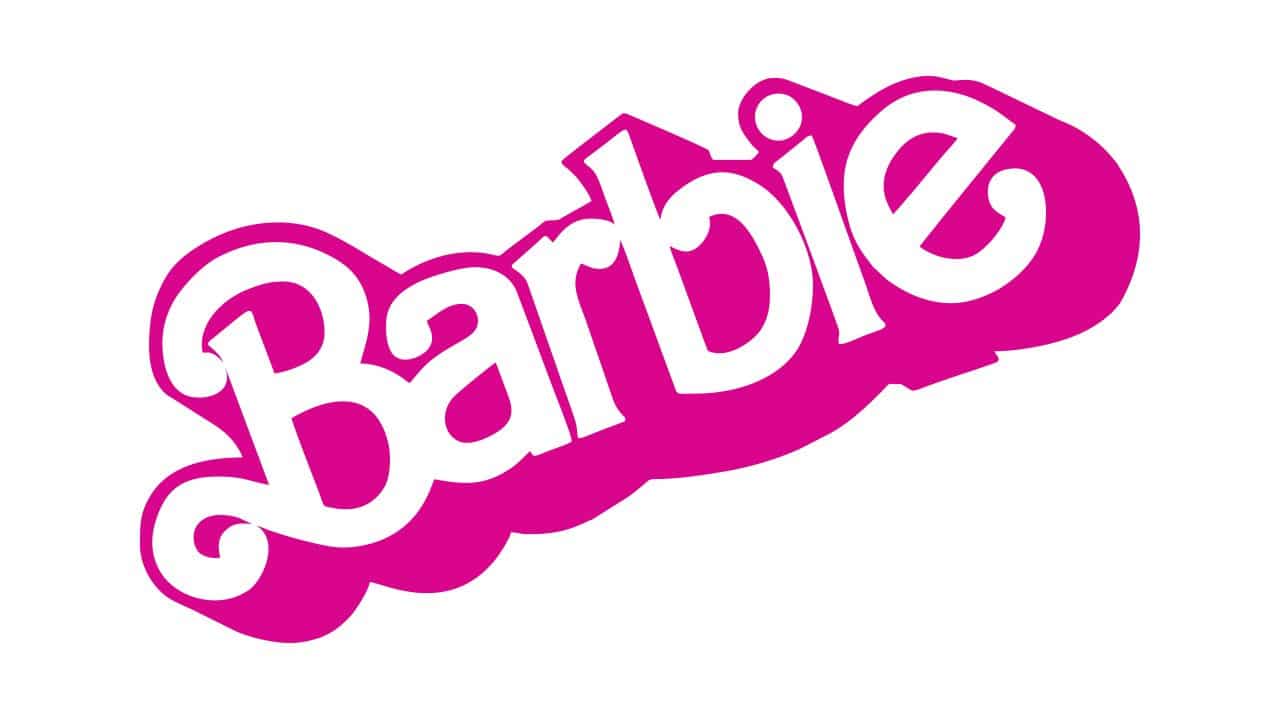
Barbie Logo
The famous Barbie logo began on the first-ever toy marketed exclusively to female children, and despite going through numerous redesigns, it has remained instantly recognized, up-to-date, and legally compliant. The logo’s color palette and design aesthetic are a direct reflection of the demographics of the brand’s ideal customer.
Barbie, which was made in the United States in 1959 and is the most famous doll brand in the world, is now owned by the Mattel Company. The business started out by making one Barbie doll, but it has since grown to include books, toys, and fashion accessories, among other things. One of the rare instances where a company returns to its original logo after multiple redesigns is the Barbie visual identity. The Barbie logo had five significant redesigns, but in 2009, the business made the decision to start over and restore the original version of the attractive feminine logotype as its official logo.
What is the Meaning Behind the Barbie Logo?
Two aspects of the Barbie inscription stand out. The jumping letters, which are organized haphazardly, are the main feature. The difference between them at the bottom and top gives the insignia an airy, relaxed appearance. With this style choice, the author conveys levity, airiness, charm, and naivete.
Is the Barbie Logo Copyrighted?
Mattel, Inc., the only graphic elements in this logo are text and basic geometric forms. It is currently in the public domain because it is not unique enough to be protected by copyright. Even though this image is not subject to copyright restrictions, there may still be some limitations.
Why Does the Logo of Barbie Pink?
Barbie’s characteristic color is a vivid shade of pink, mostly to appeal to young girls. Their logo evokes joy, playfulness, and childhood when used with a font that resembles a child’s handwriting.
What Does Barbie Stand For?
Barbara Millicent Roberts is Barbie’s full name. Ken and Barbie are named after Ruth Handler’s son and daughter, respectively. She is from the fictional Wisconsin town of Willows, where she went to high school.
Who are Barbie’s 4 Sisters?
The sisters, Skipper, Barbie, Chelsea, and Stacie, truly have the last name, Roberts. Barbie isn’t a one-named wonder, despite the fact that she is sufficiently well-known to qualify. She is Barbie Millicent Roberts in full.
Black Barbie Logo
Over the duration of her existence, the Barbie brand has seen a significant transition thanks to her different employment, habits, and even accessories. Diversity is highly regarded in the current millennium, but historically, Black women have had to struggle for their right to representation in the doll industry.
Barbie was born on March 9, 1959. At the American Toy Fair in New York City, she made her debut on store shelves as the first toy mass-produced in the nation. Following the creation of Mattel, Inc. with her husband, Ruth Handler decided to fill a niche in the toy industry. Handler reportedly noticed that her little girl played with adult paper dolls more than she did with baby paper dolls. Thus, Barbie Millicent Roberts also referred to as “Barbie,” was produced. The mother thought that providing young girls with a toy that would enable them to envision the future represented a market opportunity.
Handler is claimed to have been inspired by the Bild Lilli character from a Herman comic strip, who was “initially advertised as a provocative humor gift that guys could buy in cigarette shops.” She remembered the glitzy outings of the most famous stars of the time, like Marilyn Monroe and Elizabeth Taylor. In the first year, 300,000 dolls were sold for $3 apiece. Barbie had a number of jobs, a partner, a family, friends, and famous dolls before the creation of an African-American doll.
Christie started to change around 1978, going from having fair skin to having darker skin. She also started to grow out her afro later on. In the words of Mattel, the development of Christie was crucial and “in support of equal rights” at the time. Christie was the first doll made by Mattel with black features. She was chosen to be Barbie’s friend, even though the first “Barbie” doll didn’t come out until 1980.
Moving On…
After Christie hung out behind Barbie for years as “the black friend,” Mattel decided to make other toys. Twenty-one years after Barbie and twelve years after Christie were first made, the first African-American Barbie, the first Hispanic doll, and forty more international dolls were made.
In the summer of 1976, Louvenia (Kitty) Black Perkins got her big break. She would create the first Black Barbie in addition to being the first black designer at Mattel.
In order to stand out and finally have her own doll, Perkins designed Black Barbie. She wanted the Barbie to exude assurance, sophistication, and refinement, according to Dolls Magazine. The music industry and television had a big impact on the designer, who adored black musicians of the day like Diana Ross and The Supremes.
Barbie has given children an altogether new way to play and develop their imaginations. “I think we achieved that with the Black Barbie doll,” Perkins stated in a Mattel press statement. “We saw that the Afro-American community was yearning for something they could identify with and that children could be proud of.
Given that the Black Barbie was the antithesis of the typical Barbie, according to Perkins, it was favorably welcomed. Black Perkins claimed, “When I did Black Barbie, I gave her a short natural with a pick.” I set out to make a doll that was an exact reproduction of us. When I had short, natural hair, I really liked it. I wished the doll had that characteristic.
She made Black Barbie an outfit that stood out, with a red bodysuit, a wrap-and-snap disco skirt, dangling earrings, and a necklace that stood out. According to the doll’s box, she is black, she is stunning and she is amazing!
Barbie Logo History
Girls have long regarded Barbie as their favorite. The full name of the person is Barbara Millicent Roberts. It was created in the United States in 1959. Ruth Handler, the wife of Mattel’s founder Elliot Handler, is the creator of the doll for kids ages three to fourteen.
Ruth Handler, a co-founder of Mattel Creations, was inspired to create the doll after observing how much fun her daughter was having playing with paper dolls. Before finally being inspired by a German doll named Bild Lilli to create Barbie on March 9th, 1959, Ruth considered a variety of designs and concepts. When it was first used, the Barbie emblem was written in a sans-serif font.
The logo has had a significant impact on the continuously increasing popularity of the Barbie Doll. It continues to be a well-liked print today despite competition from other prints.
Barbie is a vibrant pink color. Choosing this symbolic hue was primarily done to appeal to females and advance the Barbie brand. The logo conveys youth, fun, and whimsy when used with a font that resembles children’s handwriting. The Barbie logo has seen multiple alterations since it was initially created in 1959, but it has always remained vivid pink.
Barbie Logo Evolution
Without a doubt, the Barbie logo is one of the most recognized and well-known in the entire world. The logo went through a lot of changes before settling on its present design. It was first displayed the same year the doll made its debut (March 1959 at the New York Toy Show).
But the peculiar form and identifiable shade of pink remain unchanged. The sign exudes fun, whimsy, and playfulness when coupled with a special typeface that resembles a child’s handwriting. The Barbie logo has seen five significant alterations since it was initially created, but in 2009 the company made the decision to start over and adopt the stylish feminine mark’s original style as its official visual identity.
Barbie Logo Evolution from 1959 — 1975
The original Barbie logo was written in an elegant yet slim, youthful style. The remaining letters are printed in lowercase, with the exception of the initial letter, “B,” which is written in uppercase. The second “b” is bigger than the letters “e,” “r,” and “a,” and is about the same height as the inscription’s uppercase “B.” The size of the second “b” and the letters “e,” “r,” and “a” appear to be similar to that of the letter I.
For two reasons, the Barbie inscription stands out. The jumping letters, which are ordered at random, are the main feature. Due to the spacing between them at the bottom and top, the logo has an airy, relaxed appearance. This style choice by the author conveys levity, airiness, charm, and naivete.
The letter “B” curve is the second noteworthy feature. with the curl positioned at the bottom and pointing inward to form a little oval.
Barbie Logo Evolution from 1975 — 1991
After being in use for nearly 16 years, the original Barbie logo was modified. The designers gave the Barbie brand a 3D moniker in an effort to update it. Although the name was useful, it didn’t make you feel wonderful. The shadow and rigidity are mostly responsible for the 3D impression of the inscription.
With the exception of the capital “B,” the letters in the logo are all lowercase and the same height. Although the line is flat, the characters are organized slightly consecutively. Its gravitas is diminished by the inscription’s diagonal placement.
This expression screams joy and optimism. The most peculiar letter is the “B,” which has two stylish curls. The heavy shadows give the remaining characters a stretched and expansive appearance.
Barbie Logo Evolution from 1991 — 1999
Before the designers opted to rework it, the old Barbie emblem served as the brand’s visual identity for more than a decade. A straightforward, streamlined design was used in place of the large, confrontational one. In 1991, the logo’s diagonal alignment was preserved, the typeface was altered to a more solemn one, and the pink tint was softened and made cozier. The gentle, nude pink against the white background took the place of the candy-colored, vibrant pink. The font was less ornate than before, and the “B” was plain and basic.
Customers of the brand appreciate looking at the straightforward, contemporary style since it conjures up pleasant memories. The light pink title was written in a straightforward sans-serif typeface with straight, uninterrupted lines, no borders, and no shadows.
Barbie Logo Evolution from 1999 — 2004
In 1999, the lettering was changed once more by the creators of the Barbie logo. The inscription was therefore italicized and slightly tilted to the right. Also recovering its tiny inner curl, the letter “B” now has an airy, fashionable aspect. The brand name “Barbie” can be written by hand with a single motion that preserves the connection between the letters. The logo is colored in a reddish tone.
Barbie Logo Evolution from 2004 — 2005
The fourth revision of the Barbie logo was made in 2004. The bottom and top of the letter “B” protrude past the front legs because the designers made it sweeping and strong. The name appears to be galloping because there is no inside connective and the characters are spelled differently.
Lowercase “b” obtained a ponytail, while I acquired a flower with five petals in place of a dot. As a result, the Barbie management team made sure the inscription appeared as innocent as possible.
Barbie Logo Evolution from 2005 — 2009
After being in use for a year, the logo underwent another modification. This time, the flower was changed to a solid pink dot, and the color was more vibrant (much like the prior variations). The capital “B” still had the letter “a” attached, but the letter “e” had its leg raised. The typeface used for the wordmark is handwritten and has great handwriting that is cheery, feminine, and welcoming.
Barbie Logo Evolution from 2009 — Today
A turning point in the history of the brand’s logo occurred in 2009. It returned to the original logo it had in 1959 while keeping each and every component. It acts as a conceptualization of the doll’s personality, frame of mind, and outfit.
Even though it is not necessary for the design, a second picture has long been utilized next to the wordmark. It has a pink-covered, Barbie head silhouette that is facing left. In this picture, she is wearing a large ponytail and long, wavy eyelashes. Under the doll’s head, the word “Barbie” is written in a handwritten font
Barbie Logo Font Evolution
The firm name is written in a lighthearted, classy, and aesthetically pleasing italic typeface in the contemporary Barbie emblem, which is a straightforward inscription. Despite major revisions, the overall appearance of the Barbie emblem has hardly changed since it was originally used in 1959.
Barbie Logo Color Evolution
Candy pink has always been associated with the Barbie brand. The second edition from 1975 used a paler shade of pink than the first. Although a little lighter, the color of the 1991 edition was more similar to the original. Later logo designs have incorporated a pink that is more vivid.
Logo Evolution
What do you think the original Barbie logo represented? The handwritten typeface has an impulsive and quirky design. This sign features the waviest lines that Barbie has used up to this point. The first “B” is the lowest letter on the line; the “a” and “r” are the tallest letters, and the second “b” is almost as low.
There would have been an arch if the I and “e” had been lower than the second “b.” The final two letters, however, “leap” nearly as high as the “ar.” The result is that the symbol has a very relaxed and informal vibe. It conveys beauty without trying too hard, and you can picture the female it represents as slightly unsettling but utterly adorable.
Ten years later, the company adopted a 3D version of this logo; however, in 1975, it was abandoned in favor of an entirely new concept. The insignia this time was anything but simple. Except for the first uppercase “B,” all of the letters were the same height and placed in a single line. Although the line itself wasn’t perfectly horizontal, it did move upward, giving the image a joyful, upbeat vibe.
The letter “B” of the 1975 design, which had two bends, was without a doubt its most distinctive component. The lower curve was almost impossible to miss, but the curve at the top was much smaller. The slightly thicker ends of the other letters gave them a bit of spontaneity and a “handwritten” look that was almost hard to see.
Cont.
How can these changes be made to better capture the girl’s sense of style that the logo depicts? We cannot argue that this woman is more courteous and submissive than her predecessor. She makes a lot of effort to look her best, which gives her attractiveness more significance.
Over the course of the next fifteen years, the business also employed a variation in which the doll’s name was flipped to the left so that the letters formed a horizontal line. This version’s 3D effect was less obvious than it was in the original.
The Barbie logo started a new phase in 1990. Although the letters’ size and color were varied, the general style was undeniably the same. The first “B” is now easier to understand. It eliminated the lower curve, leaving only the upper curve.
You will see the difference, though, if you contrast them with the glyphs of the prior edition. The other letters appeared to be essentially identical. The use of acute angles in place of the thicker ends gives the letters a slightly sharper appearance. Overall, if we were to try to picture the doll (or the girl) that this logo would stand for, we may think of someone who is still well-behaved and obedient but has a little more of a “girl next door” attitude.
With their natural grace, the letterforms of the 1999 design more closely resembled the previous mark. Both the 2004 and 2005 emblems highlighted this. The most recent logo is virtually a carbon copy of the first.
Elements of the Barbie Logo’s Design
For most of Barbie’s history, the logo was just the word “Barbie,” which is the name of the doll. Graphics were never a part of it until the letter “Idiot” was changed to a little flower in 2004. It wasn’t until 2009 that the doll’s head was introduced, completely changing the situation. From bottom to top, the word “Barbie” is written diagonally. Italicized text is primarily handwritten. Barbie Pink (Pantone 219C), the color that has become associated with the Barbie brand, is a trademark of Mattel. Together with Pantone, Mattel unveiled a new doll that had writing in Pantone 219C.
The designers used gender norms as a guide when deciding on a color for Barbie’s logo. Because they believed that bright pink would appeal to their intended audience, which was primarily made up of girls and women, they made the wrong choice. Candy pink has frequently appeared in Barbie’s marketing materials, especially in the emblem.
The pink in the 1975 edition was a tiny bit paler than in earlier versions. Although the hue of the 1991 logo was slightly paler than the original, it was still very close to it. The logos that follow are bolder and more saturated. Barbie has appeared in numerous animated movies, and she even had a fleeting cameo in Toy Story 2. (1999). Barbie has done something that has never been done before with a fashion doll or in the toy business: she has become a cultural icon.
The Vintage Barbie Dolls Guide
One of the most well-known dolls ever made, and not just among young girls, is the Barbie doll. Collectors highly value this doll, especially well-preserved vintage Barbie dolls. Since the first Barbie, also known as Barbie Millicent Roberts, was shown to the public in 1959, new incarnations have been created every ten years, each with improved features and accessories typical of the era in which the dolls were developed.
America had never seen anything quite like the Barbie doll when it was introduced in the late 1950s. Before Barbie, the toy industry only made baby dolls. Barbie brought something new and different to the industry. To encourage young girls to visualize themselves as career-focused, futuristic women, dolls were created. With more than a billion dolls sold to date, they immediately rose to the top of the list of best-selling dolls ever.
Barbie dolls produced between the late 1960s and 1959 are highly sought-after by collectors. These rarest and most expensive Barbies frequently included crimson hair or movable legs. A Barbie from this era in mint condition can currently sell for up to $25,000. Since her creation, Barbie has advanced the toy business and altered it forever.
Barbies with the Most Expensive Purchases
In spite of the fact that the Barbie doll is not vintage, Stefani Canturi created the most costly Barbie ever sold in 2010. The doll was covered with three carats of sparkling white diamonds and emerald-cut Australian pink gemstones. At an auction to support the Breast Cancer Research Foundation, the Barbie brought in $302,500. There are other Barbie dolls that have sold for astronomical sums. Some of these dolls are historical, while others were made recently and were designed by well-known figures in the fashion industry.
Values Guide for Vintage Barbie Dolls
The easiest and fastest way to figure out how much a Barbie is worth is to know which version it is and when it was made. The following tactic, which makes use of attire, hairstyles, and color schemes, can help you quickly achieve this. Depending on their rarity, some might just be worth a few hundred dollars, while others that weren’t mass-produced could be worth hundreds. Here is a list of the common methods for determining a Barbie’s value.
How to Recognize a Barbie
You can identify a Barbie with the following features
#1. Markings
The Barbie doll logo is particularly noticeable on the right hip. Any additional markings that do not indicate the date of distribution were applied by the manufacturer after assembly on the back, inside the arms, and inside the thigh. The start date of a patent or copyright is the trademark date.
The Barbie TM mark can be found on each of the Barbie ponytail dolls in the numbers 1 through 4. Barbie® is a registered trademark on Ponytail Dolls 5 through 6. More inscriptions, such as “Midge T.M.,” “Patented,” and other adornments, became apparent with time.
#2. Feet
Typically, the foot soles of Barbie dolls can be used to identify the decade they belong to. The original Barbies with ponytails had holes in their feet. The words “Made in Japan” or “Japan” are stamped on the feet of Barbie dolls, which were produced there between 1959 and 1972. Taiwan, Mexico, and Hong Kong thereafter took over as the primary production hubs. Since they were produced there, they are not regarded as vintage.
Use these identifying characteristics to locate your doll if it goes missing within a specific time frame.
#3. Hands
As more Barbies were produced, their hands and feet also underwent evolution. Older vintage dolls have divided fingers since the hands were made using the Barbie mold. The fingers were no longer completely separated after 1968. To further understand a model’s individuality, pay attention to the fingers and materials utilized in the hands since they vary from doll to doll.
#4. Hair
A doll’s worth and price are greatly influenced by the color and style of its hair. Compare various hair colors, platinum, color magic, and classic blondes and brunettes. Verify whether your doll has side bangs, factory braids, etc. It’s also amazing how many collectors alter Barbie’s hair’s roots to suit their tastes.
What is the Symbol for the Barbie Doll?
The girl is striving for perfection, which the Barbie doll represents. It is a comparison to the girl since a Barbie doll is everything she is not, and it is the epitome of beauty.
Why is the Logo of Barbie Pink?
Barbie’s characteristic color is a vivid shade of pink, mostly to appeal to young girls. Their logo evokes joy, playfulness, and childhood when used with a font that resembles a child’s handwriting.
Why is the Barbie logo pink?
Barbie Pink, also referred to as Pantone 219c, was given the brand’s moniker. Due to the prevalent gender roles that ruled society at the time, this color was selected. The attention of the intended audience—girls and women—was supposed to be drawn by the vivid pink color.
Who is Barbie’s boyfriend?
In 1961, two years after Barbie®, Ken®, the doll’s boyfriend, made his debut. Barbie® is 2 days and 2 years older than the Ken® doll, whose actual birthdate is March 11, 1961.
What does Barbie stand for?
Barbara Millicent Roberts is the full name of Barbie. Barbie and Ken are named after Ruth Handler’s children, Barbara and Kenneth. She is a native of Willows, Wisconsin, a fictional town, where she went to high school.
How old is Barbie now?
Barbie, according to Mattel Toys, is frozen at the age of 19, while she plays a young adult in her films and television shows. The fashion doll itself is, of course, much, much older than that.
Did Barbie date a girl?
However, it has now been established that Barbie is an ally of LGBTQ+ people even though she doesn’t have a girlfriend.
Who are Barbie’s 4 sisters?
Barbie, Chelsea, Stacie, and Skipper, the sisters, truly have the last name, Roberts. As a result, although being sufficiently well-known to qualify, Barbie isn’t a one-named wonder. Barbie Millicent Roberts is her full name.
Why is Barbie attractive?
It is observed that the Barbie doll’s physical proportions are distorted and accentuate derived traits. According to a theory, developed qualities are seen as attractive and primitive traits as ugly when judging human form.
What is Barbie’s favorite color?
Her favorite color is pink, and she particularly like convertible vehicles. She’s owned motorcycles, buses, vans, and trailers.
Summary
In 1974, a small part of New York City’s Times Square was called “Barbie Boulevard,” and in 1985, Andy Warhol painted a picture of Barbie. Although not growing as steadily as they did in the 1990s, Barbie’s sales currently top $1 billion annually. According to Mattel, two Barbie dolls are bought globally every two seconds. Such is the prominence and sway of the Barbie brand.