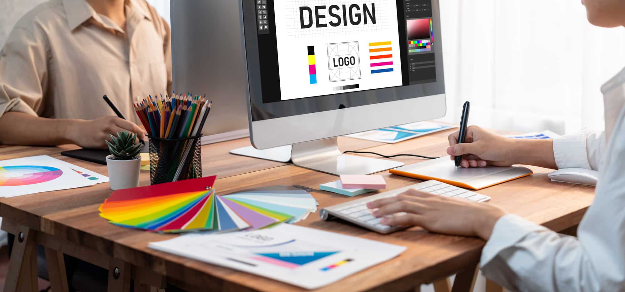
After many months, maybe even years, of hard work, your tech startup is finally taking shape. You’ve reached the point where it’s time to create a logo that accurately captures the essence of your business accurately.
This stage isn’t one you need to rush into. It requires a good amount of thought to ensure that the logo reflects modernity, creativity, and ingenuity.
This article is your handy guide for this important stage of your tech startup’s journey. It will provide you with various tips for creating your logo. It will also share some great examples to spark ideas and inspire standout designs.
Tip 1: Unearth Your Brand’s Essence
Reflect on your brand’s core values, mission, and the unique solutions you offer in the tech arena. To get this right, ask yourself the following questions:
- What are the core values that drive my brand?
- How do my products or services stand out in the tech market?
- What message do I want my logo to convey?
A good example of a brand that did this correctly is Airbnb. The Airbnb logo, known as “Bélo”, symbolizes “belonging” with a design resembling a map pin, a heart, and an abstract person.
Through this logo, Airbnb encapsulates its ethos of creating a global community where individuals can find a sense of belonging anywhere they go.
Tip 2: Know Thy Audience
Dive into the demographics and preferences of your target audience to ensure your logo resonates with them. Ask yourself the following questions:
- Who’s my primary target audience and what are their preferences?
- What visual elements would appeal to them the most?
- How can my logo communicate with them in a way that aligns with their expectations?
Take the example of Snapchat. Snapchat’s playful and quirky logo appeals to its predominantly young user base. Through its logo, Snapchat emanates a youthful and fun vibe, aligning with the casual and creative communication platform it provides.
Tip 3: Simplicity is Key
A simple, uncluttered logo fosters memorability and recognition.
When looking to create a logo with these attributes, ask yourself the following questions:
- What are the key elements that represent my brand, and how can I simplify them?
- How can I ensure my logo is easily recognizable and memorable?
- Does my logo design remain effective without color or when scaled down?
Consider the Google logo. With its straightforward font and color palette, it’s instantly recognizable. Its simple, unadorned design embodies the brand’s straightforward and user-friendly approach to information retrieval.
Looking to create a logo that meets this standard? One avenue you might explore is employing ai generated logos. This way, you can potentially simplify the logo creation process and still get a professional and contemporary design.
Tip 4: Color Theory Mastery
Colors evoke emotions; choose a palette that aligns with the emotions you wish to evoke. However, while at this, make sure the colors you choose align with your brand’s personality and values.
Take Facebook, for example. Its logo symbolizes trust and tranquility. Through its color choice, Facebook aims to create a sense of reliability and calmness amidst the bustling world of social interactions.
Tip 5: Typography Talks
Select a font that reflects your brand’s personality – be it modern, traditional, or whimsical. The right font choice can elevate your logo’s appeal and convey your brand’s message effectively. Think about these pointers for a start:
- What does the chosen font style convey about my brand personality?
- Is the typography legible and scalable across various sizes and mediums?
- How does the typography complement the other elements in my logo?
Consider the clean, sans-serif typography of Spotify’s logo. Through its typography, Spotify conveys a modern, approachable, and easy-to-navigate user experience, aligning with the brand’s mission to make music accessible to everyone.
Tip 6: Scalability
Ensure your logo looks stellar whether it’s on a colossal billboard or a tiny smartphone screen. ponder these questions:
- Does the logo maintain its clarity and recognizability across varying scales?
- Are all elements of the logo visible and clear at different scales?
A good example of a logo that does this well? Apple. Its clean, uncluttered design ensures it stands out, whether on a device, a storefront, or a billboard.
Tip 7: Symbolism And Relevance
Incorporate symbols that have a pertinent correlation with your brand or the tech solutions you offer. These symbols can convey complex ideas succinctly, making your logo rich in meaning yet simple in design.
Consider these:
- What symbols are relevant to my brand or the tech solutions I offer?
- How does the symbolism in my logo convey my brand’s core values or mission?
- Is the symbolism easily understandable by my target audience?
Take Wikipedia, for example. The puzzle piece in the logo symbolizes the ever-evolving nature of knowledge. It embodies the platform’s essence of open collaboration and continuous learning, showcasing a space where individuals from around the globe come together to share and build upon collective understanding.
Tip 8: Versatility Across Mediums
Your logo should transition seamlessly across different mediums and platforms. Consider these questions when designing:
- How does my logo appear across different digital platforms and print materials?
- Does the color scheme and design remain consistent and appealing across various mediums?
- Are there elements of my logo that lose clarity or effectiveness in any specific medium?
Think about Amazon’s logo. With its simplistic design and arrow (from A to Z) remains effective and recognizable whether online or on packaging.
Tip 9: Feedback And Iteration
Engaging in feedback loops and being open to iteration paves the way for a logo that not only aligns with your brand but resonates with your audience.
Ask yourself these questions:
- Have I sought feedback from a diverse group of stakeholders, including my target audience?
- How do I plan to iterate my logo based on the feedback received?
- What measures have I put in place to test and evaluate the effectiveness of each logo iteration?
It’s a process of refinement that leads to a logo design that stands the test of time. Consider Instagram. Its logo evolution, based on user feedback and modern design trends, led to a simplistic, yet distinctive logo that reflects its brand identity.
Tech It Head On
The logo design process requires a blend of introspection, creativity, and strategic thinking. The objective is to concoct a visual emblem that not only captivates but resonates with the ethos of your brand and the expectations of your tech-savvy audience.
These nine tips, each illustrated by real-world examples, provide a roadmap to navigate through this creative endeavor. Supplement it with input from reputable logo design experts and you’ll get a logo that fits your business niche just right.
Remember, your logo is the silent ambassador of your brand, make sure it tells the right story.