Instagram and Facebook offer various types of ad products to utilize. Carousel ads blend traditional online advertising with the expansive reach provided by Meta platforms. However, there are several key points to keep in mind when utilizing this method of promoting offers. Instagram and Facebook carousel ads are fairly self-explanatory. The ad comprises a series of images, posts, or similar content that are (or should be) arranged in a story or narrative. To make this format even more easy to use, we collected carousel ad examples in the list below. But before that – a little bit of theory.
Benefits of carousel ads
Carousels and rotating series of images are a well-established and popular tool among internet ad providers, and for good reason. This format offers significant benefits:
- Better conversions: With an engaging narrative and an attractive format, carousel ads typically boast higher conversion rates than average. The reason is straightforward—this format tends to generate higher engagement rates, attracting more buyers.
- More engagement: According to data from the Search Engine Journal, carousel ads have average engagement rates of around 1.92%, compared to 1.74% for images and 1.45% for videos. The engagement rates rise even further (to 2% and beyond) if more than 10 carousel slides are used.
- More storytelling possibilities: Last but not least, and perhaps foremost, both Instagram and Facebook are designed for consuming small bits of content—whether it’s a single post, a short video, or two sentences of text. Carousel ads allow companies to tell longer stories, divided into smaller, digestible, and appealing chunks, much like how Alexander Dumas chopped “The Three Musketeers” into short chapters initially published separately in a newspaper.
What are Instagram and Facebook carousel Ad specifications
Using this ad format is anything but rocket science. However, to launch such a campaign, the user needs to follow the requirements given by Instagram and Facebook. These include:
- Between 2 and 10 posts: Obviously, the carousel ad cannot be launched with a single image, and there is a need to limit its length.
- 15% of the bottom part of creation for icons: The icons for commenting and sharing are displayed near the bottom fringe of the image, overriding all content there. Considering that, placing any call to action or promotional code near the bottom is a bad idea.
- Text no more than 20% of the total space, and no more than 2200 characters: Both Instagram and Facebook have a strong preference for images and visual content. Considering that, there is a limit on the number of characters in the creation.
- Videos no longer than 15 seconds: Again, the carousel needs to spin, so watching too-long videos is counterproductive. That’s why there is a limit on video length.
- JPG or PNG format with a 9:16 or 16:9 ratio: The images need to be delivered in a common and popular format. The ratio needs to fit into the frames designed for that purpose.
How to design a carousel ad?
Formal requirements are just the trails to follow. The real challenge is in maximizing the outcome of the ad format, to make it actually work for the company and convert. Putting a pack of loose yet compliant-with-norms images into the system is far from being a carousel ad – what can be seen on carousel ads examples shown a paragraph below. A good and convincing ad needs to include:
- Consistency: The brand, style, and voice need to be consistent throughout the ad. Without that, the user may lose the sense of the story that is being told and, by that, the engagement is lost.
- Long caption: Carousel ads are all about the story that is told. As mentioned above, Facebook and Instagram are a medium that focuses on short bits of a story, without the need to consume longer form. By that, it may be a good idea to include a longer caption to deliver a whole context and information background required to ensure that if one gets lost, there will be an easy way to get him or her back on track.
- Pick a good image: Images are assets that are worth investing in – Instagram and Facebook are heavily reliant on this type of content. By that, delivering an impressive content is a “good practice” one cannot ignore.
- Include a call to action: Back to the basics – the user needs to know what to do, and providing one with a short and specific punchline with a task to do may be the missing puzzle – unless it is missing.
Instagram and Facebook carousel ads examples
The theory looks promising and interesting. Yet, practice is where human creativity flourishes and the best ideas take shape to fit the requirements. Facebook carousel examples below are a great proof of that:
- Gymshark – panoramic continuity
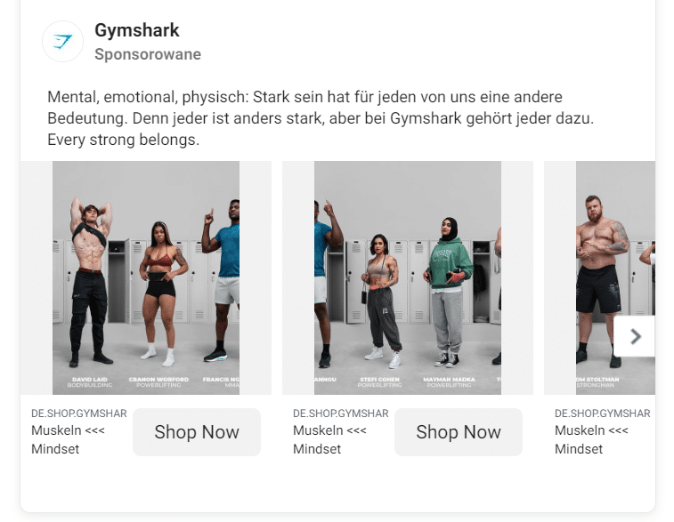
Gymshark is a fitness apparel brand that used carousel ads to both promote their products and show inclusivity. Users can swipe to see people with various body types, from bodybuilders to plus-size models, featured in the brand’s products. Also, by showing a part of a person standing next to another one, the user is encouraged to swipe and see whose elbow or knee is peeking from behind the curve of the post.
- Canva – showing case studies
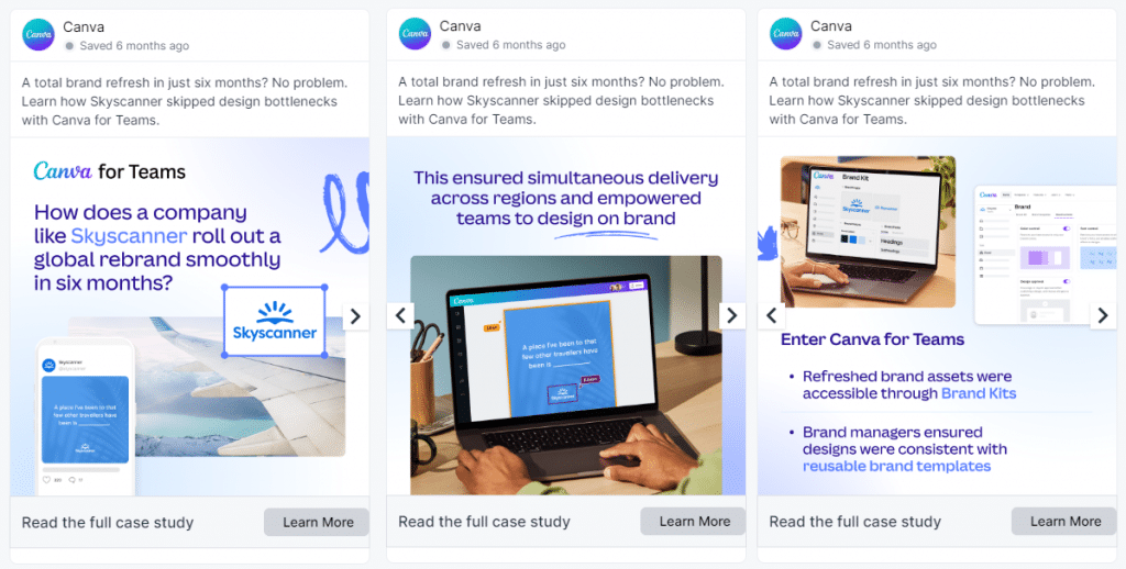
Canva is a popular tool that empowers non-creatives who need a simple graphic asset to create their own image using a theme or pre-produced example, and a drag-and-drop interface.
Canva has followed the path shown by Alexander Dumas – the carousel post shows a case study that would be hard to showcase on social media otherwise. The ad aimed to promote the “Canva for Teams” service, basically a B2B feature that is even harder to promote via channels like Facebook and Instagram.
- Gong – building buzz around the report
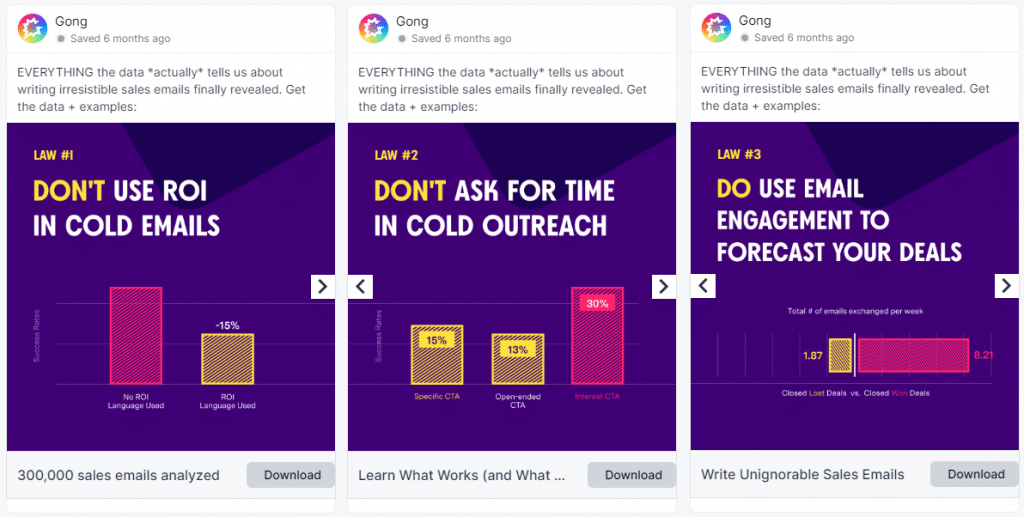
Publishing reports full of tables, charts, and summaries is one of the most popular tactics in B2B marketing. One of the key challenges in this approach is to promote the report and show the content in an attractive way, yet without revealing too much.
Gong, a revenue intelligence platform, has delivered an ad with four panels, showing a super-short story built using the data from the report. With an interesting visual form, the ad was an engaging way to build buzz around the B2B content.
- Victoria’s Secret – communicating complex promotions
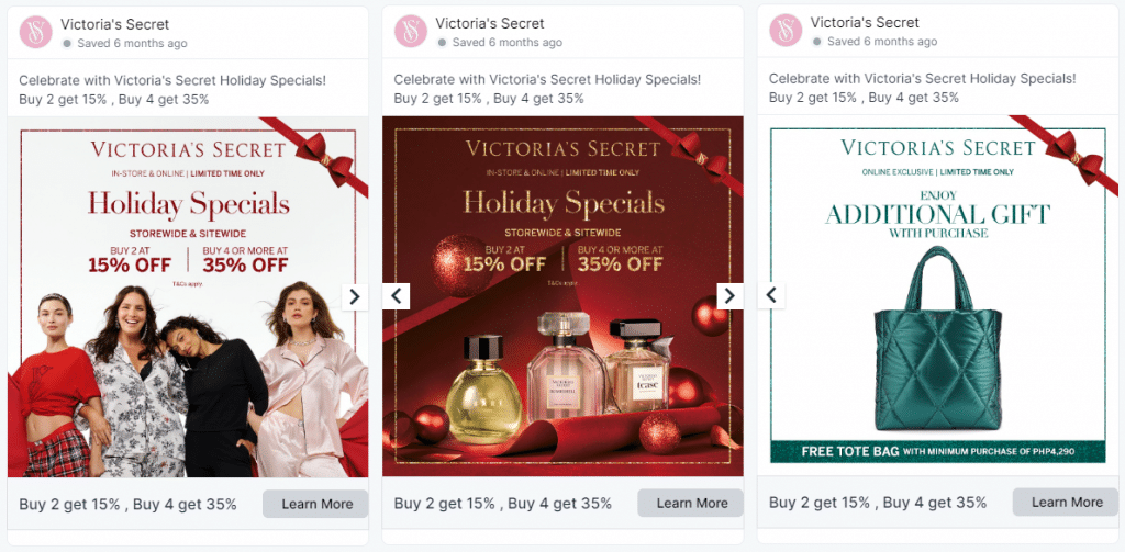
A simple promotion, like “-20% for all products,” can be communicated using only one image or even one sentence. The challenge comes if the company has to deliver information about more complex promotions, including a discount, a free gift, and a minimum purchase amount.
To overcome the complexity of the message without losing the digestible and easy form of social media messaging, a renowned lingerie brand has used the carousel format.
If you want to create carousel ads like in the examples above, be sure to check out the Cropink tool.
Summary
Carousel ads are a powerful tool that can be used by various businesses and fulfill many roles – from promoting restaurants and FMCG goods, through apparel to supporting B2B lead generation events.
The key is to understand that the limits that go with this form are basically a challenge, not a limit for inspiration and creativity – and the social media carousel examples shown above are the best proof of this statement.
