A timeline infographic is a type of infographic that shows data in the context of how things change over time. The timeline infographic is one of the most common types of presentation, financial report, and strategic report. It can show what happened in the past and what will happen in the future, such as financial reports and growth, project milestones, strategic planning, and historical events. Read further for more explanation on the timeline infographic.
Timeline Infographic
A timeline infographic is a type of graphic that shows information by showing how time goes by. This function is useful for presentations, marketing materials, and a wide range of other situations. A popular way to show information in relation to time is with an infographic timeline.
To build a timeline infographic, you must adhere to a few crucial visual rules. These criteria guarantee an appealing and insightful end product.
A timeline infographic is a style of graphic that graphically represents data within a framework of time progression. In addressing the data to be displayed in-depth, the goal is to highlight specific bits of information by connecting them to specific times. Also highly common, particularly in presentations, is the timeline infographic. It is frequently used, mostly because it is quite flexible. If it is developed well, it can depict any temporal progression and related information.
How to Create a Timeline Infographic
A great timeline infographic is the result of a production effort that meets the key requirements for making this kind of material. The following tips will help you generate this material successfully.
#1. Draw up an Outline
The foundation of a fantastic timeline infographic is a straightforward outline. Start with a concept, and without much concern for aesthetics, transfer it to the paper. You are merely organizing an idea, after all.
All the information should be added to this outline in the appropriate periods and in the order of progression. From this straightforward process, you can now begin creating the ideal model.
#2. Establish Benchmarks
Which anniversaries are necessary for your chart? It all depends, first and foremost, on the subject of the timeline infographic. The project’s stages will be the milestones if the plan is a marketing strategy. The graphic can include the following milestones if it is a content marketing strategy:
- Planning
- Making content
- Contents being made public
- Spreading the information
- Results measurement
Every milestone must have a detailed description of what it is. The information will aid in making the timeline infographic more educational.
#3. Create the Template
It’s time to present that plan to your design team! The creative team will be in charge of actualizing the project, taking into account the data, the benchmarks, and the necessary specifics in each of these elements.
#4. Choose Typefaces and Images That Support Your Narrative.
Fonts and graphics used in the infographic, which is still in the design phase, aid in better understanding the information and provide a temporal context for it. Some things must be guaranteed, such as:
- Clean, readable fonts for the information
- Thematic sources that aid in displaying the information and data
- Arranging the information in a readable way
#5. The Systematic Distribution of Content
Using visual elements that adhere to the brand’s visual style.
Is the infographic complete? Then, to ensure that it is of the best quality, it must be revised. Review when necessary:
- Ensure the information is understandable
- Verify if the data is accurate.
- Verify that all of the components are visible.
#6. Release and Advertise
The content needs to be changed before publication. Because your audience is spread out or concentrated on many platforms, it is crucial to identify which channels you will utilize to do that. Choose the one where this infographic has the greatest chance of being seen.
Why use a Timeline Infographic?
So let’s be real. Nobody wants to read a 100-page essay on the history of life (and we’d like to talk to whoever thinks that’s an amusing assignment). Why not use a timeline infographic to emphasize the fundamentals instead? The best of all worlds are combined in this set of puzzles, maps, literature, and artwork.
Notice how this timeline infographic requires the reader to pay close attention to figure out what the symbols mean. On the right are the color codes. The Phanerozoic timeline on the bottom can be understood by deciphering them. From there, we may incorporate the relevant data. Nice, huh?
Timeline infographics disrupt traditional, linear learning methods, just like any other kind of art. They incorporate fun components. Consider that the human brain does itself a favor by including play while learning, as it has been shown to boost social, emotional, physical, and cognitive capacities.
Examples of Timeline Infographics
The following are examples of timeline infographics:
#1. Power up Your Workers
Whilst classrooms are frequently the location of timeline infographics, they are by no means the only one. This infographic style is ideal for use in real estate structures, public notice boards, libraries, and sales offices.
#2. Track Progression
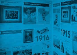
We are all lifelong learners as humans. The likelihood that you may need to look into the evolution of something depends on your personal interests, academic pursuits, or line of work, whether it be about space or how hotdogs came to be.
#3. Realize Your Potential
Similar to many timeline infographics, this one serves two purposes. It can be used professionally to build a client base or teach a class, but it can also be used for personal growth. An advanced dream board, that is.
#4. Improve Your Buying Habits
Each individual product, business, and person has an evolutionary history. Timeline infographics aid in our understanding of the history of each creation. Knowing where we’ve come from enables us to appreciate where we are today. By incorporating information in this way, we give our consumerist decisions meaning.
#5. On Time for Wedding
Timeline infographics don’t have to be based on facts or figures. Create a straightforward timeline infographic with the ideal ratio of color, pictures, and text. Because there isn’t much room for text, keep your message brief and let the other components speak for themselves. Keep in mind that creating emotion is everything.
#6. Market Your Products
Timeline infographics make a powerful point about the power of information. The graphics on refrigerators in this example serve to illustrate the product’s durability. The buyer thinks that the sheer number of symbols gives them value and makes them a reliable source of information. In a world where there is an endless supply of occasionally false information, we must be smart in how we convey the truth.
#7. Stay Hygienic.
The reasons behind our actions are sometimes difficult to recall due to common awareness. These timeline infographics show step-by-step instructions for classrooms, hospitals or medical offices, and public restrooms, among other places. While nobody will question why we need to wash our hands (hopefully), they do provide clear explanations of the reasons why.
#8. Monitor Changes in Season
Did you know that the seasons have a significant impact on human biorhythm? Recall the days when we went to bed at dusk and woke up at sunrise. I doubt it. Nonetheless, if you’re interested in this sort of thing, timeline infographics are a terrific way to track seasonal changes and their effects on people.
#9. Have a Plan for Your Plan.
There is a “meta” component to timeline infographics, just like in visual art. They help you make a plan for your goals, whether they are personal, professional, or for fun. Again, think of the organization as a favor since it causes long-lasting changes in the brain.
#10. Get Folks to Chuckle
Go crystal clear on the main topic once you’ve identified the target audience for your infographic. Even though this infographic has more information than others we’ve seen, it still has a good mix of text and pictures and uses a consistent “HA HA HA” to make people laugh.
Vertical Timeline Infographic
A vertical timeline infographic is a picture of an order of events that is shown along the y-axis or from top to bottom of a page. Vertical timelines are good for putting together information like upcoming dates and events or important historical events. Businesses use them to oversee funding progress, manage calendars, and perform a variety of other tasks.
It is simple to create a vertical timeline, just like its horizontal counterpart. Yet, the designer decides on the specifics, which may vary depending on the narrative they’re trying to convey. For instance, if the timeline is literal, where will it appear on the page? Would it be in the middle or on either side?
What Are the Benefits of Timeline Infographics?
- A timeline infographic can be used to illustrate a timeline, convey information across time, or show a sequence of events. You can construct an easy-to-understand image by using this style of graphic to show information linearly.
- A fantastic method to see a process unfold over time is using a timeline infographic. Information graphics provide several clear and advantageous benefits. It is the most efficient method of reaching the audience for marketers and advertisers.
- A timeline data visualization can be used to illustrate a step-by-step procedure for carrying out a certain task or for developing a company fact sheet for new hire onboarding.
What Is Timeline Layout?
Visualizing the passage of time is possible using a timeline layout. Text, flowcharts, and visual components like pictures and icons can all be part of it. To see significant activities or events in chronological order, customize a Venngage timeline layout.
What Are the 3 Types of Infographics?
The three types of infographics are:
#1. Statistical
An infographic template based on facts and figures is one of the most well-liked ones. Each infographic should have an engaging narrative, relevant facts to back it up, and eye-catching images to highlight the key points.
#2. Informational
But this type of infographic uses text instead of numbers, even though it is just as popular. It covers a wide spectrum of other templates due to its text-centric focus.
#3. Process
In infographics, a process’s key points are presented linearly. They divide an undertaking into a number of simple steps. A complex piece of information of any kind is intended to be reduced to simple concepts using this type of graphic.
What Is a Timeline Example?
Describe an example timeline example. Displays of historical events are called timelines. A timeline can be an outline of significant events, a thorough agenda or itinerary, or a list of events that communicates information like milestones, due dates, and continuing tasks for any project activity.
What Are the Features of a Timeline?
Dates are included in all timelines to indicate the exact dates of each event. They can also be in the form of an illustration, a video, an interactive, or any number of other formats. It’s possible for the entries to be as short as a few lines or as long as a paragraph with graphics.
Conclusion
Science- or statistic-driven timeline infographics are not required. Create an infographic with a straightforward timeline that perfectly combines text, pictures, and color. Conciseness is key because there isn’t much room for text; instead, let the other parts speak for themselves. Keep in mind that it all comes down to arousing an emotion. A wedding would seem to be a good occasion for this timeline infographic’s white background. You already know these special events have a predetermined schedule if you’ve attended one or participated in one.
Related Articles
- WHAT IS AN INFOGRAPHIC: Meaning, Example, Students & Design
- TIMELINE: Definition, Google, Maker, Maps & History.
- SHOPPER MARKETING: Meaning, Example, Strategy & Salary
- Inbound Marketing: Effective Inbound Marketing Examples