Presentation is everything in site design. Of course, the caliber of your content is important as well, but if the first thing visitors see on your website is a disorganized mess, they won’t be able to fully enjoy your articles, products, or well-written services page. There are several website layouts that function better than others depending on how your web pages are organized.
Finding the appropriate layout for you, however, can be challenging because it depends on your sector, branding, and technical capabilities. This article contains all the necessary information you need on website layout and more.
What is a Website Layout
The structure of a website is defined by a pattern (or framework) called a website layout. It serves the purpose of organizing the information on a website for both users and the website’s owner. It places the key components of a website front and center and offers obvious pathways for navigating across online pages.
Regardless of whether you’re learning how to create a blog or creating a straightforward website for your small business, website layouts specify the content hierarchy. The website’s content will direct visitors and must effectively communicate your message to them.
How to Pick the Ideal Website Layout
There are two primary considerations to keep in mind while selecting the appropriate layout for your website:
#1, Accommodate Material
Your choice of layout should be appropriate for the nature of your material. Why? The story you want to tell visitors to your website should be aided by the website’s design. Therefore, pick one whose composition will support and improve your message.
Some website layouts function best when presenting goods or creative endeavors, making them more appropriate for online shops or portfolio websites. Others deliver accurate information quickly and effectively and may be more appropriate for establishing a news platform or blog.
#2. Use Standard Layouts
The most well-known, tried-and-true website styles are typically the best choice, however, there is an opportunity for originality. Users frequently feel at ease using these traditional layouts since they are built on established standards, prior knowledge, and design tenets.
We’ve picked ten of the best and most popular website layout concepts below because they will produce an intuitive, simple-to-use interface. We’ll go through how they function as well as which kind of website is most appropriate for each.
Learning the Best Practices for Layout Design
It’s vital to familiarize yourself with certain fundamental ideas about website layouts in order to spend productive time choosing a layout design. We’ve compiled a number of ideas to help you navigate the sea of pre-designed website layouts.
#1. Visual Weight and Empty Space
People feel the visual weight when certain website elements have a larger visual presence. Specific elements can have this visual force instilled into them via a variety of approaches. The one that directly interests us in this context is negative space among them.
Through a visual force focused on them, negative space, or space empty of any elements, draws attention to elements that are more important than the others. The white and black squares are separated by a space that draws attention to the left-hand element. The four smaller white squares outnumber the left-hand element, though. The black square has a more powerful visual impact.
#2. Symmetrical Website Layout
To ensure that the user accords the text content equal weight, the layout’s components must support one another in a balanced web design. Additionally, the layout effectively presents all of the elements in a scannable format. From an aesthetic standpoint, the design feels pretty good and gives off the idea of steadiness.
Symmetrical balance, where a visual feature appears the same on each side of the center, is one of the most well-liked balanced designs. Balance, elegance, and pleasure are all evoked by symmetry. You’ve definitely experienced it as well when admiring certain architectural designs in buildings, gardens, or even butterfly wings.
#3. Sections With Features or Viewers
Particular to Users can simply navigate to various website parts thanks to flexible element arrangements. We advise you to consider websites that cater to both men and women in terms of fashion to assist you understand how this is achievable.
The website’s layout supports two distinct areas, one devoted to clothing for men and the other to clothing for ladies. The layout’s division of information into 2 distinct target audiences delivers practical content that is quite beneficial.
#4. Step Away from the Typical Layouts
While some layouts take the conventional route in an effort to serve functionality to its fullest, other layouts use risk-taking designs and structures in an effort to leave an impression on the user. Breaking the mold entails arranging the page’s elements in unexpected ways so that they stand out in a sea of conventional websites and leave a user with an unforgettable experience.
Website Layout Types
# 1. Z-Pattern Layout
We quickly scan a new website to get the main points when we come across it. Skim reading, also known as a quick scan, is frequently done in the shape of the letter Z or in a zigzag pattern. Our eyes travel from the upper left corner to the upper right corner, then descend to the lower left corner before returning to the upper right corner. The Z-pattern website design makes use of this reading behavior by dispersing crucial content over a Z shape.
When using this layout, a logo is typically positioned in the homepage’s upper left corner, where it will be seen initially. It’s typical to set the navigation menu next to it, in the far right corner, coupled with a clear call-to-action.
#2. F-pattern Layout
This design is based on a typical page scanning habit, just like the Z-pattern layout. We frequently skim or read material on text-heavy websites in an F shape. As a result, the top horizontal portion of the page receives the most of our attention. From there, our eyes move vertically downward, with the left-hand side usually serving as our focal point.
Make sure to allocate resources to the top fold of your website when using the F-pattern layout because this is where visitors are most likely to stay longer. This often consists of a headline, subtitle, and featured image—content that can enticingly present the rest of the website. Additionally, you can use navigation menus and anchor phrases to point website users to the most important material on your site.
#3. Fullscreen Picture Format
A full-screen picture layout can produce an arresting and engaging homepage design with a particularly huge graphic put front and center. A quick glance at a large media feature might reveal a lot about your identity and work. This style has the advantage of looking fantastic on mobile devices as well.
You can use any kind of visual, including pictures, drawings, and videos. In order to fully utilize this layout, it must be of a high caliber and pertinent to your business, product, or general vibe.
You should also include a brief line of text to further describe the website’s purpose besides your fullscreen image. Create a compelling headline or memorable phrase to promote your company’s services and entice them to learn more.
#4. Split-Screen Arrangement
A split screen layout provides an exact balanced balance by dividing the screen in half vertically. This clear divide into two parts enables each segment to express a completely unique notion or, alternatively, to provide two distinct arguments in support of a single proposition.
The website layout template displayed here depicts a dining experience with text and complementary vector art to the right and an eye-catching image to the left. Instead of competing for the audience’s attention, the layout allows both sides to perfectly complement one another. In situations when users are required to choose between two opposed options, such as the “Men’s” and “Women’s” categories on an eCommerce website, the same design can also be effective.
#5. An Asymmetrical Layout
This chic website style divides the website’s content into two sections similar to a split screen, however, this time the two components are not the same size and weight. The entire design feels more dynamic as a result of the asymmetrical shift in balance from one side to the other.
Visitors’ attention can be pulled to certain elements over others by using a non-uniform distribution of scale, color, and width throughout the page. You should give specific items more visual weight in your website layout to make them stand out as focus areas, such as by making them bigger, bolder, or brighter.
#6. A Single-Column Layout
The material of this website is organized into a single vertical column. It’s an easy-to-understand design that is actually being used on this website.
Visitors can easily navigate a single-column layout because they are aware of scrolling down the website for more information. One crucial website navigation tip should be kept in mind while utilizing this style, though: provide a “Back to Top” button or a fixed menu to encourage users to explore your website more.
Remember to occasionally break up the material with graphics, line breaks, headers, or sub-headers when using the single-column layout for text-heavy websites. This is a fantastic layout concept for websites with long-form content or websites that present content in chronological order, such as blogs or social media feeds.
#7. Box-Based Layout
The grid- or box-based website style combines several bits of material into a single geometric shape. Each piece of information is neatly contained within a box, preventing the components from competing with one another and creating a cohesive appearance. Users can learn more about the subjects that most interest them on each box’s respective webpage.
#8. Card Layout
Similar to the box-based layout, a card layout displays several pieces of content using a number of boxes or other rectangular-shaped containers. Most of the content on this page is presented in a non-hierarchical manner, which means that nothing really jumps out above the rest.
Since each card has the same attributes (size, font, etc.), it is simple to integrate content into each one. This produces a modular design that works well on all screen sizes, enables intuitive and approachable browsing in spite of the abundance of information, and enhances user experience.
Website Layout Ideas
Here are the Ideas for the website layout:
#1. Use a Structured Grid to Highlight Several Alternatives
If you only want to advertise one thing, the spotlight layout works fine. But what if you want to promote several things at once? You can display several items at once and allow your visitors to explore for the one they’re looking for by employing an ordered grid for this.
“Cards,” which are basically self-contained boxes that carry all the relevant information, are a common design element used in grids. Cards typically have an intriguing image, a title, and occasionally a succinct writing description.
#2. Using the Z-Pattern to Facilitate Reading
The eye-tracking tests conducted in the early days of web design are where the Z-pattern derives its name. They discovered that most users scan a website from left to right in a row before moving down and beginning a new row from left to right.
When imagined, their eyes appear to repeatedly move from the top row to the bottom row, tracing the letter Z. It imitates the way our eyes move while reading, which is left to right and down to the following line after each completed line, beginning at the left once more.
#3. Promote Single-Column Browsing
Another typical website design is the single-column layout, which is used on most social media platforms like Twitter, Instagram, and Facebook since it makes browsing easier for extended periods of time. Simply scroll to the next piece of material if you don’t like the current one. Even though it is only a simple mechanism, it does wonders by keeping people entertained for hours.
One card at a time is fully visible on the screen as is the norm when listing content vertically in cards. In order to avoid overloading users, this encourages them to concentrate on a single piece of content at a time. Since all cards have the same width, it also makes the responsive design simpler because you don’t have to worry as much about the devices that visitors are using.
#4. Make a Statement with Symmetrical Designs
We’ll finish up with a website design style that values chaos above order. By definition, asymmetry fosters an environment that is purposefully unbalanced or chaotic. It is a terrible choice for traditional and extremely formal brands, but it is ideal for those that wish to project an image of being cutting edge, counterculture, or ahead of its time.
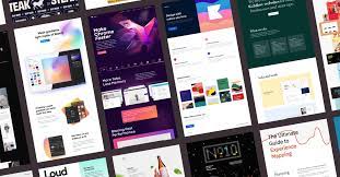
Website Layout Maker
Whatever sector your company operates in, explore the wide range of thematic templates and choose the category that best suits your needs.
#1. Business
Find templates for a variety of topics, including marketing, education, construction, software, food, and tourism. Your website is the most complete representation of your company, regardless of the industry. Customers may learn everything about your business, its goals, and the goods and services you provide here. Your consumers will progress through the sales funnel as a result of your professionally constructed website, which also aids in growing and retaining your customer base. Utilize Renderforest Website Builder to build a useful website and maximize the potential of your company.
#2. Lifestyle
Use a contemporary website to promote your fitness center, medical practice, gym, beauty parlor, or clothing line. List your brand’s distinctive characteristics and easily display your goods or services. You can rely on our website builder to give you a powerful online platform. Bring in more clients and help more individuals maintain their good looks and health.
#3. Personal
A personal website can assist you in promoting your services and building your public image, whether you are an entrepreneur, artist, solo musician, DJ, or another type of creative professional. Create an online portfolio to showcase your greatest work, add a CV outlining your work history, and describe the different services you provide. You can make a website that meets each of these requirements using one of our templates.
#4. Event
Use a creative event website to draw more people to your forthcoming event. Send your visitors online invitations, advise them of any updates, or let them count down the days with a countdown landing page. Discover the appropriate design for any occasion, like a corporate conference, a music festival, or a wedding.
#5. Non-Profit
Having an internet presence is crucial, especially when trying to raise money for a good cause. Develop a website for your nonprofit organization to connect with additional global citizens. List the tasks you’ve successfully executed, describe your company’s vision, and compel your visitors to take action with an engaging message. To reach and exceed your fundraising objectives, use one of our free website layouts.
What are the 4 Main Parts of any Website Layout?
- Heading and menu. The header is a website’s topmost section. …
- Images. There is an image, a collection of images, or occasionally a video, right below the header.
- Web page content. All websites have information, including a footer.
- A footer is the section of a website that is closest to the bottom.
What is the Perfect Layout for a Website?
Goal-Oriented: A website’s layout should be symmetrical, unambiguous, and well-organized. The best designs make it abundantly obvious to visitors what is expected of them once they arrive. You can accomplish this by using unmissable calls to action and negative space.
What is Content Layout on a Website?
A content layout comprises all of the formatting for a page, whereas a template only provides the fundamental framework for a web page. You can add fields to a content layout and then choose where the output of these fields appears on your pages. A straightforward rich text editor is the default for the basic content layout.
How do I Create a Website Layout?
How to Design a Website Layout That Works: The Ins and Outs
- Keep it simple.
- Utilize negative space
- Correctly Format Persuasive Copy.
- Be Specific About the Result.
- Don’t Be Afraid to Borrow in Step Six.
- Go Responsive
- Highlight Your Offerings & Happy Faces.
What is the Basic HTML Layout?
A well-defined HTML layout is a blueprint used to arrange web pages. It employs HTML tags to change web design elements and is simple to comprehend and navigate. An HTML layout that follows the proper structure is essential for any website and will quickly enhance its appeal.
What Makes a Good Layout?
Creating visual points of interest that lead the reader through a piece of material without obscuring its message, good layout design is both dynamic and clear. When creating a distinctive and efficient layout, many layout designers use a set of principles (such as alignment, visual hierarchy, and space).
Conclusion
There isn’t just one “best” style of website layout; it all depends on your identity and goals. Smaller sites might get away with the spotlight or Z pattern, but if you have a lot to say you might want to utilize a grid or single column. Take this into consideration. Both the layout and the style you choose with your layout should be based on your branding personality.
Related Articles
- What Is Web Design: Definition, Example, Software, Course & Package
- OFFICE LAYOUT: Meaning, Ideas & Guide
- MANUFACTURING FACILITY: How To Get The Best And Reliable Facility
- Creative Solutions For Optimizing Office Layout
- RETAIL MERCHANDISING: Importance and Best Practices
- WHAT IS GOOD ROI: Definition, Real Estate, Marketing & Guide
References