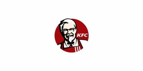
In place of hamburgers, the KFC restaurant chain offers chicken, and its logo, which precisely captures the acronym, shows a dedication to the company’s past. Warmth and welcome are emitted by the founder’s smiling face, the glass-shaped frame, and the color scheme. KFC is the fast-food chain that made chicken popular by offering it as an alternative to the popular burger. Harland David Sanders launched the company by opening the first location. Kentucky Fried Chicken is the dish’s official name. To learn more about the KFC logo, this article explains more about the history and origination of the brand. Let’s dive in!!!
KFC Logo
Every country is familiar with the fast-food establishment, KFC. The company has existed since 1930 thanks to Colonel Sanders. Yum! is the name of the restaurant chain. Louisville, Kentucky is home to brand names and corporate offices. Before KFC became the largest fast food restaurant franchise in the world, its founder, Colonel Harland Sanders, managed a single roadside stand during the Great Depression. After facing several obstacles early on, KFC eventually became a global franchise worth $8.5 billion and ranked #86 on the 2019 list of the world’s most valuable brands.
There are many variables that have led to KFC’s current level of success, including its novel approach to frying chicken and providing it as a fast food item and its distinctive branding as a restaurant based on Southern hospitality and cookery. But the company’s emblem and the inventive ways in which it has been useful in all of its marketing are one of the most important of these.
New KFC Logo
Colonel Harland Sanders is switching out his white suit jacket for a red apron as the company he established launches a global redesign of its KFC eateries and one of the most recognizable icons in the world.
On Tuesday, the company unveiled a new logo that uses more vibrant colors and a clearer picture of the late inventor of Kentucky Fried Chicken, who will continue to don his signature black bow tie, specs, and goatee.
“This move gives us a chance to not only make sure we stay contemporary but also explain to customers the realness of Colonel Sanders and the fact that he was a chef,” said Gregg Dedrick, president of KFC’s U.S. division.
The logo is changing for just the fourth time in fifty years, and for the first time in almost ten. Under the Colonel’s chin, you can see the KFC logo in large black writing against a red background to match his red apron.
The new store designs include new graphics with the words “Kentucky Fried Chicken” and a tagline that reads “Finger-Lickin’ Good” and “11 Secret Herbs & Spices,” alluding to the Colonel’s renownedly secret recipe.
The chicken bucket from KFC, another popular product, will also feature the new design in place of the existing one.
Additional Information
The company declared that throughout the upcoming year, it would enhance newly built stores all over the world. Beginning in January, television commercials will feature the new logo, which is already in use on the KFC website. Yum Brands Inc. owns KFC, a restaurant group based in Louisville, Kentucky, which is also the parent company of Taco Bell and Pizza Hut.
Dedrick projected that someday, this would be available in every restaurant. The future construction of new stores and renovations will include the new Colonel. The new restaurants, according to the firm, will have cozier interior design, glass windows that open up like shops, and a computerized jukebox that provides free music chosen by customers.
According to Yum spokesperson Amy Sherwood, the new designs will be useful overseas places, including the well-known KFC restaurants in China, where the business is opening more than one new restaurant every day. Currently, there are 1,700 KFC locations in China and 14,000 around the world.
Sam Su, CEO of Yum’s China division, believes that despite their popularity, the Colonel Sanders logo and KFC locations need to be changed.
What Does the KFC Logo Symbolize?
KFC’s emblem, which features Colonel Sanders’s likeness as the company’s founder, symbolizes the company’s rich historical past. The artwork by Harland Sander is complimented by large KFC lettering and a classic color scheme in red, black, and white.
Who is The Man in The KFC Logo?
Before it grew to be the second-largest fast-food business in the world, Kentucky Fried Chicken was the creation of a man by the name of Harland Sanders, who prepared straightforward regional cuisine at a roadside gas station. Sanders remains the company’s instantly identifiable face even after passing away in 1980.
Does KFC Use Food Coloring?
KFC Friday, a fast food restaurant business, denied using artificial colors in its rice dishes. KFC released a statement saying, “We solely use natural color (beta carotene) provided from highly reputable foreign sources in our Rizo Rice meals.
What Colour is KFC Chicken?
You can see red, beige, light tan, black, and white as the colors of Kentucky Fried Chicken on the logo. Use this KFC color scheme for digital or print projects. And when you need to match the company’s color palette and precise color values.
What Does KFC Tagline Mean?
Most fast-food restaurants have some sort of catchphrase that helps customers remember them. “Finger-lickin’ good” was the catchphrase for KFC in 1956.
This phrase implies that a lot of KFC food consumption solely with the hands. So, even after eating a meal, one still has salt and seasoning on their fingers. As a result, the expression refers to licking something clean rather than washing it.
The slogans used by KFC have changed over the years. One of them was, “Nobody does chicken like KFC.” A different one was “so good,” which is exactly their current catchphrase (as of this writing). However, none of their other catchphrases has gained as much popularity as “finger-lickin’ good.”
KFC chose to replace the catchphrase “finger-lickin’ good” in 2011 despite its popularity and the fact that it had been using it for a little over 50 years. Even if they may have stopped using it, people still frequently use the phrase.
Is The KFC Logo a Tie or a Body?
The creator of KFC, Harland Sanders, is pictured in the company’s emblem wearing the bow tie that appears in its advertisements. In more recent redesigns, KFC gave Colonel Sanders’ appearance shoulders and an apron.
KFC’s Brand Identity
KFC is a fast food establishment that specializes in fried chicken. KFC now has more than 18,000 locations in 115 nations. KFC’s mission is to be the best-integrated food services company in the world by providing consistently high-quality meals and outstanding customer service. Its goal is to increase shareholder value, enhance profitability, and provide consistent sustainable growth.
KFC’s logo and brand name are known to a large number of people around the world, and this presents a great opportunity for KFC to gain new customers. “A brand’s culture could both drive you ahead, or it can keep you behind,” says Yum Chairman and CEO David Novak. Several stores once closed, which caused a decline in industry rankings. Additionally, the business has drifted from the tenets of the brand. It can be challenging to make significant changes to return to those beginnings, but that is what KFC is attempting to achieve. “When Kentucky Fried Chicken did its best and became the most active, the colonel and his ideals were at the center of everything we did,” KFC Brand President and Chief Concept Officer Kevin Hochman told QSR magazine. These principles are essential to why Kentucky Fried Chicken is so well-known.
But the way people currently see fast food is a touch stale. It lacks the desire and current perspective to appeal to younger customers or those who are still seeking a healthy lifestyle. KFC consistently provides the best food and dining experience in the quick-service restaurant industry for its patrons. KFC offers a variety of low-fat, low-calorie menu choices, which is a perfect theme and the greatest alternative for a healthy lifestyle.
The colonel became more energetic, dynamic, and contemporary due to youthful vigor, visible differences, and less linework. He had just turned 65 when he started the business, and the logo shows that 65-year-olds today are still vibrant and appear to be young. A bigger smile also makes the colonel look more approachable and friendly, luring every customer to stop over for a lunch.
History of the KFC Logo
Born in 1890, Harland Sanders grew up on a farm not far from Louisville, Kentucky. He later founded KFC and took on the role of its mascot. Sanders didn’t open the first Kentucky Fried Chicken restaurant until 1930, even though he was nearly forty at the time. It’s often said that Sanders’ success in starting a successful firm later in life is evidence that it’s never too late to launch the next big thing.
But before launching his first restaurant, Sanders had tried a number of different careers, with varying degrees of success. Nevertheless, Sanders persisted in his entrepreneurial goals even through the worst of the Great Depression, a time when starting a new business was considerably more challenging than usual.
Last but not least, Sanders learned how to cook southern-style meals from his mother and in 1930 he bought a Shell petrol station in North Corbin, Kentucky, and turned it into a restaurant where he offered dishes like steak, country ham, and, of course, fried chicken.
After the first business was successful for four years, Sanders relocated to a larger location across the street where he could accommodate more customers. Harland Sanders established himself as a key player in Kentucky’s business sector just six years after opening his first restaurant, in 1936. Governor Ruby Laffoon gave him the honorific title of Colonel as a result.
The total cooking time for a customer’s order of fried chicken from Colonel Sanders at this moment was 35 minutes. Sanders wasn’t happy with the lengthy preparation time, but he insisted on not deep-frying the chicken because he thought it would lower the food’s quality. However, the first pressure cookers hit the shelves in 1939. Initially, the sole purpose of these pressure cookers was to steam vegetables. Sanders was able to turn them into pressure fryers, which greatly cut the time it took to make his fried chicken without lowering the quality. Now that Sanders could make fried chicken as quickly as other fast-food restaurants could make burgers and fries, KFC had a real shot to compete in the fast-food market.
Additional Information
1940 saw the selection of the 11 herbs and spices that make up Sanders’ “Original Recipe.” Even though he never made this recipe public, he did admit on numerous occasions that it was relatively simple to create and contained ingredients that most people probably already had in their kitchens. However, this original recipe and his inventive pressure-cooking technique helped Sanders’ restaurant reach a new level of wealth. In 1955, Sanders started franchising the name “Kentucky Fried Chicken” to other restaurant owners. This is with the help of a sign painter named Don Anderson. By 1963, KFC was the biggest fast-food business in the world, with more than 600 stores spread across the United States.
During this period of KFC’s rapid growth, Sanders began to adopt the persona of “Colonel Sanders” and take on the role of the chain’s mascot. After Governor Lawrence Wetherby recommissioned Sanders as a Kentucky Colonel in 1950, Sanders began dressing and acting in the role. He started calling himself “Colonel,” grew a beard, and donned a white suit and string tie. In his later years, Sanders was the company’s spokesperson and brand ambassador. He would visit KFC restaurants all over the country while keeping up the legend of Colonel Sanders. In December 1980, Harland Sanders sadly passed away. But his character as Colonel Sanders lives on and is an important part of KFC’s brand.
Of course, a key element of KFC’s branding is the company’s instantly recognizable logo design. KFC has used its logo in a broad range of ways to increase the restaurant’s popularity to the level it currently enjoys. The logo design has played a vital role in the brand’s growth over the years. KFC’s initial success was unquestionably attributed to Sanders’ plan to sell fried chicken as a fast-food menu item. But the brand’s logo design has also been crucial to its development over time.
When Did KFC Change Their Logo?
As a backup logo for KFC ads, a revitalized version of the 1959 logo that features the Colonel Sanders picture first presented in 1965 has been utilized since 2016. In North American packaging and advertising, it has, however, completely taken the place of the KFC logo from 2018.
What is KFCS Slogan in China?
When KFC first launched in China, their tagline, “finger-lickin’ good,” got a little muddled in translation and came out as “eat your fingers off.”
Do KFC Make Their Chicken Fresh?
The truth is that each unique piece of their whole chicken is hand-breaded by a skilled cook all day, every day, and is delivered fresh to their restaurants every day of the week.
Does KFC Use Rainbow Chicken?
KFC claims that the chicken they use is hormone and steroid free in accordance with the rules for all South African chicken that is produced locally, and one of their main sources of chicken is Rainbow farms.
Original History Of The KFC Logo
There are two constants in the KFC brand logo: the company’s color scheme and a portrait of the company’s founder. It has undergone five distinct iterations during the course of its history. Additionally, these were not major revisions, but rather refinements that merit the term “trademark evolution.”
Original KFC Logo: 1952 – 1978 History
Since she established the template for future logos, the period’s icon can be deemed the first appearance. Black and white graphic and text sections are included.
The first depicts the company’s namesake and namesake, Colonel Sanders, in stark black and white. The figure is merely his head, but the bow tie makes him look like the limbs and legs of a cartoon character, creating the impression that he is laughing.
The second part of the KFC name is an extended version of the original name. The name of the dish, which translates to “Kentucky Roast Chicken,” describes the dish’s star ingredient. The letters “K,” “F,” and “C” are drawn in a capital style.
Original KFC Logo: 1978 – 1991 History
In 1978, there were noticeable modifications to the logo. The visual icon was shifted to the left and positioned in front of the phrase. Which was formatted as a three-tiered column by the designers. He had his face blown up and his expression softened and smoothed out to make a better first impression on potential customers. Thus, the routine revamp became a successful advertising strategy. The emphasis in the updated typeface shifts to the letter “K” by virtue of its longer leg that extends past the “C.”
Original KFC Logo: 1991 – 1997 History
At this time, the company’s owner chose to shorten the company’s name. There were two motivations for doing this. The first does not require much decryption because the catering location is well-known. The second reason is that a smaller term can be used in a more expensive ad spot. The corporate color scheme, which was visible on the emblem at all times during those years, is the most distinctive feature of the old badge. There are elements of red and black and white in this.
In 1997, “photographs” of the chain’s founder became a big part of how KFC looks. There is a lot of detail put into the image of the colonel, and the colors are quite similar to pastels, especially blue and white. There is a solid red background behind the square insignia.
Original KFC Logo: 1997 – 2006 History
Landon Associates is responsible for the current logo. By the period’s conclusion, he’s been swapped out for a smiling stylized pencil portrait of Colonel Sanders. In the form of a spherical symbol. An apron with three horizontal stripes has replaced the traditional jacket. And also, the letters “KFC” have been moved from the left side of the central image to the upper left shoulder.
Original KFC Logo: 2006 – 2014 History
The stunning black-and-red circle depicting a colonel with an apron rather than a tuxedo was still widely recognized in 2006. Even so, in the meantime, a formal successor was being planned.
Original KFC Logo: 2014 – 2018 History
This KFC logo in black and white is a throwback to the original logo created in 1952. The newer version features a shortened variant of the name under a smiling head. With a signature bow tie, while the older one featured just the head.
Original KFC Logo: 2018 – Today History
The 2018 revamp marked the most recent iteration of the KFC logo and brand. The designers refined the profile by making the emblem trapezoidal. Three broad, vertical lines have been added to the previously white-red background, and a black border now surrounds the head. The white middle band is where the graphic sign will be shown. KFC is italicized to indicate its status as an abbreviation. The trapezoid shape of the logo makes it look like glass, which is one of the main parts of the fast food chain. This makes people feel friendly and welcome.
Elements of the KFC Logo’s Design
KFC’s 2018 logo has Colonel Sanders’s grin in a red and white trapeze with the company’s name below.
Before 1991, the company’s logo actually spelled out “Kentucky Fried Chicken.” However, the KFC acronym has been utilized rather than the complete name of the restaurant in the present logo and the previous four logo designs. It has been suggested that the decision to abandon the term “fried” was motivated by concerns over the term’s association with unhealthy food.
In modern times, the KFC logo has evolved into a design that is both friendly and inviting. Evoking thoughts of traditional Southern hospitality. It’s a great illustration of how a logo can sum up a company’s values and convey them to customers. Thus, having a fit with KFC’s branding.
The KFC Logo’s Popularity
The logo of fast food business, especially one as well-known as KFC, is crucial in luring passing customers. There is always a billboard with the KFC emblem in front of a KFC restaurant. The instantly recognizable KFC emblem makes this one billboard sufficient for informing passers-by of the establishment’s offerings before they even pull into the drive.
Obviously, the KFC logo has been crucial to the success of the company’s online advertising campaigns. You can count on seeing the KFC logo prominently featured in the background. Or as a major design element in any television commercial or internet advertisement that the company releases.
KFC, like any large and prosperous business, has been able to cash in on the licensing of its trademark. Although merchandise with the KFC brand is not widely available, it generates a respectable supplementary revenue stream for the corporation.
It doesn’t matter if you’re trying to launch the next McDonald’s or a startup in completely another field; a high-quality, professionally designed logo will be an absolute must. It’s clear that a strong logo design can provide a lot of value to a growing business. As evidenced by the many ways KFC has used theirs to expand its consumer base over the years.
What is The KFC Red Color?
The now-famous abbreviation “KFC” did not appear in the logo until 1991. According to some sources, the corporation sought to get rid of the term “fried”. This is because it implied an undesirable eating option. The emblem now includes the color red as well as a kind of horizontal gradation.
Colonel Harland Sanders is shown on the KFC logo, not a made-up character named “Colonel Sanders.” He was born in 1890 and raised in Indiana on a farm. In 1930, Sanders opened a fried chicken stand inside his restaurant.
Are KFC Burgers 100% Chicken?
It is a straightforward, flavorful Original Recipe 100% chicken breast Fillet burger. The unrivaled flavor of the all-time favorite.
Why Does China Like KFC So Much?
KFC has succeeded in China by catering to Chinese tastes with menu items that will never be presented in US outlets.
What is KFC Chicken Injected With?
In a Reuters exposé, Koch Foods, a purported KFC supplier, was revealed to have produced its chicken using medically significant antibiotics including virginiamycin. Virginiamycin is one of the “very significant” to human medicine by the U.S. Food and Drug Administration and the World Health Organization.
KFC Logo Man
When you hear it for the first time, all you can think about is their mouthwatering chicken, Zinger burgers, and those big red and white buckets packed with even more chicken!
But in addition to their delicious food, you also remember a familiar face. He is a smiling, elderly man wearing glasses who begs you to get his bucket of chicken at your favorite fast food restaurant. His bow tie, which is stylish, fits him well, and looks beautiful, complements his red and white apron.
You might not genuinely know who he is. Despite the fact that you can instantly recognize the fast food restaurant and the symbol. You could have remembered his name after your friend, who likes to mention little facts to break awkward silences, said it. But who is he really, and why is he so closely associated with the well-known fast food chain around the world? It’s not a made-up character, to start with?
KFC Logo Man: Who is He?
Colonel Harland David Sanders is a businessman who started by selling chicken at a roadside stand and later founded an extensive fast food company. There, he came up with his “secret recipe” and discovered a fresh way to cook chicken in a pressure fryer.
Sanders opened his first Kentucky Fried Chicken restaurant in South Salt Lake, Utah, in 1952. He did this after realizing that the restaurant franchise business had a lot of potentials.
As can be seen, from 1952 to 2018 history, Colonel Sanders has been in every KFC logo.
Designers Lippincott and Margulies produced the original logo between 1952 and 1978. Utilizing a monochrome black-and-white color palette to express the brand’s classic and timeless nature. Colonel Sanders had his hair trimmed more professionally in 1978. His stylized headshot was made larger, and the bowtie was cut shorter. Additionally, the font was changed to appear much more symmetrical.
When the name changed from “Kentucky Fried Chicken” to the well-known abbreviation “KFC” in 1991, the design changed a lot. Rumor has it that the company made this choice to remove the word “fried” from its logo. It’s because it thought consumers would equate it with poor food. In order to make it seem more inviting, red was also added.
Col. Sanders then adopts a new hairdo and a nicer grin to greet clients and ensure their well-being, giving his appearance a much more cohesive look. And the logo gradually started to look more simple.
Related Article
- ADVERTISING CAMPAIGN: Definition and Best 20 Campaign Examples and Ideas.
- Rye Whiskey Brands: Best 21 Rye Whiskey Brands In The World
- RESTAURANT MARKETING: What You Should Know and Strategies
- OPEN A FAST FOOD RESTAURANT: How Much Does it Cost? (How to Start)