The American fashion brand called Carhartt is renowned for its premium textiles and modern workwear designs. They founded the company in the 1880s, and today’s young audiences find the brand to be quite appealing. But let’s take a deeper look at the Carhartt Logo, considering its history, evolution, and other important pieces of information.
Carhartt Logo
Carhartt is well known for its high-quality jackets, coats, vests, shirts, pants, and dungarees, among other items. Additionally, it has grown to include additional apparel lines and locations. For example, in 1994, it granted permission to two designers, Germans and Salomee, to produce streetwear under the Carhartt WIP brand.
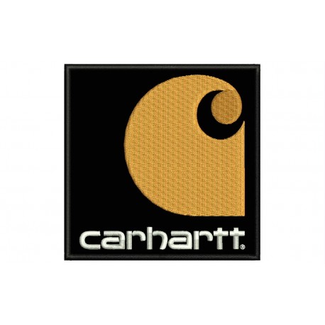
The family-owned clothing company is now represented by a well-known Carhartt emblem. Both a wordmark and a distinctive symbol make up this visual diplomat. A black lowercase inscription and a yellow and white bespoke symbol around it. The logo is distinctive, lovely, straightforward, and enduring.
Carhartt has also been effective in broadening its appeal to include everyday street attire. Plain and made in subdued hues like mustard, khaki, and navy blue, Carhartt jackets are simple.
They typically reach the waist or the third of the way down. Most have triple-stitched seams and are composed of rather sturdy 12-ounce cotton canvas. In addition to producing jacket-compatible coats, Carhartt also produces pants and overalls.
They normally cut Carhartt jackets wide around the middle to accommodate substantial individuals; they are not intended for men who are unusually tall or skinny.
The firm introduced Carhartt for Women, a brand of women’s work wear, in 2007 in time for the fall.
Carhartt Logo Meaning
The visual identity of Carhartt is quite distinctive and assured. The wordmark on the left and the emblem on the right make up the brand’s logo.
The Carhartt Logo symbolizes the expansion and development of the company, the Carhartt logo. It is made up of a spherical, bright-yellow shape that is spinning to the right and resembles a wave. It is a powerful, moving image that has a lot of energy to it.
The Carhartt logo is powerful and modern, a real representation of contemporary young fashion, but it also honors the company’s legacy and its long history as a maker of work wear, as evidenced by the wordmark’s square lines, which are reminiscent of industrial design.
The slogans used by Carhartt have also frequently appeared in several of their logos. However, different slogans were used instead of their original one, “Honest value for an honest price.” The words “Union Made,” “Master Cloth,” and others have appeared on the logos over the years. These enabled consumers to instantly recognize the brand’s personality when they see the logo.
Carhartt Logo Colors
#1. Yellow
Yellow identities and calls to mind the rounded figure in a wavy signature. Surprisingly, the majority of professionals associate yellow with joy, optimism, and freshness. The color of the sun can also represent honor, vitality, and clarity. Remember that it can also be used to describe jealousy.
#2. Blue
The previous versions of the logo had blue, but the present one does not. Both the wordmark and the railway car’s personality were inked. Blue represents commitment, assurance, and inspiration. Again, the hue of the water might imply steadiness, independence, and calmness. But keep in mind that it might make you feel icy.
#3. Black Color
Black is a color that denotes authority, power, and mystery. It can also communicate power, riches, and elegance. On the other hand, it might arouse unfavorable feelings like despair, melancholy, and fear. The dark tone emphasizes the attractiveness of the wordmark on the Carhartt logo.
#4. White Color
The yellow spherical figure has a swirling white mark on it. It also made inscriptions and the early logos clearer. The colors white stand for innocence, security, and modesty. Once more, the color of goodness represents protection, purity, and innocence.
#5. Red
The brand’s traditional color was red.
The wordmark and the famous heart persona were present.
The blood-red hue of red represents desire, love, and passion. It also represents elation, vitality, and bravery. But regrettably, the color can also imply unfavorable feelings like fury and hate.
History Of Carhartt Logo
The Carhartt logo has seen many changes over the course of its lengthy existence. The business presented its first logo in 1889. Then it had its first revision in 1920. The following year, in 1940, saw the second modification. Another makeover followed this in 1970. The present logo is totally different from the previous ones. It is stylish, readable, timeless, and appealing.
The Carhartt Logo from 1889 until 1900
They unveiled the first logo for Carhartt in 1889. The green and yellow logo had inscriptions, a train, a diamond, and a heart. It had a square background and these general design components. It’s interesting how the logo came to be known as Car in Heart because of the railcar and the heart. Furthermore, it represents the company’s name and ideology in a symbolic way.
The Second Carhartt Logo, 1920–1940
In 1920, the company launched its second visual identity. A railroad car, writing, and a heart were all present. They housed the other graphic elements in the heart, which served as the background. In capital letters, “Union Made” appeared at the top, followed by “Pants Overall & Cloves” at the bottom.
The name of the company, Carhartt, appeared beneath the train’s windows in uppercase letters. The logo glittered in white, dark blue, and red. And it held power for almost 20 years.
The Third Carhartt Logo, 1940–1970
Carhartt modified its logo in 1940 by making it more vibrant. The designer also added a new text and moved some others. Therefore, the bottom said Union Made while the top said Master Cloth. The writing then changed to “Carhartt overalls” in the center. They projected it in red and white, with cursive writing. Lastly, the train was contoured by the designer.
The Carhartt Logo from 1970 to the Present
The business updated its logo in 1970, transforming it into a timeless and recognizable design.
This graphic identity includes a wordmark, and a stylized symbol. The icon looks like a wave. Furthermore, it conveys a sense of the brand’s development, evolution, and movement. A close examination of the graphic element also reveals a white crescent inside the rounded yellow sign.
Finally, the wordmark is presented in lowercase and has a distinctive charisma. Additionally, it appears bold and contemporary.
Evolution Of Carhartt Logo
As a result of the name relation, the initial logo symbol was in the shape of a large red heart. The top two curves accommodated the white words “union created”.
In a similar fashion, the lower, more narrow part read “pants, overalls & gloves.” A large tram carriage painted white and blue was located between the two textual portions.
The company name (then “Carthart’s”) was positioned in the center of the cart’s body. Again, clever name association; the corporation had nothing to do with trams.
In the 1940s, they made updates. The written sections changed to read “master cloth” and “union made,” respectively, and the tram was also updated. The heart also took on a softer, more rounded appearance.
They specifically chose a lighter shade of blue, painted the car in a much simpler way, and basically simplified the image.
The word “overalls” was typed in red and fit in the name area from earlier. With larger, red-colored cursive characters, the wordmark itself was positioned higher up.
Carhartt has a striking aesthetic style that is easy to recognize. The company’s logo consists of a wordmark on the left and an emblem on the right.
Conradi, a square and contemporary typeface, is used in the wordmark’s lowercase writing. A horizontal bar separates from the vertical bars the curving horizontal portions of the letters “R” and “H”. The letter “T” is drawn in the shape of a cross, with the horizontal bars slightly extending to the right.
Carhartt Logo Font
A distinctive custom typeface, a square and contemporary Conradi, is used in the wordmark’s lowercase lettering. The horizontal curved portions of the letters “R” and “H,” which are divided into vertical and horizontal bars, respectively. With the horizontal bars slightly stretched to the right, the letters “T” are drawn like a cross.
Facts About Carhartt Logo
- The Carhartt Logo Is Straightforward. The Carhartt logo has chosen the simple route, like most iconic logos do. This is because it communicates its basic ideals with fewer graphic components. Because of this, it is clear, readable, and very prominent. Therefore, strive for a basic logo design if you wish to dominate your market.
- Carhartt has a distinctive visual identity, which makes their logo distinctive. And it’s the reason consumers can instantly tell it apart from other brands. So stay away from templates, stock photos, and clip-art while designing a logo to stand out. Your logo will surpass its competitors if you follow our guidance.
- Remembering the Carhartt Logo is easy. The media broadcast thousands of commercial messages to customers every day. Their ability to focus has consequently been greatly diminished. Brand owners must, therefore, work to increase retention. The Carhartt logo, thankfully, is easily recognizable and memorable because of this. Once more, it left a lasting impression thanks to its distinctive and modest viewpoint.
- It is an easily Readable Carhartt Logo: Customers need to feel emotionally connected to you, and names are essential for that. By selecting incomprehensible fonts, some business owners, however, damage their businesses. But no matter the size or medium, Carhartt has a legible, easily recognisable typography.
- The Carhartt Logo is versatile: Any print, web, garment, and other application can use the Carhartt logo. This crucial activity can be accomplished thanks to its straightforward design. This characteristic enables the logo to more easily connect with the majority of its target market. Once more, they may make it any size without compromising quality.
Founders/ Owners Of Carhartt Logo
Hamilton Carhartt, Mark Valade’s great-grandfather, started the workwear manufacturer Carhartt in Michigan in 1889. Together with his mother, Gretchen Carhartt Valade, he owns the business.
They found the company to make denim overalls for railroad employees, but it is now renowned for producing apparel that is incredibly durable for demanding workplace environments.
With its Work in Progress collection, which was tailored for the urban market, Carhartt has also found success in the fashion industry. They earned an estimated $630 million in sales in 2014.
Why is Carhartt Logo So Popular?
Because of its reliability and genuineness, the brand has gained popularity. And there’s no denying that these characteristics have drawn influencers to further its notoriety. Additionally, by emphasizing its essential beliefs through its straightforward logo, it is making a bid.
Because of its Rugged Flex stretch technology, Carhartt is widely renowned for being one of the most resilient apparel manufacturers in the industry. Despite having a harsh or tough feel to the touch, the outer material is easily bendable and increases the comfort of the items’ wear.
Is Carhartt Owned By Nike?
No, Hamilton Carhartt’s heirs continue to own Carhartt as a privately held, family-run business.
What Does Carhartt Stand For?
Hard labor is what we stand for. Since 1889, when [Hamilton Carhartt] was committed to producing a better product for employees who didn’t receive one, we have stood for that, claims Ambroza.
You’ll notice that they did not include the firm name in the logo itself. For a symbolic representation of the company name, it combined the pictures of a train car and a heart, creating the phrase “car + heart = Carhartt.”
Is Carhartt Made In China?
Carhartt produces a large portion of its non-core apparel items abroad. Carhartt hires workers from Mexico and China. The boots are therefore most likely created in China or Mexico when they are not marked “Made In USA” on the tag.
Is Carhartt Made Of Duck?
Carhartt uses a heavyweight,100% cotton duck fabric for their duck line that is precisely woven with no gaps where the threads interlace, making it wind and snag resistant. Quality, toughness, and comfort are all attributes of cotton duck.
Is Carhartt 100% American Made?
The Carhartt apparel line of pants, jackets, shirts, hats, and other clothing, which has its roots in the company’s founding in 1889, is still a family-run enterprise committed to honoring hard workers. We’re proud to supply the entire Carhartt Made in the USA line.
They mostly produced Carhartt in Mexico and right here in the United States for their “Made in the USA” line. Some of the most recognizable pieces from the brand’s collection are part of the U.S.-made line, which draws its primary inspiration from American factory workers.
What Does The Carhartt Symbol Mean?
With its hand-stitched patterns and color overlays, the Carhartt logo has an artisanal appearance. The illustration references to the usage of unique materials and cuts in the design of clothing for creative and hardworking individuals.
Is The Carhartt Logo a Wave?
It displays a circular shape with a coiling wave at the top. The white wave also has the appearance of a crescent when seen creatively.
Who Created The Carhartt Logo?
In 1889, the original logo for Carhartt was unveiled.
Beyond producing workwear, Carhartt is much more. Our family is here. In 1889, Hamilton Carhartt founded the company, which has been proudly run by the same family ever since. Dependability, honesty, and trust are shared principles that we uphold.
Why Do Rappers Wear Carhartt?
Carhartt’s apparel has long matched the overtly masculine attitudes and aesthetics that have dominated most of mainstream hip-hop with its big cuts and tough materials. They wore imposing, hefty jackets that gave any frame mass and gravitas.
What Does Duck Mean In Carhartt?
Cotton Duck is a thick, plain-woven cotton fabric that is derived from the Dutch word doek, which means “linen canvas.” Cotton Duck is also known as simply duck, duck cloth, or duck canvas, and is frequently referred to as “canvas” outside of the textile industry.
Carhartt Logo Frequently Asked Questions
- How did Carhartt get its name? Hamilton Carhartt established Carhartt in Detroit, Michigan, in 1889 to produce work clothes for manual employees. Five employees and two sewing machines made up the company’s initial staff.
- What is the company’s motto? They developed the Carhartt bib overall with the motto “Honest value for an honest money” and quickly became the benchmark for premium work wear.
- How are Carhartt labels to be read? A date code in the form of three or four digits can be found on some Carhartt tags. The last two stand in for the year, whereas the first one or two are for a certain month. Look at the illustrations below. The initial tag’s 598 in the lower left corner indicates that they manufactured the item on May 5, 1998.
Conclusion
Throughout the history of its logo, Carhartt has clung to a few essential elements. The newest logo has a rounded form with characteristics of a wave and a crescent-like appearance. Earlier iterations of the logo incorporated a heart, train cars, and other symbols to emphasize the company’s origins and development.
Related Articles
- Strategies for Making Your Fashion Brand Stand Out
- HUNTING BRANDS: A Collection of the Best Hunting Brands for Beginners and Pros
- Vegan Brands: Best 19+ Vegan Luxury Brands In 2023 (Updated)
- SCRUB BANDS: Popular 15+ Scrub Bands in 2023
- BOOT BRANDS MEN’S: The Top 9+ in 2023 According to Reviews
