Since the first Call of Duty game was released in 2003, one of the most successful video game logos and franchises of all time, Call of Duty has entertained gamers with action-packed first-person shooter games. In the fifteen years since, the series has raked in over $15 billion in revenue, surpassing Mario, Pokemon, and Sonic the Hedgehog to become the world’s best-selling video game series.
In this article, we’ll look at the Call of Duty Logo, which represents their best-selling games, the significance of its design, and the franchise’s brief but illustrious history.
What is Call of Duty?
Call of Duty is one of the most popular shooters in computer game history. Activision launched the shooter series in 2003, and there have been 18 volumes released. Call of Duty generates several billion dollars in revenue each year.
The Origins of Call of Duty
Activision published the first Call of Duty games, and the company still owns them today. Call of Duty began as a Microsoft Windows game but was later expanded to be playable on various handhelds and consoles.
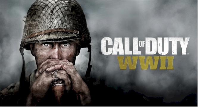
The first Call of Duty game, released in October 2003, was played from the perspective of an infantry soldier during WWII. WWII was the setting for the first three games. The franchise began to expand to more futuristic settings and technology with the release of Call of Duty 4: Modern Warfare. However, the most recent Call of Duty game, Call of Duty: WWII, takes the franchise back to its early 2000s roots.
The Call of Duty games have had a variety of developers over the years, with the main three being Infinity Ward, Treyarch, and Sledgehammer Games.
In addition to their top-rated video games, the Call of Duty franchise has released various products under the Call of Duty banner, including a series of action figures, a card game, and a comic book series.
The franchise annually releases a new video game in the Call of Duty series. The series’ popularity among gamers who enjoy first-person shooters remains relatively unrivaled. Many people don’t realize how important the franchise’s marketing has been in Call of Duty’s rise to the top, including the importance of its recognizable logo.
The Origins of the Call of Duty Logo
How Activision created the logo for their Call of Duty franchise is little known. The logo first appeared on the franchise’s first game and has since appeared on every game in the Call of Duty series.
The franchise does make minor changes to the logo for each new game release, most notably including the title of the new game. However, the core design of the logo has remained consistent since its introduction in 2003.
Today, the Call of Duty logo remains an integral part of the franchise’s overall marketing strategy, leveraging it to help create a culture around Call of Duty games and differentiate them from other first-person shooter games.
The Evolution of the Call of Duty Logo
The Call of Duty franchise began with a small studio called “2015,” whose employees released Medal of Honor: Allied Assault under the auspices of EA in 2002. Immediately following the release, a portion of the team formed a new studio called Infinity Ward and left to work on new shooters for Activision.
Activision released the first installment of the iconic shooter series in October 2003. And it was at this point that the developers laid the groundwork for the franchise, which is still in use today. Call of Duty distinguished itself from competitors in the genre with an advanced single-player campaign that allowed players to shoot not only for the American soldier, as many are accustomed to, but also for British and Soviet soldiers. The player was given three stories about different heroes, and this advantage was crucial in those years.
The first Call of Duty version was only designed for computers, not consoles, but that changed with the second edition.
2003-Today
The strict and straightforward visual identity of Call of Duty has always been text-based. The first version, released in 2003, featured all-caps three-dimensional lettering in a traditional sans-serif typeface.
2003 – 2007
The game’s logo, used from 2003 to 2007, was a new three-dimensional badge entirely based on the original emblem but in a cool gray and yellow color palette with an interesting uneven pattern on the glossy letters’ surface. The badge appeared cold, like steel or iced.
2007 – 2008
The Call of Duty logo was redrawn in a new palette of green and white with many gradients in 2007. The letters appeared transparent and light, even though the green shades resembled neon lights and dark streets with banners. There was something enigmatic about that version of the logo.
2008 – 2009
The 2008 redesign introduced a darker and more powerful version of the logo — in silver and copper. The letters were enlarged, and their contours were emphasized. The new palette was still cold and reminded me of the sharp blade.
2009 – 2010
The 2009 version was a flat white inscription, each letter outlined in a calm, muted green. This moss-like shade appeared peaceful, but it was hazy. It also did not elicit any happy or kind feelings. The color scheme remained cold and dangerous despite the simple shapes.
2010 – 2011
In 2010, the black-and-white era of Call of Duty’s visual identity began. Since this year, the logo has been executed in this intense and brutal color palette. The first version used large black letters on a white background. Every letter had ripped and uneven borders.
2011 – 2012
The 2011 version was more white, with very thin black countering and some light gray details on the bodies of the letters. The light and blurred logo evoked a sense of mystery and intrigue. It was the lightest Call of Duty emblem ever created and lasted for less than a year before being replaced by the next release.
2012 – 2013
In 2012, the emblem was based on the first Call of Duty logo. A couple of letters were given a few white lines (stencils). The inscription appeared stable and robust, evoking masculinity and brutality while perfectly reflecting the game’s essence and plot.
2013 – 2014
In 2013, the uneven edges of bold black letters made a comeback. It was nearly identical to the logo used in 2010, but it is a more refined and stylish version. Every detail was now considered, and all contours were modified and cleaned.
2014-2016
The 2014 logo was all about clean lines. Two thin white horizontal lines accompanied the original inscription. It was a departure from the Call of Duty logo, but the style and character remained recognizable, and the small details only added to the badge’s uniqueness.
2016 – 2017
The 2016 redesign included three letters: U, T, and Y. The bottom border of the “U” had a relatively large white space. In contrast, the two final letters of the inscription had their bars elongated and separated by a medium-thick white diagonal line.
2017 – 2018
The inscription’s shapes reverted to their originals, though the pattern of the black letters gained some white gradients, resembling a night sky. This redesign heightened the mysterious spirit of the visual identity even further.
Today’s Call of Duty logo
In 2019, the version from 2012 became the official version. Along with the first badge, this wordmark with two white stencils looks brutal and distinct, and the black and white color palette conveys power and confidence.
Elements of the Call of Duty Logo Design
The Call of Duty logo is a typographic logo made up entirely of text in a large font. The color of this text is where the franchise has changed the logo the most from game to game.
The Call of Duty logo’s most common text color is stainless steel grey. This design complements the game’s aggressive themes, conveying messages of strength and military machinery. The Call of Duty logo frequently includes scratches or bullet holes in the text, giving the impression that battle has worn it down. Because Call of Duty is aimed at gamers looking for a high-action video game, displaying a logo that appears to have seen a lot of action is a natural choice.
The bold typescript of the Call of Duty logo is eye-catching and commanding. The Call of Duty logo appears much larger and more imposing than it is by making the “of” in “Call of Duty” much smaller than the rest of the text. This standard design is used in typographic logos to create a sense of grandeur, and the Call of Duty logo makes excellent use.
The Call of Duty Logo’s Popularity
The new iterations of the Call of Duty logo that accompany each new game always generate a lot of buzzes, as the new logo is often the first evidence of a recent Call of Duty game released. As a result, the franchise can use its logo and the latest versions they create for each new game to generate excitement about the game’s release.
Of course, even after more details about a new Call of Duty game have been revealed, the franchise continues to promote the logo associated with it heavily. The graphics they create to promote the game online almost always include the logo in some form, and the television commercials they make also include the logo.
In addition to using the Call of Duty to generate buzz for new Call of Duty games, the franchise has created numerous apparel, posters, and other merchandise centered on its recognizable logo. This merchandise not only provides another source of revenue for the franchise, but it also promotes Call of Duty and helps to build a culture around the series.
The Call of Duty franchise’s ultimate goal is virtually monopolizing the first-person shooter video game industry. To do so, Call of Duty must develop an extremely high level of brand awareness and loyalty, and its recognizable logo has played a huge role in assisting them with this task.
Related Articles
- Google Business Profile: Meaning & Best Easy 2023 Guide
- CREDIT CARDS WITH 0 INTEREST: 17 Best Options in 2023
- HOW MUCH IS AMAZON WORTH 2023? (Revealed!!!)
- VIRTUAL CREDIT CARDS: How it Works & Best 2023 Providers
- Amazon Business: Best 2023 Practices & How to Start


