Hey, have you seen the rabbit in the Cleveland Browns logo? It’s quite difficult to see, but once you see it, you can’t unsee it. Every member of the National Football League team has a logo, a mascot, or just something that fans can relate to. For the Cleveland Browns, it’s their logo and other mascots, which include the Brownie, the elf, and the Dawg. As always, every football team’s uniform and helmet have something to do with the team’s logo. The other 31 NFL teams all sport distinctive helmet logos, but the Browns are the only ones without one on theirs. This is because the team’s logo is a helmet. The team has been through a lot of challenges, problems, setbacks, and wins, and the fans are very loyal to their team.
The team launched a midfield logo in 2023. However, the plain helmet remains the team’s official logo. The purpose of this article is to serve as a guide to both the current Cleveland Browns logo and the team’s rich history of previous emblems. Let’s unravel the mysteries behind the Cleveland Browns logo, you will be thrilled!
Overview Of The Browns Logo
Since its beginning in 1944, the Cleveland Browns football team has had seven different logos. One of these seven logos was completely thrown out by the team and management of the Cleveland Browns. The story of the Cleveland Browns is one of challenges, shortcomings, setbacks, disappointment, and, of course, victories. Many people thought the Cleveland Browns’ story was divided into two parts. The first part was between 1944 and 1969. Since its first appearance in 1944, the helmet logo has changed many times before reaching its current form.
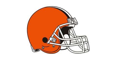
The present logo of the Cleveland Browns is an orange helmet with nothing on it. Yup, no drawing, no fancy mascot, and definitely no image. A white stripe is only on the very top of the headdress. This is because the players on this team are the only ones who wear helmets with no graphics or letters. Although it has an alternate version that includes an elf named Brownie, there’s not much to record about the team’s logo. However, I prefer the elf emblem to the plain Browns logo because characters and images add life and color to a logo.
Cleveland Browns Logo Color
The Cleveland Browns football team uses brown, orange, and white as their official team colors.
#1. Orange
Since orange conveys a sense of optimism and vitality, these are key traits for every player on a football team. Orange is one of the colors you use if you want to pique people’s interest.
#2. White
White is associated with good things like cleanliness, innocence, light, kindness, heaven, safety, brilliance, and illumination.
#3. Brown
Brown, on the other hand, conveys feelings of fortitude and dependability. The color brown is typically linked with stability, reliability, security, and safety because of the way it is thought to look like the ground. It’s rock-like in consistency.
What Does the Browns’ Logo Mean?
Since the Cleveland Browns logo is a simple image of a helmet, people wonder if there are meanings attached to the logo. Let’s find out. The new orange helmet stands boldly over the traditional brown and white stripes, representing the fervor of the Dawg Pound. Aside from the above, Cleveland’s strength and will are reflected in the new brown facemask.
What is a Brown Mascot For Cleveland?
The Cleveland Browns’ mascot is an elf named Brownie. He is a funny little man who wears a big cap and an orange shirt with striped sleeves. His ears stand out because they are pointed. No one knows where this cartoon character came from, and research hasn’t helped either.
Why Did Browns’ Change Their Logo?
Whenever a team decides to change its logo, it’s because the existing one no longer relates to what the brand or team represents. At other times, it could be because the team or brand wants to revisit its history. For the Cleveland Browns team, it was both. In 1970, the team completely altered its logo and in 2023, the same old logo was reintroduced as the midfield logo.
Why is the Browns’ Logo an Elf?
When the Browns first began playing professionally in 1946, Brownie the elf was one of the first three mascots that represented the team. Since the team moved back to Cleveland in 1999, Brownie has made several appearances. The logo and mascot were retired at that time because it was said that the previous owner, Art Modell, hated them.
Beginning in 1948, Brownie the elf was one of the Browns’ three original logos. Since the team moved back to Cleveland in 1999, Brownie has made several cameos, even though the logo and mascot were being phased out because former owner Art Modell was said to hate them.
Who is Brownie the Elf?
This mascot predates the team’s modern incarnation by a long shot, and it isn’t used nearly as much as Chomps and Swagger. Long before the Cleveland Browns picked the little creature as their logo, the story of Brownie the elf as their logo began. In old folklore, “brownies” were creatures that looked like elves and helped out around the house if you left them treats. Although it looks like an elf, it has the opposite characteristics.
Old Cleveland Browns Logo
Except for the Cleveland Browns, every other National Football League (NFL) team has a logo on its helmet. The Browns’ unbranded helmet represents the team. Even so, the Cleveland Browns are easy to spot because their helmets are orange and have no logos. This trend dates back to 1970. Masks varied only in color and style. Although anyone can easily recognize the helmet logo, the best logo the team ever had was that of 1948–1958 and 1959–1969. The majority of the team’s new fans may be surprised to find that the Browns used a totally different emblem before 1970. For 21 years, the “Brownie Elf” was the most important part of the Browns brand. The logo was available in two distinct iterations. In 1970, the team launched the helmet logo. The helmet Browns’ logo was first designed in 1965; however, it was never used. In 1970, the unused 1965 logo
Some modifications were made to the unused 1965 logo, and it became the team’s official logo to this day.
History And Evolution Of the Cleveland Browns Logo
The Cleveland Browns, like every other team, have changed their logo several times since their inception. There is always a reason why a team or a brand will choose to change its logo. It’s mostly because the existing one no longer fully represents everything they stand for, or because there is a better chance of representing everything the team stands for.
1948 – 1958
Anyone can date the Cleveland Browns’ first logo to 1948 and not 1944. It’s a little strange, and to date, many people wonder if the team was without a logo within its first four years. Anyway, the Cleveland Browns’ 1948 logo featured a cartoonish elf dressed in brown and white. The little guy was holding a rugby ball in his right hand. First, the color of the Cleveland Browns’ first logo didn’t surprise anyone because it’s the team’s name. The color scheme visually reflected the name of the club, and the elf represented the club’s bold, carefree spirit.
The little guy’s name is Brownie Elf, which also relates to the team’s name. The word “brownie” rhymes with “brown.” The drawing was made by Dick Dugan, who is a sports cartoonist for the Cleveland Plain Dealer.
Our little guy, Broonie, has a crown resting on his head. This signifies the team’s desire to win every game. Whether they lived up to this or not is a story for another day. The head of the person is angled to the left. The logo looks like it came from the golden age of animation, even though the drawing has a jagged black border around it.
1959 – 1969
Eleven years after the team debuted its first logo, it was modified. This time, Brownie Elf underwent a makeover in 1959, switching to a right-facing stance and giving up his royal crown for a baseball cap. Although he lost his crown in exchange for a hat, he was switching hands to hold the football with his right. His arms and face went white, and he was dressed in black and orange. Moreover, the shadows were eliminated and outlined in black.
The new color scheme of orange and white better reflects the vibrant nature of the team’s play.
1965: The First Dynamic Change (Unsued)
Cleveland Browns owner Art Modell thought the team’s logo was too simplistic when he purchased the team, so he had it changed. By the middle of the 1960s, a new logo had been developed, including a dark orange helmet with a white stripe at the peak and a black outline.
This athletic clothing is seen in the profile. The brown and white letters “CB” that are twisted around each other on the gray faceguard stand for the team’s home city and name, the Cleveland Browns. There are no oddball characters in the font. The Cleveland Browns never used jerseys with this logo during games.
1970 – 1985
The football team abandoned the mascot Brownie Elf after the AFL and NFL merged in 1969. The emblem they used in 1970 is very similar to the one they scrapped in 1956. It only entails minimal adjustments. In 1970, the Cleveland Browns changed their logo by getting rid of three gray dots, making the black inner outline bigger, and adding a white facemask. Since the Cleveland Browns no longer felt the need to decorate their helmets with team branding, the wordmark ”CB” was taken off. It wasn’t bad; to both the team and the fans, it was a welcome development.
The 1970 Browns logo was just a basic picture of the red helmet turned sideways with tiny white colors. Even though the picture was simple, it had a surprising amount of detail, which fit with the team’s main goal and the fact that their helmets never had any logos or graphics on them. The team’s dedication to winning is represented by the red and white color scheme.
1986 – 1991
In 1986, the team debuted a new logo. This time, it lasted for just 5 years. The 1986 Cleveland Browns logo is a departure from the traditional side view. This time, the team adopted a more dynamic three-quarters angle. The depth of the white fixtures is brought out by the dark lines that run next to them. The helmet has two stripes, one white and one gray, at the top. The orange shade changed by one degree.
The helmet was turned 3/4 of a turn. The new logo’s grille is bigger and made of white and gray to give it more depth and a more realistic look. The team’s distinctive hue of orange stands for enthusiasm, energy, and a winning mentality on and off the field.
1992 – 2005
In 1992, the helmet went through yet another round of improvements. The grille was changed to be all white with some light gray shadings, which made it stand out more than the last version. There’s now white padding at the back of the helmet, and the designs are more nuanced and well-executed overall.
The designers of the facemask gave it a sleek, contemporary form. No change occurred to the hues; rather, they became increasingly muted. A new component, a white circular ledge, had materialized in the base.
2006 – 2014
In 2006, the orange and white color scheme was replaced by orange and gray. The stripes’ proportions, width, and form remained unchanged. There were no additional alterations. Gray is a sign of strength and stability. It shows that the team is professional, grounded in the basics, and that it wants to grow and be successful.
2015 – Today
The Cleveland Browns 2015 logo is still in use to this day. The rugby club’s current logo and branding were created in 2015. It’s a reiteration of the first two logos but with a different color scheme. The orange of today is much more vibrant, nearly crimson, while the black grille has been streamlined and given more graceful lines. The Cleveland Browns have an alternate logo called the “Dawn Pound,” which has the outline of a dog’s face in black on a red background. The picture captures the team’s competitive drive, determination, and focus on the prize.
The designers made an effort to maintain the flag’s fundamentals, such as the top two black and white stripes. They also stayed true to the original color scheme, which featured lots of vibrant oranges. The iconic Cleveland Browns helmet, which every player wears and serves as a visual representation of the team, was part of the team’s new brand name in 2015.
Browns Logo Rabbit
Okay, first, the Brown logo does not feature a rabbit; rather, it’s a helmet and a mascot named Brownie. However, every logo has a hidden meaning it conveys. Most often, the meaning was never in mind when creating these logos. It’s mostly something that comes out of nowhere. There are teams that intentionally hide meaning in their logos, such as the Milwaukee Brewers logo, but most often, people just read out strange meanings and they become real. For the Cleveland Browns logo, a rabbit pushing a cart or a walker is the hidden image the helmet tends to convey. There’s this saying: “Once you see it, it’s hard to unsee it.” This relates to the fact that you won’t see the rabbit just by looking at the helmet; it takes a while to get the picture, but once you decode the image, you’ll readily see it without effort.
For a while, it was a trending issue on Twitter and across the internet, but then it was really nothing to drag. If you can decode the rabbit logo, great, if you cannot, well, that’s great too. The rabbit doesn’t add to the team’s heritage in the first place, so forget about it.
What Is the Browns’ New Mascot?
The 2015 color itinerary logo, and, of course, Brownie the elf. Brownie the Elf, the Cleveland Browns’ midfield logo since 2023, will be on display Sunday at FirstEnergy Stadium when the team plays the New York Jets in its home opener. The truth is that it is one of the team’s mascots, but not its logo. The team’s logo is still the basic helmet in yellow, white, and brown.
Why Do the Browns’ Have a Dog Mascot?
The nickname “Dawgs” for the defensive unit of the Browns team was first used by Hanford Dixon, a former cornerback for the Browns. This is where the term “Dawg Pound” got its start. Allegedly, Dixon and the other Browns’ secondary players would yell at each other during games while they were competing. The Cleveland Browns play their home games at FirstEnergy Stadium. The section of bleachers located behind the east end zone is known as “The Dawg Pound,” and it gets its moniker from the team’s mascot.
What Kind of Dog Is The Browns’ Mascot?
Labrador dog. The Cleveland Browns of the National Football League have a mascot named Chomps. The team’s website describes Chomps, a labrador dog, as 6 feet tall and wearing jersey number 00.
History Of Cleveland Browns
According to Wikipedia, the American football franchise known as the Cleveland Browns was founded in 1944. The football team was bought by taxi tycoon Arthur B. “Mickey” McBride for the city in the newly formed All-America Football Conference (AAFC). The team was named after its first head coach, Paul Brown. You already know why Cleveland is part of the name, right? Of course, Cleveland is home to the football team. Two years later, he debuted in the American Football League (AFL). According to the record, four championship games were played before the league disbanded in 1949, and the Browns won them all. After that, they joined the National Football League (NFL), where they have been dominant ever since. There was a stretch of years (from 1950 through 1955) where Cleveland went to the NFL title game every year and won three of those appearances.
A New Ownership
In 1953, McBride and his partners sold the club to a group of Cleveland businessmen for a staggering $600,000. After those first eight years, the team was sold again, this time to a consortium led by New York advertising executive Art Modell. Even though Modell sacked Brown before the 1963 season, the team was led to victory by Brown, the team’s running back. After winning the title in 1964, the Browns returned to the Super Bowl the following year, where they were defeated by the Green Bay Packers.
A Come Back And Struggles
Cleveland joined the new American Football Conference after the AFL and NFL merged prior to the 1970 season (AFC). Luckily, the team made a comeback and was successful again by the early 1970s, making the playoffs in 1971 and 1972. In football, there must be a winning team and a losing team. For the Broncos, it was a showdown after their success came back. They subsequently slipped into mediocrity for the rest of the decade. If you have ever heard of the nickname “Kardiac Kids,” it was first used in 1979 and 1980.
The game was one of the most exciting victories for the Browns, and that earned them the nickname “Kardiac Kids” and sparked something of a renaissance. Unfortunately for Browns fans, the team did not go past the first round of the playoffs when Sipe was the coach. Bernie Kosar, a quarterback drafted by the Browns in 1985, led the team to three AFC Championship Games in the late ’80s, all of which were losses to the Denver Broncos.
The Move
Modell’s announcement that he was moving the Browns to Baltimore in 1995 Not many people love the idea, but then, it has to be done. It caused a lot of anger and resentment, among the team’s die-hard fan base in Cleveland. After a lot of back-and-forth and lawsuits, the parties came to an agreement that let Modell move his team to Baltimore as an expansion franchise (the Baltimore Ravens) and that gave the Browns’ name, logo, and history back to Cleveland for use by a new team that would be back on the field by 1999 at the latest.
The Browns didn’t play again until 1999, when they had a new owner, Al Lerner. During that time, Cleveland Stadium was torn down, and FirstEnergy Stadium was built on its old site. Since their return to the NFL, the Browns have only had three winning seasons and made the playoffs twice (2002, 2020). After the Lerner family sold the team to businessman Jimmy Haslam in 2012, the franchise has been in a downward spiral ever since. Haslam was the owner of the Browns for six seasons. During that time, the team had four different head coaches and four different general managers.
The Browns’ 2016–2017 season under Hue Jackson was the poorest in NFL history, as they finished 1-31 (.031, with a 0–16 record in 2017). As a result, they were awarded the first overall pick in the next year’s draft. The 2020 Browns finished 11-5 and earned their first postseason trip since 2002 thanks to a Week 17 victory over the Pittsburgh Steelers.
Uniforms
To a large extent, the jerseys, pants, and socks of the Browns team have remained unchanged. However, we can’t possibly say the same thing for the helmet. It had undergone numerous, significant redesigns.
How Much Does Cleveland Browns Worth?
According to Forbes, the Cleveland Browns’ football team is valued at 3.85 billion U.S. as of August 2022. The team is currently owned by Dee and Jimmy Haslam and the value is expected to keep rising.
What Does Browns Mean in Cleveland Browns?
The “browns” in the name of this renowned football team are a tribute to Paul Brown, who helped start the team and was its first coach. Before the NFC and AFC merged, he spent a lot of time with the Cleveland Browns.
Where Did the Cleveland Browns Name Come From?
In a contest to find the best name, fans came up with the name “Cleveland Browns.” So, they chose the name Paul Brown, which was the name of the club’s first coach. Of course, the team is located in Cleveland, so that’s why it was also named after the city.
Conclusion
Personally, I prefer Brownie the elf to the plain helmet as Cleveland Browns’ logo. The Brownie to me, reveals the passion and zeal of the team more than the helmet. However, it’s just a personal opinion and may not really count. Hopefully, the Browns will adopt the midfield elf as its logo in the future, and add its logo to their helmet as well.
- CLEVELAND INDIANS LOGO: Why did The Cleveland Indians Change Their Name
- PACKERS LOGO: Green Bay Packers History and Timeline
- MIAMI DOLPHINS LOGO: All you Need To Know About Miami Dolphins