3M (formerly known as Minnesota Mining & Manufacturing Company) is a multinational conglomerate headquartered in Maplewood, Minnesota.
It employs over 76,000 people worldwide and manufactures around 55,000 products ranging from medical and electronic materials to adhesives. But over the years, 3M’s corporate image has been heavily influenced by its unique and innovative products, which account for up to a third of its total annual sales. In other words, branding played a major role in its widespread growth and development. Let’s find out how…
But beyond a look at the history and evolution of the 3M logo, we will also cover the history and success story of the brand itself.
What is 3M?
3M is an American corporation that began as a mining venture in 1902. Today, 3M is active in a variety of fields, including health care and worker safety, but it is best known globally as a manufacturer of consumer goods. The brand’s products are available all over the world.
The History of the 3M Logo
The 3M logo is the centerpiece of the company’s corporate identity. It has come to represent innovative and high-quality products and services over the years. The simple 3M emblem has progressed from a simple design feature to an important corporate asset.
3M Logo Evolution
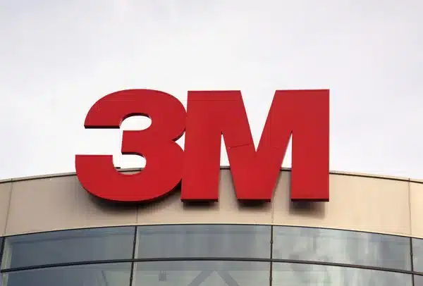
Most people today recognize the 3M symbol as a bold, eye-catching wordmark that combines the numbers “3” and “M.” Since the late 1970s, the company has used a version of this red logo.
However, the company had previously introduced several different designs. Here’s a quick rundown of the 3M logo’s evolution over the years.
1906
The original 3M logo was a simple design from the early twentieth century. An oval with the company’s full name on a white border surrounded a black rhombus with “3 M Co” in the center in this image.
The design was effective at the time, with the diamond shape representing the organization’s mining focus.
1926
3M began experimenting with dropping its full name in favor of something shorter and simpler in 1926. The new “Three M” logo used the brand’s shorter name, with the word “Three” spelled out in capital letters.
Two dots were placed on either side of the “M” to make the branding stand out.
1937
The following version of the 3M symbol, introduced in 1937, featured a different version of the name, this time with the character “3” rather than the entire word.
This logo was even simpler than the previous one, with a sleek sans-serif font for the “M” and a strong black finish. At the time, this would have been considered a very modern logo design, ideal for a forward-thinking company.
1938
Throughout the first three to four decades of 3 M’s existence, the company released refreshed versions of its original logo on a regular basis. Many of the elements in these images were the same as in the original brand mark, with some fundamental changes to font styles and designs.
To give the brand a sense of heritage, one version of this symbol introduced in 1938 also highlighted the company’s initial founding date.
1942
The previous “3-M” design was given a new font and a different level of spacing with the introduction of the 3M logo in 1942. The dash between the “3” and the “M” was removed in this image, bringing the two components closer together, as in today’s symbol.
In this logo, the company also used a more professional serif typeface with a white and black outline.
1948
After briefly returning to the 1937 logo, the company streamlined its design even further in 1948 with a simple “3M” wordmark. The inscription’s contours were refined, and the sans-serif font was reintroduced for a more modern effect.
1950
In the 1950s, 3M debuted a new serif-style font logo with a three-dimensional black and white outline. The word “Company” was introduced in an uppercase sans-serif font. The entire image was surrounded by a simple oval shape.
During this time, another version of the logo was in use, in which the 3D 3M symbol’s colors were inverted, resulting in a white wordmark with a black outline. In this case, the oval and surrounding components, such as the “Company” element, were removed from the logo.
1952
In 1952, a simplified version of the 3M logo was unveiled, lacking the serifs and extra dimensions of the previous design. To emphasize the brand’s innovative nature, the image was bold and sharp, with a deep V in the center of the M.
3M Logo In 1952, 3M also tried out a different version of its serif-style logo, this time in a black oval with the word “Brand” written underneath in capital letters.
1953
Between 1953 and 1960, 3M introduced a number of different oval-shaped logos for its brand. The same serif-style, three-dimensional wordmark for the company’s name appeared in all of these designs and various other elements.
In 1953, an oval badge with the word “Line” written in a font designed to look like a rope was introduced.
In 1954, 3M dropped the rope element and resumed using the word “Company” rather than “Brand” beneath its central logo. Two new oval emblems were introduced, each with a white serif font on a black background.
A laurel wreath was placed around the oval in one variation to give it a sense of heritage and elegance. In the other design, the wreath was removed to create a more straightforward, modern image.
1956
3M returned to using a simplified version of its logo in all of its branding assets for a year between 1956 and 1957. The two-character wordmark was created in a slightly heavier font than previous versions, with a less pronounced dip between the two components of the “M.”
In 1958, 3M returned to another version of its logo, this time using blocky serif-style 3D text for its wordmark, which was placed within a white oval. The word “Brand” beneath the two-digit wordmark is much bolder and more eye-catching in this case.
3M also tried out a flattened version of its laurel wreath logo in 1958, this time with a different, simpler serif font style.
At the beginning of the 1960s, a new version of this logo was introduced, replacing the word “Brand” with “Company.”
1960
The 1960s were a period of experimentation for the 3M logo. Between 1960 and 1961, the company reverted to its minimalistic roots with a simple two-character wordmark rendered in a sophisticated and clean serif font.
3M Logo This basic logo was replaced in 1961 with something more “modern.” A stylistic version of the wordmark with unique, blocky serifs and an unusual underline was introduced to represent the various growth paths the company was exploring.
1978
By handing over the brand development process to the Siegel+Gale bureau in 1978, 3M decided to finally slow down with its logo design changes. The imaginative designers created a bold 3M logo in a vibrant scarlet color. This was the ideal design, according to the brand, to highlight the company’s growing power and stability in its industry.
Elements of 3M Logo Design
The current 3M logo, designed by the renowned strategic branding firm Siegel+Gale in 1978, is a very intense, powerful, and authoritative work of art.
Shape: The 3M logo has a character overlap caused by ultra-tight kerning, which adds cohesion and strength to the emblem as well as the company’s image.
Colour: The use of bold letters in scarlet red in the logo gives 3M an air of stability and an innovative spirit.
Font: The logo is rendered in the elegant Helvetica Neue Condensed font family to convey a modern yet stylish feel.
The Origins of 3M
3M was founded in 1902 in the North Shore neighborhood of Two Harbors, Minnesota. Prospectors were drawn to Northern Minnesota because of the rich iron ore deposits discovered there. The founders of 3M desired to mine corundum, which is used in sandpaper. They abandoned the plan after discovering that the mine contained the mineral anorthosite rather than corundum.
Following this setback, the company relocated to nearby Duluth with the intention of producing abrasive products. Lucius Ordway Jr, a St. Paul investor, heavily invested in 3M and eventually convinced the company to relocate its manufacturing plant to St. Paul.
Despite the fact that Ordway’s continuous “savior” investments saved 3M from financial ruin, new employees were brought in to revitalize the firm and cultivate customer relationships. William McKnight, a bookkeeper who later became president in 1929, led efforts to focus on quality control. He also hired Archibald Bush to oversee the company’s product sales. After producing its first unique item, Three-M-ite abrasive cloth, 3M made its first profit in 1916. Following this long-awaited success, 3M paid its first dividends to shareholders.
3M’s management in St. Paul promoted a culture of scientific discovery and innovation. To encourage employees to create new products, the company implemented a “15% rule,” allowing scientists to spend 15% of their time working on their projects.
Read Also: Coca-Cola Logo: Meaning, Evolution & All You Need
Many of the company’s most popular products were developed as a result of independent research conducted at the company’s facilities. These include the Sasheen ribbon, a decorative ribbon, and Tartan Track & Turf, the world’s first manmade athletics track and turf.
The company’s Technical Forum, developed in 1951, was another innovative 3M product. The product was designed to enable the company’s technical staff to learn, educate, and collaborate with others who typically worked on very different products.
While Post-It Notes and Scotch Tape are arguably the two most popular consumer products manufactured by 3M, the company has pioneered a plethora of other products, some of which were inadvertently invented.
For example, in 1953, Joan Mullen and Patsy Sherman, two lab technicians, were working on rubber fluorochemical substances when Mullen inadvertently dropped the fluid’s beaker on her shoes. Sherman realized it was impossible to wipe the fluid off Mullen’s shoes but saw this as an opportunity to invent something. Within a few years, 3M had introduced Scotchgard fabric protector, which Sherman continued to improve throughout her career.
3M’s innovations impacted various industries, including entertainment and office supplies. In 1950, 3M created the first photocopier, Thermo-Fax. Although more modern photocopiers have been developed since Thermo-Fax revolutionized office communication and productivity.
Read Also: Seahawks Logo: What is the story behind the Seahawks logo?
With their Scotch Tape line of products, 3M developed far more than masking tape—Scotch video and sound, magnetic recording tapes allow TV and music shows, in that order, to be pre-recorded rather than produced live. During the 1980s, the company even won Academy and Emmy Awards for its innovations in videotape magnetic film and movie soundtrack advancements.
During the 1950s, as 3M expanded into new industries, it aimed to enter the global market. The company and its competitors formed a joint venture to compete with foreign firms, but this venture quickly ran into problems due to anti-trust laws.
Using the collaboration’s leftovers, 3M streamlined its global network and began operations in 12 countries throughout the 1950s. Throughout the 1960s, 3M established operations in a total of 23 countries, with at least one on each continent except Antarctica. This sustained early expansion enabled 3M to establish itself in a global market and to become one of the largest in the United States.
While 3M is best known for its Post-It Notes and Scotch Tape, the company has developed solutions for a variety of industries and applications. Specialized stoplights, reflective street signs, Scotch-Brite cleaning pads, and Thinsulate thermal insulation are just a few of the many innovations that have contributed to this mining company becoming a Fortune 500 multinational corporation.
Who is 3M biggest competitor
Some of 3M’s biggest competitors include the following:
- Corning.
- General Electric.
- Honeywell International.
- Emerson.
What is 3M famous for?
3M Company’s products include various types of adhesive tape, audio-visual equipment and media, medical and dental products, Post-It Notes, and safety products such as reflective coatings and signs.
Why is 3M so successful?
The answer is 3M’s commitment to research and development (R&D). R&D is the beating heart of 3M. They reinvest about 5.9 percent of their sales in the science that keeps 3M going. This investment contributes to the annual production of over 3,500 patents and a steady stream of unique products for customers.
Related Articles
- How Much Does It Cost To Fill A Pool: Compare Prices (Updated)
- Best Free CRM Software in 2023
- Caterpillar Logo: What Does the Triangle Mean?
- Coca-Cola Logo: Meaning, Evolution & All You Need
- Pfizer Logo: Meaning, Font, Products and All You Need
- GREEN BAY PACKERS LOGO: Who Had G logo First?


