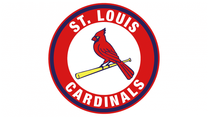
Thanks to their rich history and storied tradition, the Cardinals are a force to be reckoned with in Major League Baseball. And at the heart of their success is their unforgettable logo – a symbol that has come to represent the team’s unwavering dedication to excellence and passion for the game. In this article, we’ll go over the history, meaniing and evolution of the St. Louis Cardinals logo, examining what makes it unique and why it inspires fans and players on and off the field. So let us take a closer look and discover the legend’s magic.
St. Louis Cardinals Logo History & Evolution
The Saint Louis Cardinals have used a variety of logos over the years. This is not surprising for a club that has existed for nearly a century. Each new logo represents a new stage in the club’s history. Let us now follow the bird on the bat to its source of nesting and evolution.
1900–1919
In 1900, the Cardinals unveiled their first and only logo. It was written in bright red letters. The city of Saint Louis is represented by these interlocking initials—STL. The ends of these typefaces are extended and rounded. On the letter S, you’ll notice two white diamond signs. For nearly two decades, the team used this stylized monogram logo.
1920–1921
The first logo updates occurred in 1920 and lasted less than two years. It was a wordmark with the inscription St. Louis dressed in caps and an arc. The letters were red-dressed by the designer. This is one of the Saint Louis Cardinals’ official colors.
1922–1926
The cardinal birds were revealed during this period. Two perched birds are facing each other on a black bat. The name of the club—Cardinals—was written beneath the birds. And the highlight is how the letter—C is hung on the baseball bat. The wordmark and the birds were both red. The birds appeared to be cartoons. This logo reigned supreme for nearly five years.
1927–1947
For nearly two decades, the club used a different logo. The designer used the same graphic elements. He enhanced their emotions. For example, he mirrored the bat and painted it silver. The birds also became more visible, with red and black feathers. The letter—C in the club’s name was outlined in black.
1948–1964
The fourth update arrived in 1948. The Cardinals were perched on a silver baseball bat in the logo. The letter C was hooked on the baseball bat, just like the 1922 emblem. A closer look revealed that the birds were wearing black crests. The letter—C retained its outlined preference here as well.
1965
The Saint Louis Cardinals unveiled their sixth logo design. It came in the shape of a circle. A single cardinal perched on a baseball bat was inside this doubled frame. The bird retained its official red color. The baseball bat, on the other hand, turned yellow. A white baseball was hidden behind the Cardinal. The club’s name was boldly written in curved letters.
1966 –1997
The same design style but with a twist. The Cardinal was wearing a red baseball cap in the logo. Instead of facing left, the Cardinal turned slightly forward. In addition, the hue changed from a darker to a lighter shade. For nearly 31 years, this logo design reigned supreme.
1998
The seventh logo update for the team included some patterns from previous designs. It featured a cardinal perched on a yellow bat, as is customary. The scripted wordmark was also hung on the bat beneath the bird. The contours of the bird and the wordmark were outlined in black. The bird’s beak turned red, and its eyes turned yellow.
1999–Now:
The current logo was inspired by the previous one. The contours of the bird were highlighted in blue. The same color is used to outline the club’s name—Cardinals. The bird’s eyes turned white, and its beak turned yellow. The designer kept the scripted lettering.
What Font Does the St. Louis Cardinals Use?
The artists who created the Cardinals logo understand the importance of fonts. To convey the club’s personality, they used bold and readable typefaces. To meet its changing needs, the club has used a variety of fonts. However, two players stand out in the team’s history. We can discuss the lettering in the maiden logo. It evokes images of the Old English Alphabet. The current logo’s second standout font is a scripted font that resembles calligraphy handwriting.
Elements of the St. Louis Cardinals Logo Design
The Saint Louis Cardinals have used striking colors, symbols, and letters throughout their history. These identical graphic elements include a bird, a bat, a ball, a cap, and lovely colors. Let’s dig deeper into these design elements as we continue reading.
St. Louis Cardinals Symbol And Logo Shape
A Bird:
A bird is the most prominent element in the club’s logo. Except for the first two emblems, the bird has appeared in every subsequent logo. The Cardinal is a stunning and brilliant songbird. Its bright reddish color identifies it as a male cardinal. Cardinals are associated with romance, unity, and freedom among Native Americans. They are also associated with devotion, courtship, and blessings.
A Ball:
Most people immediately recognized the ball in the logo as a baseball. The baseball, like the bat, demonstrates the club’s sporting zeal. It represents community, unity, and eternity as a rounded object. The white baseball appeared on two emblems used by the team for approximately 32 years.
A Bat:
The baseball bat and the bird are inseparable. Except for two, it has appeared in all emblems, just like the bird. It hits the ball after a pitcher has thrown it in baseball. It connects the club to its line of competition as a graphic element in the logo.
A-Cap:
The 1966 logo featured a cardinal wearing a cap. The cap is of the baseball variety. A hat represents America. Americans wearing caps to tell their stories range from athletes to presidents. Similarly, the baseball cap in the logo assists fans in associating the club with its sporting interest. A baseball cap, worn to cover the head, represents power, respect, and authority.
Colors of the Saint Louis Cardinals Logo
Color: Red
The color red makes up a larger portion of the team’s logo. This club’s official color conveys passion, desire, and joy. The color of fire is also associated with strength, courage, and leadership. The color is visible on the bird and the letterings in the latest logo.
Color: White
The club preferred the color white. It has remained a strong and balancing color for nearly all logos. In the 1965 logo, white became the focal point. It defined the baseball’s personality as well as the club’s name. White represents goodness, purity, and security. Furthermore, the color of faith conveys simplicity, cleanliness, and humility.
Color: Yellow
Yellow is another official club color. It was initially missing from the logo. Nonetheless, it quickly became the team’s favorite color after its debut. The color is associated with vitality, loyalty, and honor. Yellow, the color of the sun, represents hope, clarity, and intellect. The current logo renders the bird’s beak and the wooden bat in yellow.
Color: Silver
In two previous logo designs, the Cardinals used a silver color. The designer used the color to dress the wooden bats in both cases. Most experts associated the color silver with wealth and riches. The color is associated with kindness, elegance, and grace. It also represents mystic vision and tenderness.
Color: Blue
Blue remained silent in all previous designs. Fortunately, the color of the sky made its way into the latest emblem. The designer used it to embellish the wordmark’s outline and the contours of the bird. Blue can instill feelings of trust, wisdom, and stability. The color of the sea can also represent serenity, confidence, and freedom.
What Is the Size of the St. Louis Cardinals Club?
For a good reason, fans laud the Cardinals as one of the most successful teams in American history. They have captivated audiences and left an incomparable legacy, from talents to titles. It’s no surprise that they’re referred to as the “gateway to baseball excellence.”
Hornsby, Rickey, Musial, Pujols, La Russa, and other notable players have come from the club. These guys had an impact on games and inspired many young people around the world. The Cardinals are still title contenders today. It would be best to never rule them out during a league season.
They’ve won 23 pennants, 14 division titles, and 11 World Series. In addition, they have 6 Rookie of the Year winners, 17 MVP winners, and 37 Hall of Famers. In March 2021, the Cardinals were ranked seventh out of 30 MLB clubs.
According to Forbes, the estimated value was $2.245 billion. They have one of the most devoted fan bases in the league and draw some of the largest crowds. The club’s stadium seats 45,538 people. They frequently ranked among the top three in MLB regarding local TV ratings.
A Short History of the St. Louis Cardinals
Based in St. Louis, the team has been dubbed the Browns, Perfectos, and Cardinals. The Saint Louis Cardinals are a professional baseball team in the United States. It is one of the country’s oldest and most successful professional baseball teams.
Professional baseball began in St. Louis in 1875. This gave rise to the National Association (NA) Brown Stockings. After the NA folded, the Browns joined the National League (NL). It became a charter member and finished third in the league with a record of 45-19.
The Brown Stockings were kicked out of the National League after a match-fixing scandal. This occurred following the 1877 league season. Following that, the club went bankrupt. Because there was no league, the Browns had to settle for a semi-professional baseball team. Until 1881, they played any interested team.
With no baseball team in town, sportswriter Al Spink became restless. Through persistent lobbying, he persuaded Chris von der Ahe, a German entrepreneur, to purchase the St. Louis Stockings. In 1882, Chris reorganized the team and became a charter member of the American Association.
Following the 1883 season, the team was dubbed the Browns. They dominated the American Association League two years later. Charles Comiskey, their manager, led them to four consecutive pennants. It was between the years of 1885 and 1888.
Read Also: Fidelity Logo: Evolution, Meaning & History (Updated)
The American Association declared bankruptcy after nearly ten years of operation. As a result, the Browns returned to the National League. The Browns struggled from 1892 to 1919. I’d like to point out that the club took on the name Perfectos in 1899.
A new name followed a new outfit. The club augmented the team’s white uniform with a scarlet of red. A St. Louis Republic sportswriter, Willie McHale, made an astonishing revelation following that season. Willie overheard the following remarks from a lady, according to the report:
“What a lovely shade of cardinal.”
Fans like Willie fell in love with the catchy name. To appease the throngs of fans, the Cardinals adopted the lady’s emotion in 1900. This lovely name, however, could not save the team’s dismal performance on the field. When Rogers was added, everything changed.
Rogers Hornsby led the team to its first pennant in 38 years and the 1926 World Series victory. Rogers had previously won the Triple Crown in 1922 and 1925. The Cardinals won the league title thrice in 1928, 1930, and 1931. They also added the World Series in 1931.
Marty Marion, Walker Cooper, Max Lanier, Mort Cooper, Stan Musial, Johnny Beazley, Red Schoendienst, Eno Slaughter, and Whitey Kurowski led the Cardinals into their golden era. It was one of the most successful periods in franchise history, with 960 victories.
Read Also: ESPN Logo: What’s the True Meaning of the Logo
This is just a brief history of the St. Louis Cardinals for those interested. After this golden era, the club has had both winning and losing seasons up to the present day. Looking at the club’s legacy, I’ll be mortified if I don’t mention the team’s financiers.
Eight different people have owned the Cardinals. Chris von der Ahe (1882-1889), Frank and Stanley Robison (1889-1911), and Helene Hathaway Britton (1911-1917) are among them. Sam Breadon (1917-1947), Robert Hannegan (1947-1949), Fred Saigh (1947-1953), and Anheuser-Busch (1953-1995) are the others. Finally, since 1996, William DeWitt, Jr. has been the current owner.
Did the Cardinals’ logo change?
The St. Louis Cardinals’ logo has been changed several times, with the most recent redesign occurring in 1999. The badge has evolved from a sleek heavy monogram to a slightly naive image of two red birds on an elongated black bat and finally into a bright, balanced badge with one red Cardinal on a yellow bat, inscribed into a wordmark. However, there was one more redesign in the club’s identity in 2020: the lettering on the players’ caps was rewritten.
How did the St. Louis Cardinals’ logo come to be?
The logo of the St. Louis Cardinals underwent several significant redesigns before becoming the current one with a red Cardinal bird sitting on a yellow bat. The first version of the badge featured a red monogram, which was replaced in 1922 by an emblem with two birds and a bat. The current logo was introduced in 1998 and redesigned in 1999.
Conclusion
The St. Louis Cardinals, founded in 1882, has become synonymous with elite baseball. They are based in St. Louis and play in Major League Baseball (MLB). Originally known as the Brown Stockings, the club has gone by the names Browns, Perfectos, and Cardinals.
The Cardinals’ first logo was an interlocking initial. These red letters featured two tiny diamonds on the letter—S. It was one of the team’s simplest and most appealing designs. The next iconic symbol to represent the club is the bird’s-on-the-bat.
Related Articles
- BEST FISHING ROD BRANDS: Top 27 Brands to Check Out (Updated!)
- Buffalo Bills Logo: Why is the Logo a Bison?
- BATMAN LOGO: What the Logo Symbolizes, Evolution & History
- 20 Top Digital Marketing Agencies(Updated!)


