The Washington Redskins’ logo represents loyalty to the country and commitment to tradition. Each club player plays football not as a profession but as a passionate pastime. The logo, on the other hand, alludes to the team’s players’ swiftness, precision, and quickness. And although the Washington Redskins logo has evolved over its more than 85-year history, the core visual theme – an image of an American Indian – has remained consistent. The question is, “how were they able to achieve this?” Let’s find out as we go over the evolution, history and significance of the Redskins Logo.
Redskins Logo: Overview
The Washington Redskins are an American football team that competes in the National Football League. The team was founded in 1932 and is a member of the NFC East Division. The club is located in the Washington, DC metropolitan area.
The franchise started with the Boston Braves. It was renamed the Boston Redskins a year after its inception to reflect its location. The founder and first owner, George Preston Marshall, relocated her to Washington. This occurred in 1937.
Marshall died in 1969, and a controlling stake was purchased by Edward Bennett Williams, who was the club’s majority owner until 1974. Then Jack Kent Cooke purchased some of his shares, giving him equal co-ownership status. This was made possible because he already owned a 25% stake in the Washington Redskins, which he obtained through a deal with George Preston Marshall during his lifetime when he suffered a stroke and could not conduct business actively.
Cooke led the club from 1985 to 1997 before establishing his foundation. Daniel Marc Snyder, who runs the franchise, acquired a controlling interest in the company in 1999.
Interestingly, the Redskins are the first NFL team to have its own marching band and sports anthem (Hail to the Redskins). Her first name came from the baseball team of the same name, the Braves. She kept the Redskins option after moving to Washington, simply changing the location from Boston to Washington. Scandals continue to erupt around the name associated with the image of the native Indian because the term “red-skinned” is considered politically incorrect, derogatory, and insulting.
Who are the Washington Redskins?
The Washington Football Team, a member of the NFC East, was previously known as the Washington Redskins. The Washington Metropolitan Area provided the franchise, which was renamed in 2020. With over 600 victories, it is one of the National Football League’s top teams.
Redskins Logo: History
The National Football League’s Washington Redskins have a long and illustrious history. Since they first began playing in 1932, their primary logo has undergone several iterations. The original logo depicted an Indian head adorned with feathers. It was used until 1972 when it was replaced by a more modern design that featured two overlapping arrows forming the letter “R” for Redskins. This logo version remained unchanged until 2020 when it was retired because it was offensive to Native Americans.
In 2021, the team unveiled its new primary logo: a stylized shield with three stars representing courage, strength, and pride, as well as elements inspired by Native American cultures of North America’s Great Plains region, such as feathers and arrowheads. The colors are also symbolic, with burgundy representing passion and gold representing excellence and unity among all people associated with the franchise, both on and off the field. In addition to this new look, there is now an alternate version with a white background instead of the burgundy one from before and similar symbols.
These modifications represent evolution and the hope for better representation in future generations within professional sports franchises worldwide. It demonstrates that, even if some logos are considered outdated or offensive today, teams can still make the necessary changes to ensure everyone involved, whether fans or players, feel respected.
Redskins Logo: Evolution
Although the brand logo has undergone several significant changes over its nearly 90-year history, it has always remained visually consistent with the Indian theme. The official colors of the franchise are brown, yellow, white, burgundy, and black. However, not all of them are present in every version of graphic symbolism.
1932
The team adopted the Boston baseball team’s logo at the start of its sports career. It was still in use until 1933. It depicts a red-headed indigenous representative of America wearing a traditional feather headdress. The element is created in the profile, which is turned to the left. White lines are used to create facial features and details. All parts have a double edging in the base palette colors.
1933 – 1936
The emblem of this era is associated with the team’s renaming as the Boston Redskins. She repeats the previous version, but only partially – there are some differences between them. To begin, another drawing style that is close to realistic. Second, a yellow circle surrounds the central element, small strokes on the face, a white background, black hair, and two feathers. Furthermore, the Indian’s head is already turned to the right.
1937 – 1951
Moving the franchise to Washington resulted in an updated logo for her. A yellow circle surrounds a Native American head profile. The hair is now dark brown, and the braid has a white garter. The feathers have changed color and are now brownish-red. The Indian’s face and neck are tanned, and he has a light redhead: strict features and a solemn appearance.
1952 – 1959
In 1952, the team started using a different symbolism – the most realistic image of the authentic American population. The designers removed the yellow circle, leaving a blank white space. Her hair was dyed jet black, her skin was dyed brown, and two feathers were dyed yellow and red.
1960 – 1964
This year’s logo is a direct homage to the original red and white version. In 1960, the club returned to the sketchy silhouette of an Indian’s head and turned to the right. There are no precise outlines; only broad strokes form the face, neck, two feathers, and hair tied in a bun. A red substrate was used as the background. A white border is also present.
1965 – 1969
During these years, the franchise attempted to drastically alter the logo, removing all but the feathers from the standard image. Everything else has been taken away. The result is a simple graphic sign with a sharp spear and two feathers hanging from it. The color scheme has also been altered: yellow is now used with white.
1970 – 1971
Coach Vince Lombardi of the Washington Redskins insisted on an entirely new logo. The logo from that period features a capital “R,” representing the team’s name. The sign is placed in the circle’s center on a white background. The letter itself, as well as the graphic symbol’s edging, is painted in dark red. Two white feathers with yellow tips adorn the right side, alluding to the Native American theme.
1972 – 1981
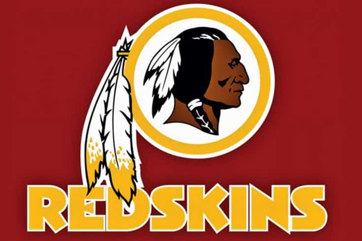
In 1972, the club restored the 1933-1936 logo and replaced “R” with an indigenous representative. A yellow ring with the head of an Indian looking to the right reappeared on the logo. He has charcoal-black hair with white feathers and dark brown skin with a red tint. Two edging line side feathers remained unchanged.
1982
This version was created in response to a marketing requirement. Because the side feathers did not fit into the round helmet stickers, the developers “pressed” them to the ring. In addition, the Indian was rotated to the left by the designers.
1983 – 2020
Because the sticker manufacturer began using more flexible material in 1983, the feathers were returned to their hanging appearance. The current version is a simplified replication of the 1972 logo with only minor changes. Dark gray shadows instead of black on the nose, corners of the mouth, cheekbones, thickened lines on the face, and even shadows under the chin and neck are among them. It also altered the skin color of a few tones. This version is being developed with the approval of Walter “Blackie” Wetzel, former president of the National Congress of American Indians.
Washington Redskins Logo and Colors
The logos of the Washington Redskins Football Club live up to their name. They are either representation of America’s indigenous peoples or symbols of their culture, such as spears and feathers. The modern version resembles a profile portrait of an Indian. It was created in 1972, and the colors were only slightly altered in 1983. Walter “Blackie” Wetzel, former president of the National Congress of American Indians, endorsed this emblem.
The logo’s design is straightforward. The center features the head of a dark-skinned man with an unusual hairstyle and two white and black feathers. This element is set inside a white circle surrounded by a yellow ring and adorned with two more identical feathers with yellow edges.
Because the team’s logo contains no lettering, the logo designers did not use the standard typeface or the Washington Redskins proprietary font. It only has a brown-faced Indian’s head with black hair. The dark palette is balanced with light shades of yellow and white. They provide the necessary contrast to make the main character’s distinctive skin color immediately visible.
Helmet
The Washington Commanders helmet design is super chic thanks to the use of a matte metallic texture on its burgundy background. A heavy geometric letter “W” in bright yellow is set on the sides of the solid helmet with no stripes, and the mask is in the same shade. The sharp contours of the four elements that make up the character add brutality and strength to the elegant palette of the helmet.
There is also an alternate helmet design with a matte black background and a yellow number on the side, with the letter “W” drawn in a smaller size and placed in the center of the helmet.
Uniform
The Washington Commanders wear three different uniform styles, two of which are in the team’s official color scheme of burgundy, gold, and white. The color uniform consists of a burgundy jersey and pants with yellow details and thin white stripes on the sleeves. The uniform is accented with burgundy elements, including gradients on the sleeves and chest. The Commander’s most stylish and exquisite outfit is the Alternate, set in plain black with small yellow accents.
Redskins Controversy
The Washington Redskins name controversy involved the Washington Commanders, a National Football League (NFL) franchise based in the Washington metropolitan area. In the 1960s, Native American groups and individuals began criticizing the team’s long-standing name, the Redskins, and the associated logo. The issue, part of the more considerable Native American mascot controversy, gained widespread public attention in the 1990s. In response to economic pressures resulting from widespread recognition of systemic racism, the team retired the name and logo in 2020. The team was initially known as the “Washington Football Team” before changing its name to the Commanders in 2022.
“Redskin” refers to Native Americans in the United States and First Nations in Canada. Throughout the nineteenth and early twentieth centuries, the term “redskin” was derogatory, and it is now classified as offensive, disparaging, or insulting in modern American English dictionaries.
For decades, the team’s owners and management, NFL commissioners, and most fans fought to keep the Redskins name, claiming that it honored Native Americans’ achievements and virtues and was not meant negatively. The name was used by three high schools with a Native American majority, according to then-team president Bruce Allen. Supporters also pointed to a national poll conducted in 2004 by the Annenberg Public Policy Center, which found that the name did not offend most Native Americans.[5] Scholars criticized the use of public opinion polling methods to measure the opinions of a small, diverse population, particularly the use of self-identification to select the individuals surveyed. The National Congress of American Indians, which represented 1.2 million people in its member tribes in 2013, opposed the name.
Washington Redskins Stadium
Since 1997, the Commanders have played at FedEx Field in Summerfield, a stadium with a capacity of 67,617 seats that was expanded in 2005 and renovated in 2012.
Before moving to FedEx Field, the club played on a variety of different fields. It was Robert F. Kennedy Memorial Stadium for over thirty years and Fenway Park for three years in the 1930s. The club’s first deacon game was held at Braves Field in Boston.
What is the origin of the Washington Redskins logo?
The Washington Redskins logo is based on the Buffalo nickel, a five-cent coin. Walter Wetzel, the leader of the Blackfoot Confederacy, proposed a redesigned version in 1972. The Indian character in the team’s emblem was originally a tribute to coach William Henry Lone Star Dietz, a white man dressed as a Native American.
Is there a new Redskins logo?
Yes, in 2020, the team adopted a temporary logo to avoid scandals related to the image of the Indian in the previous emblem.
What is the new name and logo for the Washington Redskins?
The Washington Football Team name and a brown square logo with a yellow “W” in the middle will be used temporarily in 2020 and 2021. In 2022, a new (permanent) visual identity system will be released.
What is the new name for the Redskins?
The Washington Redskins are now known as the Washington Football Team as of 2021. However, this is only a temporary name; they intend to change it.
Related Articles
- DALLAS COWBOYS LOGO: Why is Dallas Cowboy Logo a Star? (Detailed Guide)
- COMMANDERS LOGO: Meaning, Font and Leaks
- Seattle Income Tax: How Much Tax Do You Pay & All You Need
- WASHINGTON FOOTBALL TEAM LOGO: Meaning, Font and History
- Washington Redskins Logo: Controversies, Evolution & All You Need


